Recent Posts
-
Sunday
-
Climate change causes child marriages
-
Saturday
-
Friday
-
Vote Left to get expensive electricity
-
Thursday
-
Lucky us, The UN deigns to not list the Great Barrier Reef as ‘in danger’ (yet again)
-
Wednesday
-
Blackouts and maintenance problems hit farmers forced onto solar and batteries in Western Australia
-
Tuesday
-
Monday
-
Sunday
-
One Nation are now the Party of the workers, and Labor the party of wealth and academics
-
Saturday
-
Net Zero anyone? USA bets big on coal and gas — overtakes China in spending.
-
Friday
-
Winning: Trump persuades The World Bank to drop its huge spending target on “climate”
-
Thursday
-
Bafflement?! Germany, a global leader in renewables but has one of the highest EU electricity prices
-
Wednesday
-
Horse-drawn carriages must have caused a Megadrought in Europe in 1540, right?
-
Tuesday
-
Monday
-
Sunday
-
UK facing devastating 36 degree heat — can’t decide whether to use air conditioners or rip them out
-
Saturday
-
Batteries failed on day One: A four day wind drought in South Australia wreaks havoc, high prices
-
Friday
-
The UN wants to be One World Government and it starts with a carbon tax on ships and planes
-
Thursday
-
What if Global Warming was just because something made the clouds go away…
-
Wednesday
-
Snowy 2.0 is the Trillion dollar Black Hole of Australia — sucking in energy, money, land, industrial relations, the dollar, our lifestyle
-
Tuesday
-
Monday
-
Winter Solstice
-
Saturday
-
We were throwing-renewable-energy away at record levels in 2025
-
Friday
-
Pauline Hanson, the centrist, just wants a free market in electricity, and an end to the renewable energy bribery
-
Thursday
-
Blame the Climate Yeti again for making your life more expensive! (It’s a smokescreen)
-
Wednesday
-
The Sunrise Project funneled $343 million from overseas to push net zero
-
Tuesday
-
Monday
-
Sunday
-
The US government has been secretly funding 120 dangerous biolabs around the world
-
Saturday
-
New report shows renewables are a drag on our national productivity
-
Friday
-
Thursday
|
Frank Lansner’s first graph surprised me. It’s well known and often quoted that sea levels have been rising by 2-3mm a year every year for the last 20 years. But it’s not well known that the original raw satellite data doesn’t show that at all. What astonished me was the sea levels first recorded by the Topex Poseidon satellite array showed virtually no rise at all from 1993-2001. Surely not, I thought. I asked sea-level expert Nils Axel-Morner, and he confirmed: “Yes, it is as bad as that.” Now, given that Envisat (the European satellite) showed no rise from 2003-2011 (until it was adjusted) that means we have almost 20 years of raw satellite data showing very little rise. We thought satellites would finally give us a definitive answer on sea levels. Instead, like the tide gauges, and every other tool available to mankind, apparently satellites systematically underestimate the rising trends. And despite the speed of light being quite quick and all, it can take years for the data to finally arrive. Sometimes 4 or 5 (or 10 years) after the measurement was made scientists “discover” that it was wrong. Now of course, any one of these adjustments could be for very legitimate reasons and give us results closer to the truth. But the adjustments always bring data closer to the modeled trend. It’s decidedly non-random. Either there is a God who thinks teasing climate scientists is spiffy, or else there is something fishy going on, and some investigative journalists need to ask some investigative questions. Is that sea-level rise due to global warming or is it due to global adjustments? — Jo
————————————————————————————————————-
Edited by Jo Nova
Sea levels – the raw data is always adjusted upwards
[caption id="" align="aligncenter" width="506" caption="The raw data on sea levels is repeatedly adjusted "up""]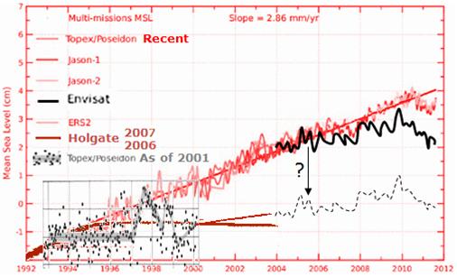 [/caption] […] [/caption] […]
This is a post for those who like the intellectual stimulation of unraveling the cause and effect links at the bleeding edge. It’s a weekend puzzle.
Frank Lansner (of Hidethedecline) wants to toss out his latest thoughts and findings for discussion. With a very simple equation he’s managed to recreate a curve just like Hadcrut temperature profile, using just the Nino 3.4 data (see Fig. 1). If it stands up, this would imply the Pacific Decadal Oscillation (PDO) pretty much determined a significant part of the climate — which is not a shock, but nonetheless there’s not a lot of room for CO2. The turning points do seem to match well (unlike the temperature versus CO2 “turning points”). As William Kininmonth reminded us, the oceans cover 70% of the planet, and are 4km deep, and most of that water is very very cold, even under the equator. If the surface of the central pacific cools by 1 degree does that drop global temperatures by 0.1C?
Of course, the mystery of what drives the PDO still stands. On that score, Frank looks at Siberia and Alaska, and finds an interesting correlation with the Nino3.4 when it is lagged by 15 -18 […]
La Nina is here. But how big will it get?
The NCEP NOAA forecasts suggest it might be so big, it’s historic — stronger and colder than anything since possibly 1917. (Then again, the Australian BOM are saying it’ll be a bit weaker than the last one.) But as Frank Lansner points out, the NCEP model got it right last year when many others were not even close.
Lansner has spotted the uber cold forecasts of NCEP. By March next year their models are telling them the Pacific Ocean (section Nino 3.4) will be 2.5 degrees below average. The forecasts are so unusually cold, some of the model runs don’t even fit on the graph. (Warmistas must be quaking at the thought of a blockbuster cold northern winter. Bring out your “warming causes cooling” memos.)
If conditions do reach 2.6 degrees below average, that would make the ocean surface temperatures in that zone, colder than anytime in the last 60 years. It would be the La Nina to almost match the strength of the 1998 El Nino anomaly (2.8K) that set records all over the world.
7.9 out of 10 based on 18 ratings […]
Have you wondered what the global raw rural data tells us?
What did those thermometers say before the adjustments, smoothing, selection, and averaging?
This just might be the first time anyone has publicly compared the global raw data to published adjusted data sets in this way.
Frank Lansner has been dedicated in the extreme, and has developed a comprehensive Rural Unadjusted Temperature Index, or RUTI. One of the most interesting points to come out of this extensive work is the striking difference between coastal stations and inland stations. Frank kept noticing that the trend of the inland stations was markedly different from coastal stations and island stations.
Fig1. Red-Blue lines mark regions where there was a different coastal to inland trend. In green areas the two trends were similar.
What he finds is perhaps not so unusual: The coastal areas are heavily influenced by the sea surface temperature. Inland stations record larger rises and falls in temperature, which is hardly surprising. But, the implications are potentially large. When records from some stations are smoothed over vast distances (as in 1200 km smoothing), results can be heavily skewed by allowing coastal trends to be smoothed across inland areas. What Lansner […]
The mystery: We know when we drive through a city that temperatures warm from the fringe to the middle. We know UHI is real, but how much does it affect the official records? Is a 2010 city 0.3 K hotter than a 1960 city? How would we know?
Frank Lansner has come up with a way that might approximate the UHI effect — very roughly. It’s well known that UHI gets bigger as cities grow, but the devil is in the detail. Frank argues that it’s not just the size of the city that matters, but it’s growth rate.
The USA is full of large cities, but there is not much difference between the trend in satellites and ground stations there. Frank’s approach could explain this — most of the growth in human population has come in regions like Africa, not the USA.
He figured that if we compare satellite records to ground stations and see if there is a divergence, we might be able to see an indicator of UHI. The info coming out of satellites ought not be affected as populations expand, but the ground stations are often near population centres and they gradually get surrounded with […]
It appears the warming of the 20th Century has been done before. It’s just business as usual for the planet.
Frank Lansner has been hard at work again, and we’ve been discussing the Vostok ice cores. This time Lansner was looking to see if the current warming trend was unusual, and if there was evidence to support the high climate sensitivities the models suggest. As it happens, most of those high climate sensitivities that the models “estimate” come not from carbon dioxide directly, but from the feedbacks (the way the planet responds to any small change in temperature).
The models assume the net feedbacks are positive. These same feedbacks ought to have been working 100,000 years ago, and if so, there should be some hint of it in the ice cores. Lansner has been hunting for large swings in temperature during the periods when Earth was at a similar temperature to present day conditions — but what he finds is that the current claimed rise of 0.7 degrees C over the last century, even if it were true (and not exaggerated by thermometer siting, the UHI, inexplicable adjustments, or selective use of records) […]
The ice cores are often lauded as evidence of the effects of carbon dioxide. Frank Lansner asks a pointed question and goes hunting to find any effects that can be attributed to carbon.
Where is the data that actually shows a strong and important warming effect of CO2? If CO2 has this strong warming effect, would not nature reflect this in data?
He has collected together the data from the last four warm spells (the nice interglacials between all the long ice ages) into one average “peak”. The common pattern of the rise and fall has already been recorded in many scientific papers. Orbital changes trigger the temperatures to rise first and about 800 years later (thanks to the oceans releasing CO2), carbon dioxide levels begin to climb. At the end of a patch of several thousand warm years, temperatures begin to fall, and thousands of years later the carbon dioxide levels slowly decline. No one is really contesting this order of things any more. What is contested is that those who feel carbon is a major driver estimate that the carbon dioxide unleashed by the warming then causes major amplification or […]
… 😮 UPDATED with GLOBAL values! The questions get bigger. (See below) July 18th.
Frank Lansner has been a busy man, and he’s asking some very thought provoking questions.
The Northern Hemisphere has a ratio of 40% land to 60% oceans, and the Hadley Met Centre seems to use a similar ratio (NH HadCrut Series: 58% ocean, 42% land). But Frank Lansner wondered why, when he graphed the GISS land-data-set alongside the combined-sea-surface-temperatures (CSST), GISS comes up with an “averaged” line that runs much closer to the land data set and not the sea surface set. If it were weighted 60:40 (ocean:land) the combined Northern Hemisphere line ought to run slightly closer to the ocean based temperatures.
So Lansner mixed the land and sea temperatures in different ratios and graphed them and an odd thing occurred. Perhaps there is some good reason for it, but the GISS NH average line is currently running close to a mix that could be almost 70% land, and only 30% ocean. Back in 1985 the NH Average was closer to the sea temps as would be expected. In fact as late as 1995, the NH line still ran at around 40% land area. But […]
UPDATED (below)
Does this herald the end of this years warm spell?
Frank Lansner has been watching the Southern Oscillation Index and noticed it’s rapid climb out of El Nino territory. He’s found graphs showing how the warm water is displaced from below and I’ve pasted them into a brutally rough animation.
See Franks full post
I wouldn’t use a single season to debunk AGW (and nor does Frank) but we all know that the crowds are swayed by weather, and Frank’s point is that the weather is possibly not going to help The Big Scare Campaign.
10 out of 10 based on 2 ratings […]
Frank Lansner has done some excellent follow-up on the missing “decline” in temperatures from 1940 to 1975, and things get even more interesting. Recall that the original “hide the decline” statement comes from the ClimateGate emails and refers to “hiding” the tree ring data that shows a decline in temperatures after 1960. It’s known as the “divergence problem” because tree rings diverge from the measured temperatures. But Frank shows that the peer reviewed data supports the original graphs and that measured temperature did decline from 1960 onwards, sharply. But in the GISS version of that time-period, temperatures from the cold 1970’s period were repeatedly “adjusted” years after the event, and progressively got warmer.
The most mysterious period is from 1958 to 1978, when a steep 0.3C decline that was initially recorded in the Northern Hemisphere. Years later that was reduced so far it became a mild warming, against the detailed corroborating evidence from raobcore data.
Raobcore measurements are balloon measures. They started in 1958, twenty years before satellites. But when satellites began, the two different methods tie together very neatly–telling us that both of them are accurate, reliable tools.
10 out of 10 based on 4 ratings […]
Human emissions of carbon dioxide began a sharp rise from 1945. But, temperatures, it seems, may have plummeted over half the globe during the next few decades. Just how large or how insignificant was that decline?
Frank Lansner has found an historical graph of northern hemisphere temperatures from the mid 70’s, and it shows a serious decline in temperatures from 1940 to 1975. It’s a decline so large that it wipes out the gains made in the first half of the century, and brings temperatures right back to what they were circa 1910. The graph was not peer reviewed, but presumably it was based on the best information available at the time. In any case, if all the global records are not available to check, it’s impossible to know how accurate or not this graph is. The decline apparently recorded was a whopping 0.5°C.
But, three decades later, by the time Brohan and the CRU graphed temperatures in 2006 from the same old time period, the data had been adjusted (surprise), so that what was a fall of 0.5°C had become just a drop of 0.15°C. Seventy percent of the cooling was gone.
Maybe they had good reasons for making […]
Yet again, we have a situation where the data doesn’t match the full-gloss coloured graphs produced by the PR agency for global warming called the IPCC.
Frank Lansner and Nicolai Skjoldby have started a new blog Hide The Decline, and posted that Scandinavian data shows clearly that temperatures got markedly cooler from 1950-1970, before they began rising again, and even after the warming, they only appear to be back where they were. But, all the IPCC graphs minimize the cooling. It would be reasonable to conclude from the data that the temperature today in Scandinavia is roughly similar to that of the 1930’s. But, you’d never know this from looking at the IPCC graphs.
Scandinavian Temperatures: 25 data series combined from The Nordklim database (left), compared to the IPCC's temperature graph for the area.
The IPCC needs to come forward and explain why its graphs are so different.
There is no “hockey stick warming” here. There is no unprecedented heat, and there is no good correlation with the rise of carbon dioxide either. Sure, this is just one region, not the globe, but this is yet another example of how the IPCC has not presented an honest assessment of […]
|
JoNova A science presenter, writer, speaker & former TV host; author of The Skeptic's Handbook (over 200,000 copies distributed & available in 15 languages).

Jo appreciates your support to help her keep doing what she does. This blog is funded by donations. Thanks!


 Follow Jo's Tweets
 To report "lost" comments or defamatory and offensive remarks, email the moderators at: support.jonova AT proton.me
Statistics
The nerds have the numbers on precious metals investments on the ASX
|


Recent Comments