It’s like watching the lights go out over the West. Sinan Unur has mapped the surface stations into a beautiful animation. His is 4 minutes long and spans from 1701-2010. I’ve taken some of his snapshots and strung them into a 10 second animation.
You can see as development spreads across the world that more and more places are reporting temperatures. It’s obvious how well documented temperatures were (once) in the US. The decay of the system in the last 20 years is stark.
For details on just how sinister the vanishing of data records is, see my previous post on Anthony Watts and Joe D’Aleo’s extraordinary summary of Policy Driven Deception.

The Great Dying of Thermometers
LATE POST NOTE
Sinan points out that people might not realize that many thermometers haven’t actually disappeared — they are often still collecting data — it’s just that their records are not being included in the “global” compilations. Though, as Watts and D’Aleo point out, sometimes these forgotten thermometers are still used to calculate the baseline averages.
…
I’m sure one day the chronological spread (and decay) of thermometers will be a useful marker for some socio/economic/historic marker (though it’s hard to put my finger on exactly what). This is not a measure of population growth — some of those dots in Australia 100 years ago are just stations (as in big farms). It’s not just “money” (Europe booms post WWII), it’s not measuring the spread of “English” though English speaking countries are well represented, Japan suddenly comes “online” in about 1880. What was it exactly, that swept countries up with the idea and the wherewithal to measure temperatures and record them?
The full 4 minute animation is (below), it’s a twinkling silent testament to human endeavor. You can also rate it on Youtube, or go to Sinan’s site and leave a comment there to say thanks.
The graph below shows the thermometer growth and decline year by year. Since 1980, as temperatures have assumed such encompassing importance, they’ve been funded, studied, and vast bets have been placed; simultaneously, somehow, temperature stations that used to number 6000 have been expanded all the way up to… 1500.

Stations have disappeared from global compilations…
As I said, the lights are going out all over the west.
h/t to Dunheved


And then there was one…..Death Valley USA
20
So there is a species that looks like becoming extinct due to “climate change”.
20
Thanks. I like what you did. Note that the code I used to generate the frames is now available at http://www.unur.com/climate/ghcn-station-locations/
Is it possible for you to fix the spelling of my name as it appears in your animation?
——
Apologies Sinan, I’ve fixed it as fast as I could! – JN
10
Incidentally, it is important to note that the stations themselves are not necessarily disappearing.
10
There will be the only one official thermometer at the end. It will be in a greenhouse at CRU kept strictly under condition by temperature curve predicted by ICPP modelers. It will thus provide unequivocal irrefutable evidence of the AGW theory.
20
Sinan Unur:
May 21st, 2010 at 4:11 am @4
exactly – most of the Australian sites are still operational, it’s just that they don’t prefer to use them as they show no increase in temp – it’s only the warming ones in use and they have all been homogenised. For example Bourke airport is a new rural rated site – Bourke Airport has only 12 years of real data, and two of them are missing, the rest of the data has been homogenised and tacked onto it.
Hay (Miller Street) is also rated as a Rural site even though it’s on the edge of an expanding rural town and is on the corner of Miller Street and the Sturt Highway – the main highway west from eastern Australia via the Hay Plain, a continuous stream of Semi-trailers, buses and grey nomads with caravans.
It’s a joke!
10
Thanks to both of you for this presentation .
Amr Marzouk
21
here’s my favourite Aussie temperature chart.
http://users.tpg.com.au/johnsay1/Stuff/Deniliquin_Post_GISS%26BoM.png
10
There was some comment made to the effect that most skeptics will agree the earth is warming. Based on the way the data is collected, the precision of the instruments, the quality of the collection points and the selective way that these are included or excluded I would have to say that the best I could manage is “I am confident that no one has any idea whether the temperature is increasing or decreasing.”
10
What you are seeing is the rise and fall of ‘real’ science. Where researchers actually went out and measured things. Instead of sitting in a climate controlled office and modelling them.
20
@janama That is an interesting graph. The difference between the two linear fits seems to be mostly due to three observations.
In any case, I am not a fan of fitting linear trends to things: To me, all that graphs says is that average annual temperatures at Deniliquin Post Office are between 15.5 to 18 degrees.
Further, my graph at http://www.unur.com/climate/ghcn-v2/501/94869.html shows that it seems to be a pleasant place with cold season temperatures around 8 degrees and warm season temperatures around 27 degrees.
Looking at http://www.unur.com/climate/ghcn-v2/501/94869-zoomed.png , I fail to see any trend one way or another (well, that’s a little tongue in cheek obviously — clearly, my graph is not the right way to analyze data containing seasonal variation either).
10
@Binny The GHCN is not about collecting data in the field. National meteorological bureaus collect the data. It is a matter of keeping the GHCN databases up to date.
20
CO2 is clearly toxic to thermometers. I can do correlations you know, its worse than we thought.
On other matters Layman’s sunspot count has been zero for a fortnight. Again.
So even if there is a CO2 warming signal somewhere in the temperature data, its likely to be lost in the cooling signal from the Maunder-like solar conditions.
http://www.landscheidt.info/?q=node/50
10
Sinan – your location is wrong – you’ve taken the Lat/long but it’s not accurate enough – the station you are referring to is Deniliquin Airport here 35.5575S 144.9458E. Put that into google.
Deniliquin Airport only has data from 1997. The data you have is the data from Deniliquin Post Office, an urban station 35°31’51.07S,144°57’53.93E
There are three sets of data for this station.
1 – is the BoM data available from here http://www.bom.gov.au/climate/data/weather-data.shtml
2 – is Torok’s homogenised data from 1996.
3 – is the High Quality data set from here http://www.bom.gov.au/climate/change/hqsites/
here are the 3 sets together.
http://users.tpg.com.au/johnsay1/Stuff/Deniliquin_Post.png
10
@janama Well, the intent of those pages was to present the data in the GHCNv2 and that site was the only Deniliquin I could find. The coordinates from NOAA are what they are.
Given the span of the data and in light of the information from the GHCN station inventory, I am confident that the data I have corresponds to the same data your charts show.
The real difference is that my graphs show monthly data.
Averaging monthly temperatures and fitting a linear trend line to them never made much sense to me.
That was the point I was making: You cannot say this Post Office or airport or rooftop is getting warmer on the basis of averaging mashing together January and July temperatures.
A better way of looking at the same data (in the absence of the possibility of proper seasonal adjustment) is to plot 12 charts, one for each month.
But, of course, everyone else does it, I am not singling you out. I was just pointing out that the only information contained in your chart and my chart and everyone else’s chart is that this place in Australia seems to have a nice, calm climate.
11
Sorry – I don’t follow you – your chart shows me nothing. My chart shows you that the data has been homogenised and manipulated to show a general warming whereas the raw data shows a cooling – now that is significant. It’s happening all over Australia and now we’ve found it’s also New Zealand. As I said in the previous thread – the southern hemisphere is not warming despite what BoM and everyone may say.
I could equally do it with monthly data as I have it for all 3 data sets but it would make no difference.
10
May I add – it also shows that the current claim regards hottest years on record is total BS.
10
Thank you, Sinan Unur, beautiful animation that deserves much wider circulation.
I first heard about this phenomena some years ago over at Climate Audit and have often tried to use/explain it in polite conversations, sometimes with the Watts and D’Aleo spin that it shows a perverse policy driven spin. Inevitably I come off sounding like a conspiracy theorist.
Janama @ 6 is point in case. Everything she just said is true. But what sounds rational and obvious on Jo’s blog can flop big time at a seminar at Byron Bay’s community center, or even at Inverell’s CWA hall before a friendly audience of farmers. It’s too easy to come off as implying that the BOM and the rest of the world’s meteorological organizations are involved with decades of purposeful tweaking each and every thermometer on the planet, which generally repels uncommitted curious minds.
Obvious, the erosion of the T-measuring system is a cultural phenomena within the global climate/meteorological community. We also know this same community has a strong bias towards supporting the CAGW theory and many have invested their professional careers in pro-AGW related research.
Anthony’s blog has convinced me that the only time a T-record is ever questioned for accuracy is because it appears anomalously cool. The unconscious bias of researchers is to anticipate upward trends. Confirmation bias doesn’t require any deceptive motives on the part of the researcher.
On the other hand we know that some researchers and academics are shameless. But without Climategate-like documents or more peer reviewed studies (as if) into confirmation bias issues in the climate record to back up the circumstantial evidence, all of it comes to naught when laid out before the lay public in debate.
Btw, confirmation bias is a problem that afflicts both skeptics and the faithful. So beware.
http://en.wikipedia.org/wiki/Confirmation_bias
10
@janama
Well, that is sort of the point of it all.
@wes george Thank your for the kind words. And, don’t worry, for years, most of my Statistics students thought I was crazy for bringing up data quality issues like this.
However, “Never relax in search of truth”: http://blog.qtau.com/2010/05/food-for-thought-never-relax-in-search.html
10
Grant: #9
That was me.
The context was that temperatures have shown a steadily rising trend since the end of the Little Ice Age.
It is fluctuations in that trend that the ‘need-a-creed’ crowd point to in saying we are all doomed.
I am sure that my understanding is incorrect in many respects, but then again I am only an engineer. Applied scientists don’t have to perfectly correct – they just have to have sufficient practical understanding to make things work. 🙂
10
Some of that spectacular “expansion” may well be due to an increased reliance on satellite monitoring.
I know from experience that politicians love anything that looks like an eye in the sky, so the availability of new technology would have impacted funding for “older technology”. How much that was, and its effect, is anyone’s guess, but it would have been a factor.
10
relative to your earlier post on RWP/Abbott:
19 May: Washington Times: EDITORIAL: Nero was hotter than Al Gore
National Academy of Science study: Ancient times were warmer
Instead of using tree rings as a proxy for air temperature, the study’s authors extracted data from sea shells preserved in deep sedimentary layers, using them as a proxy for sea temperature in the North Atlantic over the course of two millennia. According to the study, the “reconstructed water temperatures for the Roman Warm Period in Iceland are higher than any temperatures recorded in modern times.” The heat lasted from approximately 230 B.C. to 140 A.D. After that, temperatures rose and fell over time with a second peak taking place during the better-known Medieval Warm Period…
Other studies from around the world confirm the existence of Roman and Medieval warming periods, where no source of “greenhouse gases” existed aside from the horses and cows of the time. For that reason, we encourage our senators to stab their daggers into the heart of cap-and-trade and all other legislation being promoted in the name of climate-change fiction
http://www.washingtontimes.com/news/2010/may/19/nero-was-hotter-than-al-gore/
10
Sinan Unur: #16
May 21st, 2010 at 8:57 am
Tebrik ederim.
Mashing together Jan and July T’s has the effect of hiding the warming which happens in winter and at night. I’d be interested in a study of WHEN any warming has occurred. If, as I suspect, most of the warming occurred in winter and at night, even a 3-4DegC warming can’t be a problem can it?
Once again congratulations, well done Sinan
10
This is a consequence of the Hansen paper which claims that trends from a sparse sample set will reflect trends in a more complete data set. However, the caveat is that the absolute error in the result will increase. Using the same sparse set of stations to reconstruct the entire historical record, will, more or less, reflect the trend. However, if past reconstructed temperatures were using more thermometers, then the change in absolute error will be indistinguishable from a trend in the data. If as the number of thermometers is decreasing, the ones removed are disproportionately from cooler places, then the drift in absolute error will be upward.
The more relevant question is whether or not the entire record from start to finish is recalculated using the same spare set of stations. At least in this case, the Hansen claim would be more or less accurate. However, another caveat is that if the restricted set of stations were in regions that shifted from rural to urban, urban heating effects would manifest an upward trend which would be more evident in the result, given the smaller number of samples. It also would be interesting to find out what drives the selection criteria. For example, if only those stations which exhibited the largest increase over time are selected, this would clearly bias the results.
George
20
Janama:
If you live in Deniliquin, you better move out.. you guys are heading for an ice age 😉
10
@co2isnotevil Randomly and independently removing a small proportion of temperature stations from the data set every period should not have any visible effect. There is, however, no good reason to assume that the disappearances are random and independent.
Also, the small part is important.
@Baa Humbug Teşekkür ederim. I have to admit my ignorance when it comes to physical processes that are involved here. Normally, one analyzes, say, employment data or sales data after removing seasonal effects. Missing data in those cases requires some sort of interpolation among nearby points. Once you have done that, you still need to deal with autocorrelation. Dealing with time series is perilous stuff.
One simple way to deal with the complication is to look at individual months across years. Maybe I’ll do a post on that.
10
Sinan Unur: #27
May 21st, 2010 at 11:11 am
That would be good. Would it save time and effort to do a “seasonal” one? Comparing 12 months across many years may be visually crowded. However, comparisons of winter to winter, summer to summer etc would be informative and 4x less “crowded”. I think there would be a strong message if (as I suspect) most of the warming has occurred during winter months.
by the way, I tried to post on your site. When I hit the preview button, I got an error message.
10
http://users.tpg.com.au/johnsay1/Stuff/Deniliquin_Post_july.png
10
The thing that stands out (casting my statistician eyeball over the graph) is that there are two coincidental step changes in both mean annual temperature and the number of stations.
Around the 1951 grid line you show a massive step increase in thermometer numbers which coincides with a step increase in mean temperature. Then again around the 1991 grid line there is a massive step decrease in station numbers associated with a step increase in temperature.
It would be interesting to see which stations came in around the 1951 mark and which went out around the 1991 mark to see if there is much significance to these step changes.
20
@Baa Humbug: I think the preview error might due to Blogger.com’s insistence that you specify something from the drop-down list next to the “Comment as:” label, right above the preview button.
As for your suggestion, I used to something like that in class. Seasonal adjustment involves a little voodoo for anything but the simplest cases, but it is necessary. The U.S. Census Bureau’s FAQ list on seasonal adjustment might be of some value here: http://www.census.gov/const/www/faq2.html
10
janama: #29
May 21st, 2010 at 11:25 am
So the winter nights and early mornings in Deniliquin are a little warmer?
The good folk are doomed. I better put out my warm cozy wood burner.
10
No Baa Humbug – the winter nights and mornings are cooler.
10
Sinan Unur:#31
May 21st, 2010 at 11:37 am
The finer detail of statistics is a little beyond me. However from the link you provided…
If we were to ONLY compare July automobile production year on year, (for instance, to gauge if our retooling is improving in efficiency) then we wouldn’t apply the seasonal adjustment. Would we?
Likewise, if a farmer wanted to know the most suitable winter crop to sow, he’d want to know the T’s, precipitation and sunshine hours changes for winter only. What happens in summer or spring would be irrelevant to him for this purpose.
I hope I made sense.
10
@janama: Thanks for the chart. The way I read that chart, July max temperatures are flat. However, there is a shift of about 2°C starting around 1900 in the July min temperatures.
10
janama: #33
May 21st, 2010 at 11:42 am
Are you sure 99?
A cursory look shows the July min rising visibly to 1914, then steady to 1974, then a slight drop to present.
Whereas the max shows a very small cooling to 1905, then steady.
The squiggly lines have converged very slightly, not diverged.
11
Baa Humbug: Exactly. And, if you had seasonally adjusted monthly temperatures, you could combine them into annual measures. Now, the simplest way to adjust January temperatures is to subtract from each January temperature the mean of all January temperatures.
But, for some reason, it is acceptable in climate science to subtract from the individual observations the January mean of some thirty year period which decenters the data.
I have never heard a convincing explanation of why that has to be, but then, I am willing to assume that these guys know something I don’t.
On the other hand, data availability and station selection are things I can speak to without having to know the specifics of the physical processes we are trying to measure.
When a significant proportion of your observational units do not have data in 2010, comparing their average to the average you computed 10, 20, 30 years ago is nonsense.
I suspect, most of the data do exist. They are just not included in the dataset. I do not know this for a fact for every station that is missing data, but I suspect it to be the case.
Anyway, I am getting carried away here. Did you try posting at http://blog.qtau.com/ again? Any success?
10
Sinan yes I tried. Could only post as anonymous. maybe I’m misspelling my wordpress account name. I’ll check later, have to rush off to work now.
Thnx again for this post, excellent work. I’ve bookmarked your site, will visit often. And don’t be a stranger to this site, look forward to more chats with you.
10
I’ve looked, not at “weather” stations to try to understand what’s going on in the physical processes, but to Agricutural Research Stations which provide other data along with temperatures; including insolation. Insolation is important because that’s how the surface is heated, which in turn results in the air above it being warmed by conduction and convection.
Although the readily-available data sets are small, covering data usually only from the 1990’s with automated recording, there is a very strong correlation between insolation and average, mean, monthly temperatures; more strongly so (R^2 > 0.8) if the insolation from the month prior to the temperature is used. The lag between energy input (insolation) and effect (monthly mean temperature) indicates a significant storage effect.
I’ve not had a chance too anaylyse the data further as yet. The apparently-cyclic deviation of temperature from the trend-line of temperature vs insolation is interesting. My thoughts need to ferment a bit on that … I suspect that rainfall/humidity are at play so will have to look at wet-bulb temperature as well.
Other measurements, such as the soil temperature at 4 cm depth are probably useful for determining the heat content of the surface; though that will be difficult to quantify as the composition of the soil changes over time; especially with rainfall.
10
The way I see this map is that even with all the stations firing, half the earth’s surface (poles and oceans) have no thermometers at all or at best spread very thinly. Therefore half of the surface is predicated on historic data from just a handful of sites. You would want those sites to be pretty accurate. Yet what I’ve seen of the measuring stations makes me feel uncomfortable that a small UHI effect around some polar camp would propagate itself half way around the world. One rogue station could have a significanr effect. Is anyone (trustworthy) looking at these remote sites?
10
Sinan, Baa,
You can see monthly averages here: http://www.palisad.com/co2/eb/eb.html
The plots here represent the 25+ year monthly averages of data reported by weather satellites, including surface reflectivity, cloud coverage, atmospheric water content, surface and cloud temperatures, incident energy and a few other values computed from the measured values. When presented as independent hemispheres, the relationships between the various properties becomes evident.
One thing it points out is that everything in the monthly average plots gets ‘canceled out’ by anomaly analysis. Basically, the plots show the average monthly values that anomalies are relative to. The fact that this information, specifically, the relationship between the various properties, is hidden from view, is a reason why warmists can’t see how the climate works and instead, consider it an incomprehensible mystery.
George
10
co2isnotevil: #41
May 21st, 2010 at 1:23 pm
Hey George. Thnx for the link. I’ll take time to read it fully first chance I get.
Basically, it’s what most sane people have been saying, “it’s the sun, clouds and oceans stupid”.
10
OK. So, my curiosity got the best of me. Here are the observation in the GCHN-v2 data set counts by country, month and year:
http://www.unur.com/climate/ghcn-v2/observations/
On the page, use your browsers
Find in pagefunction to find the link to a specific country. Australia is here:http://www.unur.com/climate/ghcn-v2/observations/5/501.html
10
A man died and went to heaven.
As he stood in front of St. Peter at the Pearly Gates, he saw a huge wall of clocks behind him. He asked, “What are all those clocks?”
St. Peter answered, “Those are Lie-Clocks. Everyone on Earth has a Lie-Clock. Every time you lie the hands on your clock will move.”
“Oh,” said the man, “Whose clock is that?”
“That’s Mother Teresa’s. The hands have never moved, indicating that she never told a lie.”
“Incredible,” said the man. “And whose clock is that one?”
St. Peter responded, “That’s Abraham Lincoln’s clock. The hands have moved twice, telling us that Abe told only two lies in his entire life.”
“Where’s Kevin Rudd’s?” asked the man.
“Kevin’s clock is in Jesus’ office. He’s using it as a ceiling fan.
20
Hmmmm interesting. I’d have expected less variations month to month.
Lets assume there are very good reasons for these changes, say streamlining the global database by weeding out the irregular and unreliable data stations.
But, a comprehensive fact sheet has to be issued to explain these reasons, station by station, month by month. Hardly reduces workload, they might as well have kept all the stations.
Is there an explanation? (not a press release, a thorough explanation akin to an audit) or do we rely on the word of these academics?
10
@Baa Humbug: Does the following figure help? (I am being sarcastic here 😉
http://www.ncdc.noaa.gov/oa/climate/ghcn-monthly/caption.php?fig=fig1
Here is the GHCN-v2 page at NCDC: http://www.ncdc.noaa.gov/oa/climate/ghcn-monthly/index.php
And, here is the FTP site:
ftp://ftp.ncdc.noaa.gov/pub/data/ghcn/v2/
The list of observations that failed quality control contains 22,298 month, compared to the 6,782,538 non-missing data points in the database. And, their dates seem to be all over the place, not confined to post-2000.
Or, you can try their most recent mostest warmestest press release:
http://www.noaanews.noaa.gov/stories2010/20100517_globalstats_sup.html
Make sure to watch the animation where “Red dots show how a typical month’s worth of data arrives at NCDC.”
I am getting cranky. For comparison, take a look at the Health and Retirement Study documentation: http://hrsonline.isr.umich.edu/index.php?p=docs
10
Sinan Unur:
May 21st, 2010 at 4:11 am
“Incidentally, it is important to note that the stations themselves are not necessarily disappearing.”
The question popped into my head as I watched and you were in before I could ask!!!!
Nice work Simon/Jo. I am going to have so much fun leading people to this thread!
10
I’ve posted this before on another thread but it bears repeating:
as to those ‘hottest decade’ claims check out these articles:
1) http://www.quadrant.org.au/blogs/doomed-planet/2010/05/crisis-in-new-zealand-climatology
a couple of quotes:
The official archivist of New Zealand’s climate records, the National Institute of Water and Atmospheric Research (NIWA), offers top billing to its 147-year-old national mean temperature series (the “NIWA Seven-station Series” or NSS). This series shows that New Zealand experienced a twentieth-century warming trend of 0.92°C.
The official temperature record is wrong. The instrumental raw data correctly show that New Zealand average temperatures have remained remarkably steady at 12.6°C +/- 0.5°C for a century and a half. NIWA’s doctoring of that data is indefensible
2) as to Australia’s BOM compares in accuracy check out:
http://kenskingdom.wordpress.com/2010/05/12/the-australian-temperature-record-part-1-queensland/NASA GISS data does not back BoM hottest decade claim
and these three from http://www.warwickhughes.com/blog/?cat=20
NASA GISS data does not back BoM hottest decade claim
How can it serve the Australian national interest by having the BoM mislead us ?
Australian mean annual temperature reconstruction 1882-2009
10
The great dying of thermometers is a necessity to achieve the Arctic like homogenization in the style of GISS:
http://wattsupwiththat.com/2010/05/20/giss-arctic-trends-disagree-with-satellite-data/
10
Wow, talk about chalk and cheese, proffessionalism and ameteurism, honesty and……..
Those who are interested in seeing how data SHOULD be presented to the public, check out Sinans last link at #46
http://hrsonline.isr.umich.edu/index.php?p=docs
10
val majkus: #48
May 21st, 2010 at 3:44 pm
National interest? It serves an interest Val, but it’s not national
10
In the Czech Republic there is a place with the world second longest history of continual instrumental measuring of temperatures – Prague Klementinum. The time series extend is deep into the 18th century. But the temperatures in the old part of the city are slightly lower then in the new concrete quarters. Thus the second oldest continually working met-station isn’t in the net any more and the data are collected from the city quarters Libus and Ruzyne (international airport). The Klementinum data continues being used for various modern statistics but not in their raw state – as measured – but HOMOGENIZED – that means recalculated to higher values by the close warmer Prague places.
10
Re val majkus: at 48:
My point with respect to New Zealand is that their dubious temp trend propagates out over a large part of the Pacific and Southern Oceans out of proportion to the original size of the cells. This is going to have a much bigger impact than say one Deliliquin
Secondly as Bahumbug points out, the fabrication of data serves someones interest. BoM and CSIRO were recently given a huge new super computer to play on and Im guessing that there is a lot of pressure on them from political masters to get some return. The Antarctic Division needs a good global warming scare to get funding for their Antarctic budget or its back to counting penguin poo for them all – and thats going to attract funding for sure. Just watch how many ABC reporters get free rides to Antarctica to present findings on Catalyst which prop up the funding model. There is no shortage of interests here.
10
Rereke Whaakaro @ 21 “Only an Engineer”
Don`t short change youself for being an engineer mate ! Unlike much modern psuedo-scientific theory which has evolved to thrive in a world of bureacracy , ideological driven funding and political correctness, , engineering theory needs to actually apply to the real world.It`s not that engineers don`t make mistakes , it`s that if they do they change the theory to suit the facts . If a bridge built to a specific design theory collapses then driving Your Prius off it while chanting “the science is settled” will have consequences .
You may have already read the article below but I`ll include it just in case ,
http://rps3.com/Files/AGW/EngrCritique.AGW.Science.pdf
It`s by another bloke who`s “only an engineer” , Namely one Burt Rutan who also thinks AGW is a fraud
10
To Waylander 54:
Great hit! Yes, of course, engineering approach with its workable composite of science with utility is what we need but not the social engineering, which invented all the political correctness in science including the AGW Lysenkism like doctrine.
10
To A.C: 53:
Then the law that governs the climate is the law of supply and demand where the demand is driven by eager for terrifying warming.
😀
10
Lookup at the nightsky and find the reason for the ‘alleged’ global warming. You’ll be surprised to know that the Milky way is not our parent galaxy and the Sol is only now getting into the mix of the Milky way giant. The increased radiation from the Milky way is making our Sun burn hotter and emit higher energies, causing the entire solar system to warm up.
http://viewzone2.com/milkywayx.html
A new infra red digital survey of the entire sky was made in 2003. Teams from the universities of Virginia and Massachusetts used a supercomputer to sort through half a billion stars to create a — NEW STAR MAP showing our Solar System to be at the exact nexus crossroads where two galaxies are actually joining.
“We sifted several thousand interesting stars from a catalog of half a billion,” said co-author Michael Skrutskie, U.Va. professor of astronomy and principal investigator for the 2MASS project. “By tuning our maps of the sky to the ‘right’ kind of star, the Sagittarius system jumped into view.”
We are from another galaxy in the process of joining with the Milky Way. The Milky Way is actually not our parent galaxy. The mystery of why the Milky Way has always been sideways in the night sky has never been answered — until now.
10
Have the last 10 years really been that sparse in Australia?
Presumably we are only talking about government sites, but still the Australian BOM must surely maintain a lot more sites than the handful shown above, just airports alone would be more. I call shenanigans!
10
Tel @ 58
But Tel , If we declare a shenanigans on the Gore-ites who will save us from Manbearpig ?
10
My daughter used a similar graphical animation from Whatsupwiththat in her VCE (year 12) English speach 2 weeks ago. Where she spoke up against man made global warming. I was very proud of her and thanks to Jo for her assistance.
Here is her passage she used in her speach
Great Analogy Teagan
10
Thankfully for her it was an English not a science VCE I guess.
10
Who in their right mind gave Brad a thumbs up there????
10
With less thermometers making it warm, does that mean the ice will start to freeze in glaciers and the ice caps again?
http://psc.apl.washington.edu/ArcticSeaiceVolume/images/BPIOMASIceVolumeAnomalyCurrent.png
10
Jo
The CSIRO has been politicised to come out and support Carbon Dioxide emissions causing Australian warming, yet their own research indicates otherwise:
The Asian Brown Cloud of solid particle (real) pollution over China and India is cooling that region and displacing the heat down to Australia and up to the Himalayas.
This is evidenced by increased rainfall in Northern Austalia during the wet season. (Melbourne even had a ‘tropical rain event’ from up north in November dumping a month’s worth of rain in a day).
This report likely doesn’t cover that logically when it isn’t raining this dry heat must cause heat waves in our summer in to Australia’s interior.
10
Links to CSIRO research in to Asian Brown Cloud
http://www.agu.org/pubs/crossref/2007/2006JD007712.shtml
http://en.wikipedia.org/wiki/Asian_brown_cloud
10
Sinan Unur @ 3. Glad you’ve picked this up Jo and good to see you in action again Sinan with your excellent animation. Chiefio (E.M. Smith) first introduced me to your work which I found extremely helpful. I just tried to post a couple of suggestions on your site but couldn’t get through so with Jo’s indulgence I’ll ask here.
Could you or Jo kindly post the individual maps for 1991/92 and 1992/93 as I believe these will dramatically demonstrate the basis of what I believe to be a plausible explanation as follows.
To my knowledge, no reasonable explanation has ever been given for what is termed the “Great Dying of Thermometers”. 1988 was a particularly hot year in America and many other parts of the world and was the year James Hansen appeared before a US Senate Committee making his dire predictions about the effect of alleged Anthropogenic Global Warming. That was followed by the First Report of the IPCC in 1990 containing similar claims.
However, from 1988 to 1992, there was a significant cooling in many parts of Australia and the world and in my home State of Tasmania in that time frame, the drop was between 1.2 and 1.4 degrees C at almost every station. This was of course an enormous embarrassment to the IPCC AGW doom merchants and during or after 1992 I believe some 461 Australian surface stations were dropped from the GHCN data record.(E.M.Smith has covered this extensively for any one who has yet to visit his site). In the absence of any other credible explanation, I personally believe this cooling period triggered the “Dying” and also signalled the start of or intensification of adjustments, homogenisation, infilling and all the other measures used to distort the raw figures.
10
@Keith H: I see what you mean. The frames will be up soon. I’ll post the URL here.
As for posting on http://blog.qtau.com/ sorry about that: Blogger.com software requires you to select a profile. Anonymous seems to work fine.
10
@Keith H:
Here are the relevant frames:
http://www.unur.com/climate/Australia/
Also, here is a link to E.M. Smith’s blog. In fact, I was motivated to delve into the GHCN-v2 again after three years because he posted a piece about my charts.
10
With sincere apologies for repeated postings, here is the link the E.M.Smith’s blog: http://chiefio.wordpress.com/
10
See also http://www.unur.com/climate/ghcn-v2/observations/5/501.html
Here are the total numbers of observations (including any from possibly duplicate station records) for January 1991, 1992, and 1993:
501|1991|1|488501|1992|1|470
501|1993|1|80
10
So what happened around 2005-6 to cause the massive discontinuity falloff of stations in the US?
10
Boyd,
My guess is that it started to cool down and this was yet another effort to hide the decline.
George
10
@Boyd: I do not know. Even Central Park, New York City is missing data in the unadjusted
v2.meanfile. It is not that the entries are-9999: There are no rows following 2006.On the other hand, everything is hunky dory if you ask GISS. GISS is supposed to be based on GHCN-v2, but I do not understand the interrelationships among these data sets well enough.
10
[…] This post was mentioned on Twitter by Lee Charles Burch, Lee Charles Burch. Lee Charles Burch said: Currently reading href=http://joannenova.com.au/2010/05/the-great-dying-of-thermometers/ […]
10
[…] stopped using so that they can skew the temps in their favour. That's real good science all right! The Great Dying of Thermometers « […]
10
Sinan – Australia went from 1418 stations to 224 after the work of Torok and Neville
Torok, S. and Nicholls, N., 1996. An historical
temperature record for Australia. Aust. Met. Mag. 45,
251-260.
their method is described here.
http://users.tpg.com.au/johnsay1/Stuff/method.txt
10
OT _ So who is in the pay of big oil?
http://www.independent.co.uk/environment/climate-change/polluted-by-profit-johann-hari-on-the-real-climategate-1978770.html
10
It’s much colder here this morning than it was at lunchtime yesterday. This shows that the globe is cooling. And I don’t even need a thermometer to prove it.
10
CSIRO………
Climate
Sham
Inventors &
Rorts
Organisation
10
Hide the plateau:-
http://blogs.news.com.au/heraldsun/andrewbolt/index.php/heraldsun/comments/hide_the_plateau/
10
Sinan Unur: @68
Here are the relevant frames:
http://www.unur.com/climate/Australia/
Thanks for the link. Me thinks simply Amazing.
In truth simply disgusting, Australian BOM still has Government ear and the nation is still continually misled on national temperature in our main stream media, bombarded by the public funded ABC and posters here continually need to spar with the likes of the always popular but sometimes annoying MattB.
10
Don’t start building the levee just yet:
http://www.c3headlines.com/2010/05/new-peerresearch-finds-alaskancanadian-glaciers-melting-significantly-less-than-previous-estimates.html
10
@janama: I think this is the PDF version. Their method for identifying break-points seems a little too ad hoc to me. We economists think a little differently about regime-switching (see Hamilton’s summary).
In any case, after reading the paper, I am even more confused. The paper identifies and constructs temperature series for 170 stations. Australian BOM says
These 130 stations are not listed anywhere I can find.
I picked one station at random from Table 1 in Torok’s paper, 75039. It is identified as LAKE CARGELLIGO POST OFFICE in the paper, but the BOM identifies it as LAKE CARGELLIGO AIRPORT. And, it says this station is not quality controlled.
So, I started typing in station id numbers starting with the first one in Table 1. After about a dozen of those, I had not found one that was “quality controlled”. I typed in a bunch more, no luck.
The paper is from 1996. The reduction in the number of stations in the GHCNv2 happens in November 1992. Did it take that many years to get the paper published (not out of the realm of possibility by any means)?
Going back to the GHCNv2, here is my point: If the Australian BOM did excellent work identifying the highest quality stations with the highest quality data, only data from those particular stations should be in the GHCN. The rest of the series ought to be completely dropped. It is better to have fewer complete trustworthy series overall than to have mish mash of series from here and there.
So, if there is a good reason the stations dropped from the GHCNv2 were dropped, their past data ought to be dropped as well.
I am wondering what explains the disappearance of the Central Park station from the data set starting 2006.
10
If the global t-record data has been so hopeless damage through manipulation by the climatological community that we’ll never know whether it has warmed or not in the last 110 years…
1. This is only slightly more damaging to the pro-AGW argument than the anti-AGW because the non-partisan observer will realize both camps are arguing with much vitriol from positions of ignorance. Of course, the burden of proof is upon those who proposed the AGW hypothesis, but that hasn’t been of serious concern for them (or the lay public) yet, why should it be so now?
2. The goal of this line of debate is to increase the quality of the t-data record. But human nature being what it is, it’s more likely that the past t-record will now devolve into a pack of post-modern narratives, each camp sporting its own opaque reconstruction, all will have strengths and weaknesses impossible to test empirically. There will be competing satellite t-records in the future. The lay citizen will be asked to decide which scenario to support based on emotional appeals to socio-political values rather than anything remotely resembling a rational evaluation of facts since there won’t be any reliable facts.
3. Even with the past t-record tweaked to envince the climate community’s bias it still doesn’t confirm either the Anthropogenic or Catastrophic part of the GW theory. The recent restoration of the MWP/RWP to their rightful curve shows that modern temperatures are still within the envelope of natural variability even at almost double atmospheric CO2 concentrations. Therefore, a fuzzy recent past t-record is of no policy import, merely an academic issue.
Given all of the above wouldn’t it be in the best interest of rational inquiry if all parties, pro and con, come together to negotiate a single unified (if compromised) past t-record. Likewise, a transparent global standard method should be developed for all future observations, adjustments, storage and distribution. This might avert a Balkanization of the science by creating a concord of data from which climatology can be steered forward by the long established values of the scientific method and empiricism.
10
Sinan – the stations are listed here
http://www.bom.gov.au/climate/change/hqsites/
these are the supposed high quality sites that are used in the National Climate Reports. There are Urban and Rural sites and they claim only rural are used in the temperature record.
Further investigation shows that stations listed as rural may be physically rural but their data is taken from adjacent urban sites.
For example Glenn Innes Airport is described as a rural site but it’s data is only a few years long and the added data matches Glenn Innes post Office an urban site nearby.
Similarly with rural station Bourke Airport with a few years of data yet the full data matches Brewarrina Hospital another urban site 100km away.
They have a wonderful rural site at Casino Airport going back to 1908 but they don’t use it – maybe because it shows absolutely no warming.
Here is the adjustments made by Torok to Sydney (Observatory Hill) From cooling to warming in one easy alteration of 1.2C!! Somehow someone managed to move observatory hill.
http://users.tpg.com.au/johnsay1/Stuff/Observatory_Hill_Full_Adjustments.png
10
Observation: When we get to discussing the measurement of temperature, we don’t get any of the usual AGW suspects commenting. It would be really helpful if they would chime in with explanations to help us understand this phenomenon.
10
@janama Thank you. The stations are listed in this PDF document
10
That’s actually a different list to the site I posted. That is the second adjustment made to the temperature record by Trewin (2001).
here’s the list of sites used in the High Quality set at http://www.bom.gov.au/climate/change/hqsites/
ftp://ftp.bom.gov.au/anon/home/ncc/www/change/HQannualT/HQannualT_info.pdf
do you now understand why Harry called it a mess? 🙂
10
They got this guy, see, in Germany. Fritz Something-or-other. Or is it? Maybe it’s Werner. Anyway, he’s got this theory, you wanna test something, you know, scientifically – how the planets go round the sun, what sunspots are made of, why the water comes out of the tap – well, you gotta look at it. But sometimes you look at it, your looking changes it. Ya can’t know the reality of what happened, or what would’ve happened if you hadn’t-a stuck in your own goddamn schnozz. So there is no “what happened”? Not in any sense that we can grasp, with our puny minds. Because our minds… our minds get in the way. Looking at something changes it. They call it the “Uncertainty Principle”. Sure, it sounds screwy, but even Einstein says the guy’s on to something.
— Freddy Riedenschneider, The Man Who Wasn’t There
10
Sinan, this is all very interesting! Thank you.
10
Melbourne Regional Office “high quality” station (086071) is located at the intersection of La Trobe and Victoria St. Google Street View has the screen enclosures visible.
It’s a very warm location; sheltered well from cooling breezes off the Bay and with lots of active heat sources in the 6 traffic lanes and 2 tram lines within 30 metres. Here’s the satellite view withthe screens (andtheir shadows)visibleon the triangular grass patch. Zoom out to see the tall buildings to the South, West and East.
10
Bernd, that is a very snappy (navy?) uniform you have there!
10
@janama: I see. Thanks for pointing that out. I had thought that was just the same list, produced at later date.
The first time I went to http://www.bom.gov.au/climate/change/hqsites/ the map did not show up, so I was confused.
Looking at the pink and yellow circles, without being familiar with Australian history and development, the pattern of “high quality” sites is still reflective of where people chose to travel and settle.
@Bernd: That is a beautiful place to measure temperature 😉 Excellent find.
10
From the 4 minute animation it appears that the Canadians have reduced the number of stations more than anyone. Could it be that Maurice Strong who seems to be the major force behind the AGW scam is form Canada and has had some influence on this reduction?
10
wes george @ 89
Last night I saw upon the stair
A little man who wasn’t there
He wasn’t there again today
Oh, how I wish he’d go away
10
Sinan, janama:
We’re on the same wavelength. I’m currently comparing the entire BOM “high quality” (sic) data record with their own unadjusted station data and it’s not pretty. I hope to get a post up at kenskingdom.wordpress.com in the next couple of days re Northern Territory- talk about dying of thermometers, BOM use only TWO to produce the NT record, and they manipulate Alice Springs very nicely. Progress report: after 30 HQ stations, raw data shows warming of 0.79C/100 years, HQ data shows 0.96- a 21.5% warming bias. Only 70 to go…
Ken
10
Wes @ 89
You don’t mean the Heisenberger Uncertainty Principle do you? (Pardon the spelling, maybe.) This is probably more associated with nuclear physics but does (in theory) apply to every measurement that is taken. Of course the whole AGW idea is pretty theoretical itself, so fair enough.
Cheers,
Speedy.
10
Ken it’s so nice to see you here; I’ve posted links to your site on a number of blogs; congratulations on all your hard work
10
Go for it Ken @ 96
I’ve been concentrating on NSW and it’s as story of intrigue and BS.
10
janama @ 99 if you’re looking at NSW Warwick Hughes’ site is worth a visit; http://subscribe.wordpress.com?key=915093ed598741b4c35f193ac0faabb9&email=v_majkus%40bigpond.com&activate_comment=10277222&n=2d0a2f34ea7f5feb157469f210d4a963
check out the categories BOM Australia and surface record (categories on left hand side of the page towards the bottom;
like to see your work when you’re finished
10
sorry that link should be http://www.warwickhughes.com/blog/?cat=4
10
Wes @ 89
Sorry – having a blonde moment. It’s Heisenberg.
Cheers,
Speedy.
10
Wow! This is the epitome of … words fail me!!
http://www.poodwaddle.com/clocks3.htm
10
Steve Schapel: More like twaddle to me.
11
Folks,
If the historical temperature records have been systematically “adjusted” over a couple of decades, then this raises the obvious deduction of a political agenda in play.
I think not, because socialists and lefties I know are not that intelligent – monkeys seem more intelligent by comparison; no thoughtful individual would embrace collectivism as a political solution given its track record of abject failure.
I suspect we are instead dealing with institutionalised mediocrity, where, instead of a golden mean, we are subject to a dross bureaucratic mean that reacts imtemporately to any hint of criticism from the sullen masses.
They are, after all, the self-annointed elites who know better than we, what is good for us.
10
Steve Schapel: #103
May 22nd, 2010 at 7:45 pm
fascinatingly funny.
I noticed that species lost is the same as oil spill tonnage.
They have a very very accurate thermometre. To 10 decimal places.
I gotto figure out a way to make money out of the so many fools on this globe. others seem to be doing ok. Any ideas?
10
Sinan Unur @ 67-70. Thanks so much for those graphic frames Sinan and also for posting the link to chiefio which I was just too tired to do at 1.55am. Getting old, I fear! Like E.M Smith, in answer to requests, you do so much more than expected. The IPCC could learn a lot about sharing from people such as you so no need to apologise for “too many postings”!
For other posters interested enough to follow through, Chiefio has done a full series of his unique hair graphs for most parts of the world which also show the relevant number of stations at various time frames. The pivot points and subsequent step-ups in temperature when stations “die” is clearly evident.
Boyd @ 71. Remember that it was generally accepted for many years after 2000 that there had been cooling rather than warming, hence Kevin Trenberth’s e-mail concern for instance, that “it was a travesty” that the climate was refusing to comply with the IPCC’s computer models. Then came a further bout of “dying Thermometers” and hey presto, suddenly it’s “the warmest decade ever recorded”! For instance, California was left with only four stations, and they’d left the mountains and marched towards the sunny beaches! Coincidence? Make up your own mind.
General question. Does anyone know why Harry of the “Harry: Read Me” Climategate file fame, was trying to reconstruct what had been done to the temperature data? I personally think that CRU and Jones in particular had been panicked by the FOI requests for the data that had been “lost” or simply not kept. What has come to light there is, in my opinion, only the tip of another very large iceberg!
10
Sinan congratulations on your work and thanks for sharing it with us; I wanted to leave a comment on your blog but couldn’t see how; might be having a blond moment even though I’m a brunette; wonderful work! I never cease to be amazed at all the professionals who are happy to share their work with amateurs like me; I’m a post Climategate skeptic and I got my knowledge from the internet as the main stream media slept through Climategate and the subsequent relevations of the IPCC but without professionals like you and others I would have been like many others – brainwashed still; so thanks
10
The instruments for measuring temperate, made in the nineteenth and early twentieth century were accurate and never needed adjustment. Wet and dry bulb thermometers,wether alcohol or mercury were precision, made by instrument makers. The long term records taken and duly noted down diligently by farmers, schools and official weather stations. These modern electronic automated wizz-bangs planted in the heart of concrete jungles,would appear to be the sole and only cause of the panic warming.
Call me cynical, I have been called much worse, but that was another life time. Some time ago,nah nigh on sixty years ago, our last swim in the dam was the Easter school holidays. That changed and got too cold, try swimming in the dam at Easter in outer Melbourne these days. I recently gave to my daughter a barometer, thermometer that had been given to me. Made by Dunklings the jewellers in Melbourne in 1901. Still working perfectly. Too remove the rural stations with totally accurate equipment, and, fill the record with urban warming is deliberate fraud. I have seen too many floods and droughts in our land of sweeping plains. I have read too much history, of both our land and the world to fall for nonsense, scams have come and gone my entire life.
Many shonky scientists have I seen caught out, red meat is bad, don’t eat eggs or butter,ration the milk, toast will give you cancer,scientific concensus. Total utter rubbish. The problem now is that the concensus was pushed by politicians onto the pliant scientists using money.
Science was never about propaganda until now, the antidisastablishment brigage took the running from the politicians. This filtering down into the less than intelligent in the lower ranks of greenies, school teachers etc to become the new faith. Spreading ever wider the propaganda, utilising those in the media devoid of logic,and chanting a mantra of the new religion.
Glaciers forming on mount Dandenong would be a sign of global warming for many thousands of these poor deluded souls. It will take a generation of people and cooling climate for this religion to go away, even then some will believe.
10
Why is there a rapid increase (almost straight line) in temperature @1951 when a large number of sensors were added, AND again @1991 when a large number of sensors were removed? Like a rolling pool-ball does not change direction unless perturbed, this looks very suspicious to me.
10
@val majkus: Very off topic: Blogger’s default templates are a little bit of a pain. I have been fixing bits and pieces here and there as I go along. I moved the comments link off to the right margin, made it a different and slightly larger font. To comment on my blog, follow the “n comments” link. You will need to select a profile to be able to post. There is also a CAPTCHA (I know, I know).
Thank you all for your kind words and encouraging comments. And thank you, Jo Nova as well.
I should point out that I do lean more toward the mediocre people with PhD’s and inept bureaucrats view of the world. When you combine ineptitude with ambition and add in government power, you get bad stuff.
The easiest way to deal with such people is to keep asking them Why? and How? (in countries where doing so will not land you in jail or worse). That is why I am such a fan of Steve McIntyre without his dogged determination to try to answer the question How can they know that? the world might have been a much worse place.
I need to focus on some other stuff for a while but, in closing here is some food for thought:
10
@Submariner AFAIK: The number of stations included in the GHCN post 1950 increased due to collection and digitization efforts in the last part of 20th century. Here is a list of data sources used for the construction of the GHCN: http://www.ncdc.noaa.gov/oa/climate/ghcn-monthly/source-table1.html
If you look at Peterson and Vose, they point out on page 2842 in a note to Figure 2:
I find this quite and astonishing statement: The places who data were extracted from retroactive data compilations have not disappeared. And while it may not be possible to get real time data for those places, I think a year or two would be sufficient time to fill in the gaps.
It might be cooler now in Tabuk, Saudi Arabia then ever, but we cannot know that. Ever.
10
Baa @1,
Have you ever been to Death Valley? The temperature extremes are humongous. In winter the nighttime temps can go below freezing. In summer the daytime temps go to as much as 130 F, about 54 C on occasion.
Now there’s some “global warming” for you!
10
Baa,
I can’t resist — all you need to do is sell your self-respect to the lowest bidder.
Roy
11
As I read what Jo posted, all the responses and followed the links, I come away with but one conclusion — one I’ve already reached, that there’s no way to rely on the official line of the warmers. There has been too much hanky-panky. The 10 second animation all by itself is a study in how not to win friends and influence people with your message.
10
Roy Hogue:
Exactly. The reason I first became skeptical? I found a lie. Then another. It’s built on lies.
Hi Val and janama- new post is up at kenskingdom-
http://kenskingdom.wordpress.com/2010/05/22/the-australian-temperature-record-part-2-northern-territory/
And I used to think BOM was pure!!
Ken
10
Louis Hissink: #105
Bureaucrats want everybody to be the lowest common denominator – is the only way the can feel good about themselves.
10
Sinan
Very interesting animation.
Many of the individual stations prior to 1850 -together with their temperature graphs and other climate information- can be found at my site;
http://climatereason.com/LittleIceAgeThermometers/
I have another ten or so historic stations to add over the next few weeks.
Tonyb
10
Sinan, Ken Stewart et al (and anyone else interested in station selections regards Australia)
First, have a look at warwick Hughes article HERE from Nov 09
Then, if you have time, have a look at a critique of Jones et al 1986 by Hughes in 2005 and updated recently HERE
The “selective” use of stations and the wilful downplaying of the Urban Heat Island affect is stark.
At the second link, there is a very interesting commentry on an Australian BoM paper (M.J. Coughlan, R. Tapp and W.R. Kininmonth; 1990, “Trends in Australian Temperature Records”) A paper that actually confirms UHI, contradicting Jones et al 1986
11
Rereke @117,
The other side of that coin is that so many who are not moved to be the big important type seem to be looking for a savior, someone to tell them what to do and how to do it. I guess it relieves them of the pressure of having to make decisions. In fairness I admit that it’s more complicated than that simple statement. But I can see it particularly in politics and the world of environmentalism which certainly includes the global warming scare. “If I do the right thing and save the planet I’m going to be OK,” is the basic motive I see in many AGW believers.
Fortunately it is more complex than that because people are beginning to realize that the scare mongering may not be the truth. But there will be diehards until the end of the world.
11
To me, the video is interesting because it demonstrates that thermometer data has always been questionable at best. Good thermometer data would be taken at points randomly distributed over the earth’s land and sea.
Now we are fortunate to have satellite data which gives a much more accurate measurement of the earth’s average temperature. It seems pointless to continue gathering thermometer data except to compare it to the satellite data, and determine if it was ever worth anything at all.
We really only have an accurate estimate of the earth’s temperature since weather satellites started going up in the late 1970’s. Thirty years of real data on a planet that is about 4,700,000,000 years old. Anyone who “settles” a scientific theory on such skimpy data is a pathetic excuse for a scientist.
10
I am seeing some interesting patterns in the geographic distribution of adjustments in the GHCN-v2 data set: http://blog.qtau.com/2010/05/would-you-like-yours-well-adjusted.html
10
Sinan @ 122. Your animation graphically demonstrates whent the “lights” (dropped stations) went off in many parts of the world in 1992. The Southern Hemisphere was almost wiped apart from Australia, which again was the greatest, but substantially reduced contributor. Up to the 1920’s -30’s it was almost alone in the SH.
It looks like the US was by far the main source for GHCN use after 1992 until 2007 when the lights went out thereafter a lot of upward adjustment it seems. As outlined in my post at 66, in the absence of any better explanation, it only invites speculation that the changes were triggered by the circumstances I outlined and I’m definitely not a conspiracy theorist!
If you didn’t see the following thread by Chiefio (E.M.Smith), it’s well worth a visit and may answer a few questions for many people.
QA or Tossing Data – You Decide
April 11, 2010 by E.M.Smith
Well, Is It An Improvement Or Not?
I found this paper:
http://journals.ametsoc.org/doi/full/10.1175/JTECH1963.1
that gives an overview of some of the approaches used in the “QA Process” at NCDC. I’ve read it through once (but not followed all the links to the other papers it references).
10
Interesting – the big DECLINES in # of temperature stations correspond to big INCREASES in temperature. Coincidence???
10
@Keith H: I got back in to digging around the data after E.M. Smith recently mentioned some graphs I had put together back in 2007. I have been catching up with his blog bit-by-bit since then. In fact, I was motivated to look at the distribution of stations and adjustments by discussions on his blog.
As for quality control that results in tossing data that are not erroneous (say due to transcription or transmission or translation errors) but are the result of some extreme weather event, I don’t know how I feel about that. If there were some proper multi-equation dynamic model somewhere, I would be inclined to stick a dummy for specific weather events identified as extreme for the station, rather than limit the range of temperatures I consider valid. But, as far as I know, they do not use such models.
Thank you for the reference to the paper. Unless I misunderstood their analysis, it seems to me that climate scientists still have not heard of Panel data models.
It seems to me (and it is about 4:30 am as I am writing this) that their spatial regression model basically ignores variation in the time dimension at a particular temperature station, and only pays attention to what’s happening at stations around that point. Ignoring the time dimension and focusing solely on cross-sectional variation can lead to biased estimates.
Anyway, let me not get too carried away. The spatial distribution of adjustments across the globe and across time simply looks crazy IMO. I am really impressed with the seeming implication that around mid-80s only the U.S. data needed adjustment: Everybody but the Americans seemed to know how to measure temperature during that time. And then come the 90s where the party really begins.
For full effect, you should look at the pie chart immediately after watching that animation. Unfortunately, I forgot to synchronize the frame rates, so side by side would be frustrating.
10
@Asperamanka: I don’t usually indulge anonymous snide comments, but I think it is necessary to clarify a number of points.
1. If you look at http://www.ncdc.noaa.gov/sotc/?report=global you can see that NOAA uses GHCN for their land temperature anomalies. They use the GHCN data set to make statements such as
If the set of observational units is not remaining constant over time, comparing one average today with an average, say, 100 years ago is fraught with difficulties. If, on top of that, if post-2006 data do not even include Central Park, NY, I am not sure what one can say about the validity of such statements.
2. Past 15, 40, and 60 years may be long compared to the average human’s lifetime but they are very short periods compared to the span of analysis (does “warmest in a millenium” ring a bell?) I am sure such data are useful and valuable. However, NOAA uses the GHCN for its State of the Climate.
3. In your haste to make a quick point, you fail to grasp that the data set which the The World Data Center for Meteorology data set you are referring to is the very same GHCN data set I am talking about. It is within that data where the frankly crazy rate of station record attrition is occurring.
You seem to be impressed with the number of temperature stations with real time data in the last 15 years. For perspective, consider that most of those stations are clustered in a few countries such as the U.S., Australia, China and Canada and their distribution across the global land surface is not random or uniform.
Finally, please take a look at the spatial distribution of adjustments across time in the very same GHCN data and think hard about what you see.
Now, I am neither a statistician nor an econometrician, but I do have a Ph.D. in Economics and I did teach Statistics at a respectable university for more than a few years, so, I usually know what I am talking about when I say something about data analysis. And, I keep my mouth shut if I have nothing useful to say.
10
In my haste to make a quick point, I butchered the English language. Item 3 above should read:
😉
10
I hope Mr. Unur will both apply his data analysis skills to the data available and provide a thermodynamic mechanism to support his hypotheses then submit the analysis, with a full audit trail and source code, to JOURNAL OF GEOPHYSICAL RESEARCH for publication. I suggest that he approach Messrs. Carter, de Freitas and McLean for advice.
10
@Asperamanka:
Say you are shopping for a car. You test-drive one, you tell the dealer what you do not like about the car. The dealer says to you: “Yeah! Well, go build your own car then!” What do you do?
NOAA is a U.S. government agency. It has a product called the GHCN which is used to inform politicians about climate change. I am curious about the product. I am exploring the product. In exploring the product, I find things that make me go “uh-oh, it looks like we are comparing apples with pineapples here”. I raise those issues in a visually interesting way that a couple of thousand people (a drop in the ocean, really) seem to have also found informative.
The reason those of us who are not members of the priesthood of climate science have to feel our way around the dark is simple. There is no lightswitch. If NOAA had on its site, right next to the GHCN database files, a complete and accurate description of the what went into making the data set (say, similar to the way Health and Retirement Study researchers do, I and others would not be trying so hard to comprehend what the heck is going on and would probably not even feel the need.
Finally, I am not doing any analysis: I am trying to understand the data set. That is a pre-condition to doing analysis.
10
Asperamanka….Asperamanka……Asperamanka
Funny I say that name three times and it starts to sound like:
Troll
10
Sinan
We have now got on to the subject of the very curious Central Park figures which I wrote about at some lenth in this article here. There are references to Anthony Watts and Steve Mcintyre, both of whom have looked at this recrd at some length.
http://noconsensus.wordpress.com/2009/11/25/triplets-on-the-hudson-river/#comment-13064
By the way this article and many others are contained in my web sdite whose main purpose is to explore the individual historic stations prior to 1850.
http://climatereason.com/LittleIceAgeThermometers/
I have no faith at all in the concept of a global temperature. Not only do stations come and go, but named stations also frequently wander from one micro climate to another and also have the distressing habit of being engulfed by urbanisation.
Keep up the good work!
Tonyb
10
Amazing. Sinans responses at #128 and #130 made ME feel like I just got an intellectual pummelling, and they weren’t even directed at me.
I wonder how the intended respondee feels. cringe cringe
10
oopps make that #128 and #131. Which kinda proves my point.
10
Asperamanka,
What possible reason is there to bother with Nature or Journal of Geophysical Research? Six months or more of headbanging past a bunch of gatekeepers who only serve to protect the established status-quo, to get an article published, where the meaning of “published” is that it gets locked away and cannot be seen by the general public. They expect authors to sign over full Copyright ownership of their work to the journal, they pay the author nothing, and provide less useful facility than you get from a simple web page.
Unur’s existing website provides every bit of information you need to repeat the analysis including reference to the dataset that he was using and detailed description of the methodology… and that’s a lot more than the CRU ever provided. If you want full audit trail then how about asking Nature about their full audit trail (you know, where they demand that authors make their data available) and maybe asking Phil Jones to publish some source code?
Better yet, Unur’s existing website is completely public, and if you find a problem you can put a comment right there (or here, or on your own site) to explain the problem, and you can link to the original article, and anyone with a web browser can follow that link. This is technology at work! Best of all, Unur has animations.
10
If my purpose were to pursue an academic career in “Climate Science”, then doing real work and trying to get it published in Nature or JGR would be the right path. However, even if that were the case, I would still be sending around working papers, drafts, presenting at workshops and seminar series before I even got to the stage I would consider submitting something to a journal.
I am not familiar with other disciplines, but your average academic economist probably presents a paper a dozen times before she considers it ready for submission to a journal. Workshops and seminar series at economics related departments can be brutal for the uninitiated. Regardless of the speaker’s status (I’ve seen this happen with very esteemed economists in both theoretical and empirical fields — even with a Nobel laureate or two), the questioning begins early in the talk and never ends. Models, data methods, graphing techniques and math are questioned early and often. It’s not that we expect people to present models with no gaps or use data sources with no shortcomings — that is impossible when modeling complex phenomena and/or using historical data.
Almost no one can look at a reasonably interesting model and a largish data set and immediately grasp all aspects of it. When one is not familiar with a data set, one pokes around a little bit to understand the structure better (at this point, it is very important to avoid the temptation to do cross-tabs or comparisons so as to prevent forming or altering hypotheses on the basis of the data).
That is what I am doing right now. First, I looked at where on earth temperature measurements included in the GHCN come from. Second, I looked at the relative frequencies and the spatial distribution of adjustments (of course, as E.M.Smith pointed out, the “unadjusted” data have gone through “quality control” i.e. adjustment).
People like Asperamanka have this refrain that no only members of the priesthood can talk about even the most benign aspects of climate science. This was an early line of attack against Steve McIntyre (I am not comparing my simple map animation to McIntyre and McKitrick’s path breaking papers.) The inanity of this line of attack, “we don’t care about what you have to say because you are not a member of our club”, was what prompted me to invite Steve to give a talk in my class. I am glad I did: Demands on his time have grown astronomically since then 😉
So, Asperamanka is reading from a script. There are apparently zillions like him who have this religious belief so strong that any comment, however, straightforward, makes them insecure.
I have so far avoided saying anything about the validity of any conclusions reached by others. I am simply not in a position to do so. In press releases and congressional testimony, representatives of NOAA tend to play up the span and scope of their data set and express no uncertainty. They create an impression with their large red circles or splashes of paint on their maps that their data contain measurements from a well designed grid covering the whole world. It would be better for all concerned if they were more forthcoming about gaps in their data sets both across time and space. I have emailed NOAA with some questions about the data. I hope to have some light shed on some basic questions.
10
@tonyb I used to compare West Point to Central Park in my Stats classes. It is an interesting exercise 😉
10
Sinan.
I wrote an article on temperature records through the ages and subsequently received a very interesting static graphic (based on E M Smiths work) illustrating station gains and loss in each of the hemispheres. Its not on the net, but if you care to email me on [email protected] I will send it to you.
Tonyb
10
The difference is, of course, that economics is just made up educated guesses and is not a science based in physical reality. So I’d imagine there is much more disagreement and posturing as these are egos whose positions are based on their ability to argue non-facts and opinions.
10
@MattB: There is much less disagreement among economists than one might otherwise think. Although, some of us think macro guys are funny.
Let’s please not get into a deconstruction of the word fact.
20
I’m right with you Sinan. The bankers who stand to make bezillions are opportunists on a grand scale, but the combination of ambition, petty snobbery, mediocre scientists and lots of money-status-&-power made this an accident of geopolitics that was waiting to happen.
10
PS: Sinan and Mattb – If there’s less public debate about economics that’s because there’s even more money and power in it than climate science.
If even psychology can be called a science, economics could have been too … but there was too much money vested in the heories that espouse lots of government spending and taxing to let any other theories get treated seriously. Hail Keynes.
10
@Joanne #143 I consider Hayek’s Nobel prize to be one of the most important highlights of economic history. His lecture is as relevant today as it has ever been.
For a brief period in time, people seemed to have understood what have was trying to say in the 30s and the 40s. Unfortunately, it took but 35 years for the Economics Nobel prize to go back to the dark ages.
This quotation from Mises perfectly summarizes my perspective on things.
10
From ““:
10
Well sinan all I can do is quote Federal Opposition Resources Spokesman Ian Macfarlane’s comments today on the resource super tax:
“I think economists are put here to make weather forecasters look good”
Hmm he is not a skeptic I note.
Also – do you see the irony in linking to an article about consensus amongst economists:)
10
p.s. Jo – less public debate about economics? Maybe you are busy on climate but you should google “mining super profit tax”;)
10
Hello all:
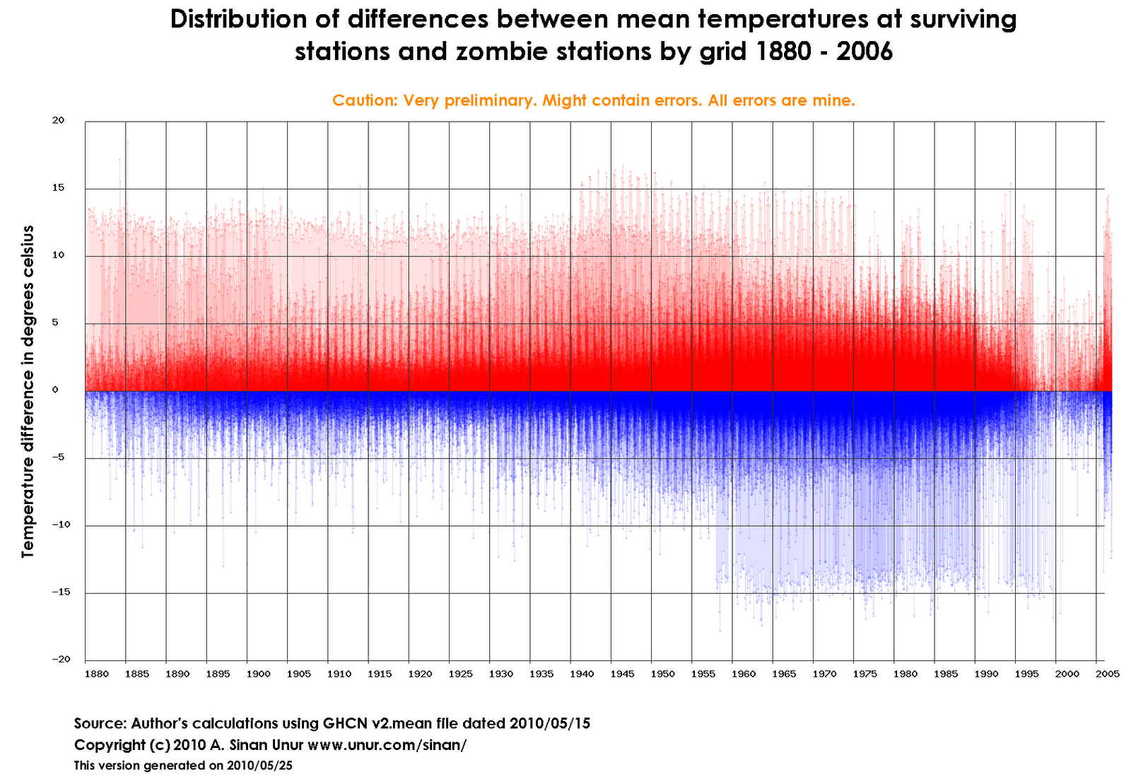
I am trying to figure out if the zombie stations matter:
PS: @MattB Forecasting and understanding the how and the why are two very different things. Economists who claim they can numerically forecast the impacts of sweeping policy changes either do not understand their limitations (see Hayek above) or have sold their souls.
10
I tried to insert an inline image but WordPress ate it apparently. Here is the link to my post on the comparison of survivors and zombies:
http://blog.qtau.com/2010/05/do-zombie-stations-in-ghcn-v2-matter.html
Apologies for the noise.
10
Sinan, we do share similar economic views then. And Mattb if you think “economic” debate amounts to a fevered discussion of one tax (albeit a raging theft) then you make my point by default. When Hayek vs Keynes makes it to the front page then I’ll concede there might be some real economic debate. The word Keynes is used in thousands of press stories as “given”.
Sinan, was this the graph you wanted to post?
I wish wordpress would let you post images. It seems random.
10
@Jo: Thank you. I had tried to post the smaller version so it did not take too much space but did not try again after it failed.
Regarding economics, I started writing a long comment, but decided to post on my blog instead: http://blog.qtau.com/2010/05/deceptive-lure-of-tyranny.html
10
And the “given” always equates to government spending… don’t worry about anything cyclic, don’t worry about balance or timing, just spend, spend, spend!
I doubt that Keynes would even recognise what is sold under his brand name.
10
Tel, just in case, I’m not sure anyone else would recognize Keynes either:
http://www.keynesatharvard.org/book/KeynesatHarvard-ch04.html
10
[…] […]
10
[…] 7. ML writes: “Next, the data itself (whether “massaged” or not) is based on temperature recording stations. Those are also suspect. To start with, look how few there are now: http://joannenova.com.au/2010/05/the-great-dying-of-thermometers/” […]
10
But there are now thousands of personal weather stations. I can see many more thermometers just within my state from http://www.wunderground.com . They still exist. Data is being collected and archived.
All you can say is that someones model is not using that data. Perhaps the quality of the data is not so good. You need to know that the weather station is well cared for. If a tree grows up next to a personal weather station over 20 years of operation, you will see a gradual tendency toward moderation in the temperatures reported. If a parking lot is built, you might see some remarkably high temps. I suspect that the researchers are selecting weather stations that report weather of a known quality — where they calibrate their instruments regularly, and keep the trees trimmed back, etc.
10
Paul,
You would think so …
But. if you examine the sites selected for many of the surface temperature reconstructions, it’s almost as if someone ran a sorting program to select stations that reported a trend that was similar to the trend they were looking for and exclude stations reporting a conflicting trend.
George
10
George,
Then someone should review the method used to create this plot and develop different selection criteria.
This report attempts to say that we’re no longer keeping good track of temperature data. Quite the opposite is true. There is more data than ever. It’s all recorded, logged, and archived far more precisely than at any other time in history. Selecting good data from that set is more difficult. But the computer tools to do that make it easy.
This report is not a good critique of this method. It gets an result. If you disagree with the result you should go and do the analysis yourself. It’s not enough to just not like the result. You’ll need to find a flaw in the analysis. That will be far more difficult than just stomping around and saying, “Hey, they only used 500,000 data points to review the temperature trends! They should have used the other 5 million.”
The truth is out there.
Paul
10
Paul,
If you follow the post, the ‘trends’ reported are more highly correlated to data collection issues than to any real temperature trend. You are absolutely right that the selection criteria used by GISS and others for their temperature reconstructions should be reviewed. FOI requests have been made to see obtain the selection criteria, as opposed to having to reverse engineer it from the results and a few junk papers by Hansen et all, but as far as I know, GISS is still tight lipped about the criteria and how it was justified.
This is why I put little faith in surface temperature reconstructions. The satellite data is a far better source of information. This has 100% coverage in time and space over the entire surface of the Earth and a subjective reduction of the data is far harder to get away with.
George
10
[…] Spain solar-gate 54. Sting-gate 55. Student dissertation-gate 56. Surface stations-gate and here 57. Toad-gate 58. UNEP-gate 59. UN natural disasters-gate 60. Ursus-gate 61. Windmill-gate and […]
10
[…] […]
10
[…] Spain solar-gate 54. Sting-gate 55. Student dissertation-gate 56. Surface stations-gate and here 57. Toad-gate 58. UNEP-gate 59. UN natural disasters-gate 60. Ursus-gate 61. Windmill-gate and […]
10
what they gonna do in africa where even +1 degree per year can have terrible concequenses for grain.
11
[…] vice-chairs of the IPCC comes from human rights wonderland Sudan. 83. Surface stations-gate and here Surface stations poorly sited and lead to false high temperatures, corrupt data. 84. […]
10
[…] wasn’t bad enough that the planet might be facing a sixth ‘great extinction’, the worldwide population of thermometers has inexplicably declined […]
10
[…] […]
10
It seems that all of the thermometers and temperature records have disappeared faster than one can say “memory hole”. Perhaps if Orwell were alive today he’d write a sequel to 1984 called 2011.
10
[…] […]
10
[…] Spain solar-gate 54. Sting-gate 55. Student dissertation-gate 56. Surface stations-gate and here 57. Toad-gate 58. UNEP-gate 59. UN natural disasters-gate 60. Ursus-gate 61. Windmill-gate and […]
10
[…] vice-chairs of the IPCC comes from human rights wonderland Sudan! 61. Surface stations-gate and here Surface stations poorly sited and lead to false high temperatures, corrupt data. 62. […]
11
[…] 61. Bodenmessstationen-Gate (s. a. hier) […]
10