Recent Posts
-
What if Global Warming was just because something made the clouds go away…
-
Wednesday
-
Snowy 2.0 is the Trillion dollar Black Hole of Australia — sucking in energy, money, land, industrial relations, the dollar, our lifestyle
-
Tuesday
-
Monday
-
Winter Solstice
-
Saturday
-
We were throwing-renewable-energy away at record levels in 2025
-
Friday
-
Pauline Hanson, the centrist, just wants a free market in electricity, and an end to the renewable energy bribery
-
Thursday
-
Blame the Climate Yeti again for making your life more expensive! (It’s a smokescreen)
-
Wednesday
-
The Sunrise Project funneled $343 million from overseas to push net zero
-
Tuesday
-
Monday
-
Sunday
-
The US government has been secretly funding 120 dangerous biolabs around the world
-
Saturday
-
New report shows renewables are a drag on our national productivity
-
Friday
-
Thursday
-
Well, how convenient. AI data centers have arrived to be the fall guy for the Energy Minister
-
Wednesday
-
Billionaires are leaving the room with excuses — Bezos says “AI will solve climate crisis”
-
Tuesday
-
Monday
-
Sunday
-
The Craziest eco laws against Farmers. Let’s check that science…
-
Saturday
-
China cooks the carbon accounting books by 400 million tons
-
Friday
-
The Wind Power Puzzle (add more wind turbines and get the same output)
-
Thursday
-
To save the world, Cement Australia stops burning coal and burns trees instead
-
Wednesday
-
On Fire! US hunger for gas power so large, wait time for turbines blows out to 5+ years
-
Tuesday
-
Monday
-
Sunday
-
Saturday
-
Perth event Saturday May 30th: Green Greed and the Grid
-
Catastrophic warming already happened in Antarctica 130,000 years ago
-
Friday
-
Suddenly the Paris Agreement grows teeth
-
Thursday
-
Australian renewable investments evaporate in 2025: reaching a ten year low
-
Wednesday
-
The Bubble Pops: Big Miner BHP quietly backs away from decarbonization
-
Tuesday
-
Monday
-
Sunday
|
Surprisingly, the World War I era temperatures are still changing. Mornings that seemed nippy at the time are now susceptible to frosts.
Someone should warn the farmers — except they’re all dead.
Thanks to Chris Gillham for independently and laboriously going through the new unannounced changes in another cycle of BOM’s hidden revamp of Australia’s history. ACORN 2.2 is the latest version of the Australian Climate Observation Reference Network of “the best” 112 weather stations across Australia.
Bureau of Meteorology ‘cools the past, warms present’
Graham Lloyd, The Australian
“The bureau has now remodelled the national temperature dataset three times in just nine years,” Dr Jennifer Marohasy said.
In the last five years the ACORN re-revisions by the BOM have discovered another quarter of a degree of warming that we didn’t know about from the last hundred years. It’s not clear why the BOM doesn’t want to tell the world how good they are at correcting thermometer records from 1913. It seems like a remarkable skill.
The minima just keep getting cooler
Chris Gillham plots the longest running stations from the ACORN 2.2 set against the old raw readings:
Who knew all those old […]
Friday April 19th set more records than anyone realized. Not only was it the earliest recorded snowfall at Bluff Knoll and WA, but it was also the coldest ever April day in Albany and many other towns in south-west Western Australia. It may also be the largest single day temperature mystery I’ve ever seen in the official “raw” data.
Days like the 19th are extremely unusual in Western Australia — it’s a state that often doesn’t get any snow all year and when it does, the length of the entire snow season is measured in hours. So you might think the million-dollar-a-day Bureau of Meteorology would be paying extra attention. Instead it appears they have lost that day’s data in Albany, despite having two thermometers there to record it. One station is in the city itself and there’s an official “expert” ACORN station at the airport about 10km away.
Luckily Chris Gillham, unpaid volunteer, was watching the live half hour observations roll in at and saw that thermometers at the airport recorded a maximum of only 10.4°C at 11am that day, which he remarks is the lowest April maximum the BOM has ever recorded there. Strangely, the 10.4°C seems to […]
…
Last week we exposed absurd errors, brutal adjustments and an almost complete lack of quality control (was there any at all?) in the key HadCRUT4 data. The IPCC’s favorite set is maintained (I’m feeling generous) by the Met Office Hadley Centre and the Uni of East Anglia’s CRU in the UK.
Finally the Hadley Met Centre team have replied to Graham Lloyd regarding John McLean’s audit. They don’t confirm or discount any of his new claims specifically. But they acknowledge his previous notifications were useful in 2016, and promise “any errors will be fixed in the next update.” That’s nice to know, but begs the question of why a PhD student working from home can find mistakes that the £226 million institute with 2,100 employees could not.
They don’t mention the killer issue of the adjustments for site-moves at all — that’s the cumulative cooling of the oldest records to compensate for buildings that probably weren’t built there ’til decades later.
Otherwise this is the usual PR fog — a few outliers don’t change the trend, the world is warming, and other datasets show “similar trends“. The elephant in the kitchen is the site move adjustments which do […]
…
What were they thinking?
The fate of the planet is at stake, but the key temperature data set used by climate models contains more than 70 different sorts of problems. Trillions of dollars have been spent because of predictions based on this data – yet even the most baby-basic quality control checks have not been done.
Thanks to Dr John McLean, we see how The IPCC demands for cash rest on freak data, empty fields, Fahrenheit temps recorded as Celsius, mistakes in longitude and latitude, brutal adjustments and even spelling errors.
Why. Why. Why wasn’t this done years ago?
So much for that facade. How can people who care about the climate be so sloppy and amateur with the data?
HadCrut4 Global Temperature, 1850 – 2018.
Absurdity everywhere in Hadley Met Centre data
There are cases of tropical islands recording a monthly average of zero degrees — this is the mean of the daily highs and lows for the month. A spot in Romania spent one whole month averaging minus 45 degrees. One site in Colombia recorded three months of over 80 degrees C. That is so incredibly hot that even the minimums there were […]
PMSML stands for Permanent Service for Mean Sea Level, though there is nothing permanent about sea-level data — like all obedient climate change data, it’s subject to change fifty years later — and the adjustments are as large as the trends.
We’ve seen this pattern in so many places. Now Cliff Ollier and Albert Parker have shown it in the Indian Ocean looking at Aden in Yemen, and Mumbai in India (and other places, and other data). Kenneth Richard at No Tricks Zone goes through it at length. James Delingpole calls it TideGate. The New York Times says nothing (just like last time).
Parker and Ollier conclude that at Mumbai, apparently the sea levels were “perfectly stable over the 20th century”. At Aden, sea levels trends are rising at a pitifully small quarter of a millimeter a year during the twentieth century. (And that’s their upper estimate). The lower estimate is minus five hundreths of a millimeter a year. Looking at other sites as well they estimate a rise of …”about zero mm/year” in the last five decades. zero.
This, they say, agrees with other things like… coastal morphology, stratigraphy, radiocarbon dating, archaeological remains, and historical documentation. (But not […]
The BOM got caught this week auto-adjusting cold extremes to be less cold. Lance Pidgeon of the unofficial BOM audit team noticed that the thermometer at Goulburn airport recorded – 10.4°C at 6.17am on Sunday morning, but the official BOM climate records said it was -10.0°C. (What’s the point of that decimal place?) Either way this was a new record for Goulburn in July. (The previous coldest ever July morning was -9.1°C. The oldest day in Goulburn was in August 1994 when it reached -10.9°C).
Apparently this was an automated event where the thermometer recorded something beyond a set limit, and the value put into the official database was the artificial limit. Since colder temperatures have already been recorded in Goulburn, who thought it was a good idea to trim all future minus-ten-point-somethings as if they were automatically “spurious”?
Yesterday, the BOM have acknowledged the error and at first deleted the -10.0 figure, replacing it with a blank space. Then today, after Jennifer Marohasy’s post, they’ve corrected it.
You might think a half degree between friends is not that significant, but this opens a whole can of worms in so many ways — what are these “limits”, do they apply […]
The Australian Bureau of Meteorology have been struck by the most incredible bad luck. The fickle thermometers of Australia have been ruining climate records for 150 years, and the BOM have done a masterful job of recreating our “correct” climate trends, despite the data. Bob Fernley-Jones decided to help show the world how clever the BOM are. (Call them the Bureau of Magic).
Firstly there were the Horoscope-thermometers — which need adjustments that are different for each calendar month of the year — up in December, down in January, up in February… These thermometers flip on Jan 1 each year from reading nearly 1°C too warm all of December, to being more than 1°C too cold for all of January . Then come February 1, they flip again. Somehow the BOM managed to unravel this bizarre pattern (cue X-files music) and figure out exactly what anti-horoscope-adjustments to use (and they were different in every city). Modestly the BOM did not explain to the public how clever their adjustments were; despite their $300m budget, it took volunteer Bob Fernley-Jones to reverse out the Special Horoscope Cure, and find the square wave algorithm that repaired our damaged climate records. Lucky for the […]
There is some major messing with data going on.
What would you say if you knew that the official Perth thermometer was accurate at recording minimums for most of time in October in the eighties, but 0.7°C too warm all of December, and 1.2°C too cool in January? Bizarrely that same thermometer was back to being too warm in February! Try to imagine what situation could affect that thermometer, and require post hoc corrections of this “monthly” nature. Then imagine what could make that same pattern happen year after year. All those weather reports we listened to in Perth in 1984 were wrong (apparently). And this bizarre calendar of corrections is turning up all over Australia.
Bob Fernley-Jones has looked closely at all the adjustments done to achieve the wonderful homogenized ACORN data, as compared to the theoretically “raw” records listed in Climate Data Online (CDO) on the BOM website. He can’t know what the BOM did (since they won’t tell anyone), but he knows the outcome of their homogenization. He was shocked when he noticed a strange square-wave pattern repeating year after year; he was astonished that there were corrections calendar month by calendar month, up and down, switching […]
Two out of three Australians live in our capital cities where the longest and best resourced temperature records would be found. These are the places where the weather reports matter to the most people on a daily basis — and where headlines about records and trends will be widely discussed. But these are also the sites which have been affected by the growth of concrete and skyscrapers, and potentially have the largest urban heat island (UHI) effect, so might need the largest adjustments.
Bob Fernley-Jones has been going through the BOM records for six of Australia’s state capitals, looking at the original raw data (at least, as is recorded in the BOM’s climate data online, called CDO). Bob compares the new “corrected” dataset called ACORN for these locations — that’s the all new marvelous adjusted data. He finds many step changes that can’t be explained by known site moves or the UHI effect. Many step changes occur in either minima or maxima, but not in both at the same time, which is also odd. As we already know, the adjustments usually cool the past — especially the minima (see all the blue lines on graphs below […]
UPDATED: Ross McKitrick’s PDF file has some minor changes.
The Pause has been unfound, not with new data, but with new adjustments in one odd dataset.
The awkward “Pause” in global temperatures shows up in every major dataset. It’s the reality that conflicts with nearly every major climate model. But it’s there in the Hadley records of land surface and ocean, it shows up in the Hadley sea surface measurements, it’s there in NCDC, GISS, and of course in the satellite data of RSS, and UAH, and it shows up in the best data we have on the ocean, the ARGO buoys. It’s quite the challenge to unfind it!
(Thanks to Ross McKitrick for the individual graphs)
To find global warming in the last 15 years, we need to ignore all that and use sea surface data blended from boats randomly trekking through shipping lanes with buckets and from ocean buoys (and that’s not ARGO buoys). But even that isn’t enough, that original data needs to be adjusted, and where sea ice gets in the way, gap-filled from sparse land data (as you would right?). Then we need to accept a lower-than-usual significance test, and carefully […]
Hello Soviet style weather service? On January 3, 1909, an extremely hot 51.7C (125F) was recorded at Bourke. It’s possibly the hottest ever temperature recorded in a Stevenson Screen in Australia, but the BOM has removed it as a clerical error. There are legitimate questions about the accuracy of records done so long ago — standards were different. But there are very legitimate questions about the BOMs treatment of this historic data. ‘The BOM has also removed the 40 years of weather recorded before 1910, which includes some very hot times. Now we find out the handwritten original notes from 62 years of the mid 20th Century were supposed to be dumped in 1996 as well. Luckily, these historic documents were saved from the dustbin and quietly kept in private hands instead.
Bourke has one of the longest datasets in Australia — but the BOM, supposedly so concerned about the long term climate trends, appears to have little curiosity in the hot weather of the 1880’s and 1890’s (I talked about the amazing heatwave of 1896 here where hundreds died and people in Bourke escaped on special trains). If it had been a cool spell then, would the BOM feel […]
It’s the news you’ve been waiting years to hear! Finally we find out the exact details of why the BOM changed two of their best long term sites from cooling trends to warming trends. The massive inexplicable adjustments like these have been discussed on blogs for years. But it was only when Graham Lloyd advised the BOM he would be reporting on this that they finally found time to write three paragraphs on specific stations.
Who knew it would be so hard to get answers. We put in a Senate request for an audit of the BOM datasets in 2011. Ken Stewart, Geoff Sherrington, Des Moore, Bill Johnston, and Jennifer Marohasy have also separately been asking the BOM for details about adjustments on specific BOM sites. (I bet Warwick Hughes has too). The BOM has ignored or circumvented all these, refusing to explain why individual stations were adjusted in detail.
The two provocative articles Lloyd put together last week were Heat is on over weather bureau and Bureau of Meteorology ‘altering climate figures, which I covered here. This is the power of the press at its best. The absence of articles like these, is why I have said the media […]
Congratulations to The Australian again for taking the hard road and reporting controversial, hot, documented problems, that few in the Australian media dare to investigate.
How accurate are our national climate datasets when some adjustments turn entire long stable records from cooling trends to warming ones (or visa versa)? Do the headlines of “hottest ever record” (reported to a tenth of a degree) mean much if thermometer data sometimes needs to be dramatically changed 60 years after being recorded?
One of the most extreme examples is a thermometer station in Amberley, Queensland where a cooling trend in minima of 1C per century has been homogenized and become a warming trend of 2.5C per century. This is a station at an airforce base that has no recorded move since 1941, nor had a change in instrumentation. It is a well-maintained site near a perimeter fence, yet the homogenisation process produces a remarkable transformation of the original records, and rather begs the question of how accurately we know Australian trends at all when the thermometers are seemingly so bad at recording the real temperature of an area. Ken Stewart was the first to notice this anomaly and many others when he compared […]
The mystery of Australian temperature adjustments
Ken Stewart has been checking the Australian BOM official ACORN minima data against the raw data. This week he highlights the six very strange cases of Brisbane Airport, Amberley RAAF, Dubbo, Rutherglen, Rabbit Flat, and Carnarvon. In all these places the adjustments change the trend by more than 2 whole degrees C. It’s a kind of hyper-homogenization.
Thermometers are supposed to be accurate to a tenth of a degree. Australian average trends are sometimes calculated to one hundredth of a degree. What then do we make of adjustments that change the trends by a whopping 2 degrees, and decades after the data came in? The only thing we know for sure about Australian temperatures is that we need an independent audit. Why is it left to volunteers to check? Surely the Greens want good data too?
Some of these stations are isolated outposts, so theoretically they are the heavyweights on Australian area-weighted averages. The map scales can be a bit deceptive. In outback Australia the nearest neighbours can all be 500 km away (300 miles). Some dots on the map are not so much a town as a motel and a gas station. […]
UPDATED, Ken has now finished the full tally of comparisons and the adjustments to minima increase trends by 47% . (Headline changed from 60% to 50% to reflect the shift.) See the new details of the last few stations at KensKingdom.
Billions of dollars, climate models, predictions, and hundreds of press releases depend on the BOM records of Australian temperatures. There were so many inconsistencies, inexplicable adjustments and errors that we put in a Senate request for the ANAO to audit the records. In response, to dodge the audit, the BOM dumped its HQ (“high quality”) dataset entirely, and established a new “best practise” ACORN dataset.
Independent volunteer auditors have been going through the ACORN records — thanks especially to Ken Stewart who is publishing his findings on his site as he works through the set. He’s analyzed 84 out of 104 sites, and finds that ACORN is just as bad as the HQ set. At Kenskingdom he shows that so far, the adjustments used to create the official Australian temperature record increase the warming trend by13% for maxima and a whopping 66% for minima. (Note the caveats in the conclusions below.)
The raw Australian data suggest the […]
Filed under the Semi-Satirical Press.
The Universe is surely conspiring against ecologicist scientists*. Their task is to convince the world that things are dire, and yet just as humans pump out more carbon dioxide pollution than ever before, many natural markers start behaving as if CO2 was having barely any effect at all. It’s all potentially so misleading.
A new paper by Cazenave et al 2014 digs deep to uncover the reasons for yet another unfortunate un-catastrophic trend change.
First, global surface temperatures stopped rising in the late 1990’s. Now, it’s become irrefutable that, for the last ten years, the rate of sea-level rise slowed by thirty percent. Seas were rising at 3.5mm a year up til 2003, then the rate fell to 2.2mm per year for the next eight years. This is exactly what ninety-eight percent of expert Global Climate Models did not predict. The slowing sea level rise is extra problematic because it forms the backbone of the excuse for the long pause in surface warming that wasn’t supposed to happen either. The fact that it coincided with the global pause in surface temperatures was no comfort at all. The missing heat, after all, must be […]
Joanne Nova and Ken Stewart
A team of independent auditors, bloggers and scientists went through the the BOM “High Quality” (HQ) dataset and found significant errors, omissions and inexplicable adjustments. The team and Senator Cory Bernardi put in a Parliamentary request to get our Australian National Audit Office to reassess the BOM records. In response, the BOM, clearly afraid of getting audited, and still not providing all the data, code and explanations that were needed, decided to toss out the old so called High Quality (HQ) record, and start again. The old HQ increased the trends by 40% nationally, and 70% in the cities.
So goodbye “HQ”, hello “ACORN”. End result? Much the same.
That meant the ANAO could avoid an audit, since the BOM had changed data-sets, the point of auditing the old set was moot.
For me, this version is so much worse than the previous one. In the HQ data set the errors could have been inadvertent, but now we’ve pointed out the flaws, there can be no excuses for getting it wrong. Instead of fixing the flaws (and thanking the volunteers), it’s almost as if they’ve gone out of their way […]
Frank Lansner’s first graph surprised me. It’s well known and often quoted that sea levels have been rising by 2-3mm a year every year for the last 20 years. But it’s not well known that the original raw satellite data doesn’t show that at all. What astonished me was the sea levels first recorded by the Topex Poseidon satellite array showed virtually no rise at all from 1993-2001. Surely not, I thought. I asked sea-level expert Nils Axel-Morner, and he confirmed: “Yes, it is as bad as that.” Now, given that Envisat (the European satellite) showed no rise from 2003-2011 (until it was adjusted) that means we have almost 20 years of raw satellite data showing very little rise. We thought satellites would finally give us a definitive answer on sea levels. Instead, like the tide gauges, and every other tool available to mankind, apparently satellites systematically underestimate the rising trends. And despite the speed of light being quite quick and all, it can take years for the data to finally arrive. Sometimes 4 or 5 (or 10 years) after the measurement was made scientists “discover” that it was wrong. Now of course, any one of these adjustments could be for very legitimate reasons and give us results closer to the truth. But the adjustments always bring data closer to the modeled trend. It’s decidedly non-random. Either there is a God who thinks teasing climate scientists is spiffy, or else there is something fishy going on, and some investigative journalists need to ask some investigative questions. Is that sea-level rise due to global warming or is it due to global adjustments? — Jo
————————————————————————————————————-
Edited by Jo Nova
Sea levels – the raw data is always adjusted upwards
[caption id="" align="aligncenter" width="506" caption="The raw data on sea levels is repeatedly adjusted "up""]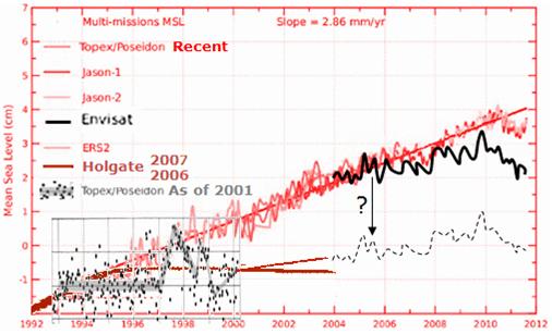 [/caption] […] [/caption] […]
The BOM say their temperature records are high quality. An independent audit team has just produced a report showing that as many as 85 -95% of all Australian sites in the pre-Celsius era (before 1972) did not comply with the BOM’s own stipulations. The audit shows 20-30% of all the measurements back then were rounded or possibly truncated. Even modern electronic equipment was at times, so faulty and unmonitored that one station rounded all the readings for nearly 10 years! These sloppy errors may have created an artificial warming trend. The BOM are issuing pronouncements of trends to two decimal places like this one in the BOM’s Annual Climate Summary 2011 of “0.52 °C above average” yet relying on patchy data that did not meet its own compliance standards around half the time. It’s doubtful they can justify one decimal place, let alone two?
We need a professional audit.
A team of independent engineers, scientists, statisticians and data analysts (brought together by the joannenova blog) has been going through the Australia Bureau of Meteorology records (BOM). They’ve audited some 8.5 million daily observations across 237 High Quality and other close sites in Australia. Shockingly, while […]
Have you wondered what the global raw rural data tells us?
What did those thermometers say before the adjustments, smoothing, selection, and averaging?
This just might be the first time anyone has publicly compared the global raw data to published adjusted data sets in this way.
Frank Lansner has been dedicated in the extreme, and has developed a comprehensive Rural Unadjusted Temperature Index, or RUTI. One of the most interesting points to come out of this extensive work is the striking difference between coastal stations and inland stations. Frank kept noticing that the trend of the inland stations was markedly different from coastal stations and island stations.
Fig1. Red-Blue lines mark regions where there was a different coastal to inland trend. In green areas the two trends were similar.
What he finds is perhaps not so unusual: The coastal areas are heavily influenced by the sea surface temperature. Inland stations record larger rises and falls in temperature, which is hardly surprising. But, the implications are potentially large. When records from some stations are smoothed over vast distances (as in 1200 km smoothing), results can be heavily skewed by allowing coastal trends to be smoothed across inland areas. What Lansner […]
|
JoNova A science presenter, writer, speaker & former TV host; author of The Skeptic's Handbook (over 200,000 copies distributed & available in 15 languages).

Jo appreciates your support to help her keep doing what she does. This blog is funded by donations. Thanks!


 Follow Jo's Tweets
 To report "lost" comments or defamatory and offensive remarks, email the moderators at: support.jonova AT proton.me
Statistics
The nerds have the numbers on precious metals investments on the ASX
|


Recent Comments