The mystery of Australian temperature adjustments
Ken Stewart has been checking the Australian BOM official ACORN minima data against the raw data. This week he highlights the six very strange cases of Brisbane Airport, Amberley RAAF, Dubbo, Rutherglen, Rabbit Flat, and Carnarvon. In all these places the adjustments change the trend by more than 2 whole degrees C. It’s a kind of hyper-homogenization.
Thermometers are supposed to be accurate to a tenth of a degree. Australian average trends are sometimes calculated to one hundredth of a degree. What then do we make of adjustments that change the trends by a whopping 2 degrees, and decades after the data came in? The only thing we know for sure about Australian temperatures is that we need an independent audit. Why is it left to volunteers to check? Surely the Greens want good data too?
Some of these stations are isolated outposts, so theoretically they are the heavyweights on Australian area-weighted averages. The map scales can be a bit deceptive. In outback Australia the nearest neighbours can all be 500 km away (300 miles). Some dots on the map are not so much a town as a motel and a gas station. Sometimes one lonely thermometer gets the job of estimating temperatures across thousands of square kilometers. This applies to Rabbit Flat, and we’ll discuss that in a different post.
We’ve talked about the extraordinary case of Rutherglen before, where a cooling trend across a whole region becomes a homogenized warming one. And both I and Jennifer Marohasy have discussed the extreme oddness of Amberley.
But Carnarvon provides new material for playing Guess-why-this-got-homogenized? In the case of Carnarvon (see below) the raw trend shows an ever so slight warming over the last century, something like 0.2C, but the all-new adjusted “high-quality” ACORN trend is rising instead at around 2.2C per century.You might think Carnarvon was the aberrant outlier — a station that was different to the rest of the region so it’s been adjusted to fit. Except the original raw Carnarvon trend was virtually the same as the raw average of all its nearest neighbours (bar one). So all those must be flawed too? Well, the BOM didn’t think so, because the adjusted trends of neighbouring towns are only warming at a modest half a degree a century, while Carnarvon is ripping along at more than 2 degrees.
I’ve spoken to Ken Stewart, and he’s just baffled about all six stations. Perhaps there is a reason for these drastic adjustments. But without detailed and credible answers, how does a rational person have confidence in the current almighty ACORN set? There are too many mysteries (like, say, the hottest-ever day being in Albany, an obvious error that still hasn’t been detected by their “expert” peer review).

Carnarvon (Western Australia) has ACORN neighbours: Learmonth (298km), Wittenoom (560km) , Meekatharra (524km), Geraldton (447km), and Morawa (538km). The only non-Acorn site with continuous data for the early part of last century is Hamelin Pool 6025 (174km away).
Ken Stewart’s conclusion: –
The Acorn adjustment algorithm creates homogenised data by comparing with up to 10 neighbouring sites. I have shown that the adjustments have made the Acorn trends greater than, not only the raw data trends for each site, not only the raw data trends of the closest neighbours in the Acorn dataset, but in every case but one, greater even than the trends of Acorn homogenised data from the same neighbouring locations. The adjustments created thus appear to be spurious and the algorithm faulty.
Carnarvon adjustments don’t make sense

….Fig. 6a: Raw vs Acorn
The Carnarvon raw trend is not rising as fast as the average of all the neighbours (three of which are 500 km away).
But this trend of the neighbouring stations is heavily influenced by just one station – Morowa.
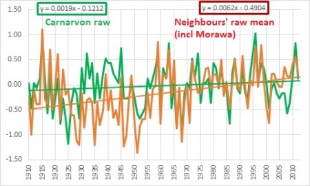
Fig. 6b: Carnarvon and mean of neighbours (raw).
When Morowa is removed we can see just how similar the raw trend in Carnarvon is to most of the stations all around it.

Fig. 6c: Carnarvon raw vs neighbours’ mean excluding Morawa
The BOM adjusted Carnarvon (black line) and now the temperatures there rise a lot faster than the neighbours.

Fig.6d: Carnarvon Acorn vs neighbours mean (raw) (including Morawa)
But the neighbouring stations did not get adjusted much — their ACORN record resembles their raw records.

Fig. 6e: Carnarvon Acorn vs neighbours’ mean (Acorn)
To see all six sites, visit Kens Kingdom. Leave a comment there or here to let Ken know how much you appreciate the time it takes to put all this data together. He’s gone through all 104 ACORN stations, he’s figured out which sites show what trends, and checked the towns that are neighboring. It’s a lot of work to get to the bottom of this, and there are no government grants for auditing government temperature data…