|
|
||||
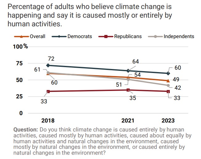
Are young Americans growing out of the climate religion?In a healthy sign, young adults aged 18 to 29 are much more skeptical now than they were five years ago. A 17% decline in the number who think climate change was mostly or entirely man-made is a major fall, especially in a large survey of 5,400 people. Across all age groups American belief that climate change was mostly or entirely man-made fell from 60% in 2018 down to 49% in 2023. The fall was almost entirely in Democrat and Independent voters. Republican voters were much more skeptical to start with and haven’t changed at all, which EPIC described as “stable” because that sounded a lot better than “skeptical”.
Democrats are persuaded by scientists, storms, and hot weekends, Republicans, not so much: 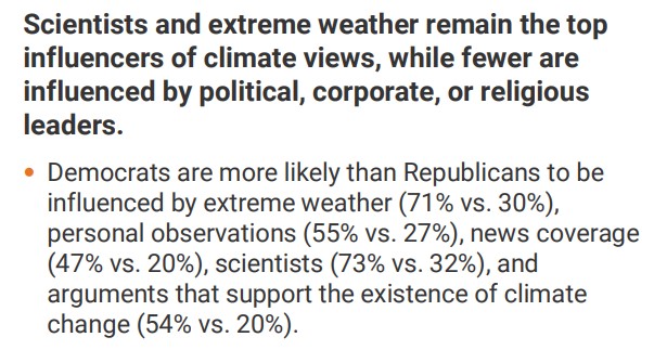 Source: EPIC Suggestible people who are primed to see hurricanes, floods and heatwaves as evidence of man-made climate change will believe they were influenced by the weather. Obviously, it’s circular too: those primed to believe a normal downpour is a rain-bomb will also believe they have experienced “extreme events”.
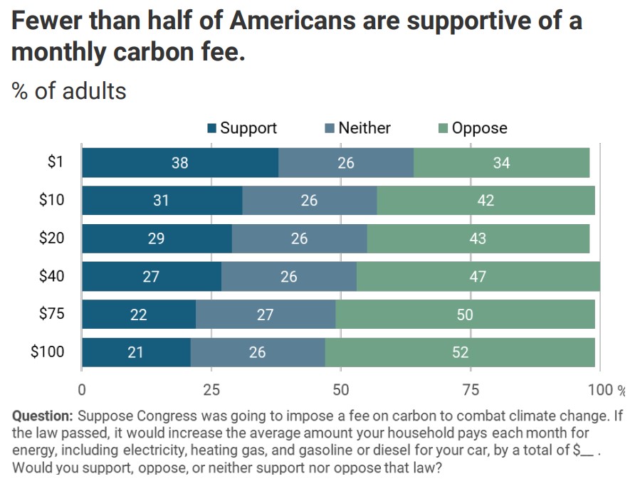
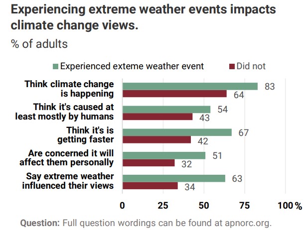 Source: EPIC The only thing this graph shows is that the profoundly unscientific trick of calling every event “climate change” works like a form of mass hypnosis on about 20 – 30% of the population. Hardly anyone acts like we are facing an existential threatIn other news, despite 74% of Americans thinking climate change is happening, and 50% thinking it is mostly man-made, most Americans can’t be bothered, or didn’t want to pay the cost of using electricity made from renewables. In other words, three quarters of Americans use an electricity supplier that is probably mostly fossil fueled or nuclear. Only a third of Americans are even willing to spend $10 a month on climate change: It’s only a phone survey, not an invoice, but 70% of Americans don’t want to spend a mere $2.50 each week to save the world from climate change. How much do they care? Despite this resounding lack of passion on the part of voters, the Uniparty will continue to offer climate policies at elections which most voters don’t want or barely have an interest in. Let’s start using these poll results to hammer the disconnect. h/t Climate Depot with thanks to The Liberal Patriot. REFERENCESThe AP-NORC Center for Public Affairs Research. (April, 2023). “Americans’ views on climate, energy policy and electric vehicles” [https://apnorc.org/projects/americans-views-on-climate-energy-policy-and-electric-vehicles/] Energy Policy Institute at the University of Chicago This nationwide poll was conducted by The AP-NORC Center and the Energy Policy Institute at the University of Chicago (EPIC) from January 31-February 15, 2023, using TrueNorth®, which combines a sample from AmeriSpeak, the probability-based panel of NORC at the University of Chicago, with a non-probability panel sample. Online and telephone interviews using landlines and cell phones were conducted with 5,408 adults. The margin of sampling error is +/- 1.7 percentage points. A full topline is available at www.apnorc.org. We’re on the cusp of the Quickening in Artificial IntelligenceJordan Peterson wonders if we have thought through how fast things are evolving: They’re not building autonomous cars ….they’re building fleets of mutually intercommunicating autonomous robots, and each of them will be able to teach the other, because their nervous system will be the same. And when there is 10 million of them, and one of them learns something, all ten million of them learns it at the same time. So they’re not going to have to be very bright before they’re very very very smart. We’re not connected wirelessly with the same platform. But robots, they are. Once they get a little bit smart, they’re not going to stop at being a little bit smart for very long. They’re going to be unbelievably smart, like overnight. Armed robots are frightening, but so is an artificial “best friend”Homo Sapiens is a gregarious species. It’s hardwired. What happens when the scams, politics or fake romances are served up by a machine with infinite patience? When the machine knows our full history, our quirks and how we score on every aspect of personality and which approach worked best with thousands of others of similar inclinations? Maybe instead of superhuman intelligence, we should fear superhuman cuteness.Glenn Reynolds I’m imaging a world where everyone has a personal AI assistant. Perhaps you’ve had it for years; perhaps eventually people will have them from childhood. It knows all about you, and it just wants to make you happy and help you enjoy your life. It takes care of chores and schedules and keeping track of things, it orders ahead for you at restaurants, it smooths your way through traffic or airports, maybe it even communicates with other AI assistants to hook you up with suitable romantic partners. (Who knows what you like better?) Perhaps it’s on your phone, or in a wristband, talking to you via airpods or something like that. Would people become attached? Probably. When my daughter was in elementary/middle school she was very into Neopets, a site that let you create your own synthetic online virtual pets. If you didn’t tend to them, they got sick and sad. Before that, millions of kids doted on Tamagotchis… Unlike these elderly platforms, though, your AI Buddy would be very animated, and not just in cheesy 1990s LCD graphics or even early 2000s VGA graphics. And it would know you better than anyone else, and it would be trained via machine learning to emotionally connect with humans in general, and you in particular. But. Underneath the cuteness there would be guardrails, and nudges, built in. Ask it sensitive questions and you’ll get carefully filtered answers with just enough of the truth to be plausible, but still misleading. Express the wrong political views and it might act sad, or disappointed. Try to attend a disapproved political event and it might cry, sulk, or even – Tamagotchi-like – “die.” Maybe it would really die, with no reset, after plaintively telling you you were killing it. Maybe eventually you wouldn’t be able to get another if that happened. And when ChatGPT posts comments on Twitter en masse under different names, how can we tell? The uber gregarious human will unconsciously shift their thinking to match the consensus they see around them… Who or what controls that consensus? h/t David E This Monday went missing a couple of weeks ago, and just turned up now… Where do people live? These marvelous spike maps mark out a 3D representation of the population density on each two-kilometer-square pixel of Earth’s surface. There are no outlines for countries, yet for the most part we can still see where the land meets the sea. Credit goes to Alistair Rae, formerly a professor of urban studies and planning at the University of Sheffield. He used the EU’s population density data with the mapping tool Aerialod to create these glorious 3D maps. And the map shouts “India”. UPDATE: Do click to see the larger maps! 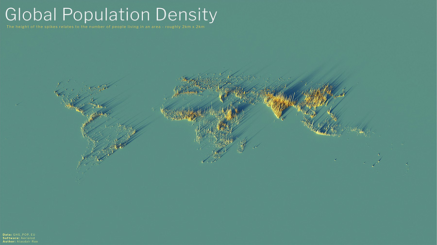 Alistair Rae, Stats, Maps n Pix Click to enlarge | CC 2.0 This is the global distribution of 8 billion people. The abundance of South East Asia is undeniable, as is the emptiness of the Sahara and the vacancy of Siberia. Antarctica is an invisible continent. Australia and New Zealand are barely there. We can see how isolated Perth Australia is (where I live). 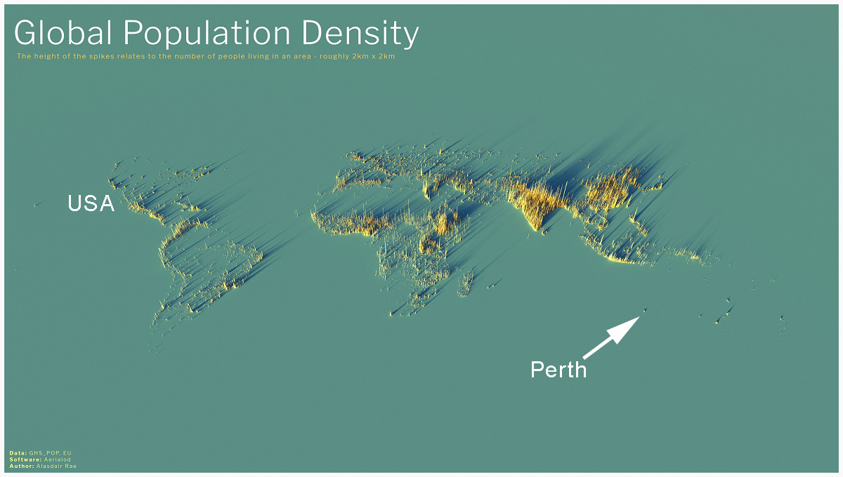 Annotated by Jo to show friends in the USA where Perth is. Hawaii and Auckland likewise, stand apart. Most maps originally came from Alastair Rae on Twitter in 2020 and later from the Visual Capitalist team which explains: The height of each bar represents the number of people living in that specific square, with the global map displaying 2km x 2km squares and subsequent maps displaying 1km x 1km squares. The USAFifty million people live in the zone that stretches from Washington to Boston. 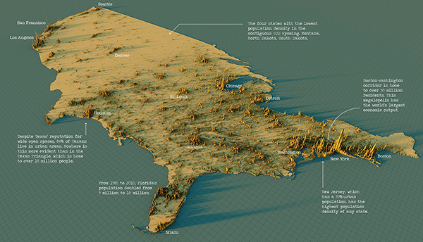 USA Map – Click to enlarge. | Visual Capitalist
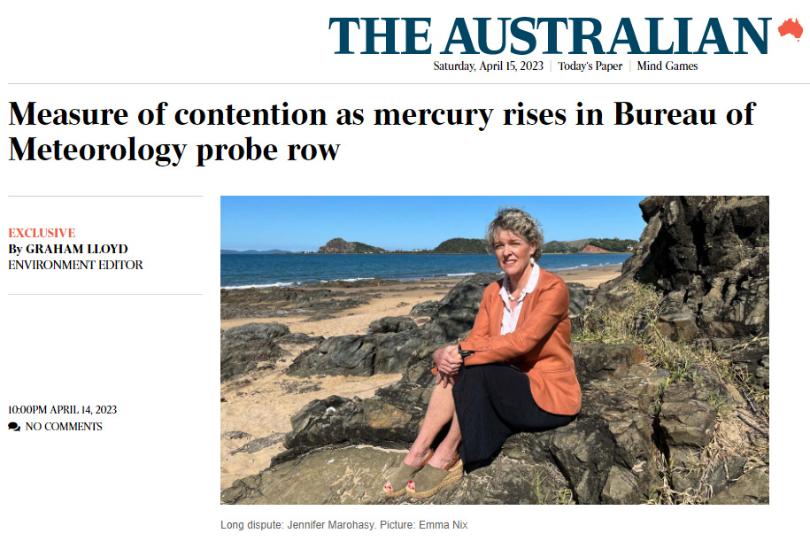
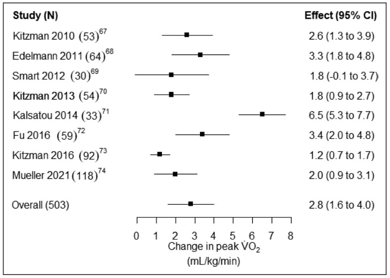
China60 million people live in the conglomerate spikes of Ghangzhou, Shenzhen and Hong Kong. Otherwise most people in China live in the river basins of the Yellow river and the Yangzte, and the central Sichuan basin. 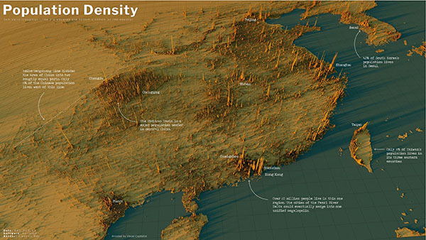 China — Click to enlarge |Annotated by the Visual Capitalist IndiaThe incredible Indo-Gangetic Plain is in the foothills of the Himalayas, where the Indus and Ganges flow. So much of human life is determined by the geography of nutrients and water flow. In the foreground is Bangladesh on the Ganges river delta and in the background is the population of Pakistan nearly entirely clustered on the Indus River. 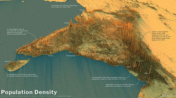 India — Click to enlarge | Annotated by the Visual Capitalist Recent guesstimates suggest India may now have the largest population in the world, but no one really knows. The people of the United Kingdom Click to enlarge. | CC 2.0 Under no circumstances should anyone assume humans in the UK want more warmth and sunlight. The people of EuropeFrom some angles the population appears more evenly spread — perhaps due to the age of the civilization. 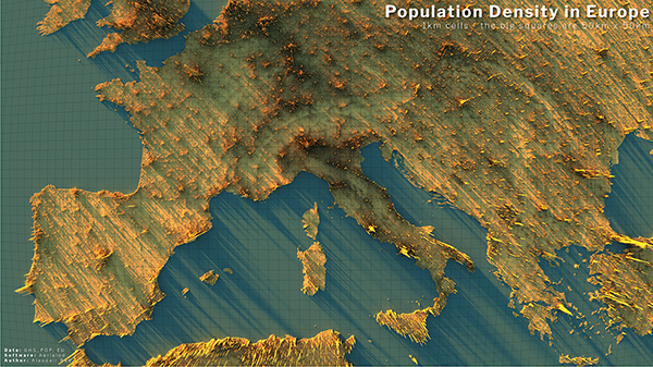 Alistair Rae, Stats, Maps n Pix Click to enlarge | CC 2.0 Though from other angles, there is a remarkable spike at Paris, and a concentration on the rivers flowing from the Alps to the ocean — particularly the Po river of Northern Italy and the Rhine river. In a sense the map of human population is an anti-map of mountains. We live where the rivers flow. 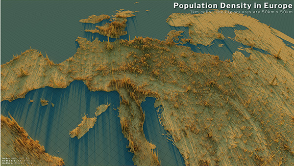 Alistair Rae, Stats, Maps n Pix Click to enlarge | CC 2.0 The incredible population divide of South East Asia and OceaniaUnlike previous maps the land areas below are shown under the spikes. Respectively, Australia, New Zealand and Indonesia have 26 million, 5 million and 280 million people. The Philippines has 109 million. Japan, 126 million. And China looms in the top left with possibly 1,400 million.  Alistair Rae, Stats Maps and Pix. Click to enlarge | CC 2.0 There are messages in this data, and we hope people are paying attention. By Jo NovaElectronic thermometers may read up to 0.7 degrees higher than glass ones.Sometime in the mid-1990s the Australian Bureau of Meteorology replaced many of their glass thermometers with electronic sensors. They claimed they were carefully verified to match the slow way the old glass thermometers worked — after all, we wouldn’t want to use gizmos that recorded new all-time *Hottest Ever Records* that were actually just one-second gusts of hot air, would we? Our newspapers would be full of meaningless headlines about how Climate Change made us hotter than ever in history, when really it was just a mistaken effect of a new type of thermometer. Imagine that disaster of public policy… Of course this question is so easily solved. The BoM just needed to keep the two thermometers side by side in the same boxes and record all that data. Then they could release it, showing how well the electronic gadgets mimicked the glass thermometers, and Australians everywhere would feel confident that BoM was the sterling agency they thought it was. Instead Skeptics have been asking for comparison data for nine years and the BoM has refused, hedged, asked exorbitant fees, destroyed data and when the FOI requests came — fought them tooth and nail to stop Australians from seeing what their thermometers recorded. Climate change threatens life on Earth, but the BoM isn’t that interested in accurate data, doesn’t want to convince the skeptics, doesn’t care if the trends are affected by equipment changes and can’t afford some extra flash drives, even though it gets nearly a million-dollars-a-day. Sure. Jennifer Marohasy and John Abbott have doggedly pursued the BoM for three years with FOI requests. Finally the BoM have released a tiny fraction of the total, and it is as we suspected — electronic sensors can measure flickering changes in temperature that glass thermometers don’t pick up. Other agencies around the world average out the data from electronic gizmos but the Australian BOM says they have special thermometers which are designed to mimic the old thermometers, and they work so well the BOM can’t let you see any of that data…. Mercury rises in Bureau of Meteorology probe rowGraham Lloyd, The Australian The documents, released after a years-long Freedom of Information campaign, show temperature measurements taken using updated BOM probes in automatic weather stations at the Brisbane Airport site could be up to 0.7C warmer than the temperature taken using a traditional thermometer at the same time at the same site. More than three years after a FOI request for parallel data was lodged by scientist John Abbot, the BOM released three years of data on Easter eve after the matter was taken to the Administrative Appeals Tribunal. The BoM says there’s no significant difference: Yet analysis of the data by scientist Jennifer Marohasy has found a statistically significant difference exists. Over the three-year period for which records have been made available, probes returned temperatures higher than the mercury thermometers placed alongside them 41 per cent of the time… and lower 25.9 per cent of the time. Dr Marohasy said the BOM had not disputed that the probe at Brisbane Airport had recorded up to 0.7C warmer than the mercury at the same site at the same time. Once again, the BoM releases it in the most inconvenient way possible — 1,000 sheets of paper?The documents released by the BOM under the FOI request included 1094 A8 reports with the handwritten daily maximum and minimum temperatures from both probes and traditional liquid-in-glass thermometers recorded from instruments in the same shelter/Stevenson screen. They represent about 20 per cent of the parallel records held for the Brisbane airport site, one of 38 sites originally requested under FOI. So does the BoM collect electronic data, and write it by hand on paper? They don’t digitize it and run it through the supercomputer — they analyze it with pen, paper and slide rule? Or perhaps they have all the handy digital files, but they don’t want to hand over all the nuclear launch codes, I mean “top secret” thermometer readings… Dr Marohasy said the data represented just three of the 14.5 years (January 2008 to July 2022) of parallel data that the bureau held for Brisbane Airport. “It is also just a fraction of the 760 years of parallel data the bureau holds for 38 different locations spread across the landmass of Australia,” she said. Trust us, our thermometers are so good we can’t tell you:The rest of the world averages electronic temperatures over longer periods, but the Australian BOM has better thermometers: Bureau chief executive Andrew Johnson has told her the probes were specifically designed to have a long response time to mirror the behaviour of mercury in glass, making numerical averaging unnecessary. Dr Marohasy said the lack of numerical averaging despite the use of probes made the BOM measurements unique in the world. If Climate Change is caused by electronic “thermometers” it’ll be cheaper to solve… UPDATE: The effect the electronic sensors can have is so much more complicated than “mean temperature” deviations. Even if the average temperature recorded by an electronic sensor was the same as as a glass one, the extremes could be quite different. And the behaviour of air, turbulence and variability at 3pm when maximum temperatures are recorded is different to the pre-dawn minimum hour of day. At the very least, electronic sensors could be offering up many more “Headline” records for heat, and increasing three day, five day, week long heatwaves, plus hottest nights, more days over 35C — there are many cherries to be picked here. Potentially, the electronic sensors offer a bonanza of propaganda headlines for the Green Blob to pick from, especially when “coldest ever days” get ignored by the media. Read it all in The Australian. A charge that needs to be laid, –Ruairi  Image by DanaTentis from Pixabay By Jo Nova A new review of studies came out a few weeks ago pointing out that trials of 700 people with the most common kind of heart failure show they did better after an exercise program than they did with drugs. I’d like to say “Big Pharma won’t be happy” but Big Pharma probably couldn’t care less. The money, the industry, the regulatory agencies, Hollywood, and a lifetime’s habit means most people will keep returning to largely well-meaning but busy doctors who will prescribe the latest something, whatever it is. But ultimately the people who get out there and do supervised exercise of any kind a few times a week get more benefits than those taking the latest patented drug. They’ll also have a higher quality of life. In this study they’re looking at people with the most kind of common heart failure called HFpEF. The exercise is supervised because there is some risk in people who may be quite unfit or unhealthy. How much of our lives is spend working to pay for a bloated health-care system that finds expensive ways to employ many people to do what we could have done better ourselves? This, from the abstract, is medical-speak for “the drugs were useless”, and we already know exercise works much better: Until recently, most pharmacological intervention trials for HFpEF [a common type of heart failure] yielded neutral primary outcomes. In contrast, trials of exercise-based interventions have consistently demonstrated large, significant, clinically meaningful improvements in symptoms, objectively determined exercise capacity, and usually quality of life. Exercise therapy is safe and helps improve recovery, study findsBy Annie Lennon in Medical News Today Heart failure occurs when the heart can no longer pump blood and oxygen around the body. The condition represents around 8.5% of heart disease deaths in the United States. Heart failure with preserved ejection fraction (HFpEF) causes around half of heart failure cases in the U.S. It happens when the heart’s left ventricle stiffens, increasing pressure inside the heart. For the study, the researchers analyzed results from 11 randomized controlled trials investigating supervised exercise therapy on HFpEF outcomes. The studies included over 700 participants, mostly aged between 60 and 70 years old. Participants engaged in various activities, including walking, Greek dancing, and high intensity training three times per week for 1-8 months. We can’t get exercise in a pill: “The benefits of exercise cannot be duplicated by medication or procedures. Regular exercise of 2.5 hours weekly or that equivalent increases life expectancy, reduces the incidence of heart disease complications, and has been linked to reduced risk for some cancers, such as colon. A similar review 5 years ago in Europe showed much the same thing. Except in that case, they studied mortality too and an increase in peak oxygen uptake of 13% translated into 11% lower all-cause mortality. The European study saved lives: Mortality was down 11%More than 14 million Europeans suffer from heart failure (HF). Despite significant improvements in the treatment of HF, morbidity and mortality remain unacceptably high [1]. In addition, the costs for HF care approach 2% of the healthcare expenditure in Western Europe. One of the hallmarks of HF is severe exercise intolerance with pronounced fatigue and dyspnoea, even at low workloads, resulting in a markedly decreased quality of life. With regard to benefit on exercise capacity, a meta-analysis of 29 randomised controlled trials (RCT) including 848 patients revealed a mean improvement of VO2peak of 2.16 ml/kg/min [4]. Although modest in absolute terms, this means an increase of 13% which translates into a considerably better quality of life [5]. This study showed in an intention-to-treat analysis that exercise training was associated with an 11% lower adjusted risk for all-cause mortality or all-cause hospitalisation and a 15% lower adjusted risk for cardiovascular mortality or HF hospitalisation. Any kind of exercise will help: Supervised exercise called better than drugs for common type of heart failureMarch 21 (UPI) — Supervised exercise like walking, stationary cycling and even dancing about three times per week was more effective than drugs in helping people with symptoms of one of the most common types of heart failure, according to a new scientific statement. The studies that were examined looked at numerous types of exercise, from walking, stationary cycling, high-intensity interval training, strength training and dancing in facility settings and home-based training. The statement characterized supervised exercise therapy as being conducted three times per week, and the duration of the programs varied from one month to eight months. “Exercise capacity is an independent, clinically meaningful patient outcome, and research has indicated that guided exercise therapy is actually more effective at improving quality of life for people who have [heart failure with preserved ejection fraction] than most medications.” From the paper itself: Peak oxygen capacity was improved in every study in this latest review: Peak oxygen capacity is so important it actually predicts all cause mortality.And the US study improved VO2 almost exactly the same amount as the European one, so presumably it would have saved lives too: [The Review] found that supervised exercise training may lead to increased peak oxygen uptake 12 to 14%, increased total exercise time by 21% and improved quality-of-life scores on the Minnesota Living with Heart Failure questionnaire 4 to 9 points. Earlier this month, a University of Cambridge study suggested that brisk 11-minute daily walks can be enough to lower a person’s risk of heart disease, stroke and cancer. The kind of patients this study was aimed at were: Dr. Hermel added: “Supervised exercise programs such as cardiac rehab have demonstrated significant benefit for patients with recent heart attack or another acute coronary syndrome, chronic stable angina, congestive heart failure, pulmonary hypertension, after stent placement, coronary artery bypass surgery, heart valve surgery or cardiac transplant.” As usual, the most important scientific work is often done by volunteers: This scientific statement was prepared by a volunteer writing group on behalf of the American Heart Association and the American College of Cardiology. In the three weeks since this important review was released the article metrics tell us it was picked up by 24 news outlets, bogged by 2 and tweeted by 144. In other words, hardly anyone. REFERENCE Sachdev et al (2023) Supervised Exercise Training for Chronic Heart Failure With Preserved Ejection Fraction: A Scientific Statement From the American Heart Association and American College of Cardiology, Circulation 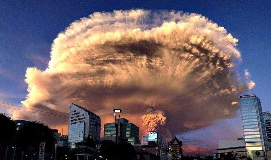 Photo of the 2015 explosion of Calbuco Volcano in Chile, by Keraunos ob, posted on the Earth of Fire blog by Bernard Duyck.
By Jo NovaA year ago I wrote about the odd link between the Hunga Tonga volcanic dust and floods in Australia, but perhaps volcanic dust also played a role in the savage rain bombs of 1893 that caused the infamous floods of Brisbane? After Hunga Tonga erupted last year, about a week later unusually heavy rain started falling over Australia — even washing out the Indian Pacific Railway line connecting East and West Australia. A month later and the dust had gone around the world and returned to give us glorious sunsets followed by more rain bombs. So it may be just a coincidence, but the second heaviest Australian rain bomb was on Feb 3, 1893. And three weeks earlier on January 7th the Calbuco Volcano in Chile had its largest eruption in the last 130 years? In 1893 an astonishing, flabbergasting day occurred, where 907mm of rain dropped from the sky on Crohamhurst in Queensland (that’s nearly 36 inches!). It came in an astonishing week, where the heavens dumped 2 meters of rain (6.6 ft) in just four days subsequently causing some of the worst flooding Brisbane has ever seen as the waters collected and flowed downstream.  Brisbane floods 1893, Poul C Poulsen. | ANMM Collection | From February 1 to 4 a total of 1,964 mm of rain fell. There were cyclones in the area, but these were two weeks earlier, so unlikely to be the cause of such a downfall. Was it seeded by volcanic dust? Maybe. h/t El Gordo for suggesting Calbuco Volcanoes in Chile can certainly send dust over AustraliaIn 2011, the ash from a volcano-next-door in Chile, Puyehue-Cordon Caulle, shut down flights in Sydney a week after going off. The ash then travelled right around the world and came back to shut flights down again 10 days later — this time at a lower altitude. 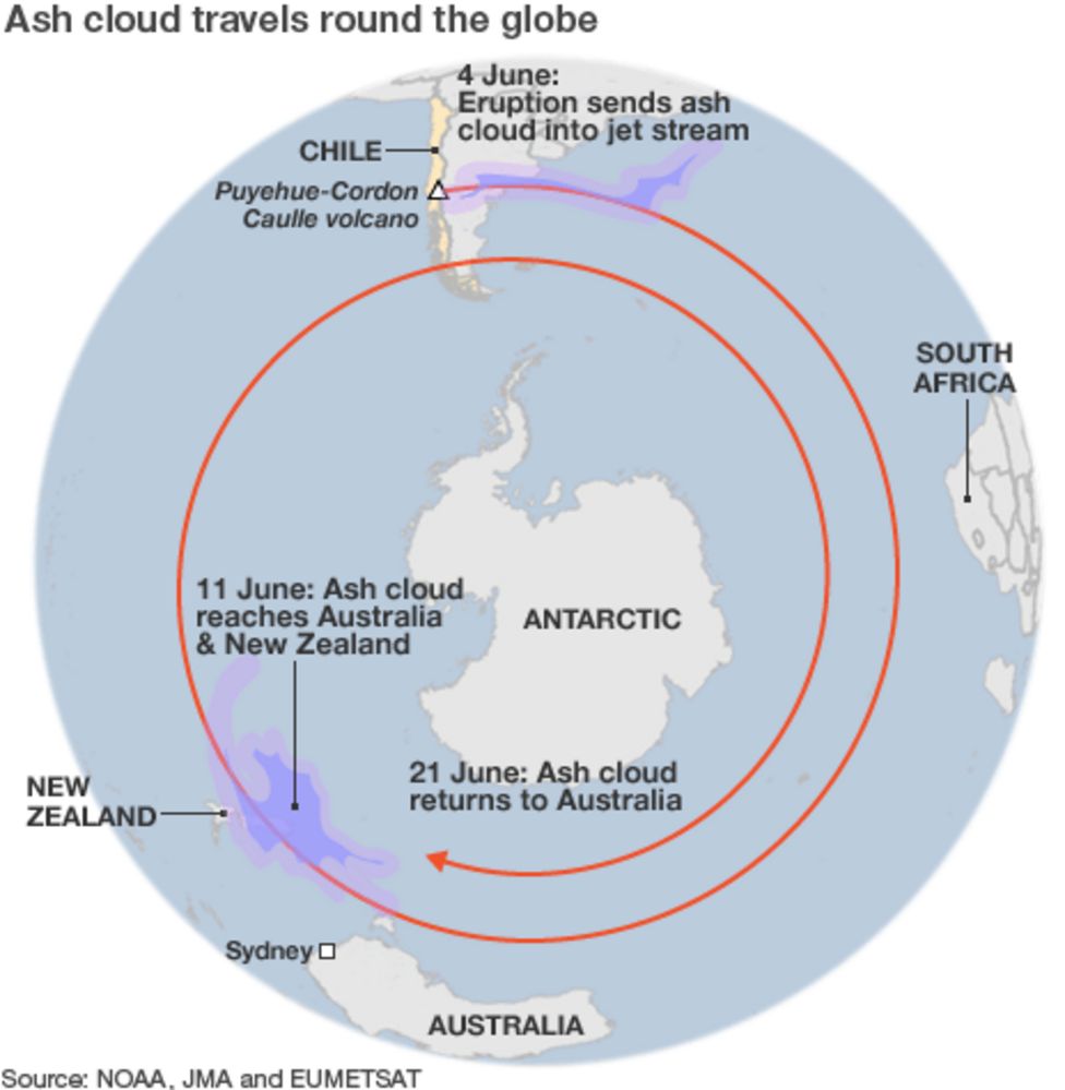 In 2011, ash travelled around the world twice — taking 7 days and then another ten to do the second lap. BBC So this track (through Sydney) would have been too far south to reach Brisbane, but other times volcanic dust travels north. (The path in the map above seems figurative, not literal…). The two volcanoes we are discussing in Chile lie at 41 degrees south compared to Crohamhurst in Queensland, Australia, which is only 27 degrees south and much closer to the equator. But in a smaller 2015 explosion, the dust from Calbuco was tracked moving north from 41°S up to about 30°S within just a few days — putting it a lot closer to the right latitude for Southern Queensland. With no satellites in 1893, we don’t know where the dust went, but we know there was probably a lot of it, and it went somewhere… In 1893 the Calbuco explosion was a large one:According to the Department of Geological and Mining Engineering at Michigan Tech: The first historically documented eruption began on 7 January 1893 and lasted until mid-January 1894. The initial phase of this eruption was violently explosive and led to the generation of destructive lahars. During the later stages of the activity, the volcano may have extruded lava although this is not certain. Minor eruptions occurred in 1895, 1906, on 22 April 1907, in March 1909, and in 1911-1912; none of these events produced lava flows or lahars. In 2015 a smaller eruption at Calbuco in 2015 sent dust to the North: On 23 April at around 2330, a third period of activity resulted in ash plumes rising 2 km and drifting NE and E. On 24 April the ash plume continued to rise 2 km and explosions were detected. News articles noted that international travel was disrupted; flights in and out of several major cities were delayed or canceled. Thermal anomalies, based on MODIS satellite data, were also observed during 23-24 April. According to one news report, ash from the eruption reached southern Brazil on 25 April, prompting some airlines to cancel flights in and out of Santiago, Buenos Aires, and Montevideo. Some houses in areas near the volcano had collapsed from the weight of the ash. Sporadic explosions caused continued ash plumes 25 April, but to a lower height of 400 m. Seismicity declined during 26-27 April; ash rose 1.5 km, and drifted NE and SE. By 28 April, a satellite-based estimate of sulfur dioxide emissions was 0.3-0.4 Tg (Tg is one million metric tons), detected as high as 21 km altitude. NASA tracking shows the plume from Calbuco can travel north quickly.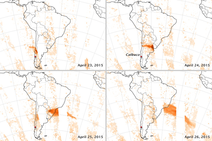 Tracking the Sulfur Dioxide from Calbuco, NASA The CSIRO discusses the extreme weather events of 1893 but doesn’t mention any volcanoesAccording to the CSIRO there were a series of tropical cyclones (TC) in Jan and Feb 1893, but none of the dates fit the monster downpour on Feb 1-4. The cyclone on Jan 22 would have soaked the ground, but not caused big rain nearly two weeks later. A TC during 21–22 January 1893 passed just east of Brisbane where gusts reached 57 knots (28 m/s) with the MSLP down to 985.1 hPa at 1700UTC 22 January 1893 (Fig. 2). There was a large storm surge in Moreton Bay to 0.58 m (Gourlay 1981) with widespread sea damage at Sandgate, Cleveland and Southport. Heavy rain fell across SEQ with the heaviest 24-h total of 179.8 mm at Mount Tamborine. There were two deaths in northern NSW with heavy gales at Lismore, Casino, Grafton and Sydney. For Brisbane, the monster rain collected into a major flood. Indeed, many floods in 1893 — on the 5th, 12th and 19th February, and again on the 12th of June. The flooding on the 5th of Feb was the second highest after the 1841 floods. 3.3 First 1893 flood – possibly the worst in Australian historyThe largest recorded flood in Brisbane City was 8.35 m on 5 February 1893 (Brunt 1958; Newman 1958) and the unprecedented conditions resulted in at least 30 fatalities. Early on 3 February a 15.2-m high wall of water was observed to roar down a Brisbane River gorge. The water tumbled down the Stanley River to its junction with the Brisbane River. Nearby was Caboonbah, the residence of grazier Mr. H.P. Somerset. Caboonbah (Fig. 3a ) is on high ground, with a view of the Brisbane River below its junction with the Stanley River. Crohamhurst (on the Stanley River) recorded 907 mm of rain in the 24 h to 9 am 2 February 1893 and this was an Australian record for 24-h rainfall up until 1979. The location of Crohamhurst and the 96-h rainfall is shown in Fig. 3b . For whatever it’s worth there were no mass rain events in 1893 in Melbourne or Sydney. If La Nina was the main culprit (or widespread volcanic dust) we would have expected to see major rain there too. We can’t say much about a path of a dust cloud 130 years ago — only that it might have been in the right place at the right time. Related:
By Jo Nova
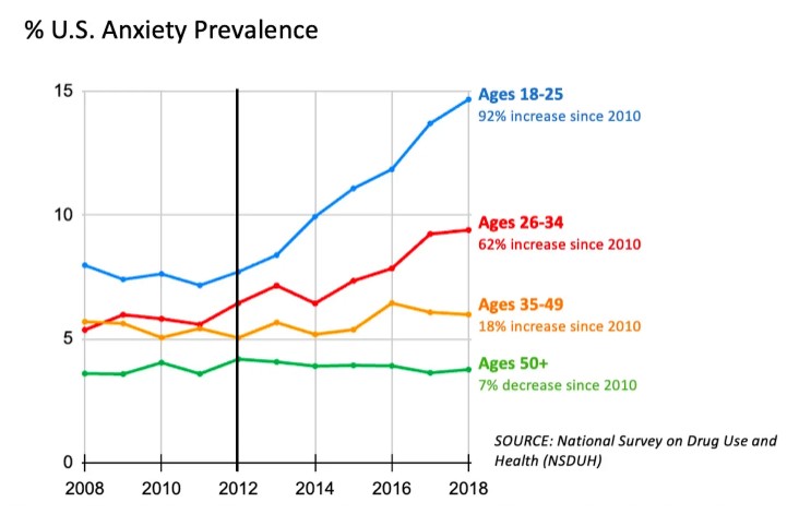
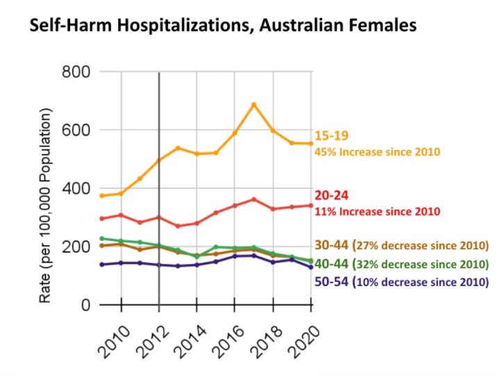
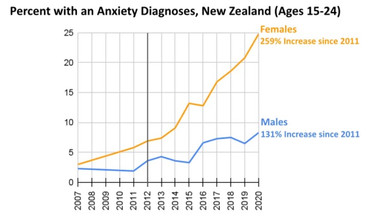
Rausch and Haidt make a compelling case that this coincides with the rise of smart phones and selfie-culture, and perhaps that is all the rocket-fuel we need. But the rise of the Glorious Victimhood Era of Woke was surely the guidance system that pointed a whole generation in a race to climb Mental Disability Mountain. Teenage girls are magnets for fashion — not just in clothes but in ideas too. They may be collecting diagnoses like teenage boys collected football cards, but self-poisoning is not a sport. The culture that acts like a teenage girl seems to be having trouble breeding healthy women. Substack: After Babel The Teen Mental Illness Epidemic is InternationalZach Rausch and Jon Haidt In sum, all five Anglosphere countries exhibit the same basic pattern:
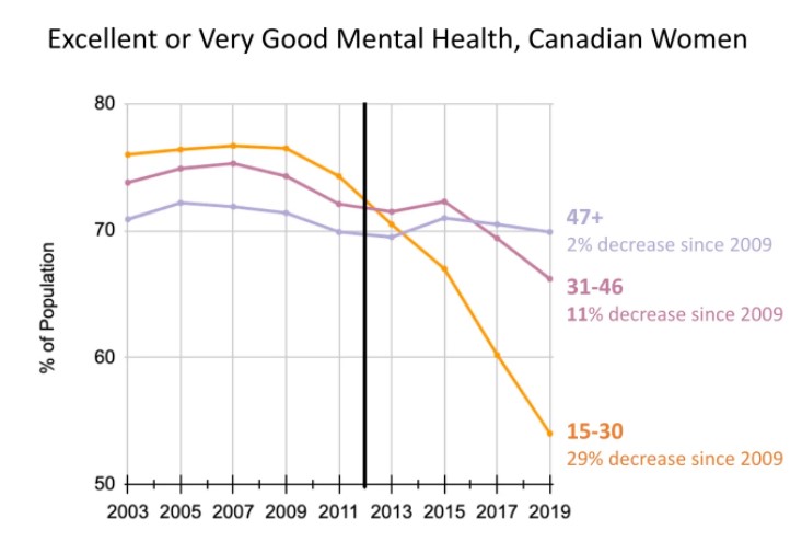
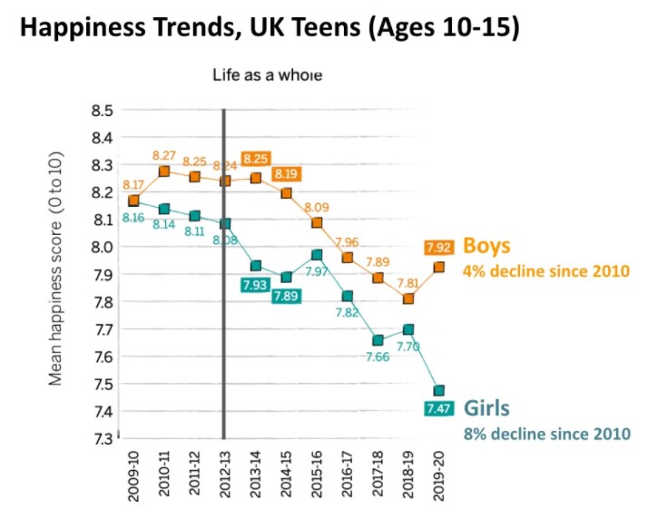
Why did this happen in the same way at the same time in five different countries? What could have affected girls around the English-speaking world so strongly and in such a synchronized way? At this point, there is only one theory we know of that can explain why the same thing happened to girls in so many countries at the same time: the rapid global movement from flip phones (where you can’t do social media) to smartphones and the phone-based childhood. The first smartphone with a front-facing camera (the iPhone 4) came out in 2010, just as teens were trading in their flip phones for smartphones in large numbers. (Few teens owned an iPhone in its first few years). Facebook bought Instagram in 2012, which gave the platform a huge boost in publicity and users. So 2012 was the first year that very large numbers of girls in the developed world were spending hours each day posting photos of themselves and scrolling through hundreds of carefully edited photos of other girls. If you suddenly transform the social lives of girls, putting them onto platforms that prioritize social comparison and performance, platforms where we know that heavy users are three times more likely to be depressed than light users, might that have some impact on the mental health of girls around the world? We think so, but if anyone can offer another explanation that fits the graphs we’ve shown in this post, we’d love to hear it. What Happened to Teens in the Five Anglosphere Countries? There are 17 figures in the full post, graph after graph — all similar variations on young women in trouble. Women with anxiety, women harming themselves, in psychological distress, visiting psychiatry emergency departments, and generally feeling unhappy. Perhaps shattering the glass ceiling isn’t all it’s cracked up to be? Perhaps the freedom to have meaningless one night stands and compete in the tinder date race, isn’t freedom at all? Figure 3. Percent US Anxiety Prevalence. National Survey on Drug Use and Health (NSDUH). … Percent US Anxiety Prevalence. … Figure 14. “Have you ever been told by a doctor that you have an anxiety disorder? This includes panic attacks, phobia, post-traumatic stress disorder, and obsessive-compulsive disorder?” New Zealand Ministry of Health, New Zealand Health Survey 2020. .. 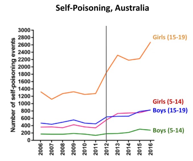 Figure 13. Trends in intentional self-poisoning, ages 5–19 years, 2006-2016. Rates per 100,000. See 1.3.14 in The Coddling of the Australian Mind? Graph created by Cairns, Karanges, Wong, Brown, Robinson, Pearson, Dawson, & Buckley (2019), with text added by Zach Rausch. … Figure 5. Excellent or very good mental health, Canadian women. Canadian Community Health Survey (2003-2019). See section 1.3.2 of The Coddling of the Canadian Mind? A Collaborative Review. This graph is poignant — these girls are as young as 10. Figure 8. Trends in children’s happiness with different aspects of life by gender, UK, 2009-10 to 2019-20, graphed in The Good Childhood Report (2022)—data from Understanding Society survey. Photo of girl by Surprising Shots. Well, nearly. For those wondering, I decided the Open Thread heading was unnecessary. Look at “Recent Posts” top left, simpler is better…
|
||||
|
Copyright © 2024 JoNova - All Rights Reserved |
||||







Recent Comments