Where do people live?
These marvelous spike maps mark out a 3D representation of the population density on each two-kilometer-square pixel of Earth’s surface. There are no outlines for countries, yet for the most part we can still see where the land meets the sea.
Credit goes to Alistair Rae, formerly a professor of urban studies and planning at the University of Sheffield. He used the EU’s population density data with the mapping tool Aerialod to create these glorious 3D maps.
And the map shouts “India”.
UPDATE: Do click to see the larger maps!
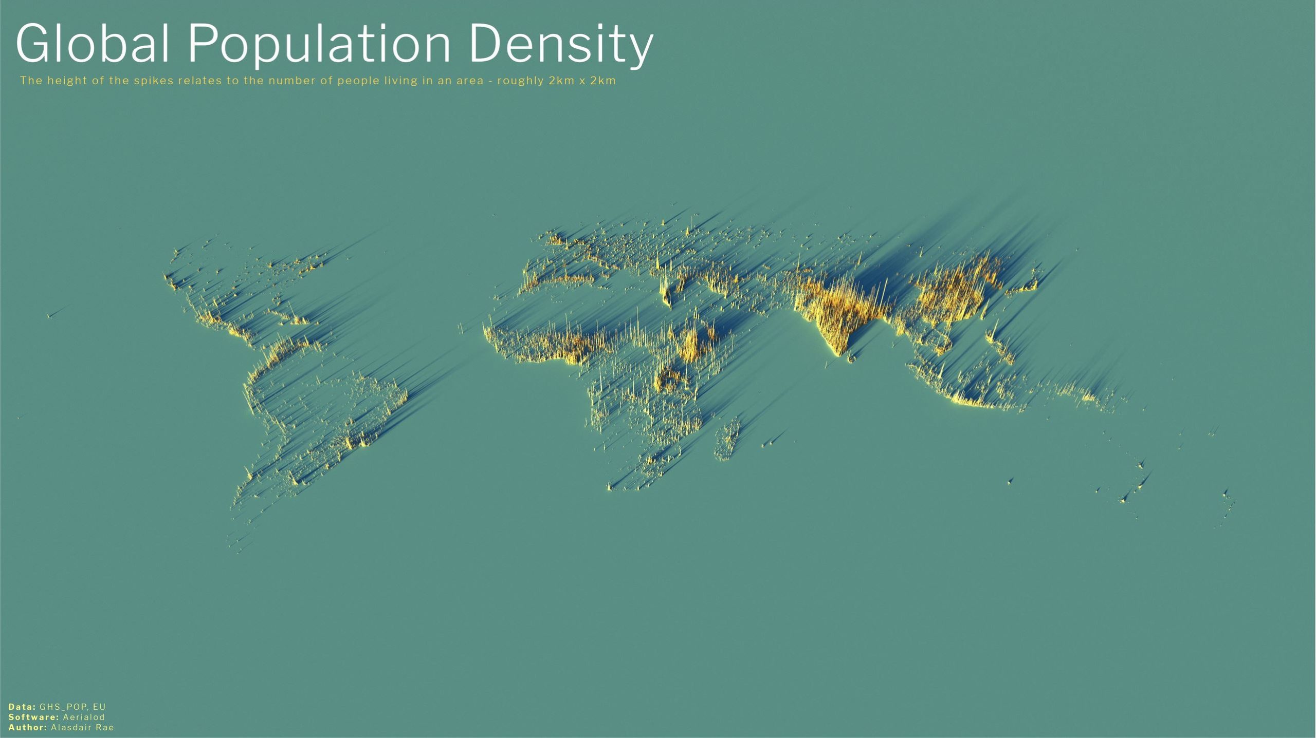
Alistair Rae, Stats, Maps n Pix Click to enlarge | CC 2.0
This is the global distribution of 8 billion people. The abundance of South East Asia is undeniable, as is the emptiness of the Sahara and the vacancy of Siberia. Antarctica is an invisible continent.
Australia and New Zealand are barely there. We can see how isolated Perth Australia is (where I live).
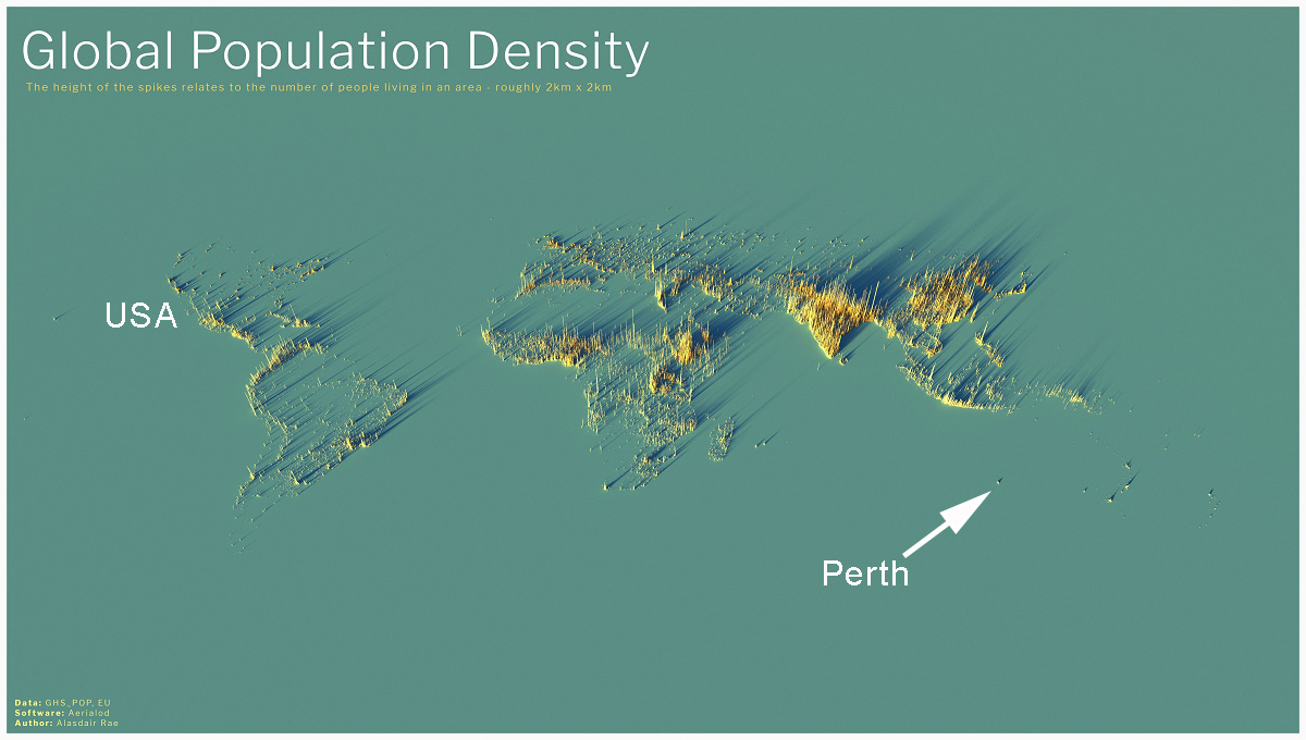
Annotated by Jo to show friends in the USA where Perth is.
Hawaii and Auckland likewise, stand apart.
Most maps originally came from Alastair Rae on Twitter in 2020 and later from the Visual Capitalist team which explains:
The height of each bar represents the number of people living in that specific square, with the global map displaying 2km x 2km squares and subsequent maps displaying 1km x 1km squares.
The USA
Fifty million people live in the zone that stretches from Washington to Boston.
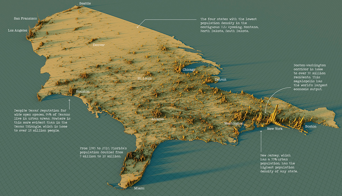
USA Map – Click to enlarge. | Visual Capitalist
China
60 million people live in the conglomerate spikes of Ghangzhou, Shenzhen and Hong Kong.
Otherwise most people in China live in the river basins of the Yellow river and the Yangzte, and the central Sichuan basin.
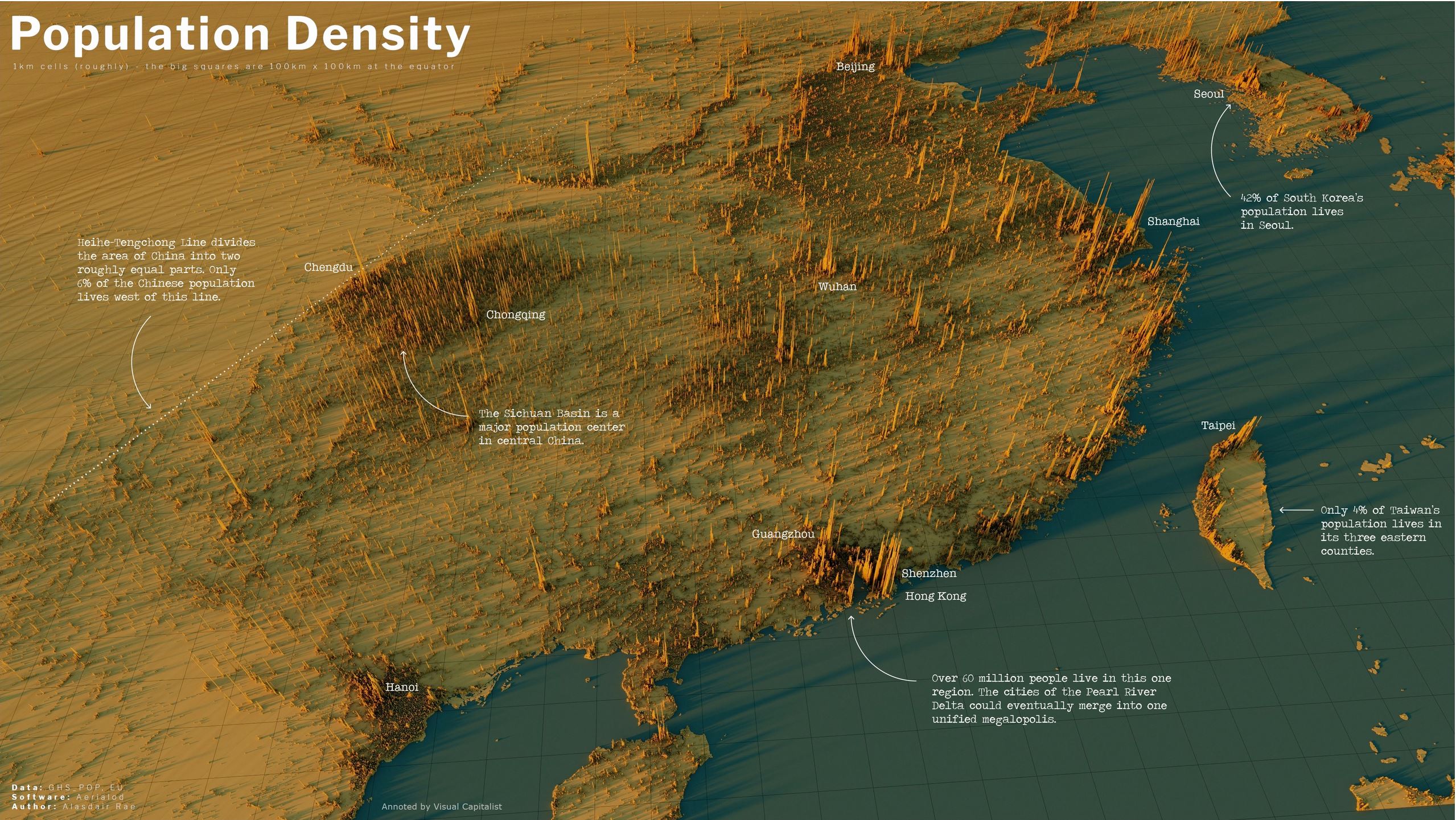
China — Click to enlarge |Annotated by the Visual Capitalist
India
The incredible Indo-Gangetic Plain is in the foothills of the Himalayas, where the Indus and Ganges flow. So much of human life is determined by the geography of nutrients and water flow. In the foreground is Bangladesh on the Ganges river delta and in the background is the population of Pakistan nearly entirely clustered on the Indus River.
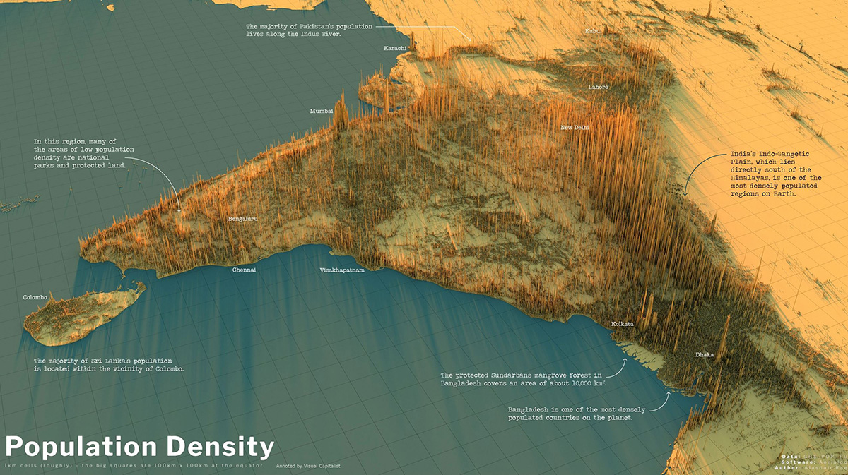
India — Click to enlarge | Annotated by the Visual Capitalist
Recent guesstimates suggest India may now have the largest population in the world, but no one really knows.
The people of the United Kingdom
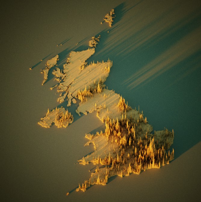
Click to enlarge. | CC 2.0
Under no circumstances should anyone assume humans in the UK want more warmth and sunlight.
I mean, look at where they live, right?
The people of Europe
From some angles the population appears more evenly spread — perhaps due to the age of the civilization.
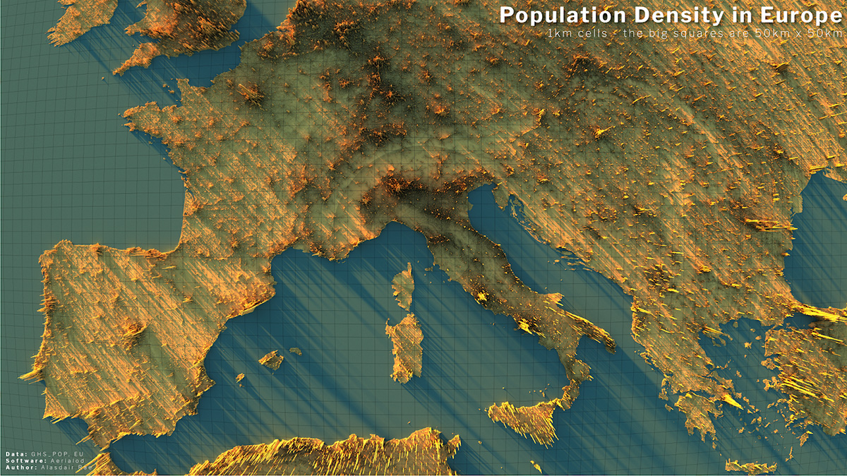
Alistair Rae, Stats, Maps n Pix Click to enlarge | CC 2.0
Though from other angles, there is a remarkable spike at Paris, and a concentration on the rivers flowing from the Alps to the ocean — particularly the Po river of Northern Italy and the Rhine river.
In a sense the map of human population is an anti-map of mountains. We live where the rivers flow.
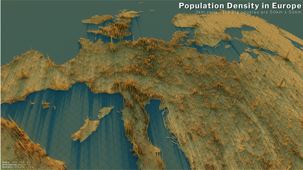
Alistair Rae, Stats, Maps n Pix Click to enlarge | CC 2.0
The incredible population divide of South East Asia and Oceania
Unlike previous maps the land areas below are shown under the spikes. Respectively, Australia, New Zealand and Indonesia have 26 million, 5 million and 280 million people. The Philippines has 109 million. Japan, 126 million. And China looms in the top left with possibly 1,400 million.
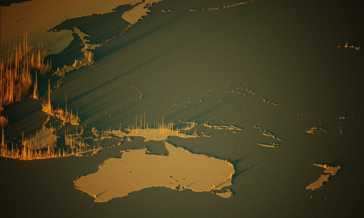
Alistair Rae, Stats Maps and Pix. Click to enlarge | CC 2.0
There are messages in this data, and we hope people are paying attention.


Clearly, northern and northwestern Australia is particularly unable to support agrarian societies, and it may well be that the more temperate and wet areas of the continent on the south and southeast coasts were just unknown for most of the period of time before the European sea voyagers brought people to them.
100
The land in the West is some of the oldest in the world, and after 3 billion years + of sitting above the lava ball being exposed to the elements, the mountain ranges in the West eroded pretty flat, and the sand was carefully filtered for 2 – 4 billion years. Makes for great white beaches, not so good for gardeners.
But the only thing stopping WA hosting 200 million people is 500 million tons of fertilizer and an extra 10 inches of rain.
We could use a volcano too.
Jack Hills in mid West WA is recognised as the oldest rocks in the world at 4.4 billion. The Canadians are working on finding an older one, but we are winning.
460
How about a Rocky Mountain Range?
Who noticed that something like half the world’s population lives on the rivers that run down from the Himalayas?
70
Thanks Ted1. If you can spare a mountain range, we could use it.
70
This was proposed in a book called Man Made Mountain – an engineer named Hogan if I recall. The proposal included an internal economy seperate from the export economy and relied on prison labour and military forces to build. Sounded a lot like a command economy we can see in you know where?! We know how that ends up don’t we?
20
Jo – thanks for the blog
I seem to recall from many years ago (but cannot find via web search) a proposal to geoengineer a mountain range near the WA/SA border.
This was supposed to have a dramatic effect on rainfall on the WA side but there would be a detrimental effect on the SA side (and further, possibly)
Maybe do this rather than Snowy 2
40
Oops posted the above before I saw your comment, sorry.
These maps are brilliant Joanne, thanks.
20
Two vastly different experiences for me on the ground show up the same on the population density map.
Have been driven through much of coastal Vietnam the continuity of village life is virtually uninterrupted.
Likewise, the train trip from Virginia/Washington D.C. is close packed houses, apartments and factories all the way up to New York.
130
We call it BosNyWash. (bosneewash)
I moved from Boston to N. Carolina and made the trip numerous times. I try to travel thru BosNyWa by hitting Washington DC at 7 PM and hope to be north of Hartford by 6 am.
We actually came up with ways to skirt around most of the mess and that was 30 years ago!
170
Travelling from Falls Church Va. to New York by rail in about 2007 was extraordinary. Wall to wall, intense population.
50
It’s never been more obvious that Australia needs to curb “carbon emissions” to stop “climate dysfunction.”
// 🙄 //
Seriously, Jo, a very nice find.
570
The NZ Climate Change Commission, headed by a chap called Rod Carr, who is legally blind (no I’m not making this stuff up) says NZers are the DIRTIEST POLLUTERS per capita EVAAAH! in the whole wide world, so it’s goodbye to growing food on farms and hello to pine forest plantations and solar & wind arrays.
Good luck finding New Zealand on that world map (hint: we’re the little pr!ck on the extreme far-right) just sayin’.
430
Greg, I have updated the post to make the top map clickable to see the whole world in all it’s glory. Reload the post and expand it out. It’s a 2500px map. On that larger map you can see NZ, and I count at least ten cities.
In Australia we can see Hobart, Launceston, Bunbury, Cairns, Townsville, Darwin, Mt Isa, Broken Hill…
70
Climate change threatens to make Siberia and Canada habitable.
It MUST be stopped at all costs.
190
An article in Forbes on the obsolescence of climate change beliefs, republished on Watts Up With That? and titled Luxury Beliefs And Energy Policy: The Fatal Conceit, by economist Tilak Doshi.
https://wattsupwiththat.com/2023/04/16/luxury-beliefs-and-energy-policy-the-fatal-conceit/
130
What a great summation, thank you Leo.
No truer words have been said.
90
Australia looks ripe for plunder.
240
Our deserts are our best protection. Apart from the Israelis we are the only people that know how to use them. Note how the greatest population density is along rivers as Jo has pointed out. Even the Chinese shy away from deserts. It would help if the visionaries who propose developing our North by harnessing the abundant water in those huge Northern rivers were given the means to do so. The blinkered city centric politicians have no idea of the bounty that exists North of Capricorn. Perhaps they are worried that should the North be developed regional Australia would become more politically powerful and those inner city seats less so.
As an aside. Liddell has days to go to be replaced by ???????? Coal is supplying 75% of electricity while mighty wind is supplying 9% and solar zip as I write this. The wonders of woke.
330
I’m buying popcorn for the Lidell shutdown.
Watching left spin in the blackout should be fun.
120
Shhhhhh.
People might get ideas.
40
“Under no circumstances should anyone assume humans in the UK want more warmth and sunlight.”
And why not?
152
It was sarcasm. I think the point was that most people in Once Great Britain live in the warmer, sunnier southern part of the country, not the north.
[Indeed, but I didn’t quite get the flavour right. So added “I mean, look at where they live, right?” — Jo]
250
Nice post – – thanks.
Draw a 1km x 1km square with my house at the center and there might be 50 people in it. However, I can drive to Seattle in 2 hours. But why?
90
Do you think the average politician, government “climate expert” or Green/Leftist could even pass a basic geography general knowledge quiz?
Indeed, it gets worse than that.
Did you know that most, if not all, climate “models” assume a locally flat earth and atmosphere, not a spherical one?
https://www.pnas.org/doi/10.1073/pnas.1908198116
A round Earth for climate models
“Early climate and weather models, constrained by computing resources, made numerical approximations on modeling the real world. One process, the radiative transfer of sunlight through the atmosphere, has always been a costly component. As computational ability expanded, these models added resolution, processes, and numerical methods to reduce errors and become the Earth system models that we use today. While many of the original approximations have since been improved, one—that the Earth’s surface and atmosphere are locally flat—remains in current models. Correcting from flat to spherical atmospheres leads to regionally differential solar heating at rates comparable to the climate forcing by greenhouse gases and aerosols. In addition, spherical atmospheres change how we evaluate the aerosol direct radiative forcing.”
SEE LINK FOR REST
210
How true, but they do like playing with their computer games, sorry models. After all there hasn’t been one of those games that has been validated in the real world – all our engineering models have to be validated before they are used why not the climate change models.
40
What do you think the Chicomms think when they see this vast, mostly empty Australian continent to their south with the majority of local inhabitants without an identity or ability to think for themselves, utterly dumbed-down by their education system and committed to self-destruction and unable and unwilling to make economic progress?
History (no longer taught) teaches that such countries are ripe for take over by someone who wants to develop them. E.g. the Chicomms.
320
Steady on, they are here already using the free enterprise model. Remember they are communist in name only.
So over in the West its KAI leading the charge and GM was the answer to overcoming a faltering start.
https://www.abc.net.au/news/rural/2018-08-09/cotton-harvest-comeback-in-the-ord/10082328
10
Darwins theory also applies to nations
50
The term “low hanging fruit” comes to mind, David.
50
“What do you think the Chicomms think when they see this vast, mostly empty Australian continent to their south ”
They think “Gosh, that looks just like the vast, mostly empty desert to our West!”
20
Interesting how crowded the UK looks compared to the rest of Europe, we’re constantly told we don’t take our share of immigrants and that we have plenty of space. Half a million net migration last year I think it was, no wonder we can’t breath and the roads are seized up.
Only this evening the BBC was telling us we have one of the worst conservation records of any country, and a lot of our wildlife is doomed. Not surprising when so much housing is built everywhere and intensive agriculture is
needed to feed all those people.
310
It’s amazing that the UK remains committed to an open door immigration policy, plus doing nothing about illegal immigration. In addition, despite the Leftist propaganda, the people entering the UK are clearly NOT future rocket scientists, engineers and neurosurgeons, but people who utterly lack skills, are unwilling to get them and who are not even committed to the Western way of life or its values.
I’m afraid to say that the once great country thst brought civilisation to much of the known world, fought great battles and wars in defence of freedom, was the mother of the Anglosphere countries of the United States, Canada, Australia and New Zealand, is doomed.
331
The UK map reminds me why i liked Scotland
170
Humza Yousaf: new First Minister of Scotland (and leader of the ‘Scottish National Party’).
So, wave goodbye to “Scotland the Brave”.
80
On the bright side, the UK house-repair costs are way cheaper than Oz. Our local tradies are in major demand (particularly those who have to get a bit dirty) so driving up prices.
61
Just imagine if the billions wasted on windmills, solar panels and related “green” insanity was spent on something useful and productive like dams for flood control and irrigation and drought proofing of Australia?
Such a vast opportunity lost, basically forever as the national debt is so high it would be impossible to pay for this or any worthwhile project. In fact, it’s doubtful that debt* will be repaid, economic collapse is inevitable.
* (Over $1.6 trillion or about $62,000 for every man, woman and child, but if you subtract everyone too young or too old to work, welfare recipients and public serpents, the actual net wealth producers are perhaps only 20% of the population so they have a debt burden of $310,000 each.) https://australiandebtclock.com.au/
220
And with each govt budget in each state and federally, in every year, the debt continues to grow. We haven’t yet managed a balanced budget since Howard, much less a surplus to pay off the debt.
No govt in Australia has any intention of paying off the debt and each year a larger percentage of the expenditure goes toward servicing the ever increasing debt.
No need to worry about climate change destroying the country we leave to our children and grandchildren, the govt is doing it instead.
330
Australia is barely visible on the map but we have willingly and deliberately destroyed our economy to “save the planet” while most people remain ignorant and silent about the world’s biggest CO2 emitter, China, emitting without any restraint and actually increasing emissions.
Not that CO2 emissions are harmful of course, but ignorant people who make anti-energy policy think they are.
Australia mines about 1.5 million tonnes of coal per day, much of it exported.
China uses about 13 million tonnes of coal per day, 8.7 times Australia’s entire production.
The Chicomms aren’t stupid like Australia. They use coal to grow their economy, while Australia shuts down its remaining coal power stations. Indeed, Australians are so stupid, we don’t even mothbsll the power stations, we start destroying them the same day they are shut down.
300
It’s a science-fiction dystopian horror movie… isn’t it? Please tell me it is…
110
Where do most people want to live? They want to live where it is warm!
150
Australian public serpents and “academics” involved in making Australia’s anti-energy policies are oblivious to the economic harm and suffering they cause because they mostly have jobs for life, and guaranteed incomes paid out of Australia’s vast public debt.
It’s just like the anti-scientific covid policies these same people were involved in. Not one of them lost a day’s pay while their policies sent many Australians bankrupt or caused other serious economic harm as well as deaths and suffering from defective “vaccines” and banning of effective treatments.
210
Papua New Guinea doesn’t look right, or am I reading it incorrectly?
60
Agreed William. It seems Stone Age villages in PNG get a tall spike but numerous Australian towns do not.
50
Plus the Ethiopian Highlands are rather ‘peaky’.
My 1970s school atlas shows the island of Java as THE most populated piece of dry land on Earth and, although it’s ‘peaky’ too, it hasn’t yet tipped over…
60
I think William is right, and there is something amiss about the PNG data. Perhaps the ten million people there are artificially concentrated into small dots on the map?
When I look at Port Moresby on the satellite map I don’t see many apartment high rise blocks. Given that the spikes are 2km2, we need very finely tuned accurate census information with lat-long data and I just don’t think PNG has that. How can the spikes in PNG be higher than Melbourne and Sydney?
Use the Google Satellite map Globe view of Jakarta say and see how many high rise apartment blocks there are. Flying over Port Moresby is not remotely the same. And nor is Melbourne! See that CBD zone.
50
Hi Jo,
I haven’t been to Moresby for a few years but the last time I was there the tallest building was the Crown Hotel – about eight or nine floors. The rest of the city is spread out with mostly one to two story buildings.
30
Population 9 million?
I think you have underestimated them.
20
Some Highland places are densely populated eg Mt Hagen PNG has over 46,000 people. I think you want fertile soil, some flat area, and water which looks like a valley. Ethiopian Highlands have very fertile soils and water in valleys. No one is starving in those areas.
60
Also, note Llhasa in Tibet. It is in a valley and has an airport. The population is over 460,000 confined in a small area with few high rise buildings. Monks live in small cubicles. When I was there a few years ago there were two universities with students living in dormitories (like I did at boarding school 65 years ago). One of the few things the Chinese have helped is agriculture with irrigation to feed a growing city.
20
That crossed my mind too.
Good to know where the high density spots are but I don’t think that the scale would be the same as that on say India.
50
Commenters might be interested in an analogous ‘spike map’ presentation by NASA showing CO2 emissions by countries of the world. See: https://www.jpl.nasa.gov/news/nasa-space-mission-takes-stock-of-carbon-dioxide-emissions-by-countries?utm_source=iContact&utm_medium=email&utm_campaign=nasajpl&utm_content=monthly20230331-17 . If you go to this site make sure you also read & digest the future of worldwide CO2 accounting in the study (https://doi.org/10.5194/essd-15-963-2023) which was the source of this report. IMHO it is inevitable that these techniques will subsume all other ground base accounting of the biosphere’s CO2 flux & present Australia in a very good light relative to other Annexe 1 countries. Note towards the end of the study report the countries evaluating this top down approach today – no doubt with a view to incorporating the methodology in future CO2 flux reporting. The endless pursuit of ‘net zero’ by woke politicians and fanatical activists may well be the trigger for the demise of their false dreams.
70
jpl.nasa/gov’s last sentence:
“However… methods are vulnerable to uncertainty when data is lacking or the net effects… aren’t fully known.”
I rest my case, Your Honour.
60
Greg – I’ll address your concerns later in the day (I’m off to golf now). If you plough thru the source paper in the meantime you will note that NZ, along with the USA & UK is one of the Annexe 1 countries evaluating ‘top down’ estimates currently. Australia also has the expertise so long as the political masters do not throttle their ongoing research.
30
Greg – the ultimate aim of all GHG accounting (e.g. for the purposes of the Paris Agreement) is to record the man induced fluxes of CO2 –e (in the atmosphere above the earth’s surface) with acceptable accuracy & precision. This is because the CO2 concentration in the atmosphere is the integral of all its sources (additions to) & sinks (withdrawals from) the air column above the earth. At the time the Kyoto Protocol was implemented most estimates of net emissions to and withdrawals from the atmosphere were based on measurements obtained at the earth’s surface. And while fossil fuel emissions could be stated with some confidence (as they could be deduced by measuring the primary source via accurately calibrated scales or flow meters) land based sources and sinks were and are far more problematic to determine.
I was involved with obtaining carbon flux data for Australia’s NGGI & its KP submission; and at best almost all flux measurements for the LU,LUC&F sector of the accounts were based on simple partial budgets and were also founded on a Canberra bureaucracy with a poor appreciation of the dynamics of the Australian landscape.
So the atmospheric concentration of CO2, for example, reflects the net effect of all the gains and losses that contribute to its presence. You don’t have to worry about what was withdrawn by the growth of organisms or released via death and decay; likewise respiration and erosion/runoff losses are ‘captured’ by the net balance of CO2 in the atmosphere. In short ‘all roads lead to Rome’.
Therefore the main question you should ask about inversion (top-down) techniques is how representative is the sampling and does it replicate what would be recorded in ground based flux towers (e.g. the Total Carbon Column Observing Network (TCCON) ground calibration stations). These questions have been addressed by Julia Marshall et al. (2015) [https://ui.adsabs.harvard.edu/abs/2015EGUGA..1712580M/abstract] and by myself [See: https://www.beefcentral.com/wp-content/uploads/2022/05/Australia-is-already-a-net-zero-CO2-emitter-thanks-to-our-forests-and-rangelands-2.pdf . I have found an additional reference to those cited in Table 1 of the latter article – See: Villalobos et al. 2021: https://doi.org/10.5194/acp-21-17453-2021 . Addition of the Villalobos data increases the Australian net sink to c. 369 Mt CO2 per year].
Importantly, where satellite based measurements are spatially filtered to include only data recorded near TCCON surface calibration sites (30+ located worldwide, including those in Australia) the resultant fluxes are found to converge to those based on surface measurements alone. This suggests that the satellite based sensor measurements will reflect ground based values even where nearby ground based validation measurements are absent. Time will tell, but I’m confident the recent rapid advances in satellite based monitoring will cause many people profiting from ground based measurements alone (e.g. by selling ‘carbon offsets’) to take pause. The auditor is coming!
Woke politicians & fanatical activists please note.
50
Thanks for that NASA link Bill and the CSIRO also tells us that the NH is a co2 NET SOURCE and the SH is already a NET co2 SINK.
Of course the SH population today is about 900 million and the NH is about 7100 million.
Here’s their quote from their CSIRO Cape Grim site.
“Seasonal variation”.
“Carbon dioxide concentrations show seasonal variations (annual cycles) that vary according to global location and altitude. Several processes contribute to carbon dioxide annual cycles: for example, uptake and release of carbon dioxide by terrestrial plants and the oceans, and the transport of carbon dioxide around the globe from source regions (the Northern Hemisphere is a net source of carbon dioxide, the Southern Hemisphere a net sink)”.
“The Cape Grim baseline carbon dioxide data displayed show both the annual cycle and the long-term trend”.
60
AGAIN here’s the link to CSIRO Cape Grim Tassie site. See my linked quote under Seasonal Variation.
https://capegrim.csiro.au/
40
I’ve linked to the global population increase many times using links to all the continents and using OWI DATA etc as the source.
The method used here today is okay but we should also try to understand how or why the global population increased by about 800 million people from 1 AD to 1810.
Then why or how the population increased by another 7 billion by 2022.
The barking mad Malthusians still reign supreme although they’ve been wrong since 1798.
But Africa is a paradox since 1950- 227 million , then 1970- 365 million and about 1434 million today.
Of course Africa’s life expectancy has also rapidly increased from 36-1950 to 46- 1970 and 64 years today.
And Africa is still very poor and has very little energy per capita and these population increases are certainly beyond any population forecast.
So their rapid decline in child mortality and rapid increase in life expectancy has seen unprecedented Human flourishing since 1950.
Yet Africa has also suffered 90% of global HIV AIDs deaths and 90% of global Malaria deaths during this period of time as well.
We certainly should understand that we live in a very safe climate today and the data obviously supports the sceptic’s case.
None of this will be possible if we change to unreliable TOXIC W & S and we will be very vulnerable if we reduce our reliance on proper BASE-LOAD energy like coal, gas or Nuclear.
150
Irrigation is the key.
https://www.abc.net.au/news/rural/2022-02-08/kimberley-farmers-welcome-ord-stage-3-announcement/100812212
50
Great news.
It should have been done 50 years ago, however.
What can we look forward to in 2073?
60
Irrigation canals, agribusiness, dry land farming in a Martian landscape, with bustling villages here and there. The population mostly of Indian descent.
30
Just 2% of the worlds population live below the Tropic of Capricorn. I have found that if you put a ruler on the world map on the Tropic of Capricorn it is an easy way to show Australia’s lack of influence in the CO2 stakes.
Below the T of C there is 90% of Australia, New Zealand, Argentina, Chile, the bottom of Brazil , South Africa, a bit of Botswana and Antartica all surrounded by millions of square kilometres of oceans. The Co2 produced by these countries feeds the phytoplankton in the oceans which in turn produce 60% of essential free O2 and as nothing goes to waste in nature the phytoplankton is the beginning of the oceanic food chains.
120
Huzzah! Does this mean we get ALL our money back plus interest?
As a ‘minority’, I’m feeling abused and bullied: financial reparations will, I’m sure, assuage my fear 😃
70
Will the MSM publish these visuals of population density.
Will the MSM explain exactly how Australia & NZ qualify as the greatest polluters on earth.
Get Sky News to publicise this on Paul Murray Live & Rowan Dean’s Outsiders.
Maybe one could even have the leader of the opposition debate this information from their somewhat shaky platform in government or would the party room not approve???
70
It is because of their inability to argue, because they are true believers themselves, that the Liberals are in the very shaky position they are in.
Semi-woke weak virtue-seeking will not win the once-Conservatives any votes anywhere… just lose them.
60
https://en.wikipedia.org/wiki/Projections_of_population_growth#/media/File:Total_Fertility_Rate_Map_by_Country.svg
Actual population is in decline, don’t listen to the UN who wish to hide the reality and bring on their Agenda 30
program of suss development. In the map, countries coloured dark green and blue have birthrates of less than two
children per family In China, North and most of South America, Europe, Japan, population is in plummeting decline.
50
Yes Beth you’re correct and I’ve linked to the fact that the global fertility rate has been in decline since 1962.
But we’ve also seen an enormous increase in population since 1950, 1970, 1990 etc up to the present day.
A big decrease in child mortality and a big increase in life expectancy has helped over the last 73 years.
Never forget that global life expectancy was only 45.5 years in 1950 and for poor Africa just 36 years.
Today global life exp is about 73 yrs and Africa about 64 yrs.
70
This is the fact that ensures the demise of the climate fairy tale. As these nations expand on the back of exploiting global fossil fuel reserves, the existing western civilisation is in demise due to the self harming of climate botherers by voting for green and green tinged governments.
People who are focused on feeding themselves do not have the time to demonise CO2.
Plenty of sun here today, plant life revelling with good recent rain; 100mm in the last week – CO2 down to 400ppm before the wind picked up.
I tested the TVOC indication today with the lid off a bottle of acetone. All readings went to the moon snd the overall condition registered as “serious”. I have not seen the PM2.5 below 20µg/m^3; inside or outside so it may be reading high because the regional indicator has been down to mostly single digits overnight.
60
The fact that CO2 was showing 400ppm this morning in SE Melbourne was interesting. It picked back up to 408 once a light wind came in. The freeway is about 1500m in the current windward direction.
It appears that this part of the world is influenced by the Southern Ocean sink and maybe thriving plant life locally
https://aqua.nasa.gov/sites/default/files/highlights/PIA14437.jpg
Old map but there are significant differences across the globe.
It is more difficult to find data on how plant life alters CO2 in its vicinity. But I have seen forest canopy data that shows at least a 10ppm reduction in CO2 levels on a daily basis.
40
AGAIN I have to link to all countries’ co2 emissions since 1970, using Wiki’s graph.
I know our blog donkeys abhor data and evidence and couldn’t care less about the science, but I’ll always link to the REAL world data.
Since 1970 up to 2021 the wealthy countries’ co2 emissions have flatlined while China, India and other developing countries’ co2 emissions have soared and will continue to soar for decades into the future.
https://en.wikipedia.org/wiki/List_of_countries_by_carbon_dioxide_emissions#/media/File:World_fossil_carbon_dioxide_emissions_six_top_countries_and_confederations.png
60
Michael Mann goes full loony AGAIN while
discussing a flood event.
https://wattsupwiththat.com/2023/04/16/michael-e-mann-goes-humpty-dumpty-on-1000-year-event/
60
Looking at the area of Washington DC to Boston – why on Earth are they so big on Climate Change. When I was there for 2-months in Winter, it rarely reached the temperature of my fridge.
60
Aloha! Hawaii seems a big nothing burger on the map! Where we are on the Big Island of Hawaii in Kalapana the population density is 37 per sq mile. Covid could not be bothered with us! Even Father Damien abandoned us for the Leper Colony on Molokai. He founded the Star of the Sea Catholic church 200 yards from where we are. Even Capt Cook missed us! That makes us an extra special forgotten Paradise!
30
On the global map there is a dot in what looks like the middle of the Pacific. Maybe I’m wrong. But you can see it below the “Gl” in Global.
But I have updated the post so you can click on the top map and expand it up to see it in its full glory. Apologies, I thought I had already done that. The clickable image is 2500px wide, so expand it out!
40
On a related topic, I see that the ABS has finally rigged it so that Melbourne is now Australia’s largest city.
https://www.msn.com/en-au/news/australia/melbourne-tops-sydney-as-australia-s-biggest-city-on-a-technicality/ar-AA19W0j5?ocid=msedgdhp&pc=U531&cvid=3e3313b3b9aa409fb8450290e3760165&ei=5
Just kidding. Andrew, originally from Sydney, would be playing a straight bat! He took over from me when I left the ABS.
50
James Delingpole had exposed the Malthusian tragedy in “Watermelons”. My memory of his missive was the population of the world would fit in Texas with no more than the density of Manila. The other fact he exposed was we live on a Blue Planet and not a Mercator projection in which the oceans are of less interest than the continents.
30
A very interesting way of looking at earth. Why are there so many stripes on the map. Has it got anything to do with the method of sampling the data?
20
Shadows from low-angle lighting to maximise the visual impact I think Robdel.
10
This has to be Kryptonite to any assertion that what happens to levels of a certain gas could have any measurable effect on the global concentration thereof!
10
Edit please. Insert “Generated in Australia” after “levels of a certain gas” Apologies.
10