Recent Posts
-
Saturday
-
60% are skeptics: Only 13% of UK voters say Net Zero is more important than cost of living
-
Friday
-
Climate change is causing South Africa to rise and sink at the same time
-
Thursday
-
Why is the renewables industry allowed to sponsor political advertising in schools and call it “education”?
-
Wednesday
-
In trying to be a small target, the Liberals accidentally disappeared
-
Tuesday
-
Monday
-
The best thing about the Australian election was that Nigel Farage’s party won 30% in the UK
-
Sunday
-
Saturday — Election Day Australia
-
Vote for freedom…
-
Friday
-
Bombshell: Sir Tony Blair says climate policies are unworkable, irrational, and everyone is afraid of being called a denier
-
Thursday
-
Blackout in Spain to cost 2-4 billion Euro, likely due to solar plants — blind and biased ABC says “cause is a mystery”
-
Wednesday
-
Days after Spain reaches 100% renewable, mass blackouts hit, due to mysterious “rare atmospheric phenomenon”
-
Tuesday
-
Help needed: Site under DDoS attack from hundreds of thousands of unique IPs this week — especially China and the USA
-
Monday: Election Day Canada
-
When the Labor Party talk about “The Science” the Opposition can easily outflank and outgun them with bigger, better science
-
Saturday
-
UK Gov spends £50 m to dim sun to create slightly less beach weather
-
Friday
-
The cocoa price crisis is a Big Government price fixing disaster, not a climate change one
-
Thursday
-
Blame the Vikings! Moss found in East Antarctica lived in warmer summers a thousand years ago.
-
Wednesday
-
Tuesday
-
Monday
-
Easter Sunday
-
Saturday
-
Good Friday
-
In crash-test dummy land, we solve teenage girl climate anxiety with $500b in fantasy weather experiments…
-
Thursday
-
Nothing says “Safe and Effective” like destroying all the data from Australia’s giant abandoned vaccine study
-
Wednesday
-
Who owns the oceans? The UN wants to tax ships to reduce carbon emissions — a $40b windfall for unaccountable global bureaucrats
-
Tuesday
-
Monday
-
Sunday
-
Saturday
-
Conservatives promise to axe the car tax that would have added $10k to petrol and diesel cars
-
Friday
-
The monster Green Tariffs we put on ourselves are worse than a foreign trade war
-
Thursday
-
Trump goes gangbusters on coal power and coal mining to supply AI energy demand
-
Wednesday
-
Instead of $8b in rebates, Labor could have built gas and coal plants and actually made cheap electricity
|
This week the Chairman of Google, Eric Schmidt, called people who oppose green energy subsidies “liars”.
Mr. Schmidt said: “And the people who oppose it (climate change) are really hurting our children and our grandchildren and making the world a much worse place. And so we should not be aligned with such people—they’re just, they’re just literally lying.”
Meanwhile, Google uses mostly non-renewable fuel to power its operations, but has “pledged $1.5billion” to fund renewables. It has invested millions into solar panel plants that are “bird-fryers” — literally roasting birds in the sky. These investments mostly occur in states with renewable-mandates, would not survive without taxpayer funding, qualify for tax credits, and require infrastructure (like transmission lines) that electricity consumers or governments have to fund.
Wall St Journal
Google Kills Birds
The mercenary motives behind Eric Schmidt’s appeal to green virtue.
“The real charlatans are businesses like Google that use climate change as a pretext for corporate welfare.”
… nearly all of Google’s solar and wind farms are located in states with renewable-energy mandates, which create opportunities for politically mediated profit-making. For instance, California requires that renewables make up a third of electricity by 2020. Google has invested about $600 million in California’s solar plants such as the Ivanpah system in California’s Mojave Desert. Ivanpah is the world’s largest solar-thermal project, which is the target of environmentalists.
Keep reading →
9.3 out of 10 based on 117 ratings
Tom Quirk takes a close look at the long historic station of Melbourne. As we would expect, things have changed around the sensor since 1855 when records started. Amazingly he finds the maximum trend in Melbourne was largely flat from 1855 – 1995. The minimums shows a classic warming from 1945.
To find out how much of the warming in Melbourne may be due to the Urban Heat Island effect (UHI) we can compare the minima at the CBD station to one on the outskirts — and Laverton is 20 kilometers away. The site near the CBD is warming at 0.2C per decade faster than the site on the outskirts. It amounts to a whole degree warmer over 50 years, though the rate may be tailing off now. It’s hard to fit in more concrete or more skyscrapers than there already are.
Tom has a close look at the adjustments and finds plenty of questions but few answers. These adjustments are done as step changes, and Tom (and I) wonder why the gradual increase in concrete would warm Melbourne “step-wise” rather than as a slope change. Tom also wonders why the BOM say that one change is due to a “time of observation” shift. He points out that the thermometers will hold the maximum or minimum for 24 hours, so the exact moment someone goes out to read the thermometer may only affect which date the reading applies too (and really only offset it by one day), rather than raise or lower the figure. The mystery?
— Jo
 The Melbourne Regional Office is located on the edge of the CBD, next to eight lanes of traffic and skyscrapers. Click for a close up. ————————————————————————————-
Taking Melbourne’s Temperature
Guest Post Tom Quirk
The Melbourne temperature record is one of the “long time” instrumental records of Australian temperature. It starts in 1855 and continues to the present day. Originally measurements were made in the Flagstaff Gardens, then when the Melbourne observatory was established in 1863 near the Botanical Gardens, the measurements were taken at that location until 1907 when there was a move to the present location on the corner of Victoria and Latrobe Streets in central Melbourne.
My great-uncle Pietro Baracchi served as the Victorian government astronomer from 1895 to 1915. He was a meticulous experimental scientist so I am following the classic rule for scientific analysis – go look at the measurements.
The raw annual average measurements are shown in Figure 1. There were no thermometer changes between 1907 and 2000 for the minimum-temperature thermometer and between 1907 and 2001 for the maximum-temperature thermometer. As we shall see, the BOM high quality homogenized data set, ACORN-SAT, does not seem to follow the classic rule.
 Figure 1: Melbourne Regional Office annual average minimum and maximum temperatures, first measured in the Flagstaff Gardens, then at the Observatory, and then from 1907 at the present site, the corner of Victoria and Latrobe Streets.
The Bureau of Meteorology (BOM) now tells us that we can regard only the measurements after 1910 as being reliable. We might note in passing that the raw record itself does not suggest anything wrong with the earlier data.
Keep reading →
8.7 out of 10 based on 73 ratings
Jean S revisited “Black Tuesday” with a post on Climate Audit. Even though I’ve seen these graphs before. It is still so arresting:
 (Click to enlarge) Graphs from a Richard Muller presentation People can debate the finer details of “splicing” but ultimately the second graph is deceptive. Do tree rings work, or don’t they?
When it comes to “tricks”, this is not like a trick to get the photocopier to work. It’s a trick to hide something (see that famous quote below). We don’t need a committee report to tell us whether it’s OK. It’s not science.
Climate Audit has well written a minute by minute breakdown of the emails at the time. (It was Barry Woods suggestion to add the graphs but they finish up at the end of the post.)
Keep reading →
9.2 out of 10 based on 150 ratings
I guess scientific debate is too hard for some people. While skeptics want to talk about the evidence, some people just want to put their heads in the sand.
This story tritely reminds us that a picture is worth a thousands words. Indeed! The original caption read “Townsville Salutes the Australian government for their achievements in combating climate change”. But the scientific evidence is clear that there are more accurate captions, so I thought I’d help them — strictly in the spirit of satire of course.
 … Fully 99% of climate models didn’t predict global warming would slow. Even in hindsight, they still don’t know why it happened.
The organizers want the idea to spread:
Mr Hirst said he hoped that the concept would take off and that others would set up their own shots.
“People seem to like the idea … I would love to see people do it on Bondi Beach.”
Go for it, I say. Tweet this!
 … Click here for the story of the 28 million weather balloons, and how tricky the IPCC can be at ignoring them. There’s more on the missing Hot Spot here.
Perhaps we can recruit more people to help Mr Hirst? How about this one?
Keep reading →
8.7 out of 10 based on 127 ratings
Remember how skeptics are supposedly the right wing ideologues who deny the science and are driven by their desire for free markets? Projection anyone?
 (Click to enlarge) The Climate March in NY was another outpouring of innumerate frustration. Marc Morano went to the Climate March, despite being listed as the hate figure of the day and found no one was even bothering to hide the real aim, which was pro-socialist and anti-capitalist. Naomi Klein even admitted that the science is irrelevant, and she would be supporting all the same “solutions” even if the science was wrong.
During the panel discussion, Klein was asked: “Even if climate change issue did not exist, you would be calling for same structural changes. Klein responded: ‘Yeah.’
Following the panel, Climate Depot asked Klein if she would support all the same climate “solutions” even if the science was wrong.
“Yes, I would still be for social justice even if there was not climate change. Yes, you caught me Marc,” Klein answered sarcastically as she abruptly ended the interview
Naomi Klein’s new book is titled “This Changes Everything: Capitalism vs. The Climate”. The enemy is “Capitalism” — hence big-coal is a target and big-dependent-renewables are her friends. It’s all about wealth redistribution. Since Klein has a crippling problem with numbers, she would prefer a world where people get ahead by networking and speaking, and not by competition to produce things that other people want. It makes sense in a self-serving kind of way.
Meanwhile Robert F. Kennedy Jr. wants to jail his political opponents.
When you can’t win an argument with persuasion, it’s the obvious next step.
Keep reading →
8.9 out of 10 based on 117 ratings
Despite all the “missing heat” hiding somewhere in the oceans, the extent of the Antarctic Sea Ice today is at a record high of 16.8 million square kilometers. In the Southern Hemisphere the record is 600,000 square kilometers more than has ever been recorded by satellites which began tracking the sea-ice extent in 1979 when CO2 was 336ppm. Atmospheric carbon dioxide has risen 20% globally since then and current global sea ice extent is slightly above than the average from 1978 -2008. The previous largest extent was 16.22 million km2 in 2012. This may not be the peak this year. Watch the chart with me this week.
The Antarctic Sea Ice usually reaches its annual peak the week after the Spring Equinox. Though it may peak as late as October 9th, as it did last year.
 (Click to see the whole graph) Source: Cryosphere
Keep reading →
9 out of 10 based on 103 ratings
Meandering off track…
8.5 out of 10 based on 27 ratings
Remember the experts who said we should drink skim milk? A new large study suggests that full fat milk is healthier. So much for that consensus about saturated fat. There have been signs things were amiss. A few studies recently have shown that milk, yogurt and cheese consumption were associated with a lower incidence of Diabetes Type 2. Dairy didn’t seem to make the heart attacks more likely either. Hmm. So this new study of 26,000 women looked at high fat versus low fat dairy products. Over 14 years the highest consumption (which is 8, crikey, portions of full fat dairy a day) is associated with … a 23% reduction in risk compared to the low fat dairy consumers. Time to eat more Brie? Maybe, maybe not.
I won’t be taking up 8 portions of full fat dairy myself — the 23% figure is not seismic, is based on a modeled estimate (so is open to debate). I suspect it’s not the fat content that is the most important thing here, but something else entirely. The “displacement effect” confounds this sort of study. It might not be that dairy fat is so helpful, just that it is less bad that other things it displaces. Hold onto your hat. Low fat dairy foods are much more likely to also have sugar or artificial sweeteners in them to make up for the flavour lost with lower fat. Coincidentally, also this week, an entirely different study showed that artificial sweeteners appear to have a bad effect, not directly on mammals, but through gut microbes.When mice were fed artificial sweeteners, they developed glucose intolerance. When bacteria in their intestines were transferred to other mice, those mice developed glucose intolerance too. In people, glucose intolerance is described as “the first step on the path to metabolic syndrome and adult-onset diabetes.”
For similar reasons it may also be that the fermented type of dairy matters. Cream was good, but fermented milk (like yoghurt and kefir) was better. Those gut microbes are popping up in study after study.
Confused? Fair enough. But this study, yet again, shows the diet consensus for the last three decades was wrong. Saturated fat, long painted as the enemy, is not necessarily, and artificial sweeteners, long painted as being useful to prevent diabetes, may be helping to create it.
Keep reading →
9.3 out of 10 based on 83 ratings
It must be some kind of misunderstanding. I’m sure the $25,000 Christmas Party was important to shed light on the impacts of climate change. (I think it’s already telling us something about invasive species.)
How could fine, infinitely-caring experts do such a thing? (Could it be — character is destiny — the self-serving are serving themselves?)
The Washington Post reports that a climate research group got caught partying and boozing on taxpayer funds in a draft audit, but what’s worse, the National Science Foundation and Defense Department officials are under investigation because they signed off on it. A whistleblower leaked the sordid story, and now two US Senators are investigating. They warn that this may be a widespread practice because NSF documents show the foundation knew what the expenses were but still paid them.
Sens. Paul, Grassley challenge climate group’s spending on lobbying, alcohol and parties
Kimberly Kindy
Two senators are investigating whether the National Science Foundation and Defense Department auditors skirted federal laws by signing off on a nonprofit organization’s use of taxpayer money for “unallowable expenses,” including alcohol, lobbying and extravagant parties.
Sen. Charles E. Grassley (R-Iowa) said the practice came to his attention earlier this year when a whistleblower provided him with a draft audit that showed a climate change group used federal funds to pay $112,000 for lobbying, $25,000 for an office Christmas party, and $11,000 for “premium coffee services” and an unspecific amount on French hotels.
The partiers were the National Ecological Observatory Network (NEON) — who received $90 million this year from the NSF.
Keep reading →
9.1 out of 10 based on 77 ratings
This is a good sign. And oh boy, there is so much more material to extend this theme. I predict we’ll see a lot more of this new form of public debate…
Michael Loftus does do a good Al Gore.
Some very funny comments about this on The Blaze.
Ridicule and mockery rather takes the fun out of things for the bully-boys of climate fear. It will dent recruitment.
So how long before DeSmog find a link to The Kochs?
H/t Sam.
9.5 out of 10 based on 76 ratings
In the case of the century Mark Steyn notes that not one climate scientist filed an amicus brief for Michael Mann, who has been lauded by some as “taking a stand for science”.
Mark Steyn: “Gotcha. Michael Mann is not doing this for Michael Mann, or even for Michael Mann’s science, or even for climate science. He’s doing it for science. Mann is science and science is Mann.
Well, yesterday was the deadline, and not a single amicus brief was filed on behalf of Mann. Not one. So Michael Mann is taking a stand for science. But evidently science is disinclined to take a stand for Michael Mann.”
Today Michael Mann invited the world to do a Q & A on Twitter. How unfortunate. The twitter hashtag #AskDrMann is being referred to as a Mock-a-lanche.

Credit Scottie Mhic Leòid @variouspenguins · 15h
By TwitchyTeam @TwitchyTeam
…
Keep reading →
9.1 out of 10 based on 150 ratings
As the wonderful Delingpole puts it, timber framed buildings have been banned in the UK since the Great Fire of London in 1666. But in 1999 environmental experts decided it was alright again, and the rules were changed. Nottingham University used all their intellectual prowess and rigorous training, and decided to make their new science labs “Carbon Neutral” in the hope that they might be able to change global weather. The labs were designed to meet the most rigorous bureaucratic rules, but burnt down before they were finished.

Late last week the £20 million GlaxoSmithKline Carbon Neutral Laboratory for Sustainable Chemistry was razed.
More than 60 firefighters dealt with the fire at its peak, after the first 999 call at 8.36pm on Friday.
Notts Fire and Rescue Service received more than 150 calls from concerned members of the public as flames and plumes of smoke could be seen for miles around. Social media was filled with photos and messages of shock and support.
It must be comforting to know it was built to the most stringent bureaucratic standards and designed by teams of top research academics.
Keep reading →
8.9 out of 10 based on 117 ratings
Questions about the BOM spread: “Adjusted Temperatures Need Explaining” by Tony Cox in the Newcastle Herald. Jennifer Marohasy picks it up and draws attention to the situation of Newcastle temperatures, which were recorded at Nobbys Signal Station, near the Lighthouse at Nobby’s Head.
Old Trove archive records show that in the 1939 heatwave there were protests that Nobby’s Head temperatures were too cool to represent the real heat going on in Newcastle because it is exposed to good sea-breezes. (h/t to Siliggy)
The BOM page for Nobby’s links to this graph of the raw data.
 The raw data from Nobby’s shows a hot period in the late 1880s. This is Climate Data Online or CDO. Jen Marohasy points out that the BOM ignore this long record and use Williamston RAAF near Newcastle instead as one of the 112 stations to calculate national trends.
Note the trends…. adjusted of course.
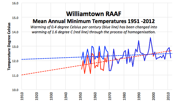 …
Marohasy argues that the BOM ignore the better long record and use the shorter airport instead:
Keep reading →
8.8 out of 10 based on 101 ratings
The sea ice around Antarctica is at a record high since satellites started recording, and snowfall is thumping down on the northern Antarctic Peninsula*, but alas — some glaciers on the same peninsula are continuing to melt, just like they have done for 300 years. Hence, a team of researchers-with-models conclude that this means these glaciers are especially, very, super-sensitive to air temperature changes and will “likely” melt fast, raise sea-levels, and disappear in 200 years time.[1]
Glaciers in northern Antarctic Peninsula melting faster than ever despite increased snowfall
Increased snowfall will not prevent the continued melting of glaciers in the northern Antarctic Peninsula, according to new research. Scientists have discovered that small glaciers that end on land around the Antarctic Peninsula are highly vulnerable to slight changes in air temperature and may be at risk of disappearing within 200 years. — Science Daily
“Faster than ever!” Blame Climate Change TM:
[Prof Glasser]: “This unprecedented glacier recession, in response to climate change, will result in significant contributions to sea level rise from this and similar Antarctic Peninsula mountain glaciers and ice caps.” –Wales.co
Hmm. I note that other warming parts of Antarctica are near a string of volcanoes and (surprize) so is this one. Though some red dots are inactive or dormant.
 The red dots on the map are volcanoes (up to 11 million years old). That includes the living and the dead ones. The proximity doesn’t mean that volcanic or geothermal energy is melting the glaciers. But does anyone know if they aren’t? Dr Davies sweeping publicity suggests they can measure the geothermal heat flux under the ice and water. Call me unconvinced — rather than adding up the kilojoules, I don’t think we can even add up the volcanoes. It’s hard to tell what is going on under a km of ice. We seem to keep discovering new volcanoes — for example: like an active volcano erupting last May, and before that a whole new Antarctic volcano last November. As one researcher puts it, things are going swimmingly if you are a volcano researcher in Antarctica.
Prof Smilley describes the situation:
Keep reading →
9.1 out of 10 based on 79 ratings
 I trained in microbiology so I’ve watched the Ebola situation unfold with quiet dread. When my favourite lecturer was asked what was worst of the worst infectious epidemics he could imagine, he responded that the sum of all fears would be a cross between Ebola and Newcastle’s disease. It would be a highly fatal hemorrhagic disease, combined with a highly contagious virus spread by birds. It’s time to talk of the dark dark possibility that one mutation could bring — the aerosolization of Ebola. I trained in microbiology so I’ve watched the Ebola situation unfold with quiet dread. When my favourite lecturer was asked what was worst of the worst infectious epidemics he could imagine, he responded that the sum of all fears would be a cross between Ebola and Newcastle’s disease. It would be a highly fatal hemorrhagic disease, combined with a highly contagious virus spread by birds. It’s time to talk of the dark dark possibility that one mutation could bring — the aerosolization of Ebola.
As long as this Filovirus stays in its current form, spread only through direct contact with an infected and obviously ill person, we have a chance to limit the spread. Quarantine is effective. If it goes airborne, the task becomes like preventing the flu, but without clinically tested vaccines, in a totally unprotected population, and with a 60% fatality rate. This is the nuclear option.
The Ebola virus has several different forms, and at least in animal studies, it has “gone airborne” before. Theoretically, it’s an odds game. The more times the virus is copied — the better the odds are that the right mutation will occur. To be brutally blunt, every infected person is another incubator, providing more copies, and more chances. For this reason, and for self interest alone, the West ought to be shifting into high gear to help Africans contain this. The humanitarian reasons go without saying. But our compassion for the ghastly suffering spreading through the slums and cities of West Africa could easily save thousands, and possibly many millions of lives, theoretically including our own.
On the plus side, we are not defenceless. There are good news stories and promising avenues. Several vaccines are being developed. Most immediately, the blood of survivors contains antibodies that can help victims. The West has grown monoclonal copies of some antibodies (ie. ZMapp) but they only grow as fast as the tobacco plants they’ve been genetically modified to grow in. Ken Brantly, one of the early US survivors who was given ZMapp is now giving his blood to another afflicted American aid worker. In Africa, a black market has already sprung up trading the blood of survivors. It’s risky and it will spread other diseases, but it is probably a rational response given the dire odds. The WHO is organizing a better cleaner method. It’s one of the few times I think a government — dare I say, even a UN solution — is something to foster and hope for. Go big-government. Except, surprise, the free market beat the government, and now some in the WHO are trying to stamp out the “illicit trade”. (Do they even know the risk-benefit of these trades?) Shouldn’t they be advising consenting adults and carers on the safest way to do this, and the risks, and collecting statistics?
8.8 out of 10 based on 73 ratings
For roving ideas…
8.4 out of 10 based on 29 ratings
Bottom line: The BOM has added a page listing “Adjustments”. It’s two years late, inadequate and incomplete. Skeptics shouldn’t have had to ask for it in the first place, and we still don’t have the algorithms and codes, or rational answers to most questions. No one can replicate the mystery black box homogenisation methods of the BOM — and without replication, it isn’t science. There is still no explanation of why an excellent station like Rutherglen should change from cooling to warming, except for vague “statistics”, or why any station should be adjusted without documentary evidence, based on thermometers that might be 300 km away.
Lo and behold, the pressure from The Australian and independent analysts means the BOM has made a weak belated attempt to do what it has implied it always has done. When Michael Brown provided cover for the BOM he said the notion that scientists were hiding data was “pseudoscience”. The BOM, meanwhile, added a page called “Adjustments”, two years after launching “ACORN”, quietly admitting that the skeptics were right. They did not correct Brown’s baseless namecalling. Other apologists for their inexplicable anomalies, major adjustments or errors — like David Karoly — demand the skeptics publish in the peer reviewed literature before they will even consider their point of view, but neither Karoly nor the BOM can name the peer reviewed document, or any publication or link, with the full homogenization code. How can skeptics discuss a method in the peer review literature which is not publicly available? The BOM homogenization technique remains a black box method that cannot be replicated — only the secret guild of anointed BOM staff are privy to the details.
Let’s open that BOM black box: let’s have a replication of the homogenization process, open to public inspection, so it can be audited. So everyone can see where every homogenized number came from, back to the raw data and the adjustments. No public company could shield its finances from observation like this: they have to produce audited accounts every six months that show all money in the company bank account, all money owed, and all money owing. All of it.
And once we have replication, then we can have an informed discussion of the ramifications of the current homogenization process, and how it might be improved or made more realistic.
Is the BOM a science agency or a PR bureau?
On August 29 2014 the BOM said it had published everything:
BOM said its methods had been published in peer-reviewed scientific journals but did not say where or in what form.
Later on Sept 11, 2014, the BOM says they have finally complied with a recommendation made years ago:
A spokesman for BoM said “publication of this table meets the Bureau of Meteorology response to the recommendations of the Independent Peer Review Panel”.
So which is it? Either they were wrong before that the methods were published, or they are repeating information now and pretending it is new in the hope of getting the critics off their back. The answer is “both”. It was inadequate before. It’s still inadequate now.
The new “adjustments” page doesn’t resolve much at all. There are still blatant errors — The changes to long term trends in minima are not “neutral”, but increase the trend by nearly 50% (See Ken Stewart’s site here and the finished set here). The hottest day in Australia was almost certainly not in Albany in 1933 (which remains uncorrected at 51C). Many maximums have been adjusted and become lower than minimums. Those mistakes did not exist in the raw data. The homogenisation has created them, like the new discontinuity in Deniliquin.
The adjustments page is just a glorified rehash of the same old excuses
Effectively the bureau is saying “we need large mysterious transformations of data to make Australian trends look like international trends”. What serious climate scientist thinks Australia is supposed to get hotter, colder, wetter, drier, or cloudier with the exact same timing and patterns to the rest of the world? Even high schoolers know that when it rains on the East Coast with El Ninos, it’s not raining on the other side of the Pacific. Just because other homogenizations have produced the same trends by blending data to the point where it is unrecognisable does not make it “good” science.
Lots of international bankers were marketing the same overrated mortage bundles. Anyone want to buy subprime science — I have a collateralized trend for sale?
Three years ago the independent audit team, with Senator Cory Bernardi, asked for an ANAO audit of the BOM’s “High Quality” HQ data set. The BOM was not enthused. They dumped the HQ set that they had previously lauded and set up a new one called “ACORN”. We listed some of the errors in June 2012. Two years on, nothing much appears to have changed. They still haven’t released the algorithms used in the homogenization process. They are still using stations more than 100km away, some 600 km away, to “adjust” temperatures. The mystery black box adjustments are still producing inexplicable nonsense, and the BOM still can’t explain why — on individual stations like Rutherglen and Bourke — anyone should find their adjustments necessary and scientifically justified. There is no documentation showing Rutherglen has moved. But there is documentation suggesting perhaps Bourke’s deleted “hottest” day really might have been 125F in 1909.
The BOM’s active silence on the long hot records of the late 1880s and 1890s suggests they are more interested in promoting one message — “it’s warming” — rather than being custodians of the real and more complicated history of the Australian climate.
The BOM still hides the “warming” effect of their mysterious adjustment procedure
The official CAWCR_049 [Back up copy here] Technical Report No. 04 claimed the adjustments were “balanced”:
“There is an approximate balance between positive and negative adjustments for maximum temperature but a weak tendency towards a predominance of negative adjustments (54% compared with 46% positive) for minimum temperature.” page 62, CAWCR_049.
Even in 2014, the BOM still maintains that the adjustments do not affect the national trends:
“And the bureau says an extensive study has found homogeneity adjustments have little impact on national trends and changes in temperature extremes.” — August 23, 2014
But a simple analysis shows this to be a misleading half-truth. The number of adjustments may be balanced, but Ken Stewart shows that the size of the warming adjustments is so much larger than the cooling adjustments that nationally the mimimum trend are warmed by nearly 50%. Given that skeptics pointed out the size of adjustments was larger two years ago, it would appear the Bureau is aware of the problem, but instead of justifying or fixing it, they carefully created ACORN so they could be seen to answer the critics while maintaining the same bias in the results. Seeming, not doing.
Where are the computer codes?
BOM’s 2011 independent panel called for the release of the computer codes:
“recommended a list of adjustments be made publicly available along with the adjusted temperature series including the rationale for each adjustment. It said the computer codes underpinning the national ACORNSAT data-set, including the algorithms and protocols used by BOM for data quality control, should be made publicly available.”
Graham Lloyd’s article in The Australian yesterday shows that the BOM is under pressure, but their lack of transparency continues, and this new page appears to be more like a public relations effort than a big advance scientifically.
What Australia needs is a full working replication of the BOM methods and techniques — only then does a true scientific peer review process begin. If the BOM is so sure it’s doing obvious world’s best practice, why won’t it release the full code? Unpacking and replicating this detailed procedure would take months of analysis. If the Australian government is serious about our climate, they need to fund a proper independent study instead of leaving it to volunteers to do on the weekend, and hoping that someone with the right combination of IT, statistical, climate, and scientific skills will find it entertaining and want to do it for free.
The Greens would surely support more funding for climate research and a better, more rigorous Australian climate database. To oppose independent replication of the BOM procedures is to admit that they prefer the BOM to be a PR agency, not a scientific group.
Bureau of Meteorology warms to transparency over adjusted records
THE Bureau of Meteorology has been forced to publish details of all changes made to historic temperature records as part of its homogenisation process to establish the nation’s climate change trend.
Publication of the reasons for all data adjustments was a key recommendation of the bureau’s independent peer review panel which approved the bureau’s ACORN SAT methodology.
BoM posted a new site on its ACORN SAT website on Monday, two weeks after being questioned by The Australian about the transparency of its homogenisation process.
Independent researchers had been calling for publication of BoM’s methodology for more than two years.
The Australian
All my posts on the BOM show that there are still more questions than answers.
Resources:
The page for ACORN-SAT data.
The page for the entire computer code… does not exist.
9.5 out of 10 based on 136 ratings
Once upon a time, Australian climate scientists discussed and published climate trends of the late 1800s. And lo, the long lost hot weather decades were apparent in many places in inland South Eastern Australia. While skeptics are accused of cherry picking data from Bourke, Rutherglen and Deniliquin, there are plenty of other examples. In the last post, the 1953 Argus story described hotter drier summers in Omeo, Bendigo, Hay, Bourke, Alice Springs, Echuca, Albury, and Cooma. Here is a Deacon et al peer reviewed graph of the long term trends at Hay, Narrabri, Bourke and Alice Springs.
Thanks to Chris Gillham for finding the Deacon paper of 1952. [On another point, I’ll have a response up to the new BOM “adjustments” page later. In short, their data still has many inexplicable errors like where maxima are lower than minima, and they are still not providing all the details we need to replicate their data and homogenization methods. – Jo]
But just have a look at this graph. Degrees Fahrenheit of course. State of the art, 1952.
 …. These cooling trends cover “only” a couple of million square kilometers of Australia:
 The location of Alice Springs, Bourke, Narrabri, and Hay (Click to enlarge) Imagine, they even had barometric data from 1880 in small country towns of NSW.
Keep reading →
9.2 out of 10 based on 90 ratings
The average maximum temperatures [of SE Australia] during the last 35 years were between two and four degrees (F) lower than the average for the previous 35 years. — CSIRO 1953
Once upon a time — before the Great Politicization of Climate Science — CSIRO was able to analyze trends from 1880 to 1910. In 1953 CSIRO scientists were making a case that large parts of Australia had been hotter in the 1880s and around the turn of last century. They are referring specifically to summer maximums, and presumably the increase in rainfall over the same period played a large role in preventing hot days from becoming hotter. Minimum and mean trends may have been quite different, but these older maximum records are surely relevant when news headlines are drafted today about hot summers and heatwaves.
So what happened to the widespread lost hot decades?
I have a lot more to say on the warm and the work of these scientists. For the moment, the full archived news story is entertaining in its own right. Thanks to Chris Gillham for this link and to Jennifer Marohasy. Graphs tomorrow : – )
— Jo
The Argus (Melbourne, Vic) Wednesday 18 March 1953

MELBOURNE’S WEATHER IS CHANGING!
by Gordon Williams
The days are cooler than they used to be, and our summers ARE wetter – much wetter than they were when the older people of today were young.
Keep reading →
9 out of 10 based on 94 ratings
You won’t believe…
Research shows surprise global warming ‘hiatus’ could have been forecast
[The Guardian] Australian and US climate experts say with new ocean-based modelling tools, the early 2000s warming slowdown was foreseeable.
Australian and US researchers have shown that the slowdown in the rate of global warming in the early 2000s, known as a so-called “global warming hiatus”, could have been predicted if today’s tools for decade-by-decade climate forecasting had been available in the 1990s.
And I’ve got a model that would have predicted the 1987 stock market crash, the GFC, and the winner of the Melbourne Cup. What I would not have predicted is that lame excuses this transparent, would be made by people calling themselves scientists, Gerald Meehl, and repeated by people calling themselves journalists. (That’s you, Melissa Davey). Though I’m not surprised that research this weak had to be published by Nature. (Where else?)
Although global temperatures remain close to record highs, they have shown little warming trend over the past 15 years, a slowdown that earlier climate models had been largely unable to predict.
This has been used by climate change sceptics as evidence that climate change prediction models are flawed.
Imagine that, the stupid skeptics think that “climate change prediction models” ought to be able to predict climate change.
But climate scientistsTM are working with different and special models. These ones are able to travel back through time to make their “predictions” from after the event.
Keep reading →
9.3 out of 10 based on 134 ratings
|
JoNova A science presenter, writer, speaker & former TV host; author of The Skeptic's Handbook (over 200,000 copies distributed & available in 15 languages).

Jo appreciates your support to help her keep doing what she does. This blog is funded by donations. Thanks!


 Follow Jo's Tweets
 To report "lost" comments or defamatory and offensive remarks, email the moderators at: support.jonova AT proton.me
Statistics
The nerds have the numbers on precious metals investments on the ASX
|


Recent Comments