What do you do when not enough people die to suit your religion? Distort the axis and hope no one notices.
Welcome to government-science, where one of top journals in the world uses graphic design tricks for political convenience. In this graph from the paper, 10 excess deaths from the heat looks “bigger” than 50 excess deaths from cold. Isn’t the whole point of a graph so we can compare the bars “at a glance”?
Björn Lomborg corrected this with chart on right. Doesn’t that tell a different story?
Thanks to Patrick Moore @EcoSenseNow:
The journal “Lancet” published the chart on left with unequal X-Axis* to downplay fact that cold causes 10X more deaths than heat in Europe. …This is disgraceful for a supposedly scientific journal.
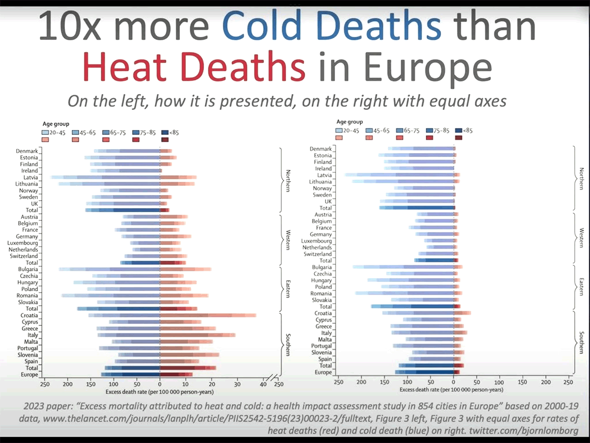
Click to enlarge
Björn Lomborg‘s version shows us exactly how important heat deaths are. It’s no small thing. The news outlets are filled with heatwave porn trying to scare people about normal weather, while politicians try to justify spending billions to “cool” the world. These graphs hide the crime — increasing the cost of energy will kill far more than mythical cooling could ever save.
![]() This is symbolic of the state of Science today: distorted by government funding until the point of it disappears.
This is symbolic of the state of Science today: distorted by government funding until the point of it disappears.
The Lancet is the world’s highest impact medical journal. It was founded in 1823, so it’s their 200th anniversary year, yet despite that, they thought they’d risk their reputation anyway…
What, exactly, did the peer reviewers think? Presumably they told themselves it was the only way to show the detail of the age groups on the heat deaths side.
Here’s a close up of the scale. Note the break marked on the far right:

We discussed this paper on the blog a week or two ago: Even in cities, cold kills ten times as many people.
It reminds us of the time Steven Sherwood changed the color on the hot spot graph so a zero degree trend looked hot red instead of yellow.
It’s a sign of desperation.
REFERENCES
Masselot et al (2023) Excess mortality attributed to heat and cold: a health impact assessment study in 854 cities in Europe, The Lancet, DOI:https://doi.org/10.1016/S2542-5196(23)00023-2
*Corrected from Y-axis. I’m sure that’s what Patrick Moore meant.


I’m sure there was more than one level of review, and, if feedback about plot scales was even provided, it was obviously not acted upon.
Whatever the case it says a lot about both Elsevier and the authors (and “peer review in general) when such data presentation tricks are condoned.
620
Apparently, peer review is the gold standard. But, the reality is that nowadays peer review is just getting your similar thinking mates to rubber stamp your BS.
Did Einstein or Darwin undergo peer review ?
Peer review is meaningless. If you’ve got a new logically sound idea, just publish. Rubbish will not survive long.
461
Peer review got to be pal review a long time ago.
210
“Rubish will not survive long”.
Wish I could agree.
Doug
160
The vast majority of Einsteins work was not peer reviewed before publication. Watson and Crick also did not have their paper on the structure of DNA peer reviewed. I imagine they all had some sort of editing/proof-reading, but that would be it.
Technically, it has been peer reviewed because people have taken their work and tried to validate or invalidate it, plus build upon it (how science is supposed to work…), It’s not “peer review” in the sense of the useless process that foolish people look up to today.
60
Remember that even at its best, peer review is still just a read through lasting an hour or so. There is no check on the data and it is certainly not a replication study. As regards papers published before peer review existed, their conclusions have been found to be valid in subsequent works. Replication studies are very rare and of the few that have been conducted many have shown up flaws in the original papers.
90
I think “*X-axis” is correct.
[It is, I did fix that. I’m sure that’s what Patrick meant. Thanks to PJB! – Jo]
10
The “gold standard” turns out to be iron pyrites, commonly known as “fools gold”. How does a reviewer miss something as egregious as that x-axis flim-flam? Most likely if the result is on message, a rubber approval stamp is automatic.
70
The Piltdown Man hoax survived long enough. The psychology is simple. With suspension of disbelief, hoax springs eternal.
40
All the stats show is that if you live in a poor country there is less artificial heating and cooling.
40
I have a different opinion on the x-axis scale. I think this is the way many scientists would present it. It is clearly marked and the squiggle on the right is a typical way to indicate the scale is different (although the squiggle is not really needed).
As Jo said, they would probably (correctly) say that it was so that people could read it (and also to fill up the right side of the graph for aesthetic reasons).
The real problem is if the authors ignore and downplay the result that cold deaths are 10X larger and then if the abstract does not highlight it, and then if the Journal Lancet downplays it in their advertising of the paper.
Then the biggest problem of all is the scientific news websites need to also point out that cold deaths are far worse and then the mainstream media needs to understand and be honest about the actual data and not produce garbage headlines. And, of course, all of that already happened – so the misrepresentation of the data is already a big problem.
21
Bill, they didn’t have to put heat and cold deaths in the same graph on the “same/not same” axis.
They don’t mention the ten times deaths rate in the headline or any heading. A reader would have to hunt through the numbers to figure it out. As I pointed out in the last post they bury the vast disparity between heat and cold deaths in many ways. EG: The first line of the Introduction:
“Heat and cold are now established health risk factors, with several studies reporting important mortality effects in populations around the world.1 , 2 , 3
Ref 1 is to the huge Gasparrini 2015 study of 74 million people which found a 20 X disparity from cold deaths to heat related ones.
A more accurate phrase would be “Cold is established as the dominant risk factor in climate related deaths by a magnitude over other factors.”
120
Thanks for drawing this to our attention.
But – isn’t that usually called the X-axis?
[It is. Thanks. I’m sure that’s what Patrick Moore meant. I’ve fixed it. Thanks. – Jo]
201
Yes the X axis is normally the horizontal but this could be the alternate reality “why oh why” axis.
For this bit of 1941 history below the axis powers may have been lured in via a really cool place to attain six feet under along Z axis.
“WOMEN of Marble Bar,
where the tempera
ture has been over
a century for four months,
prefer the climate there to
that of Perth.
A young wife has known the
temperature to go over the hun
dred in her home every day of
her married life came to Perth
on Saturday, wants to go ‘back
to the Bar’ because of the
weather here,
There are many Marble Bar
women in Perth now holidaying.
You need not pity them living up
there. They like it.”
https://trove.nla.gov.au/newspaper/article/78813006
130
How to Lie with Statistics
Darrell Huff
1954
https://www.researchgate.net/profile/Grigori-Evreinov/post/Data-visualization-which-is-best-for-within-and-cross-source-data/attachment/5b0690b6b53d2f63c3cdcad5/AS%3A629755908993031%401527156917765/download/How-to-Lie-with-Statistics.pdf
00
How to Lie with Statistics
Darrell Huff
1954
https://www.researchgate.net/profile/Grigori-Evreinov/post/Data-visualization-which-is-best-for-within-and-cross-source-data/attachment/5b0690b6b53d2f63c3cdcad5/AS%3A629755908993031%401527156917765/download/How-to-Lie-with-Statistics.pdf
130
The full quote — “There are three kinds of lies: Lies, Damned Lies, and Statistics” — has been attributed to Mark Twain, who himself attributed it to British Prime Minister Benjamin Disraeli, who might never have said it in the first place.
Regardless of the origin of the phrase, it is one that I hold near and dear.
310
There is also “How to lie with maps” by Mark Monmonier.
60
“The Journal of Irreproducible Results” once had an article on “The power of linearisation” and methods of plotting suitable graphs.
The least recommended (because help was required in its production and therefore witnesses) was to plot the points on a sheet of white rubber, stretch till they lined up, then add the axes and dimensions and photograph the result for publication.
60
As they did with Marble Bar’s record heat wave in 1923/4. ACORN is really mucking around with the temps.
https://www.waclimate.net/very-hot-days-marble-bar.html
30
As with any pustulous boil – lance it! Pop, and it’s gone.
Also, beware of ‘well-spoken’ English women who go by the name of Gaia, spewing similar cultish ****. Promoting her gospel of garbage on the radio – sumpfink about the ‘breakdown’ of climate – Gaia Vince said, in her rather upper-crust posh accent: “People are literally boiling to death on the streets”. Turning off the radio, I carried on with my day.
These people are sick: sadly, they are beyond help (perhaps trained by Al Gore’s Travelling Evangelical Sideshow Inc.?).
350
The good news is that very few members of the general public would read the Lancet and be exposed to the deliberate misrepresentation.
Then, when we consider who actually would read it, the plot thickens.
The prime targets for the message from the Lancet are our Doctors.
If the pier reviewed journal can believe that it can mislead doctors on this issue then we, the public, may be in trouble.
Could this “Journal” be misused by large pharmaceutical companies to lead GPs to overprescribe with unnecessary and perhaps useless “medications”. I can think of one item that has probably done more damage than good.
Then the escalation is set in motion when the “misleadia”, love that term introduced by someone from this blog, interviews a spokesperson for the Australian Medical Association.
No wonder some doctors are dissaociating themselves from that organisation.
Meanwhile, our politicians, acting our behalf, can’t see any problem.
£$
370
G’day KK,
Thanks, and I agree with one exception:
“…may be in trouble.”?? Nah. ” are already in deep dodo” I suggest is more precise. And can be paraphrased to suit anyone’s vernacular.
Cheers
Dave B
70
Sheep dit?
30
KK, we’re in trouble and have been for years. A few years ago I read the book ” The illusion of evidence based medicine” by Jon Jureidini and Leemon B Mc Henry. I am under no illusion that doctors are real scientists anymore. They may have had a grounding in science, but when they get to medical school all the curiosity is belted out of them. They then become protocol robots captured by government medicine.
120
“The good news is that very few members of the general public would read the Lancet and be exposed to the deliberate misrepresentation.”
I’m afraid that’s not how it works, Keith. Research papers like this are used to provide an excuse – and a veneer of credibility – to alarmist media ‘reports’ which WILL be read by the general public. Thus, crappy ‘science’ gets mainstreamed, amplified and fed to the masses, with a thick topping of apocalyptic spin.
These papers and the accompanying news reports also serve to justify politicians’ efforts to spend, spend, spend on climate change policies.
60
Yes, the bad news is that the taxpayers are going to be hit with this stuff to justify their suffering.
10
“No wonder some doctors are dissaociating themselves from that organisation.”
Mostly good doctors. I wonder if the Lancet reports to John Kerry.
20
Your last comment is the one that counts. They are getting desperate. Few people even care anymore because they have far greater worries just managing day to day and worried about such things as the war in Ukraine being a harbinger of what could happen closer to home. Chris Bowen has overplayed his role and I can’t see much being achieved in this term of maladministration. Will he force farmers to hand over their land so as he can build the transmission lines? Will investors risk their money when Dutton is promoting SMRs and the like? Subsidies can be taken away as happened in Spain a decade ago. Dear electricity and the need for warmth generally will over ride the sort of deception that the Lancet has descended into. If heat kills why do people gravitate to warmer climes? I don’t see the Romans selling up to live in the Alps nor Sydneysiders heading to Cooma in droves unless they like skiing.
250
Lawrie:
Bowen is delusional, like many politicians. He thinks that the world will agree with his speeches and that passing a bill will change the world.
My point is that the cost of his (and others) fantasies is not likely to be paid for, esp. by those who they expect to build them.
Offshore wind farms aren’t the money making plan that was once thought. Vattenfall has cancelled its North Sea (Boreas) wind farm with a loss estimated at $500 million. Obviously they think they would loss more if the continued.
https://notrickszone.com/2023/07/23/energy-giant-vattenfall-puts-gigantic-offshore-wind-project-on-ice-threatening-uk-climate-targets/
So Bowen might not find those companies with experience wiling to spend money. There are shortages of the specialty ships needed to site offshore wind farms, so who would send them to Australia unless they see money there?
Then the first announcement has already attracted criticism, causing Bowen to move the site out to 20km not 10km. Extra costs to the builder. And the opposition will intensify when those onshore realise that the power cables might go through their property.
And on top of that he has to face farmers not wanting to have transmission lines through their properties. The SA line to NSW hasn’t been finished but might be in the third government since it was announced.
220
“So Bowen might not find those companies with experience wiling to spend money.”
Sure he will. You see, as companies seeking to gouge huge profits out of the net zero con step back because risk has increased, Bowen and his ilk will simply ramp up the subsidies and de-risk the supplier side of contracts until bidders come back to the table.
The money tree at work.
40
Thank goodness Peter Dutton is at last speaking out about nuclear power. It’s horrible that he has taken so long, but maybe he has now been pressured by the Nats, or maybe both are feeling the One Nation blowtorch. Whatever, let’s all hope that this spells the end of the Uniparty and federal elections can mean something again.
130
Whatever happened to ethics? Is there a way to appeal this unethical report?
160
If a Business is not ethical, it will fail. Perhaps not right away, but eventually.
– Sir John Templeton
100
That’s not very comforting given how long it can take for an unethical corporation to wither. Look at the East India Company, perhaps the first large company to collude closely with governments in order to ride roughshod over citizens. That particular monster lived for 184 years …
50
Yep. Even the learned Medical journals enjoy a bit of scientific fraud when it suits their needs.
150
What we are seeing now is a greater and greater tendency of warmists, the Left, Regressives and Elites to blatantly lie or engage in gross misrepresentation because they know they can get away with it because:
1) the media no longer do journalism and just repeat what they are told to say by the aforementioned elements, they do propaganda not journalism
and
2) almost the entire population has been suitably dumbed-down since the communists started infiltrating the education system 50 odd years ago (Rudi Dutschke’s “Long march through the institutions”).
The most recent example is the measurement and reporting of actual ground temperatures in Europe rather than air temperatures, in order to massively exaggerate the extent of the “heat wave”. See below:
https://notrickszone.com/2023/07/19/europes-48c-horror-that-never-was-esa-media-sharply-criticized-for-manipulative-reporting/
340
Post-normal truth is a slippery beast. Anything constitutes truth these days. Objective truth is on the backburner and falsities thrive in the mind of the insidious Leftoid.
80
Paul Homewood has also picked up on this.
‘It was hot this week in much of Europe, very hot in places.
‘But I have found no evidence that the heatwave was in any way unprecedented, never mind the inferno suggested.’ (Notalot of people know that)
81
Here’s the much longer 2015 Lancet study.
Note the 13 selected countries and accurate COLD and HEAT deaths for each.
Of course COLD deaths are much higher than HEAT deaths. And MODERATE COLD deaths are much higher than EXTREME COLD.
https://www.thelancet.com/cms/attachment/79cee7d6-8e9d-4659-a6cf-f334e1403498/gr2.jpg
180
Here’s the full 2015 Lancet study.
https://www.thelancet.com/journals/lancet/article/PIIS0140-6736(14)62114-0/fulltext
80
This is plainly a dishonest representation of data.
The Lancet has lost all credibility
This should be front page news – surprise, surprise… not a whisper from the MSM!
201
In the UK data it’s difficult to see any heat deaths and the cold/hot death ratio must be in the vicinity of 100/1. Amusingly, this is where most of the die hard climate activists reside, obviously upset at the prospect of fewer people dying each year and protesting for a return to even more deaths.
170
I trusted the science – and found the money
I trusted the experts – and found the money
I trusted the “misinformation” – and found the truth
361
Also from Pommy-Land:
https://www.samizdata.net/2023/07/the-climate-scam-is-on-manoeuvres/#comments
Coming VERY soon to a taxpayer-funded network near you.
80
And no doubt “our ABC” are doing something similar with antarctic ice?
https://www.abc.net.au/news/2023-07-24/antarctic-sea-ice-levels-nosedive-five-sigma-event/102635204
90
Good grief! Will the pack ice shrink back to the same as Mawson found in 1910/11?
(The ship of fools in 2013 couldn’t get within 110km to where his ship was anchored).
250
Reminiscing
“The Ice That Wasn’t There
Ruth
January 2, 2014 at 9:04 pm
Here is something I wrote on JoNova’s blog:
Thanks to Robert W Service for the inspiration!
There are strange things done in the midnight sun
By the men who moil for fame;
The Climate Change has bedfellows strange
That would make your brain go lame;
The Southern Lights have seen queer sights,
But the queerest they ever did bear
Was the climate geeks on the Akademik
Who got stuck in the ice-not-there.
Now Chris Turney was from New South Wee, where the gum tree stands and grows
Why he left his home in the South to roam ‘round the Pole, God only knows.
He was always hot, (no matter what), and often channelled Mao;
And he’d often say in his arrogant way “The Ice has Melted now.”
On Christmas Eve with Argo’s leave they were slow to find the trail
Talk of your cold! Through the parka’s fold it stabbed like a driven nail.
If eyes they’d close, then their lashes froze till sometimes they couldn’t see;
It wasn’t much fun, but the only one to tweet was Chris Turney.
And that very night, they got a fright – their ship was in sea ice;
And the blogs were read, and the wind they said was blowing up a vice;
Chris Turney claimed it was “Climate Change” – the Ice had Up and Went;
The rest had napped and they were trapped in their own experiment.
“Sea ice has waned due to climate change, but here it’s building up!
We have found this has changed – they all explained, there’s fresh water all about!
And don’t you know, the seawater below, well, we can almost drink it.
This ice which packs will have impacts so fast – you wouldn’t think it.”
The Snow Dragon and had also come, and got stuck in the same sea ice;
The Astrolabe tried and Turney cried so they hailed the Australis.
The sea ice grew and tempers brewed, and those onboard got sick;
The wind was blamed on Climate Change; that’s why the ice was thick!
The days went by and my oh my; the media had dissed
The simple fact the ship was packed with climate scientists!
They tried to show the melting snow would strike our hearts with fear
And we would back the carbon tax – if truth was far, not near.
Now a promise made is a debt unpaid and the sea has its own stern code.
In the days to come – though the papers were stum, we learned to love that load
Of childish geeks and climate freaks who danced and sang and stuff.
They howled their woes to ice and snow, and proved their warming bluff.
The choppers came and came again – the rescue on and off;
The Australis and the Chinese ship were struggling in a trough
Of water cold near the South Pole so they could pluck them out
Of their own vice in the snow and ice – “not supposed to be about.”
These scientists were more like kids when they begged for help from Watts;
To give the fools some weather tools, to extract them from a spot
Of danger here and trouble there – to save them from themselves!
The choppers came in just in time to pluck from icy shelves.
There are strange things done in the midnight sun
By the men who moil for fame;
The Climate Change has bedfellows strange
That would make your brain go lame;
The Southern Lights have seen queer sights,
But the queerest they ever did bear
Was the climate geeks on the Akademik
Who got stuck in the ice-not-there.
https://wattsupwiththat.com/2014/01/02/the-cause-of-the-akademik-shokalskiy-getting-stuck-in-antarctica-sigtseeing-mishaps-and-dawdling-by-the-passengers-getting-back-on-ship/#comment-1165100
170
Magnificent!
00
Trash science from 3rd rate scientists on the public purse. More alarmist cup half empty nonsense from the ABC. The article is full of naive drivel about human attribution that is likely to convince the brain dead and gullible.
70
Thanks again to Jo for highlighting more of these doubtful displays . And thanks to Bjorn Lomborg as well.
And no thanks for the silence from the MSM or prominent medical groups etc.
230
“Here’s a close up of the scale. Note the break marked on the far right:”
Ouch. Even being warned, my eyes did not track that far to the right. If I were the author or editor, that “trick” would be cancelled.
150
https://www.numberwatch.co.uk/chartmanship.htm
110
Blatant cheating has become normal now . Hyperbole rules . Does the biggest lie win ?
120
Sound familiar?
Unknown authorship but usually misattributed to Joseph Goebbels. However it is indeed a technique of the Left in general, whether they be communists or National Socialists.
100
I think we can attribute the quote to Goebbels. “A lie told once is a lie, but a lie told a thousand times is the truth”. There are many variations on the persuasive nature of propaganda and I think that what you quoted is often attributed to him.
70
I know it’s an oft used term. But ” it’s easier to fool someone, than to tell them they have been fooled”, just applies to everything in the Climate change debate. It also applied big time during COVID. The similarities are very evident.
60
Hopefully people can read
18
GA that high frequency whistling sound you hear is the noise the point makes as it whizzes past you as you miss it once again. If you cant see how this graph was manipulated to produce a false impression of what the data is actually showing then you are one of the moor ons i speak about in comment #23. You are one of the people that cant get their heads out of their phones long enough to see how you are being manipulated.
You just sit there staring at your phone waiting to be told what to think next, what to be angry about next, what to like next, who to hate next and so on. In the end peopl elike you, simon and Peter Fitzroy ARE THE PROBLEM because of your lazy low IQ complacency.
Well done GA
150
HOw would you compare data patterns on two different scales?
15
You cant! but thats not what happened here is it GA, you cant even be honest can you, when was the last time you told the truth GA?
Apparently you lot can abandon honesty and fairness and simply make stuff up, lie, cheat because the cause is worth it in the end and destroy the science as you go.
You are a joke.
40
Thanks for that though it is more complete if you finished your spray with an evil muhahahaha.
In any case #21 stands unchanged and unaffected.
04
The Lancet…enough said after their suppression of COVID treatments.
150
This is no different to last week when they claimed the hottest day ever 3 days in a row only to find they were using the surface temp not the temp 2 meters above the ground.
All they need to do is write some BS and a vast majority of moor ons who cant look up from their phones for 5 seconds see it and believe it, the latest talking points are like a soft ware down load for them.
120
The sad thing is that so many innumerate illiterates find emotions superior to reason and fact.
There are many causes, but the one most frightening is a lack of personal effort. Intellectual laziness is not an excuse to tax, encumber, control and insult those who are intellectually competent.
The Lancet graphs shown are the essence of propaganda, agenda over fact, absence of science, and excess of politics. They ought be ashamed of their shallowness.
The authors are liars and the publication’s editors are propagandists.
60
“innumerate illiterates” describes leftists accurately. No wonder so many young journalists are of the left. They can’t write so they reproduce handouts and they are terrified of numbers so real science is beyond them.
20
If I remember correctly, the Lancet did something similar in order to undermine the effectiveness of Ivermectin. The trial was deliberately skewed.
80
More and more these scientific papers are presented in a format intended for” science poor” journalists to just cut and paste. Even, amongst the science journalists at most of the MSM in Australia, their analytical skills are not good. During COVID, a lot of articles seemed to originate from pharmaceutical companies. You also get the same with the journalists reporting on the energy industry. With energy reporting, at times it would appear they have literally just cut and pasted the press release from either the solar/wind industry or government. The trick with the scale in this graph is only something that are true scientist with sceptic skills would pick up. I’m the ultimate conspiracy theorist these days – just follow the money. Look at who sponsors studies and what affiliations or conflicts of interest they have as well.
70
I wonder if there is a similar trick here.
Antarctic sea ice levels dive in ‘five-sigma event’, as experts flag worsening consequences for planet
The Google heading has not been corrected
Still, that is dodgy. The Ross ice shelf was open water sometime between 5-3 million years ago.
And another story points to how large parts of Greenland was ice free 400 000 years ago. I know it’s at the other end but surely the ice extent must have low down south as well?
These ice extents are areas of at least 10% ice. The large area of about 10% ice are very fickle. I smell something dodgy.
41
R.B. >Antarctic sea ice levels – “I wonder if there is a similar trick here”
No, just an aberration. You can see the graph here:
Daily Sea Ice Extent [Switch Hemisphere to Southern]
https://climatereanalyzer.org/clim/seaice/
Hide All – Switch on 2022 and 1986
From May right through to mid December those curves are identical but 36 years apart.
Also, the greatest extent was Sep 2014 – less than a decade ago.
20
And 2023 from the beginning of may to the present is exactly the same. Clearly not just unprecedented.
00
4th sentence at ABC News article:
Baffled but then some race into definitive anthropogenic attribution.
Then:
And,
Baffled Dr Doddridge would say that wouldn’t he?
20
My editing got cut off. It’s 15% rather than 10%
From NOAA
It seemed to have bounced back up when low before 5 years ago, although a million sq km less than about 10 years ago, it was more than the average.
The max are around 18 million and min were a near constant 3 million until recently. The plots do paint a picture that something is up with the measurements.
https://www.climate.gov/news-features/understanding-climate/understanding-climate-antarctic-sea-ice-extent
10
NOAA >”This low value [Feb 2023] punctuated a series of below-average extents, including multiple record lows. Whether this was due to natural variability or the start of a climate-change signal was not clear as of February 2023″
This is daft.
See #27.1 upthread. At the time of minimums (Feb/Mar), Feb 2008 is the highest and Feb 2023 is the lowest of a relatively narrow band – so what?
20
Is this Mis or Mal information?
40
Findings
203 620 deaths attributed to cold
20 173 attributed to heat
Figure 1(A) is an interesting graph too:
Figure 1 Overall age effect in the predicted risk
(A) Pooled overall cumulative exposure–response relationship predicted at several ages.
https://www.thelancet.com/cms/attachment/33c5147b-88fc-4012-8a4f-69ace0d41659/gr1.jpg
The Y axis is distorted to show the effects at each of the extremes i.e. the 1st percentile (cold) is twice the 99th percentile (hot) which accentuates the rise of hot risk. The 1st and 4th quartiles are similar but not equal and the 2nd and 3rd quartiles are larger than 1st and 4th and also similar but not equal.
This is very subtle but there is no mention of what the Y scale graduation actually is.
Even with the distortion and vague graduation it can still be seen that the cold risk continues right up to about the 85th percentile. And hot risk only begins at about the 85th percentile i.e. the last 15% of the temperature range.
I note this:
Reanalysis facilitated this study and is now the accepted metric for temperature analysis.
20
Richard Horton, the editor of The Lancet recently put it only slightly more mildly [than John Ioannidis]: “Much of the scientific literature, perhaps half, may simply be untrue.”
https://bigthink.com/surprising-science/believe-it-or-not-most-published-research-findings-are-probably-false/
50
Think The Lancet’s bad?
Try this one:
https://tr.pinterest.com/pin/126100858286490011/
20
Very misleading figure…. nasty scaling.
On top of that, the age groups in the figure show a mistake. The darkest blue mentions that it is ages “85”, anyone over the age of 85, as is mentioned in ‘Figure 2: Cold (first percentile of temperature, in blue) and heat (99th percentile of temperature, in red) relative risks in capital cities for five age groups’ of the original article.
Well done peer review.
10
[…] Zum Vergrößern anklicken. Datenfälscher bei der Arbeit: Das (bisher) angesehene Wissenschaftsmagazin „Lancet“ veröffenlichte eine Grafik (links), die die Anzalhl der Kältetoten in Europa (links von 0-Achse, blau) im Verhältnis zu den Hitzetoten (rechts von 0-Achse, rot) darstellen soll. Es ensteht der Eindruck, daß die Zahlen gar nicht so weit auseinander liegen. Der Trick: Die Skalierung links von der 0-Achse ist fünfmal größer als rechts von der 0-Achse: Während in gleicher Entfernung von der 0-Achse links = 50 angzeigt wird, sind es rechts davon nur 10. Die Skalierung wurde zugunsten der Hitzetoten optisch um 500% übertrieben. Die rechte Abbildung zeigt die tatsächlichen Verhältnisse: 10mal mehr Kältetote als Hitzetote in Europa. Quelle: 10mal mehr Kältetote als Hitzetote in Europa […]
20
I like the map on this page, with a huge color range distinguishing between plus and minus 2ppm CO2:
https://climate.nasa.gov/news/2915/the-atmosphere-getting-a-handle-on-carbon-dioxide/
And this stunning conclusion:
… “For as long as we can remember, we’ve talked about Earth’s tropical rainforests as the ‘lungs’ of our planet,” he said. “Most scientists considered them to be the principal absorber and storage place of carbon dioxide in the Earth system, with Earth’s northern boreal forests playing a secondary role. But that’s not what’s being borne out by our data. We’re seeing that Earth’s tropical regions are a net source of carbon dioxide to the atmosphere, at least since 2009. This changes our understanding of things.”
Measurements of atmospheric carbon dioxide in the tropics are consistently higher than anything around them, and scientists don’t know why, Crisp said. …
10
Whatever you do, don’t mention the fires in Greece! Let’s leave the conspiracy-lovers sure that global warming is not happening! Wouldn’t want facts to get in the way of their theories!
01
Odd, I just checked the Lancet paper, the graph in question looks correct!!
No corrupt x axis.
Has anyone seen the original corrupt graph?
Elsevier state that no changes have taken place to the document.
23
Look again Steve,
I checked the paper just now.
The graph in question is just as Jo says.
20
“Journals have devolved into information laundering operations for the pharmaceutical industry.”
– Richard Horton, former editor-in-chief of ‘The Lancet’
20
Peter C, I have just looked again: https://www.thelancet.com/journals/lanplh/article/PIIS2542-5196(23)00023-2/fulltext#figures
And you are right and I am wrong!!!!
The graph is still the ‘funny one’.
Apologies.
10
[…] simplen Manipulationen. So verglich die berühmte Medizinzeitschrift „The Lancet“ die Zahl der hitze- und kältebedingten Toten in Europa. Um den Eindruck zu erwecken, dass die „klimabedingte“ Hitze im Sommer mehr Menschen das Leben […]
10
[…] mit solch promitiven Tricks. So verglich die renommierte Medizinzeitschrift The Lancet die Zahl der hitze- und kältebedingten Toten in Europa. Um den Eindruck zu erwecken, daß die Klimakatastrophe im Sommer mehr Menschen das Leben koste, […]
00
[…] mit solch promitiven Tricks. So verglich die renommierte Medizinzeitschrift The Lancet die Zahl der hitze- und kältebedingten Toten in Europa. Um den Eindruck zu erwecken, daß die Klimakatastrophe im Sommer mehr Menschen das Leben koste, […]
00
[…] Solch primitive Tricks in den Systemmedien ist man ja gewohnt, aber auch die „Wissenschaft“ arbeitet heuer mit solch erstaunlich simplen Manipulationen. So verglich die berühmte Medizinzeitschrift „The Lancet“ die Zahl der hitze- und kältebedingten Toten in Europa. […]
00
I’m confused – I read the paper and fail to see what the problem is. The graphs & tables provided accurately display the data at hand, based on the objective of the study.
“The objective of the present study is to provide a comprehensive and consistent assessment of the current mortality burden associated with non-optimal temperature across most European cities, characterising differences in risks due to local distributions of vulnerability factors and demographic distributions.”
“Across the 854 urban areas in Europe, we estimated an annual excess of 203 620 (empirical 95% CI 180 882–224 613) deaths attributed to cold and 20 173 (17 261–22 934) attributed to heat.”
The graph is clearly marked to easily show the numbers per country – with heat being considerably smaller, that side is extended, otherwise, the numbers are basically impossible to differentiate, and even worse for the age groups.
The study is about “non-optimal temperatures” – nothing more.
10