“All else being equal, larger animals can tolerate cold conditions better than smaller animals, so one could expect that a warming climate is relatively more advantageous for smaller animals,” said Professor Altwegg.
To investigate this idea and whether it could be true, the research team looked at a group of wagtails living along the Palmiet River.
It’s “a” group — just the one — and a temperature change of less than one fifth of a degree over 23 years:
Based on data from a local weather station near the Palmiet River, the researchers knew that temperatures in the area had increased by 0.18 °C. But they didn’t know how this had affected the birds’ size.
What they found supports the idea that climate change can shrink Earth’s animals.
“Supports” the idea? The study’s big achievement was only that it didn’t extinguish the idea at the “back of envelope” stage…
Their results showed that as temperature increased along the Palmiet River, the mountain wagtails living there had become lighter. Specifically, they found lighter individuals were replacing heavier ones in the population and that they survived better under high temperatures. This indicated that an evolutionary pressure was acting on the birds to become lighter.
Or maybe food, predators, fertility, rainfall, and disease were more important than 0.18 degrees C which may or may not be larger than the error bars of South African meteorology. Who knows. Australian meteorology has larger “adjustment bars” than this.
But this is definitely evolution. Look closely and we can see evidence that smaller minded researchers are outcompeting larger ones.
This appears to occur in every soft left environment there is, no matter what the climate.
REFERENCE. Seriously?
Jorinde Prokosch et al. Are animals shrinking due to climate change? Temperature-mediated selection on body mass in mountain wagtails, Oecologia (2019). DOI: 10.1007/s00442-019-04368-2
(What are the odds this is pure spoof? I mean, a bunch of wagtails…. fergoodnesssake– Jo)
Dr Rex Fleming has a PhD in Meteorology and spent years at NOAA, as he said involved with climate research from the beginning, and responsible for funding scientists who “pushed” the theory of man-made global warming. He’s written a book called The Rise and Fall of the Carbon Dioxide Theory of Climate Change (2019) and has just done a podcast with James Delingpole.
When David Evans first spoke out as a skeptic we were contacted by someone inside NOAA who said there were many skeptics there, but none of them could speak. We know there are others out there, still silent.
My rough notes: Dr Fleming did a PhD in uncertainty in climate and was involved in something called “The weather experiment in 1979.”. He talks about “people who fiddled with the data — ocean data, atmospheric data..”, and about how they “won’t admit they put their temperature sensors too close to cities.”
James Delingpole asks what motivates these researchers and Fleming replies along the lines of soft corruption, how people just want to keep the funds coming in. That people are just not willing to fight it. He repeats that Under Obama they would get sacked. So people don’t speak up until the retire. (@ 7 minutes)
It’s so much fun saving the planet 114 private jets at a time
The glitterati are descending on a ritzy Sicilian seaside resort this weekend to discuss how to save the world. As usual, a bit of wrecking-the-world on the way is fine if it’s “for a good cause” — meaning fame, status, and hot three day summer camps in an Italian resort.
It’s known as Google Camp — the place where famous VIP’s get some training and incentives not to stray off the Google Groupthink-Ranch:
The three-day event will focus on fighting climate change — though it’s unknown how much time the attendees will spend discussing their own effect on the environment, such as the scores of private jets they arrived in and the mega yachts many have been staying on.
It’s only going to cost Google $20 million or so. It’s a small investment in their pet team of lobbyists for Big Government.
Small governments, after all, like to break up monopolies, encourage competition and cut subsidies…
What starling would want to announce they were a climate denier and get crossed off this invitation list?
Thanks to Bill in Oz sending in the shot of Mt Barker, Ken Stewart started auditing other sites in South Australia and discovered this masterpiece of expert siting. And thanks to Ken, you can see The Wacky World of Weather Stations: No. 2- Murray Bridge.
The screen is in a houseyard near concrete paths, vegetable gardens and shrubs, close to a picket fence, within 5 metres of sheds, sheltered from the south by a 1.6 metre high fence, with buildings to the east, north, and west, and less than 10 metres from the bitumen road.
Like Mt Barker, this is another site which is not an ACORN “top ranked” site that the Bureau of Meteorology use, but results from here are used to adjust ACORN sites like Mount Gambier, so it is de facto a part of that network. Sites like this are also used to create propaganda, sorry, press releases about “hottest ever records”.
The BoM know exactly how bad this site is, and in carefully measured detail.
Somewhere a paid bureaucrat has dedicatedly measured and mapped all the things that shouldn’t be there within a 30 meter radius.
Ponder the awesome attention to detail for a site that should never have been selected. In that single PDF link, there is not just one map like this but 14 separate maps of this same site dated roughly once a year since 2004. Would private industry spend so much money documenting failure or would they just … move the dang site?! And then there are more maps from before that of the site when it was located near the railway station (see below for that photo).
More meaningless expert data
Would any private company spend money analyzing the exact time of day shadows fall on this thermometer each month of the year, or would they just find a 30 by 30 meter square plot of clear land in the most empty inhabited continent on Earth? Does anyone think a supercomputer could calculate what the thermometer should have recorded, and if so, why bother having a thermometer at all?
Murray Bridge, skyline, Bureau of Meteorology, climate data.
As Ken says, don’t blame the householder, blame the BoM. As Jo says, send a message to your elected representative.
If life on Earth depends on climate science why don’t the Bureau of Meteorology care about the data? We give them over a million dollars a day, yet they use sites like this to tell us that Australia has “unprecedented” warming.
Modern junk used, old quality forgotten
The thermometers scientists installed in 1896 which recorded extreme heat then may be more accurate than the modern “expert” network, yet the BoM ignore those and use junk like this.
Here’s the expanded view of the site that was chosen in 2004 (white arrow marks the spot). At a glance, there are other sites you might think were better, like the sort under the red dots. Just a thought?
Count the ways this site breaches the Bureau of Meteorology own rules:
Ken Stewart finds the relevant BoM guidelines. Clearly this site is on a slope, too close to buildings, too close to tall foliage, too close to heat sinks, it should not be artificially watered, or near asphalt. It should have a 30 meter buffer zone, and not be shielded from the sun, rain or wind. BillinOz points out that it is totally screened from the southerly cold winds, and the cold air will be drained from the spot down the slope.
How much do the Bureau of Meteorology care about climate change? — About 1m out of 30m or 3% of their advertised “care” factor. That’s a a 97% Junk-Science rate. The future of life on Earth is supposedly at stake and the “experts” can’t even be bothered accurately measuring the climate change they tell us we need to pay billions of dollars to solve.
Obviously every record claimed at this site is scientifically meaningless. This sort of error can’t be homogenized or adjusted away, but taxpaying Australians might think that installing a proper site would be possible when we pay them over a million dollars a day.
Mt Barker’s temperatures are published at their Latest Weather Observations page. As Stewart points out this flawed site is used to adjust temperatures at official superstar ACORN-SAT sites at Adelaide, Cape Borda, Nuriootpa, Robe, and Snowtown. And thus does bad data pollute Australia’s temperature records and the press releases that are used to scare the public into paying more money to fix a climate problem no one can be bothered to even measure properly.
The bottom line? Ask our M.P.’s to audit the Bureau of Met. If the environment matters, there must be an independent audit. Skeptics have asked, and the Bureau threw out the whole dataset to avoid the audit. They admit they won’t describe their methods. If the Greens or Australian Conservation Foundation cared about the environment, they would demand an audit like we do.
In 2015 this site was on the other side of the block next to the driveway and car. “Lucky” the BoM realized, and … moved it to another inadequate spot.
Skeptics are now the brain-eating undead from Haitian Cult Voodoo. Just more namecalling in lieu of science. The ABC has become the US Weekly, TVWeek, or OK! of national policy, filled with inane clickbait animations, fictional stories and fantasy myths.
Looks like it’s projection again
Here’s a guy who believes that we control storms, floods and droughts with solar panels and wind turbines. The only climate zombie that needs hosing down is all his. He’s the one saying that the type of milk you drink, or your funeral service are to blame for random stuff like spotted quoll fertility, shark attacks, or tornadoes. Go vegan to save the planet!
Poor Nick Kilvert is so badly trained he can’t figure out why ideas like “CO2 feeds plants” just won’t die. The mystery of how the truth keeps coming back (despite their best efforts). So this weekend he put out a handy condescending guide of strawmen and mythical myths for beleaguered believers who are lost for answers to skeptical scientists. The man’s cult-like belief is so obvious, the real question we need to ask our elected MP’s is why are we funding an journalistic organization which has staff who are so incompetent, and who clearly work as ideological partisan activists? After writing an article like this, could anyone argue that Kilvert is capable of dispassionate investigative research on this topic? Kilvert, with a Bachelor of Applied Science and Honours in Ecology, apparently thinks Nobel Laureates, NASA Astronauts, Professors of Atmospheric physics are brain sucking zombie deniers, involved in a big fossil funded conspiracy.
This is the same guy who wrote climate fiction: Life at 0.5 degrees hotter: imagining an apocalypse by 2040 where 2,000 km of Barrier Reef dies and jellyfish rule the world, and where gardens are dead, err, because our rainfall increased, yeah?
They might pop up in your social media feed, or manifest in comments under climate change news online. They might even appear at your Christmas lunch. And they’re rife in some media outlets — they often come out after dark.
They’re the cases against climate science that were buried years ago, yet somehow, refuse to die. “It’s the Milankovitch cycles”, “CO2 is good for plants anyway”, “What have the scientists ever done for us?”
You might have even been infected yourself. It’s no surprise really, a multi-billion dollar campaign funded by the likes of Donors Trust, Donors Capital Fund, Koch-affiliated foundations, and parts of the fossil fuel industry has been animating these damned corpses since the ’80s.
So consider this your own handy guide for killing the undead. Or at least a shield for deflecting their relentless pursuit of brains.
Good luck out there.
#1 CO2 doesn’t cause warming
Strawman. None of the serious skeptical scientists or main commentators say this. Kilvert couldn’t quote skeptics here because there’s no one to quote.
CO2 is a greenhouse gas, it absorbs infrared. The question is whether the clouds, humidity and jet streams amplify this warming or neutralize it. Believers assume these feedbacks are positive, put that in their models then, lo, their models tell them the feedbacks are positive. The miracle! Skeptics look at all the data (before it’s adjusted) and find that feedbacks are negative. The hot spot is the key fingerprint of feedback and it’s missing. The warming has happened before and the runaway greenhouse didn’t happen. Skeptics point out that the CO2 effect is saturated already, and water is a far more important as a greenhouse gas –– and even the IPCC agrees.
Kilvert either hasn’t done any research or is working to mislead ABC readers. Which is it? Lazy or dishonest?
#2 It’s Milankovitch cycles
Another strawman. The skeptics he debunks are imaginary creatures he has invented. The largest skeptical site in Australia (this one) has over 3 million words on it and “Milankovich” gets barely three times, none of them by me. Clearly it’s an important plank … not.
#3 There’s been a 5? 10? 20? year pause in warming
In 2008 NOAA said that pauses of 15 years or more didn’t fit with climate simulations (so if it went longer, the models would be wrong). Likewise James Hansen was caught in ClimateGate saying that ‘no upward trend’ has to continue for a total of 15 years before we get worried.’When the pause got a bit longer still, Ben Santer said in a paper it really was 17 years we needed to see. That was 2011.
The IPCC says: there is low confidence in quantifying the role of forcing trend in causing the surface-warming hiatus…. {WG1 8.5; WG1 Box 9.2}
Kilvert says: “This little doozy has gone a bit quiet in the past few years, though it ate quite a few brains in the early 2000s and again in 2012/13.”
He thinks 1998 is in tenth place, but that’s only in hyper-adjusted data changed with secret adjustments. The best satellite system in the world reports that year as number 2, and shows the obvious, unarguable pause. All the major datasets once showed a pause, til they were adjusted. At the same time as the pause, sea levels slowed, hurricanes paused, deny deny deny, eh?
Energy cannot be created nor destroyed. The pause is still a problem, even though it stopped. The models were wrong, and no wonder. They are missing key forcings like solar magnetic, solar spectral changes and the solar wind.
#4 It’s a natural cycle, man
Apparently it’s not natural because 250 million years ago CO2 rose fast and caused the Permian Extinction. Kilvert argues that all past changes were slower than this one. Since we know warmer temperatures cause CO2 to rise about 800 years later, it takes some magical thinking to assert that any scientist can show CO2 rose before temperatures 250,000,000 years ago. Show us your error bars.
Riddle me this: we’ve got 800,000 years of ice cores, and modern satellites circling the Earth 24 hours a day, but the only proof that CO2 causes rapid warming comes from a quarter of a billion years ago?
Any nutritional deficiencies are so minor they can be solved by adding two chickpeas to each cup of rice.
#6 It was warmer during the Medieval Warm Period
Skeptics can name hundreds of peer reviewed studies from every continent showing it was as warm or warmer. Believers say that these are just localities, but can’t name continents that were colder at the same time. They “know” it was cooler 1,000 years ago because their models say so, and because junk science graphs look like Hockeysticks — but only if they use tree rings for 2,000 years then throw them away and use thermometers near airports instead. The Hockeystick graph has all the skill of a random number generator but fake scientists are still defending it. Fake journalists are letting them get away with it.
#7 But the world’s been colder before when CO2 levels were higher
Another mythical myth. I’ll just quote Kilvert: “Actually CO2 has been at higher levels than today, when temperatures were much cooler.” Kilvert debunks himself.
#8 Climate science is a conspiracy of the ‘elites’
#9 CO2 has historically followed, not caused warming
Another myth that’s hard to break because it’s true. Skeptics cite the Vostok Ice Cores, Kilvert cites Al Gore.
He goes on to quote a couple of scientists who just declare the positive feedbacks to be real. Kilvert doesn’t ask them to name actual examples of where they demonstrate this mythical amplification in the ice cores. Where are those papers? If there is amplification, if CO2 is the defining “force”, why is it so hard to find examples of it?
#10 Climate scientists are only in it for the money
Kilvert appears to be saying that climate sensitivity is 3.3C because mining engineers are paid more than climate scientists.
This is no accident. With climate scientists inept modeling skills, which mining company would employ them?
The mining engineers and geologists are mostly skeptics. Why? They can add up. Their jobs depend on getting it right. Climate Scientists jobs depend on getting the “right” answer. If engineers and geologists don’t find the oil, gold or gas, they get sacked. If climate scientists don’t find a “climate crisis” they lose their job. They’re just mining for different things…
The truth is that B Grade graduates of ecological degrees can’t get better paid work than “in climate science”. They get rock star status, two week round-the-world UN junkets every year, no journalist asks them hard questions, and besides, if they don’t toe the line, they get sacked.
Cowardice everywhere
The ABC can take the punters money but it can’t allow taxpayers to comment, lest inept, unresearched activism like Kilvert’s gets torn to pieces on their own site.
Likewise Kilvert can’t risk naming large skeptical websites either. Despite skeptics being stupid tin-foil hat wearing conspiracy theorists, apparently Kilvert is too scared his readers might find out that he doesn’t know what skeptics say, doesn’t have any real answers, and is debunking strawmen and mythical myths.
And why has the ABC sunk to posting nauseating repeat animations, as if their website is run by teenage boys? Even tabloid news is above that. This is inane mocking, not a scientific argument. And that’s exactly the point. This ABC article is not there to educate, to discuss science, or explain national policy. It appears to be there to tell readers what opinions they are permitted to have — to warn them how they’ll be treated if they ask the wrong question. The flicker-repeats are the type of images used by teenage clickbait-minds looking for easy things to go trolling on to score points to boost their low self-esteem.
Apparently, the ABC aren’t writing for national policy makers any more, they’re feeding the trolls. Well, send ’em on over…
h/t David B, Pat, George, Todd H, Travis T. Jones, BillinOz, bemused.
After nearly two weeks the ABC carrier pigeons finally brought the news that Bob Brown, former Greens leader, is campaigning against this gigantic wind farm — the $1.6b one in NW Tasmania that wants to be the largest in the Southern Hemisphere. Could it be the ABC doesn’t want to admit they were wrong too, pushing wind power non stop for years?
Look how erratic that wind is — 90% one day, zero the next
Tom Quirk looked at the nearest wind farm to Robbins Island, and it’s a fitful machine (see that graph below). Worse, it fails in synchrony with most wind farms in Australia. Thus exacerbating the unstable, fickle supply of wind energy.
Tom Quirk predicts the demise of another coal plant
A wind farm on Robbins Island will simply extend the variations in power supplied to the mainland while making no difference to the correlations of wind through the states in the wholesale market. Thus more backup would be required from gas and hydro sources. Loy Yang B with 1,000 MW would clearly become uneconomic to operate since more wind farms are also planned for Victoria…
Woolworth Wind Farm, Tasmania, Output, June 2019, Data source anero.id/energy
The proposed 400 to 1,000 MW Robbins Island wind farm is at the North West of Tasmania close to the 140 MW Woolnorth wind farm. The capacity factor for Woolnorth is shown below. The behaviour of the Robbins Island wind farm should be the same with a capacity factor varying from 0 to 90%.
If it’s built, it will make good money for the American owners on the days it works, but make electricity more expensive for Australians. The awkward truth is that, barring freak accidents, its power arrives exactly when Australians don’t need it — when they have an excess from every other wind farm and a steady reliable baseload supply working just fine that must sit around, waiting for the wind to ebb, while it has bills to pay.
Like other windfarms it will help drive the cheap baseload off the grid, and leave Australians footing the bill for high cost peaking replacements.
With turbines moving at 300 km an hour it’ll be the apex predator — death to avians too.
Whats the difference between and ABC reporter and a PR writer? PR writers are more honest.
Carrington Clarke of the ABC gives free advertising to an industry, interviews no critics and does no research. Watch the pea, the word “average” is used to bury the bad-news variability. This sounds like it could be from a prospectus for UPC:
“We have an absolutely stellar, solid, low turbulence, high average wind speed around the 36 kilometres an hour average, which in my experience is some of the best in the world,” UPC chief operating officer David Pollington said.
“Best” in this case being “best for the owners”, bad for Australians. For about a quarter of the entire month of June the output was between ten percent of capacity and “zero”.
The average buries the bad news on prices too:
Mr Pollington argues projects like Robbins Island are good news for consumers in Tasmania and on the mainland. “We’re confident that we can produce energy at a lower rate than is currently the average price in the market,” Mr Pollington said. “So we should be helping depress the price of electricity for consumers.”
It’s hardly an achievement if wind turbines can make electricity cheaper than the “average” record high prices we pay now. In any case, it’s the effect on the whole system that matters, not the cherry-picked five-minute bids for wholesalers on windy days. The average retail price paid by consumers is what matters and the more wind we get, the higher it is. If wind farms “depressed” the price (rather than the consumer) there might be a country on Earth which has cheaper electricity since it built wind farms. There isn’t.
Tom Quirk looks at the erratic synchronicity of wind power of the national grid:
Wind power supplied is an example of state by state wind correlations that reflect the reach of the weather systems in the Australian eastern region.
Total wind power contribution to the wholesale electricity market
Total wind farm output Australia, June 2019 | Data source anero.id/energy
The capacity factor is the energy produced as a percentage of the maximum output of a wind farm. The total capacity factor is the weighted average of all wind farms. The capacity factor is a useful way of showing the correlations in wind energy supply from the state regions.
The figures below show strong correlations for Tasmania, Victoria and South Australia with lesser correlation for New South Wales and Queensland.
Wind farms, Australia, combined output, June 2019. Data source anero.id/energy .
There are 55 wind farms on the National Electricity Market in the Eastern States: 2 wind farms in Tasmania and Queensland, 22 in South Australia, 17 in Victoria, and 12 in NSW. Those graphs for June 2019 for each state up close:
Here’s one of the great whitewash lines of PR by the ABC:
UPC’s Mr Pollington says the company has been working with experts to ensure the wind farm is designed to minimise the impact on birds.
What does minimize even mean? They’ll make choices that kill less birds as long as it doesn’t cost much. The way to minimize the impact is to not build it in the first place.
…AGL’s Macarthur wind farm in Victoria is a good example of how expert reports can be wrong and conditions difficult to enforce.
Local farmer and bird lover Hamish Cumming has been raising the alarm for almost a decade. In September 2014, he wrote to all federal MPs: “The AGL Macarthur wind farm is slaughtering raptors at an alarming rate and no one seems to care, especially the Greens.” He asked Brown for help: “Dear Bob, I think the Greens in Victoria (and nationally) have forgotten what they are supposed to be protecting,” he wrote. “They refuse to help me make AGL adhere to their permit conditions just because they are a wind farm.” Cumming says he got no reply.
When the Macarthur wind farm was approved, AGL estimated it would kill two birds per turbine a year. However, post construction monitoring showed the project was killing 13.4 birds per turbine a year, more than six times the pre-construction estimate. The AGL permit application claimed a raptor kill of three a year across the wind farm, yet a post-construction report estimates a kill of 430 raptors a year, 30 per cent of bird deaths at the wind farm.
The experience in northern California is an 80 per cent decline in golden eagles numbers with none nesting near the Altamont facility, although it is a prime habitat.
The best solution to this conflict is to use different types of Wind Turbines that would not kill birds. There are at least 4 types of smaller wind turbines on the internet that will not kill any birds. That they are smaller would mean that they would be easier to transport to Robbins island. One of the birds I research, the White-throated Needletail is the main species being killed at a wind farm near Robbins island, in spite of it being one of the fastest birds in the world. Because it flies all day it is going to pass many wind farms and risk being killed. Two weeks ago the Australian Government accepted my application and declared this species as Vulnerable.
Also near Robbins island, Short-tailed Shearwaters or Muttonbirds are also being killed by wind farms of the same type that are used across Australia. Which politician has shares in this company. Lets solve the problem by using the types that will generate cheap electricity and do not kill birds.
Prof Mike Tarburton.
Likely this is Prof. Mike Tarburton, “retired” from Dean of School of Science & Technology, Pacific Adventist University, Papua New Guinea. His website is Swifts of the World.
Turbines are going to get bigger, so Prof Tarburton, bird specialist, is effectively telling us that things for birds are going to get much worse. Sadly, the awful bird toll will get more awful.
Smaller turbines might save the birds, which is a good thing, but they still make grid-wrecking, job-destroying electricity that makes the entire network more inefficient and more expensive. And presumably small turbines must be more expensive per Watt than large turbines or the profit making corporations wouldn’t be building the biggest ones they can get approval for.
Lets save birds and jobs and keep the heating and lights on.
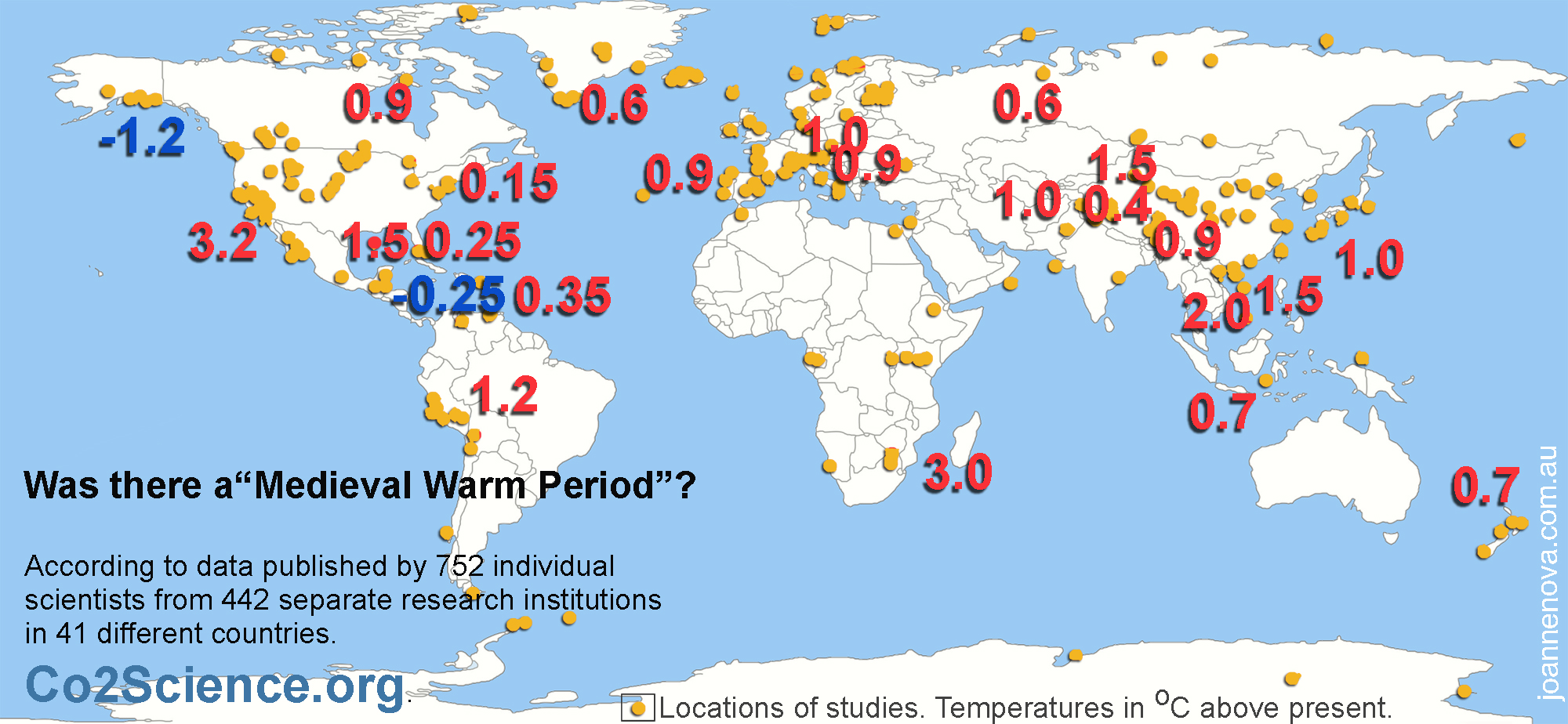
Here we go again. For five or so years believers didn’t really mention the Medieval Warm Period. Too bruised by the embarrassment of Hockey Stick Zombie failures. But it’s an inconvenient era they have to rub out because none of the expert models can explain what caused it, and it’s hard to panic about same temperatures that Edward the Confessor survived with oxen and carts.
And it’s hard to call the modern warmth “man-made” if nature created something just like it 1,000 years ago.
By Michael Collett, ABC, Environmental Copy and Paste Promoter
Climate scientists writing in the journal Nature have found there is no evidence for “globally coherent warm and cold periods” over the past 2,000 years prior to industrialisation.
That’s significant, because climate change deniers have sometimes pointed to epochs like the so-called “Little Ice Age” or “Medieval Warm Period” to argue that the current global warming is one among multiple similar global climate events.
But what the research actually shows is that other “peak warming and cooling events” over the past two millennia appear to have been localised, whereas the human-caused global warming observed over the past 150 years is unparalleled in its global scale (not to mention its absolute temperatures).
Who’s denying a million raw data points?
This new global temperature reconstruction by The Pages Consortium miraculously agrees with the models yet disagrees with hundreds of stalagmites, corals, ice cores, trees, lake sediments, mud from the ocean floor, pollen dust and 6,000 boreholes. It disagrees with the history of peoples like the Vikings. It disagrees with plants that grew and with trees that survived “above the snowline” that shouldn’t. This map shows just some temperature estimates from all around the world during medieval times relative to today.
The latest paper is trying to claim that all these temperatures were not recorded at the same time and that it wasn’t global. But when proxies are combined it’s obvious it was. Even in our modern warm period, there are still warm and cold records being set at the same time. Medieval times were no different. It’s only by collating and combining many proxies that we can see “the average”.
18 proxies tell us the world was the same or warmer 1,000 years ago
Craig Loehle in 2008 used 18 non-tree-ring proxies which included Greenland borehole data, Conroy lake pollen, isotopes from Chesapeake Bay, Sargasso Sea, Caribbean Sea, results from caves in South Africa, the Swiss Alps, Sea Surface reconstructions from Norway, the northern Pacific and the South Atlantic and other proxies too.
Temperatures were higher 1000 years ago, and cooler 300 years ago. We started warming long before cars and powerstations were invented. There’s little correlation with CO2 levels.
Loehle 2008. Note the graph ends in 1935, not 1980.
Here’s what 120 proxies from the Northern Hemisphere tell us
Rosenthal et al 2013 put out quite the zinger of a paper. They’ve reconstructed the temperature of the water flowing out of the Pacific to the Indian Ocean over the last 10,000 years and as deep as 900m. The Indonesian Throughflow is pretty significant in global ocean currents.
Figure 4. Holocene changes in Pacific Ocean heat content measured as it swings past Indonesia on the way to the Indian Ocean. Reconstructed anomalies are calculated relative to the reference period of 1965 to 1970 C
Clearly that water was warmer 1000 years ago than it was circa 1970. It was even warmer again in the Holocene.
UPDATE: This graph shows the ice-core data up until 1855. The last 150 years (1705 to 1855) are highlighted in red to show the warming as the Earth began coming out of the LIA.
6,000 Boreholes show it was global
Just some of the places these boreholes have been dug. They stick a thermometer down a hole, and all over the world there is a pattern that repeats as temperature changes on the surface travel gradually down through the rocks. Sure, the resolution is bare bones. The data is “smoothed”. We can’t use boreholes to know if things were warmer than today and we can’t tell how long ago that big last surge in warmth was, but where boreholes come into their own is in showing us just how global that last big warm spell was.
Boreholes are handy because they assess land areas that have few other proxies.
Below is the latest iteration of a graph that went through a savage evolution from 1997 – 2008. What stayed constant was that boreholes always showed a medieval warm period and a little ice age, that is, except for the time Huang et al “lost” nearly 20,000 years of data.
Huang and Pollack 2008: Their latest boreholes published study
In the graph above, if the assumption about the speed of heat flow is shifted to line up the coolest point with other proxies in 1680 and the warmest point to somewhere around 1000 – 1200 the amplitude would increase (see the jaw dropping 1997 original paper which claimed it was much warmer in medieval times).
These papers are by no means the only important ones. There are so many others…
So go tell the world — everywhere we look the world was hotter and colder in the last 1000 years, the last 10,000 years and the last billion.
h/t George, David B, Original Steve, Peter Fitzroy.
A new Nature paper claims that pauses and cooling phases mean C02 may cause more warming than anyone thought.
Pause Excuse #431
It’s all so obvious. If researchers start with models that don’t work, they can find anything they look for — even abject nonsense which is the complete opposite of what the models predicted.
Holy Simulation! Let’s take this reasoning and run with it — in the unlikely event we actually get relentless rising temperatures, that will imply that the climate sensitivity of CO2 is lower. Can’t see that press release coming…
Nature has sunk so low these days it’s competing with The Onion.
The big problem bugging believers was that global warming paused, which no model predicted, and which remains unexplained still, despite moving goal posts, searching in data that doesn’t exist, and using error bars 17 times larger than the signal. The immutable problem is that energy shalt not be created nor destroyed, so The Pause still matters even years after it stopped pausing. The empty space still shows the models don’t understand the climate — CO2 was supposed to be heating the world, all day, everyday. Quadrillions of Joules have to go somewhere, they can’t just vanish, but models don’t know where they went. If we can’t explain the pause, we can’t explain the cause, and the models can’t predict anything.
In studies like these, the broken model is not a bug, it’s a mandatory requirement — if these models actually worked, it wouldn’t be as easy to produce any and every conclusion that an unskeptical scientist could hope to “be surprised” by.
The true value of this study, if any, is in 100 years time when some psychology PhD student will be able to complete an extra paragraph on the 6th dimensional flexibility of human rationalization and confirmation bias.
Busted climate models can literally prove anything. The more busted they are, the better.
A decade without any global warming is more likely to happen if the climate is more sensitive to carbon dioxide emissions, new research has revealed.
A decade without warming is even more likely to happen if CO2 is irrelevant. Did the experts forget to mention that?
A team of scientists from the University of Exeter and the Centre of Ecology and Hydrology in the UK has conducted pioneering new research into why both surges and slowdowns of warming take place.
Using sophisticated climate models the team, led by PhD student Femke Nijsse, discovered if the climate was more sensitive to CO2 concentration also displayed larger variations of warming over a decade.
When combined with information from simulations without any carbon dioxide increases, the authors were able to assess the natural variability of each climate model.
Thus they calculated the natural variability of an imaginary world.
The research is published this week in Nature Climate Change.
Femke Nijsse, from the University of Exeter, said: “We were surprised to see that even when we took into account that sensitive climate models warm more over the last decades of the 20th century, these sensitive models were still more likely to have short periods of cooling.”
The biggest changes in temperature (“divergence” in dark red brown Fig 6) occurred where the most people lived (blue dots). In the 60 years to 2010 China was reported to have warmed by 0.79 ± 0.10 °C. However Scafetta et al calculate at most, China could have experienced a real warming of only 0.46 ± 0.13 °C.
Somehow the combined might and supercomputers at NOAA, NASA, Hadley and the Bureau of Met experts all missed this.
It’s another third of a degree gone from the Glorious CO2 Narrative. Just like that.
Fig. 6. Map of the divergence (ΔTMin − ΔTMax) between the warmings registered by the minimum and maximum temperature records (CRU TS4) between 1945 and 1954 and 2005–2014. The cyan dots indicate the 200 most populated cities in China according to the Free World City Database. (White regions over India and the ocean indicate missing data).
Is there a more perfect nation to study the Urban Heat Island effect than China?
The worlds most populous nation has made a blistering transformation in two decades. As recently as 1995 the population was 75% rural. Now it’s approaching 60% urban. Shenzhen, which is near Hong Kong, grew from 3000 people in 1950 to more than 10 million in 2010. Around Beijing, thousands of towns have been built in a networked carpet, each a mere 2km apart (zoom in on Google satellite view). The stations in these areas are effectively not rural anymore.
Prof Nicola Scafetta and Shenghui Ouyang wondered how this massive growth affected the temperatures. They discovered the regions that warmed the fastest were also the largest population centers. Proving the warming might be “man-made” but nearly half the warming is due to heated concrete and all the assorted infrastructure and industry around thermometers. That part is not CO2.
There would be more CO2 produced from those population centres too, but we all know that given five minutes CO2 will split for Tahiti or Siberia, or anywhere. In any case, Scaffeta et al compared what the top greenhouse models driven by CO2 predicted. And lo, the models were totally wrong. The CMIP5 set projected that CO2 would warm all of China roughly equally.
The research duo looked at the minima, the maxima, the seasonal and monthly patterns, and in pretty much every case, the warmth follows the same pattern we’d expect if it was caused by human industry. The minimums rose more than the maximums. The biggest warming effect comes in the coolest part of the day and in the coolest half of the year — and it’s a toss up whether China has even warmed at all since 1940. The nights are hotter, but the days are colder than they used to be — inasmuch as anyone has any idea at all what the temperature would really have been.
The Climate models (CMIP5) have barely any ability to predict future maxima and minima…
Fig. 5. (Left) Tmax and (Right) Tmin. The maps show the 2005–2014 mean value minus 1945–1954 mean value. (top) Temperature observations (CRU TS4) and (bottom) full CMIP5 GCM mean ensemble simulation. The maps are centered over China. The hatching represents areas where the signal is smaller than one standard deviation of natural variability (e.g. the value is nearly zero).
…
Compare the models to the measurements:
And notice how hot China was in the daytime in 1940? I don’t see how that can last.
:Fig. 9. [A] CRU TS4 Tmax and Tmin near-surface annual average temperature records. [B] CMIP5 maximum, mean and minimum near-surface annual ensemble average temperature records. Region [112°–120°E:32°–40°N]. The red segments indicate the mean values, T1 and T2, in the 1945–1954 and 2005–2014 decades.
Presumably China in the 1940’s will start cooling soon like most other places in the world have.
The population doubled, doubled, and doubled again
Beijing that increased from 1.7 million in 1950 to 18.4 million in 2015. It grew by about 11 times in 65 years.
ig. 12. [A] Population density in China (2000). Mapping prepared by Beijing City Lab (http://longy.jimdo.com). [B] Urban agglomeration population increase in China from 1950 to 1990, from 1990 to 2015 and the projected population increase between 2015 and 2035. Data from United Nations 2018.
Nicola Scafetta, Shenghui Ouyang: Detection of UHI bias in China climate network using Tmin and Tmax surface temperature divergence. Global and Planetary Change, Volume 181, October 2019, 102989. https://doi.org/10.1016/j.gloplacha.2019.102989
“Climate Apartheid” is just the latest round of Thesaurus-Torture, whereupon people with no clue about anything make up a meaningless buzz-phrase to tell us we are about to lose something we never had.
The Big-Gov-PR-Generator randomly combines climate with any bad word in the dictionary then post hoc rationalizes it to pretend they’ve discovered something. By default they also delete 100,000 years of history. Eons of slavery, genocide and war simply never happened.
Why do we pay a UN Expert to tell us inanities and stoke the fires?
May not survive? The only places in the world with any human rights are the ones with massive emissions of CO2.
The kindest thing we could do for any nation is to help them use their own resources and produce more CO2. It will increase their quality of life more than nearly any other thing we could do bar from making them a protectorate.
In the Handy-guide for Tyrants and Tin pots, surely Step 2 is: tap primal emotions — in this case “fear” and “jealously”
A particularly dire report from the United Nations Human Rights Council has upped the ante in the fight against climate change, warning that a potential “climate apartheid” could fracture the global population, splitting the planet between the wealthy and the rest of the world who will be “left to suffer.”
It combines 100 other dubious studies to produce a new dimension of nonsense:
The report, published on June 25 and written by U.N. human rights and poverty specialist Philip Alston, combines the work of more than 100 other studies and reports. It goes into particular detail about what will happen if there is too great of a reliance on the private sector to combat the changing climate.
And the answer is always “more government”. Because the entire global private sector is just like GoldmanSachs, right?
“Rather than helping the world adapt to climate change, privatizing basic services and social protection may be a form of maladaptation,” Alston wrote in the report. “When hurricane Sandy wreaked havoc in New York in 2012, stranding low-income and vulnerable New Yorkers without access to power and healthcare, the Goldman Sachs headquarters was protected by tens of thousands of its own sandbags and power from its generator.”
The mythical climate-apartheid is coming. Sure. The poor, after all, have always had more ability to withstand the elements and pick nice safe places to live. Presumably rich people got trapped in castles or something, eh?
Alston likened it to a coming “climate apartheid,” where the wealthy are able to mitigate some of the potentially catastrophic effects, such as food insecurity, disease and death, and the poor, “who have contributed the least to emissions and have the least capacity to react, will be the most harmed.”
The answer is to help everyone get rich, not to “get the rich” instead.
It’s all another UN analytical train-wreck — if only we put up enough solar panels and gave the government power over everything, then we’d all be happy together, and have equal incomes? It’s just the Soviet Union on Solar — and we know how that will work out. Same collapse, just faster. Death by double-starvation instead by Gulag. Some “progress”.
The UN report by Philip Alston supports the Paris agreement — paradoxically encapsulating all the most useless, toxic and harmful solutions, destroying wealth, reducing CO2 and, based on the last million years of history, guaranteed to reduce human rights.
James Cook University is poised to appeal against the Federal Court finding that its sacking of physics professor Peter Ridd was unlawful.
JCU’s response was so far from the mark, apparently Justice Vasta is considering whether to refer it to the Federal Court Marshall. Vasta said the statement attributed to Chris Cocklin of JCU was “almost contemptuous”.
The IPA, bless them, filed an FOI to find out how much money was burnt in the quest, and says it’s high time JCU stops:
Gideon Rozner: The details of a freedom of information request lodged by the Institute of Public Affairs with James Cook University and released today reveal the University has already spent at least $630,000 on legal fees in the Dr Peter Ridd case.
“The very fact that an Australian university is willing to force the weight of an entire administration backed by taxpayer funds to stifle an academic’s freedom of speech sends a massive chilling effect to any academic engaging in public debate in Australia,” said IPA Director of Policy, Gideon Rozner.
“James Cook University’s shameful actions prove without doubt there is a crisis of free speech at Australian Universities.
“It is staggering to think that after the Federal Circuit Court ruled on every point in Dr Ridd’s favour, JCU is contemplating an appeal.
“Australian universities receive billions of dollars in taxpayer funding for the purpose of free intellectual inquiry. Now JCU wants to go to a higher court to prove it can shut down the freedom of speech on academic issue by one of its professors. It is outrageous. Taxpayers fund JCU to do education and research, not engage in vexatious litigation against its own staff.
Education Minister Dan Tehan or PM Scott Morrison could fix this in five minutes. All they have to do is tell JCU they’ll get no more grant money until the institute guarantees free speech and shows accountability for the people who flagrantly wasted over half a million dollars.
JCU grant money is better spent elsewhere. All the research they produce is now tainted and effectively worthless– no matter what any Professor says, everyone knows they are not free to criticize other staff, or procedures, or point out flaws. They’re scared to use their email addresses. We’ll never know what any JCU researcher is holding back.
JCU is the text-book example of what happens when government funding strangles science. The people in charge of JCU’s “science” department — deciding what “the consensus will be” are the administrators, not the academics.
This is not a one off. JCU has a pattern of evicting, blackbanning, and ousting people who disagree with the bureaucrats pet fashions (vale, Bob Carter!). In this culture, more funding means more strangling. So just stop.
Part 3 in the hugely popular, politically incorrect, Apollo 11 series from Daily Wire as we count down to the 50th Anniversary.
Enjoy.
I was surprised to hear that Apollo 10 made it to within ten miles of the moon. The lunar module was launched, started descent, then had to stop and return. It was all according to plan, and apparently they were so afraid the astronauts would go that extra ten miles that NASA only “half filled their tank”. They didn’t have enough fuel to do the landing and return.
…
The Youtube direct URL: https://www.youtube.com/watch?v=b9hC1Rc0uC0
______________________________
UPDATE: Stephen sends in another Apollo 11 site — it’s replaying the audio and transcripts for the whole mission in “real time” with a 50 year delay. 240 hours of space-to-ground audio!
All around the world conservative politicians are afraid to campaign against the cost of renewables. So here comes yet another survey showing a huge voter group sits there unrecognized, invisible, waiting for someone to vote for.
In two recent national surveys of American adults, we asked how much more per month, if anything, people would be willing to pay to get their electricity from 100% renewable sources. Nearly half of Americans (47%) reported that they were willing to pay more, while 50% said $0.
It’s a devastating result. Think about the fantasy they were being asked to put a price on — on offer was the mythical golden goose of “100% renewable energy”. It doesn’t exist (unless you count hydroelectricity). Even so, what was that fantastical creature worth? For half of Americans — nothing.
Instead, the Centre for Climate Communication could have put a more realistic price on “100% renewable purity”, and asked how many Americans were willing to pay that exorbitant sum — it might be 1%. Might be less. (Can’t think why the Centre for Climate Change Communications didn’t want to find that out…)
They were expecting so much more:
In our December 2018 Energy in the American Mind report, we found that a bipartisan majority (85%) of American registered voters support requiring electric utilities to transition to renewable energy, even though only 38% think that wind and solar cost less than electricity from coal. This suggests that many Americans may be willing to pay more to get their electricity from renewable sources.
The inconsistencies layer like a supersize lasagne. 63% of Americans know wind and solar costs more than coal. Fully 85% say they want “climate action” — they want to make it law, they know it will cost, and they want someone else to pay for it.
The payment paradox is the same all around the world. People know what they are supposed to say, that renewables are like apple-pie and motherhood and good, good, good. But hardly anyone wants to fork over the cash. But ultimately, if the government legislates a more expensive energy source, someone has to foot the bill. There are two ways to reconcile the divergent figures: one, that bullying keeps people from admitting that they don’t believe to random pollsters that call in the night; or two, that western education has duped the masses into thinking that the government or companies have some magical pot of money that can cover the cost.
Who wants to pay — The young and easily led (Liberal Democrats)
The old, wise and careful are much less willing to pay for weather-changing sorcery.
How telling that the prime deciding factor for “paying up” is politics, not income. (Black-symbols, right, versus green symbols, left).
….
The other predictors are age and education. And given the dime-a-dozen nature of modern degrees, education is partly a proxy for age anyway — there just aren’t that many post-docs in their eighties.
My hypothesis — that climate payments are a meaningless fashion statement — holds up well against the data. Fashion always counts most in youth, and in the inner city, university, left wing arty sector. Everyone wants to be seen to pay, but no one cares if the money really gets there.
Even those willing to pay are not willing to pay much:
The half that were willing to pay for the Golden Climate Goose were offering figures like $1 – $30 per month which is only $12 – $400 annually.
Overall and on average, Americans are willing to pay an additional $16.25 per month for renewable energy. About one in six (17%) say they would pay between $1 and $10 more, while 15% are willing to pay between $11 and $30, and 14% are willing to pay between $31 and $200 more. Among those who are willing to pay at least some amount more per month, the average is $33.72 per month.
Note the misleading average in the first sentence? The average American is absolutely not willing to pay $16 per month extra. Given that 50% want to pay nothing more, and 17% want to pay $1 – $10 per month, that means 67% of Americans are offering to fork out a lot less than ten dollars.
Cling to that fantasy
The Climate Centre says none of this matters anyhow because their own disappointing study is irrelevant:
It is important to note that public willingness to pay more for renewable energy is likely to become less relevant in coming years, because the costs of generating electricity from renewable energy sources have been rapidly declining . Increasingly, Americans will not have to decide if they are willing to pay more for renewable energy. Rather, they will likely be able to pay less for renewable energy. Because nearly half of Americans are already willing to pay more for renewable energy, we expect that consumer demand and positive sentiments will increase as renewable energy prices fall.
If renewables are so competitive why do we need government funded Climate Centres to ask how much extra the punters will pay?
Gustafson, A., Goldberg, M., Rosenthal, S., Kotcher, J., Maibach, E., & Leiserowitz, A. (2019). Who is willing to pay more for renewable energy? Yale University and George Mason University. New Haven, CT: Yale Program on Climate Change Communication.
Indoctrinated ABC copy-writers can’t see anything other than future doom and a chance to advertise the government religion. Figure that the Australian GDP per capita is 13 times larger now than in 1900. We have phones, planes, antibiotics, air-conditioning, satellites, and super computers, yet somehow we wouldn’t cope as well if the drought hit now?
It’s great, for a change, to see the ABC reporting on historic Australian extremes, and the BOM researching our amazing documentary history, shame they miss the bleeding obvious.
By Nikolai Beilharz, ABC Enviro-propaganda Unit.
A reconstruction of the Federation drought has found that if it were to occur again today, its effects would likely be even more devastating in some areas of the country.
The ‘once in a century drought’, which went from 1891 to 1903, caused an ecosystem collapse affecting more than a third of the country. The drought was one of the world’s worst recorded ‘megadroughts’, which at its peak saw much of the country get less than 40 per cent of its annual rainfall, with 1902 the driest year on record.
Isn’t “global warming” meant to increase rainfall?
Panic, Australian rainfall has increased since 1900.
An increase in rain across the year and the nation doesn’t prove droughts will be lower, but it’s surely relevant. Figure how it makes the risk of a long widespread drought worse?
If the ABC represented the taxpayers, they would train staff to ask reasonable questions. Beilharz would have pressed the BOM to mention long term rainfall and drought trends, he would have pointed out that we are vastly better equipped to deal with any climate extreme, and he also would have asked about studies of previous megadroughts. Instead he’s a paid parrot.
[The Vance et al 2014] study of Law Dome Ice cores tells us that droughts are common in Australia, and that there appears to be eight mega-droughts over the last thousand years, including one that lasted a whopping 39 years from 1174- 1212AD. By their reckoning the 12th Century in Australia was a shocker with 80% of it spent in drought conditions. Things weren’t so bad from 1260 – 1860, at least, as far as they can tell. The researchers are convinced theirs is the first millennial-length Australian drought record.
The ABC even reported on the 39 year megadrought at the time. Of course, it didn’t show our climate was worse without “CO2” — it only mattered for water management policies.
One day maybe the ABC and BOM will serve the nation instead of themselves. But not while Big-Government funds them both, and the voters get no accountability. A “tick a box” option on our tax returns would change that — these agencies would need to impress the people instead of the politicians.
Give us a real free market please. Who would buy this propaganda if they had a choice?
REFERENCE
Vance et al, Interdecadal Pacifi c variability and eastern Australian mega-droughts over the last millennium (2014) American Geophysical Union, doi: 10.1002/2014GL062447
For those who want to immerse themselves in the engineering masterpiece of the Apollo 11 mission, Burt Rutan recommends this documentary series. A whole fascinating hour each. Burt Rutan is an aerospace engineer who has designed 46 aircraft, received six honorary doctoral degrees and hundreds of awards. If these documentaries can keep him interested …
Hail the brilliant technical minds that triumphed and the brave men who got there.
Only 12 men have walked on the moon and three out of four still alive are skeptics. Buzz Aldrin is an outspoken skeptic, as are other astronauts Harrison Schmidt, and Charles Duke. So is Australian born Phil Chapman (support crew, Apollo 14) and Walter Cunningham (Apollo 7). Burt Rutan too, of course.
Remember a time when NASA could achieve great things…
Part I: We choose to go to the moon: Hosted by Bill Whittle
Rutan warns that Google or Youtube searches may not find the series. Apparently Bill Whittle is too politically incorrect for them. At this point the Google search works with “Apollo 11: What we saw”. But “Apollo 11 youtube” is a fail — five screens of nothing. Spread the word.
There is information here you won’t hear on the Lamestream.


Recent Comments