A new incendiary blog by Dr. Duane Thresher and Dr. Claudia Kubatzki unleashes on NASA Goddard Institute (one of the two main motherlodes of climate activism), calling for them to be defunded because they are “ignoble”, with “herds of do-gooders”, and “NASA GISS is a monument to bad science that truly should be torn down. Take the money and buy a rocket.”
They are a husband and wife team, both producing peer-reviewed climate papers. He worked at NASA GISS for seven years. Since they came out as skeptics in California, they’ve had to move house. Thanks to Marc Morano for the tip.
His latest post calls on the new NASA head, appointed by Trump, to just turn off the tap, cut the cash:
Everyone assumes climate scientists are noble. Fighting to save the planet. What nonsense. Not even close.
They write about a wave of new money into climate science and the decay of the field:
Enter opportunists, carpetbaggers, the corrupt, the ignoble.
What to do? Stop paying climate scientists. The good ones are so into their science they will work for food, maybe less, maybe even pay to do it. French President Macron has invited the rest to move to France so they will be fine.
Start with defunding NASA GISS where this whole global warming nonsense started. It was started by James Hansen, formerly head of NASA GISS and considered the father of global warming. It was continued by Gavin Schmidt, current head of NASA GISS, anointed by Hansen, and leading climate change warrior scientist/spokesperson.
Thresher is an MIT graduate in electrical engineering, and went on to study Atmospheric Science (climate modeling), has done Antarctic research, got a PhD from Columbia and worked for James Hansen and Gavin Schmidt at NASA GISS. His wife Kubatzki, is a meteorologist, climate modeler, pollen proxy analyst and a a native German. She’s worked at the Potsdam Institute for Climate Impact Research (PIK), Germany.
Being a whistleblower is always risky:
If you think neo-Nazis are bad, try being a global warming skeptic in the Bay Area of California, where we had to move from for our own safety.
Gavin Schmidt “couldn’t make it” in maths so he became a climate scientist
Thresher is scathing of the quality of the talent that flowed in to the field with the sudden influx of money:
And then there are the not qualified who become climate scientists. When the science bureaucrats (if you can’t do real science be a science bureaucrat) decided global warming was the next big thing, there was a huge influx of money, which meant a huge influx of unqualified into climate science since there just weren’t enough qualified and the money HAD to be used. Enter opportunists, carpetbaggers, the corrupt, the ignoble. Physicists and mathematicians who couldn’t make it in their own fields, like James Hansen and Gavin Schmidt (who actually told me one reason he became a climate scientist was because he couldn’t make it in his degree field of mathematics). People who just wanted instant success as fake heroes or showmen rather than doing years of hard slow obscure real science.
This influx into climate science of unqualified [people] also meant they threw out good scientific practices, like not pretending climate models can actually predict climate when they were just invented to study it by experimentation.
Given the save-the-planet nature of the field, the unqualified included herds of do-gooders, particularly women. (Note: Dr. Claudia Kubatzki agrees with this assessment.) They love committees. Protection by the herd. Power without sticking your neck out.
NASA GISS has got nothing to do with space:
[NASA GISS is] a small group over a restaurant (Tom’s Restaurant from the TV comedy Seinfeld!) in New York City, nowhere near any other major NASA facility. Just the dedicated data link to the nearest NASA facility, GSFC in Maryland, is a big expense. GISS is the Goddard Institute for SPACE Studies. If you don’t need a rocket to get to it, it’s not space.
He could have pointed out the irony that NASA GISS uses land based thermometers and ignores the satellites.
We are the most qualified real climatologists to ever come out as global warming skeptics (including even more than Dr. Richard Lindzen and Dr. Judith Curry, although we acknowledge their revolutionary courage). Unlike most scientists counted in the scientific consensus on global warming we are real climate scientists. Our graduate careers included numerous courses in climate and we have done extensive research in climate, including climate modeling and climate proxies (past climates). Doing both is unusual. Not only have we actually used and run climate models but we have actually programmed them and so fully understand their (huge) weaknesses. Unlike many we don’t just ignorantly use the climate proxy data produced by others but we have taken courses and done research on climate proxies and so fully understand their (huge) weaknesses.
The science of managing the weather with power stations and other modern superstitions.
September 20 @ 6:15 pm – 9:00 pm
The Generous Squire, 397 Murray St, Perth city, Western Australia.
Organized by LibertyWorks: $20 or Free-for-members. Includes a beer or wine. Early bird discount of $15 ends tomorrow at midnight. Food for sale.
How to destroy a perfectly good electricity grid in three easy steps
The World is watching Australia. Despite being handicapped with abundant resources, we’ve turned ourselves into an international spectacle with rampant blackouts, flying squads of diesel generators, and the highest electricity prices in the world.
An achievement like this does not come easily.
The grand experiment unfolds around us, as the nation discovers why “free” energy isn’t free, why storage is deceptively expensive, yet baseload is deceptively cheap.
The key question: How much of the warming trend in Australia is due to the switch in the mid 1990s from older slower thermometers to new electronic zippy ones that could record every waft of hot air? How many records today are just noise?
Here’s an example graph from Maryborough where the daily maximum was 1.5C above every thirty minute reading. Ouch — are we writing outliers and noise into our history books and climate data bases?
Add “sampling method” and averaging to your skeptical vocabulary. There will be a lot more discussion on these.
Let’s consider some basic standards in the meteorology world
The Weather Observer’s Handbook 2012 tells us the new electronic sensors are more sensitive than the old mercury thermometers. The author, Stephen Burt, explains that the new electronic sensors can be too sensitive, and will record “minor random temperature fluctuations“. This means they will simply “generate slightly higher maximums and slightly lower minimums” than the older equipment did. Temperatures from new style thermometers must be averaged over longer periods to make them comparable with the older mercury thermometers, and also to “iron out minor stray electrical noise or sensor logger resolution artefacts.” h/t Chris Gillham.
The WMO, the UK Met office and the US all use longer average samples than Australia
The WMO recommend a one minute mean temperature standard be used, which is what the UK uses. In the US though, get this, meteorologists use a five minute average, and further below, Lin and Hubbard suggest it should be 7 minutes not five.
Further complexifying things — I hear the UK may put electronic sensors outside the Stevenson screens, which would make a big difference. Keep that in mind. UPDATED: Now I’m hearing, not so, it was just one photo.
Records, trends, daily ranges — they can all change with the sampling method
Was that really a record? Here’s a case where longer sampling times meant a record was not set on one day in Dodge city:
Weather Observers Handbook. Click to enlarge.
A good example is accorded by the maximum temperature recorded at Dodge City, Kansas during the heatwave which affected the southern and eastern states of America in summer 2011. Dodge City has one of the longest continuous temperature records in the United States, commencing in 1875. The hottest day on its long record stood at 110F (43.3C). On 26 June 2011 the highest 1 minute temperature observed was 111F (43.9C). However the value logged on an ASOS system was not accepted as a new record because ASOS take the maximum temperature as the highest 5 minute running mean, which was 110F. Thus the official high by the US method was 110F, tying rather than exceeding the previous record: by the WMO recommended method the maximum was 111F which would have set a new record.”
Here in Australia, with one second averaging, based on past behaviour, the new “record” could have been even higher, like 113F (45C) — who knows — which might have been measured for just one whole second. That kind of difference, which appears to be momentarily far above most of the data around it, has been entered into our official climate data online.
The Australian Bureau of Meteorology (BOM) responds with “Fast Facts”
Lets compare the Australian method to the US. In the US, researchers publish long papers on, say, the bias that occurs with two different ways of doing 5-minute averaging (more on that extraordinary detail below). The WMO only recommends a one minute average. Prepare yourself for the Australian BOM’s answer about why they don’t even do that (get ready to be surprised). Engineers everywhere may be crying…
The guide recommends that temperatures be integrated over time to smooth out rapid fluctuations. There is more than one method of achieving this. The WMO guidelines do not prescribe which method to take. In its automatic weather stations the Bureau achieves this by using platinum resistance thermometers. These are comparable to mercury in glass thermometers.
Say what? “Comparable” to mercury in glass? That last sentence goes against everything in the WMO guidelines and the handbook. It blithely writes off peer reviewed papers, not to mention engineering-common-sense. Apparently the BOM are claiming a bucket defacto-averaging kinda-in-the-system. Because their electronic sensors are inside the Stevenson screen, there is a sort of averaging — a lag, or a low pass filter — but probably one that changes minute-by-minute with the wind-speed. They also claim that the response-time of the sensor is as long or longer than the changes in the temperature of the air. (Color me unconvinced, where is that data?)
As Jen Marohasy points out, this is far from a declaration that the electronic sensors are averaging temperatures in the same way that the old slow liquid-in-glass ones do. (Did I mention the data….?)
The BOM:
This means that each one second temperature value is not an instantaneous measurement of the air temperature but an average of the previous 40 to 80 seconds. This process is comparable to the observation process of an observer using a “mercury-in-glass” thermometer.
Spot the weasel-word “comparable” (in both paragraphs). Comparable is not equivalent. One and ten are comparable, but they are not equivalent. (Just like one second and sixty seconds, Hmm?) When Ken Stewart looked in detail at the Australian data he found a lot of volatility — in the most extreme case, temperatures fell by almost 3 degrees C in under one minute. In 44 of 100 cases, temperatures changed by more than 0.3C in the following minute. That doesn’t smell like “smoothing” or averaging. Think about what kind of overarching volatility it would take to create a smoothed average that still had that kind of instability.
The bottom line: What we have is 20 years of incomplete raw data that includes random noise recorded from instruments that are nothing like the ones used for about eight of the last ten decades in Australian climate history. Somehow we are supposed to connect that data together?
The Bureau has a budget of $365 million a year, yet it’s looking like they have thrown away the raw detailed data for the last twenty years that might have been useful. What we are left with is — we have to ask — possibly not salvageable?
Where to from here?
The first thing the BOM needs to do is store all the b—– data. Second, it needs to make that public. Then we need to talk about changing the BOM sampling process and getting some averaging done properly. Then we need to set up a search and rescue team to go back through the last twenty years of electronic data and see what they can do. At this point, it would take a group of PhDs years to set up replica stations in many different conditions to gather enough data to be able to kinda “back predict” what the electronic data should have shown had it used a proper averaging method.
A one second wafting hot spike,
Gives a false average temperature hike,
Which for sensors is crude,
And with past records skewed,
Are the methods the B.O.M. like.
–Ruairi
________________
The Nitty Gritty: How temperatures are supposed to be measured
Now we get into some more detail about how different the standards are overseas. We get a better idea of things that muck up the data, so we can all start to appreciate how tricky this is — and perhaps what better management and processes might look like.
Even the US five minute averages are not necessarily good enough
A paper by Lin and Hubbard discusses in extraordinary detail how a systematic bias occur. They have complex graphs showing how different sensors respond to changes in air temperatures at different temperatures, and with different wind speeds. (TX, means maximum temp. TN means minimum.)
Liquid in glass thermometers are fundamentally different from electronic (platinum resistance) thermometers. They are not equivalent:
Although the LIG thermometers in the CRS also is an instantaneous observation for TX and TN the relatively large LIG thermometer’s time constant plays an exclusive role in filtering out high frequency temperatures and exponentially weighted smoothing temperature signals.
The bias (error) can be as large as 0.2°C (and they are talking about 5 min averages):
For the ASOS observations, the ASOS does have a 5- min running average for daily TX and TN, however, the even smaller sensor’s time constant in the ASOS makes its biases systematically significant (0.05–0.2 °C warmer on average TX or cooler on average TN).
Hence they recommend 7-minute averages:
.. “Commonly-used 5 min average was not sufficient for the fast-response thermometers in surface climate networks while the WMO standard thermometer (20 s time constant) should have a 7-min running average for reporting daily maximum and minimum temperatures. The surface temperature sensors with smaller time constant than the standard LIG thermometers must implement a follow-up running average algorithm.”
Calibration alone is not enough to remove this effect:
It should be noted that most of surface temperature calibrations, even highly accurate calibrations, are unable to remove out this type of out-of-phase uncertainties in the TX and TN because the instrument calibrations for climate networks usually are of static calibrations rather than a dynamic calibration process for the electronic surface temperature sensors and the LIG maximum and minimum thermometers…
Is that warm bias bigger than the cool bias?
From the same paper: In the field the maximum temperatures (fig 8) are affected more than the minima (figure 9). Note that they are comparing two different ways to average 5 minute readings, and they still find a difference. They are not looking at the change from one-second to five minutes. That is something entirely different.
Daytime air turbulence intensity usually is stronger than that during nighttime, thus, it is understandable that the TX differences shown in Figure 8 were larger than the TN differences in Figure 9.
Maximum temperature bias from different sampling rates. Lin, Hubbard. Figure 8.
…
Minimum temperature bias from different sampling rates. Lin, Hubbard. Figure 9.
Thermometers circa 1912
The whole point of averaging is so we can compare modern temperatures with ones recorded a hundred years ago. So check out Thermometric Lag (1912) which looks at the response time in different media including air at different wind speeds. The chart comes from a study published by the American Meteorological Society. Basically, if the wind is very still (slow in cm/sec) it takes a lot longer for a thermometer to respond to a change in temperature outside the screen. A thermometer in air may take over 3 minutes to respond on a still day. When wind speed is very fast, the change is more rapid.
Hurricane Irma is a big bad storm, like other big bad storms. Six awkward facts:
It’s only the 7th most intense at landfall in US history.
It formed over water that was two degrees cooler than normal,
1893, 1933, 1950, 1995, and 2005 had more Accumulated Cyclone Energy by Sept 10.
In 1933 two hurricanes hit the US in just 24 hours
In 1893, 1909, 2004 there were three Cat 3+ landfalls in US (blame climate change).
NOAA itself says there’s no evidence anyone can detect that greenhouse gas emissions have an effect on hurricanes.
Not to be stopped by a lack of any scientific connection, climate druids are out in force finding fingerprints in every storm. Like all the great witchdoctors of history, Big Storms are a chance to pump fear and sell their services.
Oscar-winning actor Jennifer Lawrence said Harvey and Irma were signs of “Mother Nature’s rage and wrath” at the US for electing Trump to the presidency and not believing in man-made climate change.
The Tim Flannery-backed Climate Council declared: “Fingerprints of climate change all over Tropical Storm Harvey.”
Council chief executive Amanda McKenzie issued a statement to claim climate change was driving and influencing extreme weather events around the globe. “Climate change is now supercharging extreme weather events including storms, bushfires, heavy rainfall and floods,” she said. “This is occurring in a more energetic climate system, that’s warmer and loaded up with more moisture than ever before.” McKenzie said Harvey was a “window into our future”.
“Hurricanes get their energy from warm ocean waters, and the oceans are warming because of the human-caused buildup of heat-trapping gases in the atmosphere, primarily from the burning of coal, oil and gas. The strongest hurricanes have gotten stronger because of global warming. “
Judith Curry: “In a matter of a few hours, Irma became a major hurricane. The surprising thing about this development into a major hurricane was that it developed over relatively cool waters in the Atlantic – 26.5C — the rule of thumb is 28.5C for a major hurricane (and that threshold has been inching higher in recent years).
We can’t blame 26.5 C temperatures in the mid Atlantic on global warming.
The dynamical situation for Irma was unusually favorable. In particular, the wind shear was very weak.”
NOAA: There is no evidence that there is a human influence on hurricanes.
It is premature to conclude that human activities–and particularly greenhouse gas emissions that cause global warming–have already had a detectable impact on Atlantic hurricane or global tropical cyclone activity. That said, human activities may have already caused changes that are not yet detectable due to the small magnitude of the changes or observational limitations, or are not yet confidently modeled (e.g., aerosol effects on regional climate).
The NOAA team go on to say that maybe by the end of the 21st century man-made climate change will make cyclones 2 -11% more intense. The odds are “likely” or “greater than 66%” as defined by the IPCC, and calculated by climate models that have exaggerated every effect so far in the last 30 years. So, not a wild increase, not spooky, and odds are only “better than even” (yes, they use that phrase).
UPDATE #4: Now Cat 2, crossed the coast, winds 105 mph (165 km/h) and 942 mb. Slowing down, but hurricane force winds are still covering an area 80 miles from the eye. Hurricane Jose is Cat 3, 120 mph, 956 hPa. Moving at 14 mph.
UPDATE #3: Late Sunday night Australia time (Sunday morning US 11AM) Official advisory updates are here.#46 says 130mph, with lowest pressure 933 hPA . Watch news come in on twitter #IRMA. Blackouts across Miami — over 1 million without power. Storm surges. Streets turning into rivers. Waterspouts off the east coast of Florida.
Katrina is listed as 920 and 902 hPa on different wiki pages. (PS: Judging by the map on this post, Camille and Andrew did not hit Florida. Hmm. Wikipedia?)
UPDATE#2: Sunday morning Australia time. Irma now aCat 3, up to a Cat 4 again, savaging Cuba and weakening as it loses moisture being half over land. It is already affecting Florida, with gusts of 50-60 miles per hour, and set to go north right along the western edge of the peninsula (which has caught people off guard, as the eastern edge have boarded up windows in anticipation, but many on the western side did not). In the 12 full hours over the ocean north of Cuba it may well recover a lot of wind speed quickly. Will hit the Keys in 12 hours. Watch the windy.com radar here, or the Ventuski radar and the TropicalTidbits updates here. Weatherbell forecaster Joe Bastardi has a public update with the eye track running along the west edge of Florida. He is expecting it to speed up and hit near Port Charlotte as close to a Cat 5 with 150 mile per hour winds. He predicts it to deepen from 935hPa to 896hPa. Hurricane Jose is following in the wake of Irma and could be a big problem. Watch his public video (top right at his site). He points out the high pressures in the North Atlantic are also helping to drive a bad hurricane season.
UPDATE #1: At least 4 dead in British Virgin Islands. BBC footage shows devastation.This video is by Levi Cohen (TropicalTidbits). h/t to RAH, Tomomason, RobertW and others (great comments, thank you).
Best wishes to the people of Florida, Cuba, the Caribbean.
The tracker here is automatically updating.
Hurrican Irma Forecast
Ryan Maue :No longer any spread or uncertainty about landfall of Hurricane #Irma … this is happening for sure, unfortunately.
Thoughts also to those in Mexico with the Magnitude 8.1 Earthquake hitting the southern coast, and at least 61 dead.
The BOM’s bad luck never seems to end. Of all the 695 stations in Australia, 693 worked perfectly, but Jen Marohasy and Lance Pidgeon happened to live near, or have a personal random connection to the only two stations that didn’t — Thredbo and Goulburn. Apparently these stations had been flawed (not fit for purpose) for 10 years and 14 years, but the BOM world-class experts hadn’t noticed. I expect they were just about to discover the flaws when (how inconsiderately) Lance and Jen announced the errors to the world and the BOM were forced to do this pointless 77 page report to stop people asking questions they couldn’t answer.
The nub of this fracas is that something called an MSI1 hardware card was installed in cold locations even though it would never report a temperature below minus 10.4C. Awkwardly this doesn’t explain why the 10.4C appeared in the live feed, then was automatically changed to -10C in the long term data sets which are used for climate analysis. Does the BOM think the dumb public don’t know the difference between -10 and -10.4? Implicitly — the BOM installed the wrong type of card, and also accidentally had an error flagging system on top of that, that compounded the error by ruling out even the already-flawed -10.4, which may have been even colder. A double flaw, and both non-randomly warming the minima. What are the odds?
And John Frydenberg, Minister of Critters, Plants and Green-stuff believes this? Seriously?
The BOM wants to stop this sort of error being discovered
For me the absolute red-flag, radioactive recommendation is this one where the Panel recommends changing their website in a way that would hide the exact inconsistencies that make this public error detection possible. They want a less complicated BOM reporting system — saying that currently it is possible for different temperatures for the same site/time to be on the Internet in public:
“The Review Panel found that: … the current data flow architecture creates situations where data can be delivered to, and displayed on, the Bureau’s website via multiple pathways and this can be potentially inconsistent and confusing for end users;
Recommendation 6: Future investment in supporting IT systems should, as part of their design and system architecture, streamline and improve efficiency and consistency in data flows.” — page 12 of the PDF.
The review panel didn’t thank the citizen scientists who helped them find an error the experts had missed for years by noticing the inconsistencies in the live and long term data streams. Instead the BOM’s priority is to not get caught again, by rejigging the system to get “consistency”. What matters more: accuracy, error detection, or “consistency”? It depends on whether you are a scientific unit or a PR unit.
The BOM review tries to palm off the citizen scientists who were right, and more careful than them, as “confused”. In this in-house review the million-dollars-a-day BOM proves beyond a doubt that their highest priority is to protect their own jobs, not to collect accurate information about the Australian climate.
Thredbo
Thanks to Bob Fernley-Jones for graphing the data from Thredbo. The maxima in red are at the top. The minima in blue below. In green the data recorded on the new electronic thermometer which was faulty for seven years (which is not even the same faults we are discussing in the review.) Between 1997-2004 the electronic thermometers were rounding temperatures to whole degrees. So much for the 0.2C accuracy. On the minima side, it is obvious to the eye that since electronic thermometers were installed there have been no temperatures below minus 11 (I thought we weren’t supposed to even get below minus 10.4?).
Perhaps this was a climate shift that occurred around the same time the electronic equipment was brought in? Perhaps it wasn’t. Where is the raw side-by-side data of the two year overlap between old and new equipment? There have been a lot of -10.4Cs since the flawed MS1 hardware card was installed in 2007.
Thredbo, maxima, minima, 1966 – 2017. Click to enlarge. | Graph: Bob Fernley-Jones.
I’m not suggesting that a few truncated minima, if that’s all it was, necessarily affect our long term trends. (Though it may affect press releases about cold records). Nor am I suggesting it was deliberate. The bigger issue for me, the reason this matters, is yet again we see what kind of scientific standards and attitude are behind the work the BOM do. Accidents happen, but lack of interest in error detection and correction and the cover-up’s are not unwitting. Do the details of the Australian climate matter to the BOM?
Here’s a few choice picks of BOM fails — the highest temperature ever recorded in their Hallowed ACORN data set occurred in Albany far south WA, but only after adjustments. This basic error quality control error is a flag for who knows how many other unexplained changes, but even this radioactive “hottest day ever recorded in Australia” hasn’t been corrected. (Three years and still counting.) Who cares about good data when it’s only the planet at stake?
The BOM homogenize stations a thousand kilometers apart, they use city stations, bad stations, to adjust the good ones by a mysterious unpublishable process. Their methods generated a thousand days where mimima were absurdly higher than maxima. They adjust temperatures up-down-up on a calendar month with major corrections whipping up and down 2 degrees overnight that defies any kind of meteorological explanation. They introduced a new electronic thermometer system right across Australia in the 1990s which coincides with a jump up in temperatures. They say they carefully calibrate the two systems, but they’ve deleted all the side by side raw data, so who knows? Who will ever know?
The Australian climate data set is possibly beyond recovery — damaged beyond repair. We’re at the point where if Frydenberg and Turnbull won’t do something to serve Australian citizens and the Australian environment we need to set up our own independent stations. Someone needs to collect data that the Australian people can trust. We need thermometers outside the control of the BOM.
The current review is full of “confidence-building” but totally unjustified language:
This includes taking a highly precautionary approach and ensuring any location that has recorded below -5 degrees Celsius in the past has equipment capable of recording down to -25 degrees Celsius.
The previous approach was sloppy, lazy, inept and for years, and would not have been discovered without volunteers. Now they discover the highly precautionary approach?
What kind of “rigorous” control includes not publishing the full methods or data?
Page 12 “The controls around ACORN-SAT are particularly rigorous, requiring a minimum two-year overlap between sites or systems when observing equipment is changed or relocated, or techniques are changed. System changes, and any other events that might have an impact on data records, are documented in the Bureau’s station metadata repository SitesDB, in accordance with WMO requirements.”
Question 1: Is the SITESDB open to the public?
Question 2: Does it contain raw data from the overlap period?
There is so much more to say about this, and the many PR terms in what is supposed to be a scientific reply, but for the moment, why trust the BOM?
Christopher Kremmer, Senior Lecturer in Literary & Narrative Journalism, School of the Arts & Media, UNSW, wants to help you shield yourself from worldviews that you don’t like, so he provides a detailed “how to” list of ways to make sure you filter out, specifically, news.com.
This man lectures in journalism. Instead of teaching journalism students on how to logically outplay and counter arguments and spot the flaws, he’s teaching them to cleanse their feeds lest they be exposed to inconvenient worldviews.
The team that has no evidence and no answers has to find a way to compensate for their intellectual vacuum.
… before I had even typed in my search terms, it was apparent that my options had been narrowed. The news list that the aggregator threw up was dominated by websites whose idea of what constitutes news is very different to my own.
It takes a lot of effort to build an information silo:
One by one, I began blocking offending mastheads, then refreshing the browser to check the progress of my censorship. It takes a while because news websites use multiple addresses to maximise reader access. So with News Corporation, for example, I had to eliminate all their Australian regional mastheads, which provide backdoor access to stories that are often hidden behind the pay walls of their larger publications.
I would love to report that ten minutes of effort produced a remarkable change in the news of my world. But it takes more than that to curate news feeds until they perfectly match your worldview.
“News cleansing” made no difference to the top three stories that day which appeared in exactly the same order as before I tweaked my feeds.
Some of us choose who are we, others “get shaped” accidentally by the news they read:
News doesn’t just report on our world. It shapes it, and it shapes us. So the media choices we make matter. Instagram over Twitter, or The Conversation over The Daily Mail – all determine the horizon and characteristics of the known. Like it or not, we need to take control over who gets to send us news.
You have to feel sorry for those with jellyfish for brains.
If you can’t think for yourself, you’d better filter:
For digital natives, with their proclivity for tailoring their social media news feeds, this is a no-brainer. When I asked my students recently to find stories on a range of topics, most of their sources were stories on Yahoo7 and News Corporation mastheads delivered via Facebook. This stuck me as odd. Why would 18-year old undergrads with strong views on the need for action against climate change be reading The Australian? (sic)
Just let your ideology hang right out there… why would an 18 year old want to read our national masthead?
The answer is that as far as they are concerned they’re not reading The Australian. They’re reading Facebook. Yet much of their “news” reflects the attitudes of an aged generation that likes coal mines. Go figure.
Coal mines are bad, because Christopher Kremmer, polymath, genius is not just a lecturer in journalism, but a climate and energy expert, and he knows the best energy generation mix for Australia. Why don’t we just make him Prime Minister? Heck, King?
That Kremmer-Cleanser trusts Google to micromanage his sources tells you all you need to know.
Please — send your polite thoughts on this to Uni NSW, and add them as comments to The Conversation. Copy your comments (and screencap) and write them here too. We want a record of the censorship of the Guide to Censorship.
Who knew it would cost a lot to change the climate?
It’s crisis time in Australia. Electricity bills have doubled, and the fallout is just starting to feed through to consumers. Not only does electricity cost more, but so will nearly everything else. Large businesses, economists, and miners are warning that Australians will be paying so much more it will push our inflation figures up.
Major packaging and brick makers, supermarkets, soft-drink bottlers and poultry producers said yesterday the bill shock would chip away further at profit margins and could push up consumer prices…
Economists, including National Australia Bank chief economist Alan Oster, warned the power bill shock was expected to show up in national inflation figures as early as next month.
He predicted headline inflation would increase 0.6 per cent for the July-to-September quarter, purely from energy price rises.
Paul McArdle from WattClarity makes the point that for most of the last 16 years our electricity prices didn’t even rise with inflation. In this graph, since the start of the NEM (National Electricity Market) in 1998 the spot price of electricity was about $30 per MWh, barring major drought, carbon tax and the last two years. Currently, prices are $100/MWh.
Why have things “gone seismic” in the last two years? It looks like we’ve reached the tipping point — the tolerance limits of the system. Renewable penetration has been increasing since 2006 or so. The RET (Renewable Energy Target) started in 2001, but has been rising ever since. In the last two years we’ve had the closure of Hazelwood and Port Augusta coal, broken interconnectors in South Australia and Tasmania, had major blackouts, got stung by rising gas prices and the sudden awareness of ‘uncertainty’. The system has lost its buffer — previously if gas prices rose, we had cheap coal to rely on. But with so much intermittent wind and solar power and with the closing of coal power plants we are now unable to escape high gas prices (and that demand is feeding the gas price rise too). It’s positive feedback of the ugly spiral kind. Coal can’t ramp up and down with the coming and going of wind power, only gas or hydro can.
The record electricity prices aren’t just about the percentage of renewables, but the correlation is inescapable. There are no nations with high wind and solar penetration and cheap electricity. Australia is also one of the few advanced nations with no nuclear power generators. The EU interconnected nations get access to a mix which is about 25% nuclear.
The NEM was designed at a time when supply of electricity was reliable, but demand varied. Now both supply and demand are volatile, and traders have more opportunity to game the system.
How much should we pay to slow storms in 2100?
The only point of wind and solar is to change the climate. In Australia, where we are the worlds second largest exporter of coal, so it’s not about “energy independence”. It’s not about pollution either. Our coal generators meet strict standards. It’s not about us being “world leaders” in exporting solar panels or wind turbines, we are buying these from China. The sole reason we destroyed our cheap power base is because we hope the weather will be nicer next century. We are doing this for our unborn great grandchildren, the same people who will be laughing at our primitive climate-alchemy, our bizarre superstition and delusional fixation that we can hold back the tide, stop floods and droughts and windy days.
It’s like a hidden carbon tax on every item that needs to be heated, cooled or moved in Australia.
BlueScope Steel chief executive Paul O’Malley warned the nation was facing an “energy catastrophe”. “If it hits the point where people can’t make money then the industry will start to shut down,” he said.
It was only June when there were expectations of an El Nino coming. But the sea has cooled rapidly since then — much faster than usual — and now NOAA thinks a La Nina is slightly more likely. If so, global temperatures will decline.
Cold water is upwelling across the Eastern Pacific. Sea Surface Temp Anomaly. | Image Sept 6, 2017
I notice that there is also unusually cold water on the surface of the eastern Indian Ocean near West Australia (see below). One spot is 2.5C cooler than normal. I don’t know the significance…
Hoping for the best for everyone affected.Irma is a mega-blender, may set all time record windspeed for Atlantic storm, and on the way to Florida by Sunday. On twitter the hastag: #Irma
Just as man-made climate change usually causes long droughts in hurricanes, this month it causes #&@Hurricanes*$&*! Not just Irma, but Jose as well.
Ryan Maue:Hurricane expert, skeptic, estimates Irma is so fast, it ought to be called a Cat #6. “Simple physical arg for Category 6 at 170-knots (Haiyan) is power or destructiveness is v³ in knots = 2-times v³ at 140-knots.”
In an update Maue predicts 190mph: “Based on near perfect environment for #IrmaHurricane to intensify, expecting a peak of 900 mb central pressure & 190 mph in next 24-36 hrs.”
Radar simulation from NOAA’s flagship hurricane model (HWRF) for Category 5 Hurricane #Irma for next 5-days. pic.twitter.com/MUtYybVjHV
87% of Australians think a dollar a day is too much. But hey, it’s only the planet at stake.
Most Australians don’t want to pay anything more for renewable power.
The survey is still biased. There was no option to pay “less than zero”. How much are you willing to pay to get rid of renewables?
The sad thing is that most Australian’s don’t realize they’re already paying so much more.
For starters, The Australian calculated that the bill for federal renewable subsidies would be $60 billion by 2030. That’s $2500 per Australian. In a house of four, that’s $10k over 20 years or $200 per year. And that’s only the federal subsidies and schemes, it’s not the state schemes, nor the higher cost of electricity. It doesn’t include the cost of losing your job, or the extra money needed to pay bills to cover the rising electricity costs of Coles, Woolworths, Telstra, and every other company that uses electricity to make or store something you want. Someone has to pay for the blackouts, the lost production, and all the diesel generators ready in the sheds across the nation. Meanwhile the local school pays more for electricity, so you pay more in tax or fees, and so on and on for hospitals, movies, insurance, and anything with aluminium or steel in it, on it, or around it.
The latest Newspoll shows that 45% of Australians understand that renewables make electricity expensive while 24% are confused, and 22% believe that you can store spare electricity in a shoebox under the bed for a rainy day.
The latest Newspoll survey highlights the community divide on energy, with 45 per cent of voters expecting an increase in their bills from the shift to renewables while 22 per cent anticipate a decrease and 24 per cent expect no change. In a warning sign to the government, 60 per cent of Coalition voters believe renewables will increase their bills. Only 31 per cent of Labor voters and 31 per cent of Greens voters believe the same.
We live in a democracy. Let’s hold a plebescite: “Should Australians try to fix the weather in 2100?”
A new coal-power station would take seven to eight years to build and could face fierce competition from wind and solar by the time it starts generating, given the steady fall in the cost of producing renewable energy.
The only competition coal faces is in fierce subsidies. Renewables are so uncompetitive the government mandates a “fee” of 9c/kWh for those who don’t buy enough — twice the price that wholesale coal power sells out. Tell me again about fierce competition when there are no subsidies.
The real story here is that past scares claiming that ocean acidification would create reckless fish were most likely an artefact of an inadequate experiment. There are big swings of CO2 and pH in shallow water environments, and the normal day-night cycle turns out to be good for fish. Putting them in a laboratory tank without these daily changes may create fish that behave badly. So ocean acidification is not only natural, but a good and necessary thing.
Chemical changes in the ocean, as a result of climate change, are leading to a more acidic environment, referred to as ‘ocean acidification’ (OA). In a laboratory setting, these changes have been shown to lead to a range of risky behaviours in the affected fish, with some fish unable to flee from their finned foes effectively.
But, when researchers recalibrated experiments to adjust for natural daily changes in concentrations of dissolved carbon dioxide (CO2), the primary chemical driver of OA, they found that the fish were less affected than previously thought.
“Shallow water habitats where reef fish live can experience substantial natural fluctuations in water chemistry throughout the day,” explained senior author Professor Philip Munday, of the ARC Centre of Excellence for Coral Reef Studies (CoralCoE) at James Cook University.
“For example, carbon dioxide levels on coral reefs are often much lower during the day than they are at night.”
Did you know night time was like man-made global warming? Or more correctly — man-made global warming is like night time (only not as severe).
“Our data suggests that these natural daily changes in water chemistry are enough to provide fish with a recovery period, reducing their sensitivity to higher carbon dioxide levels,” said Michael D. Jarrold, lead author of the study and PhD student at James Cook University.
Who could have known that day time is a recovery period from the ravages of night?
Or thinks Jo, wickedly, perhaps fish already have genes for adapting to climate-change, I mean, the 24 hour cycle? Imagine the poor fish that don’t? Like — what a shock — ocean acidification hits at 7pm again, and I can’t deal with it? Four hundred million years of evolution, and “oh my codfish!” here’s another night I’m not prepared for?
The study published today in Scientific Reports, utilised state-of-the-art facilities at James Cook University and at the Australian Institute of Marine Science’s National Sea Simulator (SeaSim) to mimic the natural conditions of a coral reef environment.
“It’s the first time these dynamic natural conditions have been reproduced in a laboratory setting to test their potential influence on the behaviour of coral reef fish,” explained Mr. Jarrold.
Similar dynamic natural conditions were presumably available in most of the worlds reefs. Surely scientists knew there were big pH swings in natural shallow water? Unless I’m reading this wrongly (see the numbers below), it would be remarkable if fish could not cope with a man-made change that takes 100 years and is 150 times smaller than what some fish deal with every day?
At least, to their credit, this team admitted this was better news than past releases.
“We are thrilled about what we’ve found,” he added. “Our results provide a greater level of optimism for reef fish populations in the future.”
What they could have said was that previous researchers were too quick to announce dire results, and scientists forget how adaptable life can be.
From the paper itself — look at how large the variation is naturally:
In shallow reef areas, diel variation in pCO2 can range anywhere from ±50 to 600 µatm around the mean…
“Diel” means a 24 hour cycle and 600 microatmospheres is apparently loosely equivalent to a bit less than 600ppm. If I’m reading that correctly, it would mean that some fish are coping with something like 300 years worth of man-made climate change every night. Did someone say man-made climate change is unprecedented? Only since breakfast, and maybe not that long.
When did scientists learn of the large diurnal variation in pH?
I thought, surely scientists have known about the large day-night swings of pH for a long time, but of the four papers Jarrold cites, only one was published before 2012. (I reported on another different paper in 2012 showing large daily pH variations). So it appears to be a recent discovery that pH shifts so quickly.
Way back in 1995, Kayanne et al found “reef waters exhibited large diurnal changes ranging from 160 to 520 microatmospheres”. So the clues were there, but perhaps researchers didn’t realize how widespread it was.
The day–night shift in Kayanne et al, changes according “to the light intensity”, and I’m reminded of the corn fields of Ohio that start sucking the CO2 out of the sky at sunrise and slow down when the atmospheric CO2 falls each day by lunch time. CO2 then rises back up each night over the cornfields and the cycle begins again. (Chapman 1954).
The real story here is buried between the lines. This is written up as a “new discovery” shows things won’t be so bad for fish with climate change, but the real story is that scientists are just realizing how much water conditions vary on a daily basis and how well adapted fish are to those big natural swings. Past papers issued dire warnings about fish living under stable low pH conditions, but put fish in tanks with low pH and wild swings, and the fish cope much better.
Ask not if your tank is stable enough, but if it varies enough?
Instrument errors, noise, may account for a quarter to one half of our national warming trend in the last century.
When the newspapers run a headline with Sydney hits, say, 44.4 degrees and that number gets engraved in history, who realizes that the extreme heat may have only lasted one second? You might think the maximum temperatures were above 44 for at least ten minutes, but the BOM will write it into the record books even if that heat lasts one second, and if the temperature a minute before was more than a whole degree cooler. We’re writing puffs of jet emissions, car exhaust, or random packets of hot (or cold) air into history books, and comparing these new records with old ones done in slow reacting liquid in glass thermometers. No wonder we are setting records!
In the last twenty years, electronic sensors have replaced most of the old fashioned thermometers. It’s for exactly this reason that we need the side-by-side comparison data that Bill Johnston asked for and which the BOM can’t supply because it is deleting the data – as a matter of routine practice.
Back in 1910, or even 1990, thermometers were not able to record a spike of heat (or cold) that lasted for such a short time. Liquid-in-glass thermometers just can’t react that fast (who remembers waiting with a thermometer under their tongue as a child?)
This is not just about headline grabbing records, but about temperatures recorded every day and used to calculate long term trends. The effect of bringing in newer more sensitive thermometers in the mid nineties could cause a “step up” in maximum temperatures.
Any politician who cares about the climate would order one immediately.
Meteorologists debate whether it should be 5 minute or 7 minute averaging, not 1 second
A paper by Lin & Hubbard in 2008, argued that, even 5 minute averaging was not long enough to avoid some warming bias in maximums (and cooling biases in minima). We don’t have to ask what they would think of one-second “averaging” or sampling rates:
“Commonly-used 5 min average was not sufficient for the fast-response thermometers in surface climate networks while the WMO standard thermometer (20 s time constant) should have a 7-min running average for reporting daily maximum and minimum temperatures. The surface temperature sensors with smaller time constant than the standard LIG [Liquid in glass] thermometers must implement a follow-up running average algorithm.”
The story of strange temperature mismatches appearing
A few months ago, Ken Stewart and others in the independent BOM Audit team (like Lance, Phill, Ian, Chris, Bill, Geoff, Bob and Tony) were watching the various BOM data channels when they noticed strange mismatches. The live update BOM observations page records temperatures every 30 minutes at hundreds of sites across Australia. Sometimes though, the daily maximum temperature would lie far above any of the 30-minute observations. Stewart wrote to the BOM to find out why, and was shocked to hear that the 30 minute data was not the average of the last 10 minutes, or even the last single minute. It was just a random sample of the data the second before.
So Ken asked for the detailed data (and paid for it) so he could graph and see how long the temperature spikes were lasting. But what he found was that readings would sometimes erratically rise and fall, chopping up, down and up, and the spikes — were often outliers, far beyond normal variation. And there was no apparent mechanism to remove these noisy errors either (at least, not on the high side). And normally noise is not so important – it cancels out when numbers are averaged — but when only the highest moment (or the lowest) is recorded, there is no averaging among the Maxes, and nor the Mins — though the cooler extremes are less affected by the spikes and rapid changes that are going on in the hottest part of the day.
Sometimes a temperature two whole degrees above the rest of the readings was being recorded for posterity as the the daily max, which may theoretically be also recorded as the hottest day ever… See these graphs below and be prepared to change the way you think about “record temperatures”.
To find out how often these spikes occur, Ken graphed how fast temperatures changed within one minute of the daily maximum temperature being reached — and fully 44% of all the readings he looked at, the temperature fell more than 0.3C within one minute. In theory these electronic thermometers are supposed accurate to 0.2C, so swings this fast could be due to pockets of warm air coming and going (like a jet turbine) or they could be errors (or both). In 200 cases Ken found five situations where the one minute drop after the peak temperature was reached was 0.6C – 1.5C!
More importantly — the entire 20th century warming trend — as Ken points out — is only 0.9C. If these thermometers are picking up noise spikes as big as two degrees, it’s no wonder the BOM doesn’t put error bars on the century long trends.
There have been no studies published of automatic electronic thermometer probes and the old fashioned liquid in glass thermometers side by side.
Record temperatures, maximum and minimum temperatures, and monthly, seasonal, and annual analyses are based not on daily values but on ONE SECOND VALUES.
The Bureau reports daily maximum and minimum temperatures at Climate Data Online, but also gives a daily summary for each site in more detail on the State summary observations page , and a continuous 72 hour record of 30 minute observations (examples below), issued every 30 minutes, with the page automatically refreshed every 10 minutes, also handily graphed.
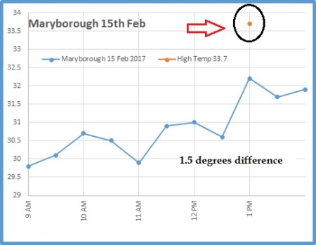
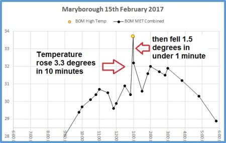
In Maryborough on the fifteenth of February this year the daily maximum was recorded as 1.5C above the highest 30 minute data point.
At Harvey Bay, the temperature was 2.1 C below the reading at 6am.
I sent a query to the Bureau about Hervey Bay, and the explanation from the Bureau’s officer was enlightening:
Firstly, we receive AWS data every minute. There are 3 temperature values:
1. Most recent one second measurement
2. Highest one second measurement (for the previous 60 secs)
3. Lowest one second measurement (for the previous 60 secs)
In Stewart’s words:
The temperature reported each half hour on the station Latest Observations page is the instantaneous temperature at that exact second, in this case 06:00:00, and the High Temp or Low Temp for the day is the highest or lowest one second temperature out of every minute for the whole day so far. There is no filtering or averaging.
The BOM tries to explain why:
The explanation for the large discrepancy was that “Sometimes the initial heating from the sun causes cooler air closer to the ground to mix up to the temperature probe (1.2m above ground).”
However… it can be seen that the wind was south east at 17 km/hr, gusting to 26 km/hr, and had been like that all night, over flat ground at the airport, so an unmixed cooler surface layer mixing up to the probe seems very unlikely.
You will also note that the temperatures in the final second of every half hour period from 12.30 to 6.30 ranged from 25C to 25.5C, yet in some second in the final minute before 6.00 a.m. it was at 23.2C.
How to spot natural versus unnatural temperature changes
In Part 2, How Temperature is “Measured” in Australia Stewart describes what the differences are between natural and unnatural temperature fluctuations, and looks at the noise levels on minima compared to noise levels on maxima.
Not all quick changes are unnatural.
Temperatures can change quite rapidly in a natural setting — for example, as the sun rises over an inland spot (like Urandangi) temperature rise 5.1C in 24 minutes. So that’s a sustained rapid rise of 0.2C a minute. Fast! But we wouldn’t expect to find rises that are faster than that in coastal situations, or ones that happen during the middle of the day. We also wouldn’t expect to find cool changes that come and go in a minute – flip flopping from warm to cold to warm. We know that cold fronts and other changes can come through and drop temperatures rapidly (as Ken describes, like a 1.2C fall over 1 minute in Rockhampton) — but these are step up or step down changes that are sustained after the shift.
What’s not natural are spikes like this in Maryborough where temperatures rise 3 degrees in ten minutes then fall 1.5 degrees in just one minute straight afterwards.
” …rogue outliers are being captured as maxima and minima.”
Doesn’t noise just cancel out and won’t this make minima cooler too?
The errors don’t cancel out — high spikes are recorded as the max of the day. The noise that trends downwards (and is cooler) during the hot part of the day is not recorded in the long term climate records. (As is hot noise during the coolest part of the day). As Stewart points out during the warm part of the day “only the highest upwards spike, with or without positive error, is reported. Negative error can never balance any positive error.”
Stewart analyzed both the hot and cold parts of the day and found that there is a lot more variation during the hot part of the day. As well, the Bureau was caught clipping low side “noise” (and even low side real measurements) at Goulburn and Thredbo a couple of months ago. They have not answered questions about when this clipping started, and which stations it applies to. They are doing an inhouse review instead.
Ironically, because there will be a smaller cooling effect, as well as the larger warming one, it will mean the DTR (Diurnal Temperature Range) will be increased. This is not what the CO2 modelers are looking for. They expect CO2 to shrink that diurnal range by keeping the heat in at night and bringing up the minima.
Instrument errors may account for a quarter to one half of our national warming trend in the last century:
There is some ambiguity about the error margins of the electronic AWS sensors, is it +/- 0.2 or +/- 0.5? In 2011, the BOM mentioned that 10% of electronic thermometers are functioning outside the +/- 0.2 range that is more than 50 probes in the network.
Stewart concludes that because these one-minute differences are so common he thinks it’s likely nearly half of the high temperatures recorded may be 0.2C too high, saying that “Instrument error may account for between 22% and 55% of the national trend for maxima.”
Stewart has a wish list of things that need fixing which include replacing automatic electronic sensors at at least 50 sites. Obviously the Australian BOM should not be using one-second samples but something more like ten minute averaging. He wants the BOM to show error bars on all it’s long term trend calculations. He wants the BOM to redo their filters so they can identify their spurious spikes.
I naively thought that the ‘raw data’ was mostly good data. But now I am even sceptical of this.
As someone who values data above most else – this is a stomach-churning revelation.
Indeed, it could be that the last 20-years of temperature recordings by the Bureau will be found not fit for purpose, and will eventually need to be discarded.
Just yesterday I wrote a rather long letter to Craig Kelly MP detailing these and other concerns. That letter can be downloaded here: TMinIssues-JenMarohasy-20170831
Corals first appeared 540 million years ago, but having made it through supervolcanoes, mass extinctions, and an asteroid impact equivalent to 10 billion Hiroshima A-bombs, it’s now likely they will be wiped out because a trace gas has risen from 20% up to 25% of levels common for half of the last 300 million years.
Source: www.geocraft, Scotese and Berner 2001
Having made it through the volatile last 65 million years, and multiple ice ages where the oceans rose and fell by as much as 125m repeatedly, it will be tragic if the current man-made warming phase wipes them out. According to one thousand tide gauges the worlds oceans are relentlessly rising by 1mm every year. While corals coped with the last 125,000mm of sea level rise, it’s not clear they will still be around if it rises another 20mm.
Current climate change marked in
The team of 22 researchers admit “there is still a lot to understand about corals,” and “there are major knowledge gaps”. But despite not knowing much, the experts on marine ecosystems advise that “our only real chance for their survival” is to control the global climate.
While they don’t actually predict the exact year the world will be coral-free, they do say “The time to act is now, as the window of opportunity to save coral reefs is rapidly closing…”
Looks like that’s it for 542 million years of the evolution of corals. Pfft. A world without coral?
The cost of Going Green, The Australian, Cover, September 1, 2017.
The Australian calculates the total bill will be in the order of $60b for green electricity.
It’s not like we could have done something better with that.
Read it all (if you can), then write to your MP and Senator. Ask why — if they are serious about helping reduce CO2 — we don’t have a USC coal plant like so many other countries, and why we don’t have nuclear power. Then ask why, if they are concerned about the poor, about health, about education, we are wasting $60b dollars to try to change the weather in 2100 that we could be spending on these critical areas right now?
Taxpayers will have paid more than $60 billion through federal renewable energy subsidies by 2030, about twice what the crumbling car industry received over 15 years and enough to build about 10 large nuclear reactors.
The government’s large and small-scale renewable energy targets, which will compel energy retailers to buy 33 terawatt hours of wind, solar and hydro energy by 2030, will deliver about $45bn of subsidies to renewable energy producers over 20 years, according to analysis by The Australian.
If it’s improving and getting cheap, whatever you do, don’t buy it yet:
It’s hard to argue with ACIL Allen Consulting chief executive Paul Hyslop:
“Solar costs have probably fallen 75 to 80 per cent in the last six or seven years,” Mr Hyslop told the energy and environment committee. “If we had not done anything seven years ago and today we then did all those things, we could have … two to three times as much solar (energy generation) in roofs for the same amount of investment over that period.
“If you think that the cost of renewables and low-emission technology is falling rapidly, absolutely put it off for as long as possible.”
Economist Geoffrey Carmody, a founder of Deloitte Access Economics:
“If we sweep nuclear energy off the table in favour of renewables, achieving these three conflicting objectives with one instrument — renewable energy — is numerical nonsense,” Mr Carmody said.
Australia is the only G20 country to have banned nuclear power.
Read it all….
PS: USC = Ultra super critical coal. Hot burning generators are so much more efficient. They cut emissions but without the pain of intermittent unreliable generators. Japan, China, India have lots of them.
If we started planning one now we might catch up in the advanced technology stakes with Indonesia.
Malcolm Turnbull cannot afford to fiddle around any longer before tackling Australia’s energy crisis. Handled well, the issue would be an election winner for the Coalition…
That [the $60b] is twice what our crumbling car industry received in the 15 years to 2012. It would build 10 large nuclear reactors, an option long dismissed by politicians as too expensive. Present policies provide an exorbitant taxpayer-funded windfall for renewable energy producers for little if any public benefit. However inefficient, car industry subsidies protected about 40,000 jobs. By comparison, 39 renewable energy projects under construction or being completed this year have created 4400 jobs, according to the Clean Energy Council.
We allowed a free market in gas, but didn’t allow one in coal generation.
If we had true free markets, we wouldn’t worry about high gas prices. We’d just profit from the high priced gas sales, and get cheap electricity from coal. We wouldn’t need so much gas if we didn’t have so many intermittent wind generators.
Malcolm Turnbull has seized on energy spokesman Mark Butler’s admission that Labor was warned that customers would be hit with higher energy prices from the gas exports it authorised in government five years ago, blaming the Gillard government for the spike in gas prices which has seen energy bills rise dramatically.
Mr Turnbull said the Gillard government had made a “reckless” decision in allowing gas to be exported from the east coast of Australia without putting in any protection for Australian families, households and businesses.
The coalition is taking the wrong tack. Real free markets produce better cheaper outcomes. The problem is the regulations in the electricity market.
How many people have died prematurely because they swapped their fats for carbohydrates?
More fat meant less death (left). More carbs (right) meant the opposite (at least above 60%). (Click to see the full table of Figure 1 results).
New research published in the Lancet shows that low fat diets could increase your risk of death.
Specifically, those who are in the top fifth of carbohydrate-eaters are also about 28% more likely to die than the fifth eating the lowest amount. This is a correlation (only), but the PURE* study was tracking the thing that matters most — all-cause mortality — and they followed the diets of 135,000 people in 18 countries for 5 – 9 years. Loosely, if people avoided high carbohydrate diets, they were less likely to die.
The graph flattens off below “60% carbs” (that’s a percentage of total calories). However, the mortality numbers keep improving for the highest fat intakes which rather skewers 40 years of headlines. I’m guessing that some people who kept carbs below 60% ate more protein instead, which, judging by the “fat” graph, wasn’t as useful.
The McMaster University team announced this quiet bomb, slightly obscured, in a press release about three papers at once under a tame headline, “Moderate consumption of fats, carbohydrates best for health, international study shows.”
Read carefully:
…higher fat consumption was associated with lower mortality; this was seen for all major types of fats (saturated fats, polyunsaturated fats and mono unsaturated fats), with saturated fats being associated with lower stroke risk.
So saturated fats might reduce strokes?
Total fat and individual types of fat were not associated with risk of heart attacks or death due to cardiovascular disease.
This is not the dietary approach that 97% of experts and officials recommend.
The current government consensus, backed by thousands of scientists and doctors, and running for decades, tells people to limit fat and eat a high grain diet (which means carbohydrates). See the US Dietary Guidelines.
The message has generally been to “limit fat”, be careful with protein, and fill up all the empty spaces with carbs.
The current US Food guidelines puts a big emphasis on grains (carbs).
Guideline 2 recommends “Milk, yoghurt, cheese and/or their alternatives, mostly reduced fat“. Guideline 3 tells us to Limit intake of foods containing saturated fat,…
Australian experts remark that “Low fat diets are not suitable for children under the age of 2 years.” They don’t say that low fat diets may increase the risk of death in people over 2.
Grains make up the largest part of the food plate in Australian Government Recommendations. | Click to enlarge
The news that fat is no demon, will come as no surprise to people who have been looking at medical papers, internet forums, and some popular diet books for the last twenty years. (Though notably, the percentages assessed in the PURE study are not remotely “keto” levels of low carb which are in the 5% carb range and 75% fat as per the Atkins, or Keto-style diets.)
Presumably the mainstream consensus and recommendations will shift in the next 5 – 10 years to soften up on the anti-fat dogma, and start to warn people that just making your bread wholemeal doesn’t neutralize the carbs and turn it into a superfood. When will food pyramids and guiding-plates drop the non-essential “essential grains” meme?
In the meantime, the people who obediently follow the official experts can be sure that “consensus” is self correcting eventually — but the process can still be deadly.
For those who want the gritty details, the lowest quintile of carbohydrate intake ate about 46% or less of their calories from carbohydrates. The highest quintile — 77% or more. So most people won’t have a clue, (or an inclination) but if you do, there is good software available online to estimate these numbers (and a lot more). It’s easier than you think.
On saturated fats, the researchers write that things are complicated, but we appear to need some small base level:
Collectively, the available data do not support the recommendation to limit saturated fatty acids to less than 10% of intake and that a very low intake (ie, below about 7% of energy) might even be harmful.
Sat-fats might not be so bad, but at 10% of daily intake we are only talking of 20 grams a day in a 2000 calorie diet. It’s still not a lot.
On monounsaturated fats, the finding is consistent across many big studies:
We found an inverse association between monounsaturated fatty acid intake and total mortality. Consistent with our findings, two large cohort studies of the Health Professionals Follow up and the Nurses’ Health Study showed lower total mortality by higher monounsaturated fatty acid intake.46
Monounsaturated fats means olives, avocados and some nuts.
And of course things can be confounded by the fact that carbs are cheap, cheap, cheap, and maybe some people who are eating lots of carbs just don’t have the money to afford the more expensive fats and especially proteins. (Though they did adjust for income, education, wealth, etc to try to consider that).
Finally, at least they do recommend that the consensus shifts, and it’s worth mentioning that they refer to other enormous separate studies (Health Professionals Follow up and the Nurses’ Health Study) as well as some randomized trials:
Global dietary guidelines should be reconsidered in light of the consistency of findings from the present study, with the conclusions from meta-analyses of other observational studies and the results of recent randomised controlled trials.
This is a good sign. Fifteen Ivy league professors have offered advice and a warning to students everywhere –to recapture the spirit of truthseeking and free debate. The message might just catch on, because although the young strive to conform to fashionable norms, approximately none of them want to be seen doing so. Who wants to be a the weak minded conformist?
The real bigots are those who fear open-minded enquiry…
It’s sad that it needs to be said, but we don’t train children to question fashionable truths and always look at both sides.
Our advice can be distilled to three words:
Think for yourself.
Now, that might sound easy. But you will find—as you may have discovered already in high school—that thinking for yourself can be a challenge. It always demands self-discipline and these days can require courage.
In today’s climate, it’s all-too-easy to allow your views and outlook to be shaped by dominant opinion on your campus or in the broader academic culture. The danger any student—or faculty member—faces today is falling into the vice of conformism, yielding to groupthink.
It is great to see them stepping into the fray:
Thinking for yourself means questioning dominant ideas even when others insist on their being treated as unquestionable. It means deciding what one believes not by conforming to fashionable opinions, but by taking the trouble to learn and honestly consider the strongest arguments to be advanced on both or all sides of questions—including arguments for positions that others revile and want to stigmatize and against positions others seek to immunize from critical scrutiny.
The love of truth and the desire to attain it should motivate you to think for yourself.
They are calling out the namecallers who have distorted the meaning of the word “bigot” and use it to shut down questions:
Merriam-Webster’s first definition of the word “bigot” is a person “who is obstinately or intolerantly devoted to his or her own opinions and prejudices.” The only people who need fear open-minded inquiry and robust debate are the actual bigots,…
“These views should probably come with a trigger warning on Ivy League campuses, but are likely to be celebrated by parental check-writers from sea to shining sea.”
It’s a very well written article: Bonackers vs. Big Wind by Robert Bryce. h/t Andrew. The good news is that opponents of wind power are having a lot of success onshore. The bad news is that the renewables industry is pushing offshore instead, but fishermen don’t want them either, and families that have been fishing the same areas for 300 years are up in arms.
“The South Fork fishermen are fighting to preserve their access to some of the most productive fisheries in the world.”
Some eye-opening numbers:
Obama set a target of 10GW of offshore wind power by 2020. But right now there is only 30 MW. It’s 9,970MW short. The offshore push is on.
To replace a single nuclear generator will take 45 offshore wind plants.
Offshore generation costs as much as three times what gas power costs per KWh.
They face big money renewables proponents — not just rich beachfront homeowners, but large corporations who want tax credits worth millions, and groups like Norwegian oil giant Statoil ASA, plus the Sierra Club and Natural Resources Defense Council (NRDC). Governor Andrew Cuomo has a goal of “producing 50 percent of the state’s electricity from renewables by 2030.” But to do it, bills will go up for the poor.
The backlash on land:
“The backlash against Big Wind is evident in the numbers: since 2015, about 160 government entities, from Maine to California, have rejected or restricted wind projects. One recent example: on May 2, voters in three Michigan counties went to the polls to vote on wind-related ballot initiatives. Big Wind lost on every initiative.
An analysis of media stories shows that, over the past decade or so, about 40 New York communities have shot down or curbed wind projects.”
Onshore wind is becoming unviable due to opposition. So New York Governor wants it offshore. But fishermen don’t want wind power either.
“Alex. Beckwith traces his family’s roots in the region back more than 300 years. “I’m totally opposed” to the wind project, he said. “It’s going to be a hazard to navigation.”
Expanding offshore wind to the 2.4 gigawatts that Cuomo has pledged will require covering about 300 square miles of offshore territory with turbines.
… fishermen are facing “permanent denial” of their labor in the areas in and around the proposed projects. “We can’t go anywhere else,” she tells me. Asked about the politics of offshore wind, Paul Farnham, who owns the Montauk Fish Dock, which packs fish for shipment and sale (on consignment) to the New Fulton Fish Market at Hunts Point in the Bronx, replies: “I’ll guarantee you, 90 percent or more of all these fishermen voted for Trump. It wasn’t because they liked him. It was because they wanted less regulation.”


Recent Comments