|
|
The Art of Lying by Omission
Back in the old days, when scientists had standards, they would never get excited over one hot year and certainly not over one meaningless hundredth of a degree.
The NOAA and NASA spinmeisters are parsing their press releases carefully, using vagueness to speak in half-truth-tongues. They utter no outright lie, yet misinform the crowd with lies by omission.
NOAA and NASA don’t say their models still don’t work, that the world was supposed to be a lot warmer and the “pause” continues. Nor do they admit that it has been warmer before many times in history. They don’t say the warming trend started long before we pumped out CO2. They don’t mention how tiny the “record” is, so tiny it could, and probably will, disappear with the next man-made adjustment. They don’t mention that the record depends entirely on which dataset you pick, and better instruments, satellites, show it wasn’t a record. NASA may launch satellites, but they prefer a thermometer in a carpark or beside a runway for measuring temperatures.
 All major global datasets, up to date. The pause is clear enough. The lower two lines are from satellites. Jan 2015 | Graph, Dr David Evans. They don’t mention how much hotter it was than the last record. That’s because it looks very uncool — scientifically speaking — to get excited over two hundredths of a degree, when the error bars are 500% bigger. It’s called “noise”, in real scientific publications.
Get a grip on how much a few hundredths of a degree matters in this graph. “Get excited”.
 Panic! \
Image created by Robert A. Rohde / Global Warming Art If it was the hottest in 130 years, who cares? It was hotter 7,000 years ago, hotter 120,000 years ago, and hotter for most of the history of life on Earth. It doesn’t mean CO2 caused the last hot spell. It doesn’t mean warming is bad. It doesn’t mean it will continue to warm. And it doesn’t mean we understand what drives the climate.
But it does mean some people who want to seem-scientific want more of your money.
The Vaguest Scientists in the world
While NOAA and NASA declare that “… 2014 temperatures continue the planet’s long-term warming trend…”
If they had wanted to they could have said the opposite and it would be true too. It’s a fact that we’ve been in a long term cooling trend since human civilization developed. In this case the not-to-long term trend they refer to is 135 years long, but it has been running for 300 years. They don’t mention that either. It is equally true to say “2014 temperatures continue a warming trend that started circa 1700”. There were no coal fired power stations until 1882. Coal power is so dangerous that it causes heating 200 years before it starts producing carbon (sic).
The El Nino Spin
NOAA and NASA are pointing out that ” 2014’s record warmth occurred during an El Niño-neutral year.” What they don’t say is that this is exactly what we would expect for an object that started off warm and continued to stay warm. The world has been in pretty much the same warm zone for 16 – 25 years (depending on how you measure it). In other words, El Nino-in, El-nino-out — we don’t need to add much more energy, in the big-scheme, to raise it by a hundredth of a degree.
But if I were a marketing and promotions agent, and not interested in science, I would make a big deal out of the non-el-nino which didn’t happen and doesn’t matter.
NASA wants your money
Here’s the line early in the press release which is the real point of the story:
“NASA is at the forefront of the scientific investigation of the dynamics of the Earth’s climate on a global scale,” said John Grunsfeld, associate administrator for the Science Mission Directorate at NASA Headquarters in Washington. “The observed long-term warming trend and the ranking of 2014 as the warmest year on record reinforces the importance for NASA to study Earth as a complete system, and particularly to understand the role and impacts of human activity.”
Who cares about accuracy or serving the public. The only decimal places that matter to these NASA scientists are the ones on the numerous grant cheques.
Gavin Schmidt knows that it is naughty to make a fuss over one hot year:
Keep reading →
9 out of 10 based on 136 ratings
What really happened in 1878?
The raw data at Nobby’s near Newcastle (graphed below) shows monster heat in 1878, 1879, and 1883 — far hotter than modern times. Its unlikely that it was recorded with modern equipment, so it’s hard to compare. Was it really hotter? We don’t know when the Stevenson screen was installed. I went hunting through our wonderful historic Trove archive of old newspaper records. It doesn’t help us make any accurate comparisons, or even tell us about annual averages, but there is a remarkable story of exceptional heat and dryness in January 1877 that few Australians know. Let’s revisit the times of forgotten people who lived when CO2 was perfect and the climate was ideal.
How hot were the 1800s in Australia? My favorite quote is about the miners near Braidwood (in the mountains between Canberra and the coast). It reached 108F but look at the cultural norms:
“Years ago in the valley the miners always ‘knocked off’ if the thermometer registered 112 degrees (44.4C) in the shade, but times and wages are changed now, and the poor men are willing, to work on days like last Friday 18.1.78″ (see the Freeman’s Journal link below for the full quote).
Piecing together the quotes I found below, it looks like an El Nino probably formed in 1877, which caused a widespread drought right across Australia. Rivers all over NSW were running dry, and so presumably was the soil, which may explain the heat. When soils are dry they gain heat faster because there is less evaporative cooling, and less humidity in the air. Wetter soils limit the heat gains. January 1878 was described as “intensely hot” in many places, with temperatures recorded “in the shade” at Walgett of 120F, Coonamble, 113F, Sydney 114F and at Hay 117F. Later in January it reach 119 at Gunndah, and 129F at Coonamble.
The rivers of NSW were empty: At Lachlan ” the water-supply has given out and residents are reduced to great straits”. The Namoi River also dried up. And the ” upper part of the Moruya River, is completely dried up in some places — in other parts it consists of a chain of ponds.”
 …. Jan 5 1878
WALGETT, Thursday. . The weather to-day is intensely hot, and water is very scarce. The river is drying up fast, and stock are dying. There is no appearance of rain. Tho temperature in the shade to-day was 120.
COONAMBLE, Thursday. The thermometer’s average for six weeks has been 102 in the shade. To-day it registers 113. There are no signs of rain. The grass which sprang since last thunderstorms has been quite burned up. There were no stock passings to report.
GRAFTON, Friday. The weather is intensely hot.
The Riverine Grazier (Hay, NSW : 1873 – 1954)
Saturday 12 January 1878
“The heat is now the current topic at Hay. Business, where not entirely suspended, receives very little attention. Scarcely a soul is to be seen in the streets; and even in the stores, those who are not enjoying the cool of the cellar, may be found lolling on the counters, talking about the weather, and occasionally scrutinizing the thermometer. On Thursday the glass indicated 117 degrees of heat in the fair shade, on a wall on which the sun never shines at noon ; in the sun the glass indicated 154 degrees. We know of one case in which a gentle man fainted in the shade, and we fear that next week will bring its records of sunstroke. On the Lachlan, the Darling, amid the Billabong, the water-supply has given out and residents are reduced to great straits. At Hay, fortunately, there is no fear of failure in this direction, but a few more days of this weather will certainly lead to a serious exodus to cooler latitudes.
The SMH 21 Jan 1878
“The weather has of late been somewhat,warm, in fact on Tuesday last I may say it was hot, considering the thermometer stood 114 in the shade. A southerly-burster set in about 10 o’clock at night, but the houses of our citizens were so intensely heated that even this wind did not cool them, and consequently but little sleep could be obtained during that night. Wednesday and Thursday were moderately cool, but today, we have had another scorcher. A gentleman informs me that had never experienced the ‘heat so much as he did in Sydney, on Tuesday, but even that extreme was surpassed in Maitland to-day, where the heat was far greater. We have at Newcastle, “nearly at all times, a breeze from the sea, which our northern friends are deprived of.
Gunnedah. — Friday. “The weather is excessively hot, and the thermometer registered 119 in the shade to-day. The Namoi River has dried up, and there is no water suitable for drinking purposes. A meeting has been held for the purpose, of’ sinking wells on the river bank, to obtain water for the inhabitants. Coonamble, — Friday. — The thermometer to-day was 129- in the shade. The birds are dying in hundreds. There is no sign of rain.
Freeman’s Journal (Sydney, NSW : 1850 – 1932) Saturday 26 January 1878
Keep reading →
9.4 out of 10 based on 99 ratings
Skeptics, and particularly Nils-Axel Mörner have been saying that sea level rise, as recorded by tide gauges has been much slower than widely advertised. They’ve also pointed out how the rates of sea-level rise have either stayed the same or slowed down. There’s been no sign of the acceleration needed for the wildly speculative hypothesis that your SUV, and China’s coal plants are warming the ocean.
This week a new Nature paper (Hay et al) shows the skeptics were right — but did that view make it to any news broadcast?
Watch the sea-level scare mutate
Even in The Australian the spin from the propaganda machine gets a running, and the previous slow rise is used to pump the scare that the modern “acceleration” is even scarier. What the Australian (and selected sea level “experts”) don’t mention is that the tide-gauges don’t show any acceleration, and nor did the raw recordings from satellites. The 3mm rising sea claims apparently come from satellites that were calibrated to one subsiding tide gauge in Hong Kong.
It’s cherry picking par excellence. We might finally accept tide gauges up to 1990, but after that the tide gauges don’t count — bring in the “adjusted” satellites.
[The Australian] SEA levels increased at a slower rate last century than previously thought, according to new research.
A fresh analysis of tide-gauge records, published in the journal Nature, found that the sea level rose by 1.2mm a year from 1901 to 1990, compared with earlier estimates of between 1.6mm and 1.9mm a year.
Researchers said this meant the acceleration in sea-level rise to 3mm a year over the past two decades was greater than previously thought.
Keep reading →
9 out of 10 based on 77 ratings
Sometime around 2007 or 2008 the sun’s magnetic field should’ve become more active again as part of the cycle it had been roughly following for at least 80 years. Instead it fell. The current solar cycle is not like all the other ones…
David Archibald has drawn my attention to the Ap Index and just how remarkably different the current solar cycle is. He also points out that solar physicists were cranking out predictions about this cycle during the last cycle, but now hardly anyone wants to stake a claim on what the sun will do in the next cycle.

Ap Index 1932 – 2014 | Click to enlarge
From David Archibald
The Ap Index is a measure of geomagnetic activity from eight stations around the planet and reflects disturbances in the horizontal component of the Earth’s magnetic field. Activity for the current solar cycle has peaked at about the floor activity for the prior solar cycles back to early 1930s.
David Archibald writes that solar physicists have hit a quiet cycle too.
“The solar physics community has gone very quiet. There are almost no predictions of Solar Cycle 25 maximum.
At this stage during 23, there were more than 50 predictions of cycle 24
Either people have given up on their models or there is too much reputational risk.
Keep reading →
9 out of 10 based on 89 ratings
In a followup to the post If the BOM was incompetent, the ABC would be the last to find out, Ken Stewart has a reply from the BOM.
The news story run by the ABC said the current Queensland drought was the worst in 80 years. When Ken pointed out that the BOM’s own graphs showed that the drought in 2003 was even worse, and the conditions were not that unusual, the ABC effectively said they were parroting BOM statements which, ahem, is all any public broadcaster could be expected to do, right? It’s not like we pay the 1.1 billion-dollar-ABC to ask our bureaucrats hard questions, is it?
Ken wrote to the BOM, who have now replied, and he’s posted it: “How not to admit a mistake”. The BOM blandly point him at their official drought statement which contradicts what their spokesman said:
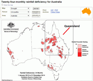
The current drought in Queensland is comparable to the 2002–2003 drought, which was perhaps more severe in terms of rainfall deficiencies that occurred at times over a very large area. Historical data shows that the current drought is perhaps a one in ten or twenty year event over a significant part of inland eastern Australia (see for example the 24-month deciles map for 2013–2014), but very severe in some places. For example, some location in central Queensland the present deficiencies are the most severe on record, and in addition have been accompanied by record high temperatures. See: 24-month maximum temperature deciles map for 2013–2014.
So both the ABC and the BOM are palming off responsibility for misinformation being broadcast to the public. Neither are quoting the news story, but cite other documents which were not part of the broadcast, as if the invisible caveats makes this OK.
Ken has some questions for the BOM:
I will email them again asking for a specific reply, preferably Yes or No, to the questions:
Was Mr Jeff Sabburg correct in saying “In terms of rainfall deficiencies the comparison is we haven’t seen this across Queensland at least since the 1927- 1929 depression drought”?
Was Mr Sabburg correct in saying “37.3% of the state was covered by the lowest rainfall on record”?
If the answer to either of these is “No”, will the Bureau immediately issue a correction in a media release?
I would like to know if the BOM is concerned that the ABC has misinformed the public about a climate factor. Is it part of the BOM charter that it provides accurate information to the Australian public? For all the farmers who are making major life and investment decisions based on BOM information and news of fictitious “drought trends”, will the BOM be compensating those who suffer financially?
Will the ABC?
9.7 out of 10 based on 91 ratings
Get ready for the startling news that Australians have been great corporate “green” citizens — on a per capita basis, all of us are so much more carbon-efficient (sic) than we were 25 years ago. Back then, in those dark days, people frivolously heated and cooled their homes without a thought to how many sinful cyclones they were creating in the Philippines. They drove recklessly in fossil fueled cars, and windmills were used to pump water a mere 10 metres, not to stop floods in Pakistan.
The amazing thing is that Australia’s population has grown by a whopping 38% since 1990. And our emission have grown with that, but the emissions per person has declined by 28% per person. Why aren’t the Greens more excited?
As with all these statistics, watch the pea for the real story. Most of that decline is not due to solar panels, pink batts, bird blending wind towers, energy efficiency, or even economic trends — it is predominantly due to cutting down fewer trees. The “improvements” are in the “land use, land-use change and forestry (LULUCF)” sector, of which the “LUCF” basically means deforestation, afforestation and reforestation. The decline is mostly thanks to farmers like Peter Spencer, who was not allowed to cut down trees on his land (and who, by the way, will be back to finish his case against the Commonwealth in February).
Without accounting for regrowth of trees since 1990, our per capita emissions would only have declined by 8%.
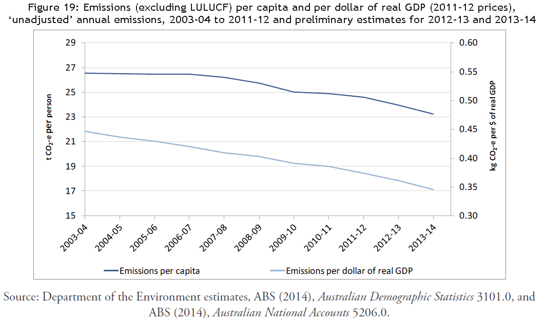 Dept of Environment, Australian Emissions of CO2 per capita. (Click to enlarge) Unfortunately the graph in the report does not go back to 1990 when per capita emissions were 33.4 t.*
The details for the Quarterly update:
- In 2013-14, national inventory emissions per capita (excluding LULUCF) were 23.2 t CO2-e per person, compared to 25.2 t CO2-e in 1989-90, representing a 7.8% decline.
- When LULUCF activities are included, the 2013-14 estimate is 24.1 t CO2-e per person, compared to 33.4 t CO2-e in 1989-90, representing a 27.9% decline.
- Australia’s population grew strongly over this period, from 17.1 million in June 1990 to over 23.5 million in June 2014 (growth of 37.8%).
LULUCF is a nice euphemism for letting farms and native bush go to pot, largely unmanaged, and reach a state of high-fire-risk bonanza fuel loads. They hold a lot of carbon, but it’s only until the next blaze releases it all back to the sky. We live in a land of eucalyptus that love fires.
This week, as fires threatened outer suburbs of Perth, West Australian Firefighters are calling crown land fire laws absurd.
Vice President of the Association of Volunteer Bush Fire Brigades, Dave Gossage, said holes in the law have allowed governments to get away with neglecting to adequately manage bush land that presents fire risks without accountability.
“Under the Bushfires Act in WA; that Act does not bind the Crown,” Mr Gossage said.
About 93 per cent of WA’s land area is classified as Crown and include areas that were fire-ravaged.
The Bullsbrook fire affected land managed by local, state and federal governments as well as private property.
As the governments are not bound by the legislation, the land can be neglected by the relevant agency and that agency will not be held accountable.
“So you’ve got this situation, as has been previously reported, a private landowner can get fined for not doing their fire breaks but yet on the other side of the fence, on Crown land, they don’t have to do anything,” Mr Gossage said.
“And yet that will be more of a risk than what is on the private property.
“It’s bit like with the Bullsbrook fires.
“You’ve got federal land, there’s no legal requirement for them to do anything and it’s absurd.”
Remember, in Australia if you personally try to clear a firebreak on your land to protect you from Crown mismanagement, you could go to jail
That’s what happened to Maxwell Szulc.
Keep reading →
9.1 out of 10 based on 60 ratings
David Archibald points at a very interesting paper that suggests that children conceived during solar activity peaks were less likely to survive and had a whopping 5 year deduction from their lifespan. But don’t panic if you were a peak baby, the affected people were born to poorer women in Scandinavia in the 18th and 19th century. Mortality was 8% in the first year. One in twelve babies didn’t make it. Things were different then. Richer women were somehow able to compensate, or repair the damage. The authors seem fairly sure it has something to do with UV, but I’m not convinced. Solar effects include magnetic effects, solar wind, neutron bombardment, and cosmic rays. There are plenty of things to choose from. Lots more papers to come on this.
Marvel that the sun might influence our lifespan and fertility, but not “do much” to the climate. ;- )
There is much to discuss in comments — many of us wondered if there is a dietary connection, but this effect does not seem to be due to famine, or less food (wheat was cheaper at solar maxes).
— Jo
Guest Post by David Archibald
Solar Activity At Birth
It is now more than 20 years since David Juckett and Barnett Rosenberg published their paper “Correlation of Human Longevity Oscillations with Sunspot Cycles” in the journal Radiation Research. They had found an interesting correlation between the level of solar activity at birth and lifespan, with lower solar activity resulting in longer lifespans. From the abstract of that paper:
“An examination of past human mortality trends revealed that the mean longevity of birth cohorts from 1740 to 1900 for United States of America (U.S.) Congressional Representatives exhibited oscillations that coincided with the 9- to 12-year sunspot cycle. Cohort mean longevities were 2-3 years greater during times of low sunspot activity than at peak activity. This phenomenon was confirmed in data from members of the House of Commons of the United Kingdom Parliament and from University of Cambridge alumni. An additional longevity oscillation with a longer period was visible in the data and may also be related to sunspot cycles.”
A new paper on this subject has just been published by the Norwegian trio of Gine Skjaero, Frode Fossoy and Eivin Roskaft in the journal Proceedings B of the Royal Society: “Solar activity at birth predicted infant survival and women’s fertility in historical Norway”. From the abstract of that paper:
“Using data on temporal variation in sunspot numbers and individual-based demographic data (N 8662 births) from Norway between 1676 and 1878, while controlling for maternal effects, socioeconomic status, cohort and ecology, we show that solar activity (total solar irradiance) at birth decreased the probability of survival to adulthood for both men and women. On average, the lifespans of individuals born in a solar maximum period were 5.2 years shorter than those born in a solar minimum period. In addition, fertility and lifetime reproductive success (LRS) were reduced among low-status women born in years with high solar activity.”
 ….
Relative to the Biblically allotted span of three score years and ten, a 5.2 year reduction in average lifespan relative to those born during solar minimum is 7.4% shorter. What is new about the Norwegian study is that they also looked at the effect on female fertility. On top of lifespan, being born in a solar maximum period also significantly reduced fertility for women born into the poor category, but not for wealthier women or for men. The effect of socio-economic status on the relationship between solar activity and fertility suggests that high-status pregnant women were better able to avoid the adverse effects of high solar activity.
Keep reading →
8 out of 10 based on 31 ratings
The worst paper ever published has competition. I was going to mock this, but it has all rather slipped beyond the Plains of Derision and sunk in a parallel universe. Researcher Jose Duarte is flummoxed, he simply can’t explain why a paper so weak was written, but moreso why it was ever published, and why everyone associated with it is not running for cover. It’s not so much about the predictable flaws, biased questions, and mindless results, it’s now about why UWA, The Uni of Bristol, PLOS, and the Royal Society are willing to wear any of the reputational damage that goes with it.
Lewandowsky, Gignac and Oberauer put out a paper in 2013 which was used to generate headlines like “Climate sceptics more likely to be conspiracy theorists”. The data sample is not large, but despite that, it includes the potential Neanderthal, as well as a precocious five year old and some underage teenagers too. The error was reported on Lewandowsky’s blog over a year ago by Brandon Shollenberger, then again by Jose Duarte in August 2014. Nothing has been corrected. The ages are not just typos, they were used in the calculations, correlations and conclusions. The median age was 43 but the mean age was a flaming neon 76. One wildly old person in the data skewed the correlation for age with nearly everything:
That one data point – the paleo-participant – is almost single-handedly responsible for knocking out all the correlations between age and so many other variables. If you just remove the paleo-participant, leaving the minors in the data, age lights up as a correlate across the board. Further removing the kids will strengthen the correlations.
Duarte remarks he would not sleep if he knew his work had a problem as major as this:
I don’t understand how anyone could let a paper just sit there if they know the data is bad and specific claims in the paper are false. No credible social psychologist would simply do nothing upon discovering that there were minors in their data, or a five-digit age. I’d be running to my computer to confirm any report that claims I’d made in a peer-reviewed journal article rested on bad data, fake participants, etc. I wouldn’t be able to sleep if I knew I had something like that out there, and would have to retract the paper or submit a corrected version. You can’t just leave it there, knowing that it’s false.
In any case, something is very wrong here. The authors should explain how the 32,757-year-old got into their data. They should explain how minors got into their data. They should explain why they did nothing for more than a year. This is a very simple dataset – it’s a simple spreadsheet with 42 columns, about as simple as it gets in social science. It shouldn’t have taken more than a few days to sort it out and run a correction, retraction, or whatever action the circumstances dictated. These eight purported participants allowed them to claim that age wasn’t a factor. It allowed them to focus on the glitzy political stuff, allowed them to focus on finding something negative to pin on conservatives.
They don’t tell you until late in the paper that conservatism is negatively correlated with belief in conspiracies – the exact opposite of what they claimed in the earlier scam paper that APS helped promote. Also note that we already know from much higher quality research that Democrats are more likely than Republicans to believe in the moon hoax, though it’s a small minority in both cases (7% vs. 4%), and that Democrats endorse every version of the JFK conspiracy at higher rates. I think some journals might be unaware that the pattern of these conspiracy beliefs across the left-right divide is already well-documented by researchers who have much higher methodological standards – professional pollsters at Gallup, Pew, et al. We don’t need junky data from politically-biased academics when we already have high-quality data from professionals.
Duarte describes how unusual this kind of simple mistake is. The software used to run the survey specifically asks researchers to set age boundaries and it automatically checks to make sure respondents fit within the accepted range.
What’s also exceptional is that Lewandowsky, Gignac and Oberauer managed to delete and filter out more than a quarter of their participants, yet somehow left in the person born in 30,000 BC. They ruled out one in four responses yet allowed minors to be included, which they don’t have ethical approval for, and given the political conclusions, don’t have a scientific reason to include either.
Duarte wonders where the accountability is:
Which brings us back to the previous paper. APS extended that scam in their magazine, fabricating completely new and false claims that were not made in the paper at all, such as that free market endorsement was positively correlated with belief in an MLK assassination conspiracy and the moon-landing hoax. Neither of these claims is true. The data showed the exact opposite for the MLK item (which we already knew from real and longstanding research) – free market endorsement predicted rejection of that conspiracy, r = -.144, p < .001. And there was no correlation at all between free market views and belief in the moon-landing hoax, r = .029, p = .332. APS just made it up… They smeared millions of people, a wide swath of the public, attaching completely false and damaging beliefs to them.
They’ve so far refused to run a correction. It’s unconscionable and inexplicable. The Dallas Morning News has much higher standards of integrity and truthfulness than the Association for Psychological Science. I don’t understand how this is possible. This whole situation is an ethical and scientific collapse.
He fears for his profession, and is writing a longer article for a magazine to discuss the corruption in science and the roles that organizations like APS, IOP, and AAAS play:
This situation is beyond embarrassing at this point. If anything were to keep me from running the magazine piece, it’s that it’s so embarrassing, as a member of the field, to report that this junk can actually be published in peer-reviewed journals, that no one looks at the data, and that a left-wing political agenda will carry you a long way and insulate you from normal standards of scientific conduct and method. This reality is not what I expected to find when I chose to become a social scientist. I’m still struggling to frame it.
What does “science” mean anymore and who is responsible for keeping the standards? Normally the host institution investigates allegations of scientific misconduct:
… the system appears to be broken. Lewandowsky has not been credibly investigated by the University of Western Australia. They’ve even refused data requests because they deemed the requester overly critical of Lewandowsky. That’s stunning – I’ve never heard of a university denying a data request by referring to the views of the requester. UWA seems to have exited the scientific community. Science can’t function if data isn’t shared, if universities actively block attempts to uncover fraud or falsity in their researchers’ work.
To this day Lewandowsky refuses to release his data for the junk moon hoax study. That’s completely unacceptable, and there is no excuse for Psychological Science and APS to retain that paper as though it has some sort of epistemic standing – we already know that it’s false, and the authors won’t release the data, or even the national origin, age, or gender of the participants.
Jose Duarte is a PhD candidate in psychology, who writes an excellent blog unpacking the weaker links in his chosen field. It’s really worth reading the whole gobsmacking description, and all the comments too, which are especially well informed.
Gullible media science writers who take mistakes and magnify them
The media, and specifically science communicators, ARE the problem. Instead of investigating and exposing bad science (or psychology), mainstream science communicators often make it worse. Barry Woods comments that PLOS One is proud about the coverage this paper received and lists it as if it were an achievement. But PLOS One would back away in an instant if the mainstream media mocked them in a mass protest for their pathetic “peer review” and disinterest in correcting the record. So would UWA, The Royal Society and the APS. We are in that most dangerous of places where is no brake on falling standards, but there is the illusion of one. What’s worse than no science communicators — ones trained to repeat mistakes, laud bias, and propagate fallacies.
In a normal world the PLOS One team would be as diligent in tracking down those papers and journalists below, apologizing and making sure they correct the record. All of the journalists who wrote the articles here should be contacted, and so too, should all the real journalists who might report on the failure of the other unskeptical science writers.
- Guardian Environment Title: “Climate sceptics more likely to be conspiracy theorists and free market advocates, study claims”
- NeuroLogica Blog Title: “Politics, Science Rejection, and Conspiracy Thinking”
- Popular Science Title: “Surprise! Conspiracy Theorists Are More Likely To Disavow Vaccines, Climate Science And GM Foods”
- Scientific American Blogs Title: “Motivated reasoning: Fuel for controversies, conspiracy theories and science denialism alike”
- The Burrill Report Title: “Princess Di, Faked Moon Landings, and the Denial of Science -”
- The Conversation Title: “Right, left, wrong: people reject science because …”
- Times Live Title: “Conspiracy theorists, conservatives more likely to reject science”
- Vaccine Nation Title: “Belief in a range of conspiracy theories predicts vaccine denial”
Keep reading →
9.4 out of 10 based on 104 ratings
We had a an excellent few days holiday this week in the South West of Australia. What still surprises me is how these giant trees seem to sneak up on you. One minute you’re driving through normal forest and the trees don’t seem to “get big” but you suddenly notice the scale of everything has changed. Like the car and road shrank instead.
Karri trees are some of the tallest trees in the world. See the trunk girth of a medium specimen. Try to imagine this tree in your yard.
 Karri Forest, Caves Road, Western Australia They must be the most beautiful.
 Karri Forest, Caves Road, Western Australia | Click to enlarge.
9.4 out of 10 based on 37 ratings
According to the ABC the Bureau of Met tells us that Queensland has experienced “the worst drought in 80 years” and that “37.3% of the state was covered by the lowest rainfall on record”. (Watch it on iview if you can bear to).
These exacting facts are easy to check, and Ken Stewart did, but the 1.1-billion-dollar ABC did not.
Ken used the BOM’s own websites (Climate Maps and Climate Change and Variability) and shows that the current drought is the worst in 9 years, not 80, and even if it is very bad (heartbreaking for some) it’s not unusual.
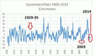 Current low rain is not unusual. The current drought is bad (see red blobs in Queensland):
 NW Queensland has missed two wet seasons in a row The Federation Drought, circa 1900, was much much worse:
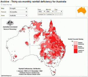 (Federation Drought graphed only 1900 – 1902) Ken wrote to the ABC, and Genevieve Hussey replied immediately — effectively saying the ABC repeat all BOM claims, no matter how hyperbolic, extraordinary, or repetitive they sound.
The information in our report was based on an interview with climatologist Mr Jeff Sabburg from the Bureau of Meteorology. He was also interviewed by the ABC Country Hour the same day as the annual climate statement was released and said:
“In terms of rainfall deficiencies the comparison is we haven’t seen this across Queensland at least since the 1927- 1929 depression drought. These heat waves we’re getting a number of days in a row above 30- 40 degrees Celsius and then not getting reprieve at night time that’s certainly contributing to the point where there’s nothing much to evaporate away.” —Genevieve Hussey
If millions of Australian citizens are misinformed, the ABC doesn’t seem too concerned. Not concerned enough to point at all the contradictions in their file footage of past droughts, or rainfall stats on the BOM’s own site. Not concerned enough to ask questions that 50% of skeptical Australians might be asking.
Any serious journalist would have asked the BOM whether it was misleading to call this drought the “worst”, when the rainfall statistics so clearly suggest the opposite. Hypothetically, if the BOM was wallowing in a bureaucratized religious group-think, cherry picking their data, and adjusting data with inexplicable methods, the ABC would be defending them. Serving big-government, not the tax-payer.
The point of the ABC is not to ask our public institutions any hard questions after all. It’s there to cover for them.
More info:
Ken Stewarts post: Not the Worst Drought in 80 Years and ABC reply to my complaint.
9.6 out of 10 based on 92 ratings
The man who uncovered the 80 years of missing empirical data on ocean pH is Mike Wallace. That hidden data suggested the ocean had been getting slightly more alkaline in the 20th Century –the opposite of the man-made acidification theory — but that pH change hasn’t been a linear shift. The pH has been cycling up and down, and on his blog back in February Wallace suggested that the pH of the ocean was varying naturally as the PDO cycled*.
It’s an interesting theory. He’s used the PDO index and his global ocean pelagic zone pH time series chart that was based on 1.5 million pH readings.
It’s nice to watch a real scientist at work. His blog is worth a look.
 … ..
*PDO means Pacific Decadal Oscillation – the 15 – 30 year long cycles of warmer or cooler sea surface temperatures in the northern Pacific. In a positive phase the western side is cool and the east is warmer, it rains more in California and less in Australia. The negative phase is the opposite.
9.3 out of 10 based on 93 ratings
Skin In the Game
Guest post by  Rereke Whakaaro. Rereke Whakaaro.
It has jokingly been said, that people can be classified into two groups. Those who classify people into groups, and those who do not.
On the subject of Catastrophic Climate Change, almost everybody ends up being classified, in one way or another, and such classification seems to be unavoidable. You are either a Believer or a Denier, and that is it.
Or is it?
Are there no other classifications that could be considered? It seems that there are.
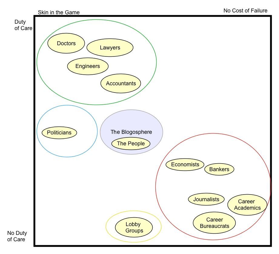
Take for example, the group of people who belong to professions that make pronouncements on Climate Change, but who in reality have no “skin in the game”. These are people who will utter dire predictions and make forecasts, but are not held to account when their prognostications do not come to pass.
I am, of course, talking about journalists, who are paid to watch the world go by; and career academics, who are paid to explain how the world goes by; and the career bureaucrats, and other Government employees, who are paid to keep an eye on the intellectuals, and to implement the policies they recommend. Do these people have any “skin in the game”? Is there a down-side for being wrong, for this group? Likewise, consider economists and bankers; who are never held to account for any losses incurred by those who misguidedly take their advice, even when those losses are counted in millions.
Compare the folks in that group, with your own Lawyer, or your General Practitioner, both of whom can be held to account by their respective professional disciplinary committees. Or compare those folks with dozens of other professions, all of whom have the legal obligation of “getting it right”, usually mandated in law; Engineers, and Accountants being obvious examples. This is the second group.
Which group would you trust more? Those who are answerable for their actions, or the advice they give, or those who are not?
And what of the politicians? Where should we place them? In which group, do they belong?
Well, they certainly have “skin in the game”. That fact is tested at each and every election. It is also tested within caucus and by the party apparatus on an ongoing basis. No political party wants to give ammunition to the opposition. But, even so, it is difficult to place politicians in either of the first two groups.
So I place politicians in a group of their own. Where members are required to make judgements, and decisions, on behalf of us all, based upon theoretical concepts, supplied by academics; public opinion, manipulated by journalists; international market trends, surmised by economists; financial mechanisms designed by bankers, looking for new investment opportunities; and do all of this, within the overarching bureaucratic structure. I am surprised that politicians do as well as they do, in the circumstances.
Also, we have the organisations that make up the lobby industry, pushing their own political memes to garner support from members and charitable donations from groups and individuals looking to reduce their personal tax liability. These “charitable” organisations march to their own drum, towards an ideal nirvana that can never be achieved. But they gladly accept donations from Industry, Governments, and the UN, on the hypothetical route to the future. This is the fourth group.
And then of course, there is the blogosphere, and blogs such as this, with a self-imposed mandate to keep the other four groups honest, by publicly pointing out when they are not.
The Ancient Roman aristocracy understood the power of the people – the plebeian classes – and were afraid of them. So it is today. Ultimately it is the people who hold all the power. So those with no skin in the game, will eventually find themselves out in the cold, and feeling very sad.
Jo deserves her weblog awards. They were voted for, by people like us: We are the fifth group – we are the people and like the Roman plebeians, we cannot be ignored.
And let’s not forget it’s a new year. Please take a moment of time and some of your treasure and tip Joanne via the PayPal link at the home page. Joanne does this blog because it is the right thing to do. Please help support free speech and proper science.
9.4 out of 10 based on 119 ratings
In 1988, way back before the data was in, the CSIRO was already push-pumping the public awareness campaign against carbon dioxide. There was never a debate about the science. Nobody checked the things that matter first, they just stepped straight into pointless action. (Why?) Twenty five years later, nothing has changed. There is still no one paid to make sure the science is right, too make sure Australians are not being taken advantage of. When will conservative governments recognise that they can’t leave this vital area to unpaid volunteers without staff, funding, access to scientific libraries and full government data?
BOM and CSIRO research that suggests billion-dollar policies must be checked and replicated independently by a group with no interest but finding holes in it. In a law court, there is a defense whose job is to poke holes in the prosecutor’s case, but in science and public policy it’s like being back in the Middle Ages with only the prosecution’s accusations getting a hearing. Only with a proper science defense will the Australian taxpayers and the environment be served.
The Australian, Graham Lloyd
“…the CSIRO and the Commission for the Future were at the forefront of international research and public awareness campaigns on reducing CO2 emissions by 20 per cent to 2005, as decided at the Toronto conference in 1988.
And as early as 1989 the Australian government was already paying to set up vested interest groups to push for carbon reduction.
“Following his landmark Our Country, Our Future statement on July 20, 1989, prime minister Bob Hawke wrote to ministers requesting a working group be set up to evaluate options to reduce emissions.
He said it was clear “we cannot afford to wait until we are certain of all aspects of global climate change before action is taken …”
What working group would ever produce a report saying that reducing emissions was a waste of money? These would become the paid lobbyists to propagandize the issue.
9.2 out of 10 based on 112 ratings
Co-authored James Doogue and JoNova
Empirical data withheld by key scientists shows that since 1910 ocean pH levels have not decreased in our oceans as carbon dioxide levels increased. Overall the trend is messy but more up than down, becoming less acidic. So much for those terrifying oceans of acid that were coming our way.
What happened to those graphs?
Scientists have had pH meters and measurements of the oceans for one hundred years. But experts decided that computer simulations in 2014 were better at measuring the pH in 1910 than the pH meters were. The red line (below) is the models recreation of ocean pH. The blue stars are the data points — the empirical evidence.
James Delingpole on ‘Breitbart’:
NOAAgate: ‘ocean acidification’ could turn out to be the biggest con since Michael Mann’s Hockey Stick
 - …
[CFACT] Marita Noon:
The alleged fraud was uncovered by Mike Wallace, a hydrologist with nearly 30 years’ experience now working towards his PhD at the University of New Mexico. While studying a chart produced by Feely and Sabine, apparently showing a strong correlation between rising atmospheric CO2 levels and falling oceanic pH levels, Wallace noticed that some key information had been omitted.
Mysteriously, the chart only began in 1988. But Wallace knew for a fact that there were oceanic pH measurements dating back to at least 100 years earlier and was puzzled that this solid data had been ignored, in favour of computer modelled projections.
It has all the usual marks of modern bureaucratized science: scientists use a short stretch of data and computers to guesstimate a long “dataset”. Then when asked, they get huffy, hide the data, and insult the questioner. The poor sod seeking access to publicly funded data has to do an FOIA request, which in this case wasn’t successful, but then he got the data another way anyhow. Money was wasted hiding the data, it was wasted on bad policies, it was wasted defending an FOIA request, and dare I suggest, it was wasted training and paying the salaries of people who call themselves scientists but don’t act like them.
[CFACT] Marita Noon:
Feely’s chart, first mentioned, begins in 1988—which is surprising, as instrumental ocean pH data have been measured for more than 100 years — since the invention of the glass electrode pH (GEPH) meter. As a hydrologist, Wallace was aware of GEPH’s history and found it odd that the Feely/Sabine work omitted it. He went to the source. The NOAA paper with the chart beginning in 1850 lists Dave Bard, with Pew Charitable Trust, as the contact.
Wallace sent Bard an e-mail: “I’m looking in fact for the source references for the red curve in their plot which was labeled ‘Historical & Projected pH & Dissolved Co2.’ This plot is at the top of the second page. It covers the period of my interest.” Bard responded and suggested that Wallace communicate with Feely and Sabine—which he did over a period of several months. Wallace asked again for the “time series data (NOT MODELING) of ocean pH for 20th Century.”
Sabine responded by saying that it was inappropriate for Wallace to question their “motives or quality of our science,” adding that if he continued in this manner, “you will not last long in your career.” He then included a few links to websites that Wallace, after spending hours reviewing them, called “blind alleys.” Sabine concludes the e-mail with: “I hope you will refrain from contacting me again.” But communications did continue for several more exchanges.
In an effort to obtain access to the records Feely/Sabine didn’t want to provide, Wallace filed a Freedom of Information Act (FOIA) request.
We were told that coral reefs would crumble, crabs and molluscs would be unable to build their protective shells, the ocean food chain would collapse, and therefore the global food chain would fall apart.
Clearly the ten year moving average of ocean pH since 1910 has a slight upward curve. This means that in fact the alkalinity of the ocean has increased, not decreased. It has become LESS ACIDIC. The researchers Feely and Sabine would have known this. But it suited their purpose to truncate the data to start in 1988 to allow them to show a falling pH level over that relatively short period instead of the actual long-term increasing trend.
Wallace says: “Oceanic acidification may seem like a minor issue to some but, besides being wrong, it is a crucial leg to the entire narrative of ‘human-influenced climate change’.”
He adds: “In whose professional world is it acceptable to omit the majority of the data and also not disclose the omission to any other soul or Congressional body?”
What we have here is one of the basic foundations of the climate change scare, that is falling ocean pH levels with increased atmospheric CO2 content, being completely dismissed by the empirical ocean pH data the alarmist climate scientists didn’t want to show anyone because it contradicted their ‘increasing ocean acidity’ narrative.
Further information
h/t to Joffa, Climate Depot, Heartland
9.5 out of 10 based on 140 ratings
Guest post by Eric Worrall
The following is a slideshow of images from the NOAA National Ice website, showing snow and ice cover over the Northern Hemisphere. The images are loaded directly from the NOAA site – I just provided the slide show mechanism.
The days chosen are the 1st day of the year (top left), the 90th day of the year (top right), the 180th day of the year (bottom left), and the 270th day of the year (bottom right). In a few cases images for that exact day are unavailable, so instead I display the nearest adjacent day.
I’m not making any particular statement about the ice. You can see the fall in Summer ice cover in the bottom right panel, which excited various parties into making dubious predictions about an imminent “ice free arctic”. You can also see a moderate recovery in ice cover in recent years.
The most remarkable feature of this series IMO is that minimal visible variation in winter snow and ice cover – so it seems we may have quite a long wait, until the “end of snow”.
Note that viewing the slideshow requires a fairly up to date web browser – if the images don’t update every few seconds, make sure your browser has been upgraded to the latest version available for your computer. For example, the slideshow won’t work if you use an old operating system such as Windows XP, but it should work in Windows 8, if your system is fully up to date.
2014
2013
2012
2011
2010
2009
2008
2007
2006
2005
2004
2003
2002
2001
2000
1999
1998
8.8 out of 10 based on 55 ratings
These birds weigh only 9 grams, but they can apparently tell that the weather is going to get really nasty. Is it infrasound? And how often do thousands of birds split the scene for a false negative scare…
By Will Dunham
WASHINGTON (Reuters) – You might want to be careful about who you call a birdbrain. Some of our feathered friends exhibit powers of perception that put humans to shame.
Scientists said on Thursday that little songbirds known as golden-winged warblers fled their nesting grounds in Tennessee up to two days before the arrival of a fierce storm system that unleashed 84 tornadoes in southern U.S. states in April. The researchers said the birds were apparently alerted to the danger by sounds at frequencies below the range of human hearing
Keep reading →
7.8 out of 10 based on 50 ratings
In 2015 the hunt for clues continues…
The central mystery in climate science is the Sun. The direct energy from the 1.4 million-kilometer-wide flaming ball stays remarkably constant. The radiation pours down on us but the relentless sameness of the watts can’t be causing of the swings in temperature on Earth. Something else is going on with the Sun. For one thing, the total light energy coming off the Sun stays almost the same but the type of light changes — the spectrum shifts — with more shorter wavelengths at one point in the cycle and longer wavelengths at the opposite part of the cycle. These have different effects. Shorter wavelengths (UV) generate ozone in the stratosphere and penetrate the ocean. Longer wavelengths don’t. But the Sun is also sending out charged particles and driving a massive fluctuating magnetic field, both of which affect Earth’s atmosphere.
But the tiny changes in total sunlight (TSI) may still be leaving us clues about other things going on with the Sun. David Evans’ notch-delay theory is that TSI is a leading indicator, and after solar TSI peaks, the temperatures on Earth follows with a peak roughly 11 years or so later (or one solar cycle). But what’s the mechanism? Stephen Wilde has a theory. Plug in your brain, and follow this chain of potential influence:
The Sun —-> UV or charged particles —- > ozone —-> polar jet streams —–> clouds —–> surface temperatures.
Stephen Wilde put forward the first version of this hypothesis in 2010. It is long past time to get into those details.
Summary of the Stephen Wilde Hypothesis
In essence: The Sun affects the ozone layer through changes in UV or charged particles. When the Sun is more active there is more ozone above the equator and less over the poles, and vice versa. An increase in ozone warms the stratosphere or mesosphere, which pushes the tropopause lower. There is thus a solar induced see-saw effect on the height of the tropopause, which causes the climate zones to shift towards then away from the equator, moving the jet streams and changing them from “zonal” jet streams to “meridonal” ones. When meridonal, the jet streams wander in loops further north and south, resulting in longer lines of air mass mixing at climate zone boundaries, which creates more clouds. Clouds reflect sunlight back out to space, determining how much the climate system is heated by the near-constant incoming solar radiation. Thus the Sun’s UV and charged particles modulate the solar heating of the Earth.
 Figure 1: When the Sun is less active there is more ozone at the poles but less over the equator. Less ozone above the tropopause causes less stratospheric warming, allowing the tropopause up, which pushes the climate zones towards the equator. This causes the jet streams to be more meridonal, so more clouds are formed. Clouds reflect sunlight, so less solar radiation warms the Earth. An active Sun increases ozone in the stratosphere:
“Changes in solar ultraviolet spectral irradiance directly modify the production rate of ozone in the upper stratosphere (e.g. Brasseur, 1993), and hence it is reasonable to expect a solar cycle variation in ozone amount. The global satellite ozone records since 1979 show evidence for a decadal oscillation of total ozone with maximum amplitude (~2%) at low latitudes (Hood and McCormack, 1992; Chandra and McPeters, 1994; Hood, 1997).
 Figure 2: When the Sun is more active there is less ozone at the poles but more over the equator. More ozone above the tropopause causes more stratospheric warming, forcing the tropopause down, which pushes the climate zones away from the equator. This causes the jet streams to be more zonal, so fewer clouds are formed. Clouds reflect sunlight, so more solar radiation warms the Earth. New research reports a missing driver — energetic electrons
In October 2014 a paper by Andersson et al suggests another layer of action, again on ozone. Described as the missing driver in the Sun-Earth connection, energetic electron precipitation (EEP) dramatically affects ozone — but above the poles, not the equator. The EEP in the mesosphere is directed preferentially towards the poles along the magnetic field lines because the electrons are charged particles, which explains why the effect is strongest at the poles.When the Sun is active the energetic electron rain decreases ozone preferentially above the poles and in the mesosphere.
At the poles, the rules get strained through a singularity
At the north and south poles the magnetic field lines converge, the Earth drags the atmosphere around a single point, the tropopause is lower, and temperature inversions are common. Polar vortices occur when an area of low pressure sits at the rotation pole of a planet. This causes air to spiral down from higher in the atmosphere, like water going down a drain. (Polar vortices should not be confused with the circumpolar jet around the poles, which is often given the same name in the media.)
All this remarkable action means that above the poles even the high mesosphere affects the height of the tropopause. In the polar vortices the descending flow draws air down from the mesosphere, right through the stratosphere to the tropopause.
The presence of a layer of ozone in the stratosphere is the cause of the temperature inversion that forms at the tropopause. That layer of ozone is warmed directly by incoming solar radiation. It is warmer than the rising air coming up from the surface below, so it effectively puts a lid on convection.
Ozone variations affect the temperature of the stratosphere, which in turn affects the height of the tropopause. From page 14 of Zangl and Hoinka:
“Suppose, for example, that the surface temperature and the tropospheric temperature gradient are given and that the temperature of the stratosphere varies. Then, a cold stratosphere will be associated with a high tropopause (low tropopause pressure), and a warm stratosphere will correspond to a low tropopause (high tropopause pressure).”
If the tropopause rises or falls, it causes a change in the gradient of tropopause height between equator and poles. This in turn causes the jet streams to shift north or south, because it pushes around the climate zones beneath the tropopause. A lower tropopause restricts the available space for free movement of air horizontally beneath it. So a lowering of the tropopause above the poles when the Sun is less active (as implied in the Andersson et al paper) squeezes the air in the tropospheric climate zones towards the equator. We have seen that happen in the form of increased jet stream meridionality since about 2000, as the level of solar activity declined in the transition from active solar cycle 23 to much less active solar cycle 24. That is the reason for the observation of more frequent and intense incursions of polar air across middle latitudes in recent years.
The world is divided up into permanent climate zones, which align along the lines of latitude due to the Earth’s rotation. These zones can move poleward or equatorward, in response to changes in the Earth’s energy budget. Poleward shifting was observed during the late 20th century warming, and it is well know that the zones shifted equatorward during the Little Ice Age.
 Figure 3: A Jetstream can be more zonal (left) or meridonal (right). Source.
The jet streams are high-level rivers of fast moving air threading between the climate zones, and are driven by temperature, humidity and density differentials between the different types of air mass:
- An equatorward shift of the climate zones gives the jets more room to loop north and south, and that gives more meridonal jets (the north-south components of the jets).
- A poleward shift of the zones pushes the jets poleward, forcing them to more closely following the lines of latitude, that is, more zonal jets (the east-west components).
- Such shifts are also associated with the Arctic Oscillation, wherein a positive phase results in the climate zones being pulled poleward and the jets adopting a more zonal (straighter) pattern. A negative phase results in the opposite. A more frequent positive phase is associated with a more active Sun due to cooling of the polar stratosphere (less mesospheric ozone descending through the polar vortex) and consequent lifting of the polar tropopause. A more frequent or more pronounced negative phase (as observed to a record extent during the very low solar minimum between cycles 23 and 24) is associated with a less active Sun due to warming of the polar stratosphere (more mesospheric ozone descending through the polar vortex).
Wandering jets means more clouds
Keep reading →
9.1 out of 10 based on 130 ratings
If the Greens cared about the environment, they’d call this scheme “a ghastly waste”.
The “price” of carbon was advertised as $24 (per ton emitted) but real price of reducing emissions by one ton was $5,000. It could only happen when people are playing with other people’s money. That’s the soft left idea of good maths and good business.
That the Labor-Greens boast that this spectacular failure was a success shows the carbon tax was never about the climate, nor about CO2 or the environment. Follow the money. The purpose of the tax was to reward friends and punish competitors. Anyone dependent on Big-Government is a “friend”, and anyone who can stand on their own two feet is a “polluter” or a “denier”.
If the Greens cared about the environment, they’d call this scheme “a ghastly waste”.
The $15 billion price tag is $670 per Australian, or $2,700 per household of four. The real total is much more (when will the government add up the real bill?), because that tally doesn’t include the money wasted on solar panels, windpower, or the whole “Department of Weather Change”. It doesn’t include millions in scientific research money poured down the sinkhole of climate models that don’t model our climate, nor the advertising, promotion and propaganda of all of the above.
A smart conservative government would add up the whole bill, then spend 0.1% (something like $20 million) paying skeptical scientists to audit, and check the evidence trail. They would trumpet their green credentials. This source of the river of gravy starts with the science. People who care about the poor and the planet would want to get that right.
Sid Maher, The Australian
THE carbon tax cost $5,310 for every tonne of emissions abated during its two years of operation, new government analysis shows.
The release of the National Greenhouse Gas Inventory last week shows emissions for the economy, excluding the land sector, fell 1.4 per cent in 2013-14 and 0.8 per cent in 2012-13. When the land sector is included, as is the case under Kyoto accounting, Australia’s emissions fell from 567.1mt in 2012-13 to 563.5mt, a drop of 3.6mt. Between 2011-12 and 2013-14, emissions fell 0.5 per cent or 2.9mt (there was a small rise the previous year).
No one can call this a success. Australian emissions were falling before the carbon tax came in. The big 1.4% fall only came after the figures of the year before were adjusted up. The 0.8% reduction they talk about for the previous 12 months does not exist after the figures were changed, yet they are still citing it. The current count of emissions will most likely be adjusted up itself, and the 1.4% figure is mere noise in the data — in past years the post hoc adjustments have been larger.
Opposition climate change spokesman Mark Butler told the ABC the report proved Labor’s policies were working. “The National Greenhouse Gas Inventory — dropped by the government in the lead-up to Christmas in an effort to bury the report — showed that the emissions count for the overall year of Labor’s climate policies reduced by 1.4 per cent,” he said.
“That compares to a decline in emissions of 0.8 per cent for the previous 12 months, which shows that Labor policies to reduce emissions were working — to say otherwise is laughable.
Shame the Greens hate the environment.
Edit April 2015: First sentence changed to make it clearer and more useful. Was “It takes skill to figure out a scheme where you set the price at $24 for something and end up paying $5,000.”
9.3 out of 10 based on 104 ratings
That date line is rolling around the world. May 2015 bring you happiness and good health.
Cheers!
Jo
9.6 out of 10 based on 48 ratings
Researchers at Harvard wondered if high risk heart patients were more likely to die if they turned up at the hospital during national cardiology meetings when most of the experts are not around. Instead, it turns out that mortality rates during the conferences fell from 70% to 60%. Oops.
Who do you want to see if you’re sick? In this situation, possibly not your specialist.
High-risk patients with certain acute heart conditions are more likely to survive than other similar patients if they are admitted to the hospital during national cardiology meetings, when many cardiologists are away from their regular practices.
Sixty percent of patients with cardiac arrest who were admitted to a teaching hospital during the days when cardiologists were at scientific meetings died within 30 days, compared to 70 percent of patients who were admitted on non-meeting days.
“That’s a tremendous reduction in mortality, better than most of the medical interventions that exist to treat these conditions,” said study senior author Anupam Jena, assistant professor of health care policy at HMS, internist at Massachusetts General Hospital and faculty research fellow at the National Bureau of Economic Research. There is substantial ambiguity in how medical care is practiced, particularly for these complex patients, he said. “This study may help illuminate some of those gray areas and suggest ways we can provide better care for those high-risk patients.”
To be fair, this only applies to one very specific subgroup of patients, and hopefully this red flag will help us figure out what needs to change. Possibly expert cardiologists are doing a bit too much to try to help their patients. But don’t feed me that line that experts are always right:
Keep reading →
9 out of 10 based on 29 ratings
|
JoNova A science presenter, writer, speaker & former TV host; author of The Skeptic's Handbook (over 200,000 copies distributed & available in 15 languages).

Jo appreciates your support to help her keep doing what she does. This blog is funded by donations. Thanks!


 Follow Jo's Tweets
 To report "lost" comments or defamatory and offensive remarks, email the moderators at: support.jonova AT proton.me
Statistics
The nerds have the numbers on precious metals investments on the ASX
|


Recent Comments