Who’s desperate to find the missing hot-spot? Sherwood’s new paper claims to have found it, but after years of multi-layered adjustments, and now kriging the gaps, and iteratively homogenizing, the results of the new data partly “solve” one problem while creating others. There’s no documented, physical reason for the homogenizing and there’s no new insight gained. The raw data was used by airlines, the military, and meteorologists for years, yet the suggested new results are quite different to the raw data. It’s as if we can’t even measure air temperature properly. Somehow we’ve made multivariate complex models work but not simple temperature sensors? The main problem with the old results was that they didn’t fit the models. Now, after torturing the data, they still don’t.
Twenty-eight million weather balloons had shown by 1999 that the key assumption in the climate models was wrong. Without feedbacks, the models only produce 1.2°C of warming with a doubling of CO2. With feedbacks the simulations ramp that up to a dangerous 3 – 4 degrees C, and water vapor was the most important feedback. It’s just no fun for the Global Worriers without it.
No hotspot = no water vapor feedback like in the models = no danger from CO2
The fingerprint test of the water-vapor feedback is the “hot-spot”, a warming of a band of the upper troposphere 10 km over the tropics. (See the reasons below at the end). The weather balloons were designed and calibrated to measure temperature and humidity as they rise through the sky and right through the hot-spot. Their results are unequivocal: red was not yellow; the spot was not hotter. Supporting this, the specific humidity was also supposed to rise, but fell instead. If the computer models worked on everything else, we might wonder if the millions of observations were biased, but the models didn’t predict the pause, were wrong about humidity, rainfall, drought, and clouds too. They didn’t work on regional, local, or continental scales and can’t explain long term historic climate either. At this point, a scientist would throw out the theory. The weather balloons independently agreed with each other, the humidity results fitted the temperature results, the whole lot was loosely supported by satellites. The data doesn’t need homogenising or kriging or obscure numerical witchcraft.
Instead Steven Sherwood and Nidhi Nishant of UNSW revisited their 2008 technique of homogenizing temperature data by using wind data as well. They homogenised it again. They have iterated the iteration? They’ve also extended it from 2005 to 2013 and changed the “wind shear” component to “vector wind”. Their new homogenized-temp-wind data is below (left). The model predictions of 2005 are centre, and the radiosonde temperature results (before homogenisation etc) are on the right.

The new temperature estimates (Left) might agree with the models (centre), but not with the raw temperatures (right). | Click to enlarge
Sherwood was a co-author of the model projection in the centre from the US 2005 CCSP report (a kind of mini IPCC, known as “Karl et al”). Chapter 5 of the CCSP report used the term “fingerprint” seventy four (74) times. It was that important. Note that color and time scales are different in these graphs. Sherwood could have made these directly and easily comparable, and put them side by side. He is paid to do this.
They’ve iteratively homogenised, but their findings are paradoxical
The fingerprint was strengthened by adding years of irrelevent data
The new study added data from 2005 – 2013, though we have to wonder why — there hasn’t been any global warming of the surface since the late 1990’s, so we wouldn’t expect to find a hot spot in the last 18 years. The hot spot is supposed to warm faster than the surface, but two times zero is still zero. Yet this strange point is the first finding mentioned in the abstract: “First, tropical warming is equally strong over both the 1959–2012 and 1979–2012 periods”. It shouldn’t be. The hot spot should exist from about 1976 to 1999, but not during the non-warming times before and after. In the climate models a hot spot only happens when the surface warms. This result still doesn’t fit the theory. Sherwood et al acknowledge that the rate should have slowed after 1998 but didn’t. They admit that adding in the extra data during the last flat decade is “the main reason why the trends are now slightly stronger than those shown in [Sherwood 2008].” They added data that shouldn’t generate a hotspot, and this helped find one? Sherwood calls this “interesting”, and says it “deserves further scrutiny”. Rather?
The models still have the altitudes wrong, by 1 – 2 km
Their second finding is also more bad news for models: “tropospheric warming does not reach quite as high in the tropics and subtropics as predicted in typical models”. The height is crucial. Higher means cooler, and cooler layers emit less than warmer ones. “…our data indicate that the upper tropospheric warming since 1979 began transitioning to stratospheric cooling at a lower altitude (by about 1–2 km) in nature than in a typical climate model.” If the models have this height wrong, they’re still a long way from understanding our climate. If the top of the water vapor (to one optical depth, looking from space) does not rise, then the water vapor does not amplify the effect of extra CO2 and there is no crisis.
The stratosphere was supposed to cool more but cools less?
Their third finding was that “cooling has slackened in the stratosphere such that linear trends since 1979 are about half as strong as reported earlier for shorter periods.” But wait? Wasn’t stratospheric cooling part of the fingerprint? So all that extra CO2 since 1979 has had less effect than expected?
Independent scientists are setting the science agenda
The press release was quite different from the abstract (perhaps because the central findings raise more questions than they answer). The press release is primarily designed to respond to skeptics, and it openly says so. Forgive me for feeling pleased. We’ve been talking about the hot-spot here for nearly seven years. This site put the missing hotspot on the search-engine map in 2008. Dr David Evans got the first headline about the “hot spot” into the media. The hot spot was the first point in the Skeptics Handbook and the key point in the evidence. For all the posts here see the tag: missing hot spot.The hunt for the hot spot has been so passionate, that in the 2008 paper this new study was following, Sherwood and co. even used deceptive color scale tricks to “find it” where the color of zero was a hot orange-red.
Independent scientists and blogs are setting the agenda in the science debate, supported only by citizens donations (and we do need your help). Sherwood collects a UNSW professorial salary and gets full resources, PhD students, support, and superannuation to produce papers telling us essentially that we can’t even measure the temperature of the upper atmosphere without adjusting the data so much that the homogenized results look nothing like the raw measurements. If the models are that good that we are “correcting” data to fit, why bother taking the measurements? We could just figure out the temperature over Sudan from a computer in Pennsylvania, right?
This is modern bureaucratized science — it’s what 95% certainty means — yellow is red, don’t ask questions — we have to stop the storms.
Compare wind-temperature to modeled simulations
Sherwood has never published a paper admitting the hot spot is missing, except implicitly when he issues another paper that “finds” it. If this paper really shows something new, why was his attitude to the missing hot-spot the same last week, last year, and every year before this discovery?
Credit to the independent scientists fighting for the basic truth in the peer review medium: Fred Singer, David Douglass, Roy Spencer, John Christy, Garth Paltridge, Ross McKitrick, Steve McIntyre, Chad Herman, Benjamin Pearson, and others named in citations below. I’m pretty sure credit for the “hotspot” phrase itself goes to Christopher Monckton.
On satellites: Radiosondes are the best tool to use. Satellites are not as useful for detecting the hot spot since their vertical resolution of the atmosphere is in large bands several kilometers thick, while the movement of the water vapor emission layer is tens or maybe hundreds of meters. The satellites excel at separating longitude and latitude, but not altitude, which is vital for finding the hot spot. Even so, when John Christy et al 2010 looked at the scaling ratio of temperature trends between the right layers, the satellites agreed with the radiosondes — the models were wrong. The upper troposphere should have warmed 1.4 times as much as the surface, but instead satellites suggested it was only warming by 0.8 times the amount at the surface. This was supported by Fu et al 2011.
Water Vapor feedback is the strongest feedback in the models:
See the IPCC graph Chapter 9, AR5, page 819.

IPCC AR5, Chapter 9. The strengths of feedbacks in models. | Figure 9.43 | (a) Strengths of individual feedbacks for CMIP3 and CMIP5 models (left and right columns of symbols) for Planck (P), water vapour (WV), clouds (C), albedo (A), lapse rate (LR), combination of water vapour and lapse rate (WV+LR) and sum of all feedbacks except Planck (ALL), from Soden and Held (2006) and Vial et al. (2013), following Soden et al. (2008). CMIP5 feedbacks are derived from CMIP5 simulations for abrupt fourfold increases in CO2 concentrations (4 × CO2). (b) ECS obtained using regression techniques by Andrews et al. (2012) against ECS estimated from the ratio of CO2 ERF to the sum of all feedbacks. The CO2 ERF is one-half the 4 × CO2 forcings from Andrews et al. (2012), and the total feedback (ALL + Planck) is from Vial et al. (2013).
The radiosonde network
The radiosondes are most concentrated over the northern hemisphere and over land, and are not as common in the southern hemisphere and barely cover the oceans.

Worldwide radiosonde stations (NOAA)
Source: NOAA The integrated Global Radiosonde Archive
The ARSA site estimates there are around 40,000 radiosondes released each month. (The NOAA site above suggests it’s been closer to 50,000 per month. It’s been something roughly like that every month since 1958.) See this post on radiosondes for more information.
The reason the hotspot is where it is (theoretically):
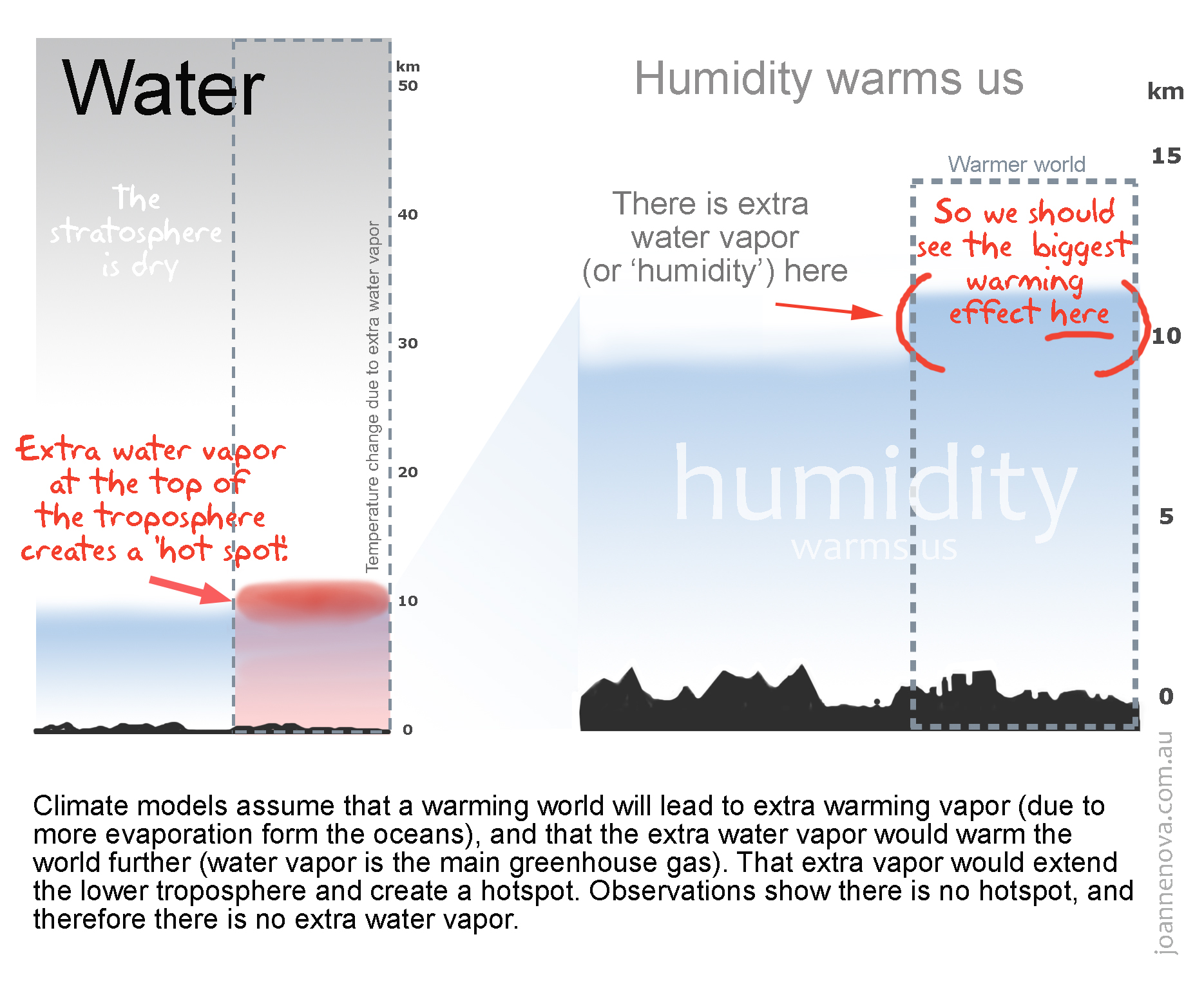
(Click to enlarge) From a post in 2009 and The Second Skeptics Handbook.
Despite the name, the hot spot is actually cold air that is meant to be warming faster than everywhere else in the atmosphere. The idea is that this dry band above the damp water vapor layer becomes humid and warmer as the water vapor rises and reaches higher into the atmosphere. This extra thickness of water vapor matters. The molecules at the top are the VIPs releasing energy to space. (The water molecules down lower emit energy too, but it’s mopped up by all the molecules around: thwarted from escaping.) As the blanket of damp air thickens, the temperature of the top layer of molecules gets colder — it’s one of those rules about the atmosphere — as everything gets higher in the troposphere it gets colder. The reason you care about this (really) is that colder molecules are more sedate boring creatures; they just don’t fling energy into space as well as warmer molecules do. The net effect is that a thicker blanket of humid air warms the planet by slowing the amount of energy lost to space.
For more information see, The one fatal flaw that wipes out the crisis (a brief summary), and the models are wrong, but only by 400% (Herman, McKitrick and McIntyre).
Creative color scale tricks
In 2008 Sherwood used a color changing trick to produce a hot spot graph which appeared quickly in blog-battles. He altered the standard color scale so that even zero degrees of warming would look orange red hot. (It fooled John Cook.) Sherwood has never apologized for or corrected that 2008 graph. The only acknowledgement given was that Cook stopped using the graph, and Sherwood has stopped using that skewed color scale. He is much more restrained this time, but is still not using the standard scheme. In the latest effort a zero-degree-trend is still not the normal yellow, but a neon green. The effect is to make it look as cold as possible and contrast it with the ultra hot red a fraction of a degree away, which implies a stronger signal than the data might suggest. The red scale goes all the way to black, and most of those red-black shades are unnecessary as they aren’t used at all in the graph. The net effect is to artificially generate contrast, and isolate the “hot spot”. Meh.
Press release UNSW:
New publicly available dataset confirms tropospheric hot spot and increased winds over Southern Ocean
Researchers have published results in Environmental Research Letters confirming strong warming in the upper troposphere, known colloquially as the tropospheric hotspot. The hot has been long expected as part of global warming theory and appears in many global climate models.
The inability to detect this hotspot previously has been used by those who doubt man-made global warming to suggest climate change is not occurring as a result of increasing carbon dioxide emissions.
“Using more recent data and better analysis methods we have been able to re-examine the global weather balloon network, known as radiosondes, and have found clear indications of warming in the upper troposphere,” said lead author ARC Centre of Excellence for Climate System Science Chief Investigator Prof Steve Sherwood.
“We were able to do this by producing a publicly available temperature and wind data set of the upper troposphere extending from 1958-2012, so it is there for anyone to see.”
The new dataset was the result of extending an existing data record and then removing artefacts caused by station moves and instrument changes. This revealed real changes in temperature as opposed to the artificial changes generated by alterations to the way the data was collected.
No climate models were used in the process that revealed the tropospheric hotspot. The researchers instead used observations and combined two well-known techniques — linear regression and Kriging.
“We deduced from the data what natural weather and climate variations look like, then found anomalies in the data that looked more like sudden one-off shifts from these natural variations and removed them,” said Prof Sherwood.
“All of this was done using a well established procedure developed by statisticians in 1977.”
The results show that even though there has been a slowdown in the warming of the global average temperatures on the surface of the Earth, the warming has continued strongly throughout the troposphere except for a very thin layer at around 14-15km above the surface of the Earth where it has warmed slightly less.
As well as confirming the tropospheric hotspot, the researchers also found a 10% increase in winds over the Southern Ocean. The character of this increase suggests it may be the result of ozone depletion.
“I am very interested in these wind speed increases and whether they may have also played some role in slowing down the warming at the surface of the ocean,” said Prof Sherwood.
“However, one thing this improved data set shows us is that we should no longer accept the claim that there is warming missing higher in the atmosphere. That warming is now clearly seen.”
DATA:
Credit to Sherwood — the data is supposedly available, though I cannot get anything through this link or variations of it. Presumably that will be fixed.
“The data presented here (v2.01) may be freely downloaded from the lead author’s website.”
REFERENCES
Steven C Sherwood and Nidhi Nishant (2015) Atmospheric changes through 2012 as shown by iteratively homogenized radiosonde temperature and wind data (IUKv2) Environ. Res. Lett. 10 054007 [PDF]
Christy J.R., Herman, B., Pielke, Sr., R, 3, Klotzbach, P., McNide, R.T., Hnilo J.J., Spencer R.W., Chase, T. and Douglass, D: (2010) What Do Observational Datasets Say about Modeled Tropospheric Temperature Trends since 1979? Remote Sensing 2010, 2, 2148-2169; doi:10.3390/rs2092148 [PDF]
Douglass, D.H., J.R. Christy, B.D. Pearson, and S.F. Singer. (2007). A comparison of tropical temperature trends with model predictions. International Journal of Climatology, Volume 28, Issue 13, pp. 1693-1701, December 2007. [Abstract] [PDF]
Fu, Q., S. Manabe, and C. Johanson (2011), On the warming in the tropical upper troposphere: Models versus observations, Geophys. Res. Lett., 38, L15704, doi:10.1029/2011GL048101. [PDF]
IPCC, Assessment Report 4, (2007), Working Group 1, The Physical Science Basis, Chapter 8. Fig 8.14 [PDF] Page 631
Karl et al (2006), Climate Change Science Program (CCSP) 2006 Report, Chapter 1, 1958-1999. Synthesis and Assessment Report 1.1, 2006, CCSP, Chapter 1, p 25, based on Santer et al. 2000; [PDF]
Karl et al (2006) Climate Change Science Program (CCSP) 2006 Report, Chapter 5, part E of Figure 5.7 in section 5.5 on page 116 [PDF]
McKitrick, R., S. McIntyre, and C. Herman, (2010), Panel and multivariate methods for tests of trend equivalence in climate data series. Atmospheric Science Letters, 11: 270–277. DOI: 10.1002/asl.290. Data/code archive. [Discussion on JoNova] [PDF]
McKitrick, R., McIntyre, S., and Herman, C. (2011) Corrigendum to Panel and multivariate methods for tests of trend equivalence in climate data series, Atmospheric Science Letters, Vol. 11, Issue 4, 270–277. DOI: 10.1002/asl.360. [Abstract] [See McKitricks page on model testing].
Fu, Q, Manabe, S., and Johanson, C. (2011) On the warming in the tropical upper troposphere: Models vs observations, Geophysical Research Letters, Vol. 38, L15704, doi:10.1029/2011GL048101, 2011 [PDF] [Discussion]
McKitrick, R. and Vogelsang, T. J. (2011), Multivariate trend comparisons between autocorrelated climate series with general trend regressors, Department of Economics, University of Guelph. [PDF]
NOAA Satellite and Information Service, Integrated Global Radiosonde Archive, Data Coverage. June 8th 2010. [Link]
Santer, B. D., P. W. Thorne, L. Haimberger, K. E Taylor, T. M Wigley,. L. Lanzante, J. R. Solomon, M. Free, P. J Gleckler, P. D. Jones, T. R Karl, S. A. Klein, C. Mears, D. Nychka, G. A. Schmidt, S. C. Sherwood and F. J. Wentz (2008), Consistency of modelled and observed temperature trends in the tropical troposphere. International Journal of Climatology, 28: 1703–1722. doi: 10.1002/joc.1756 [Abstract] [PDF]
Paltridge, G., Arking, A., Pook, M., 2009. Trends in middle- and upper-level tropospheric humidity from NCEP reanalysis data. Theoretical and Applied Climatology, Volume 98, Numbers 3-4, pp. 351-35). [PDF]
H/t to the late Rod Smith — the original dropsonde-man — for giving me some appreciation of the formidable database amassed from weather balloons. His comments in the early days of this blog are still remembered.