Where do people live?
These marvelous spike maps mark out a 3D representation of the population density on each two-kilometer-square pixel of Earth’s surface. There are no outlines for countries, yet for the most part we can still see where the land meets the sea.
Credit goes to Alistair Rae, formerly a professor of urban studies and planning at the University of Sheffield. He used the EU’s population density data with the mapping tool Aerialod to create these glorious 3D maps.
And the map shouts “India”.
UPDATE: Do click to see the larger maps!
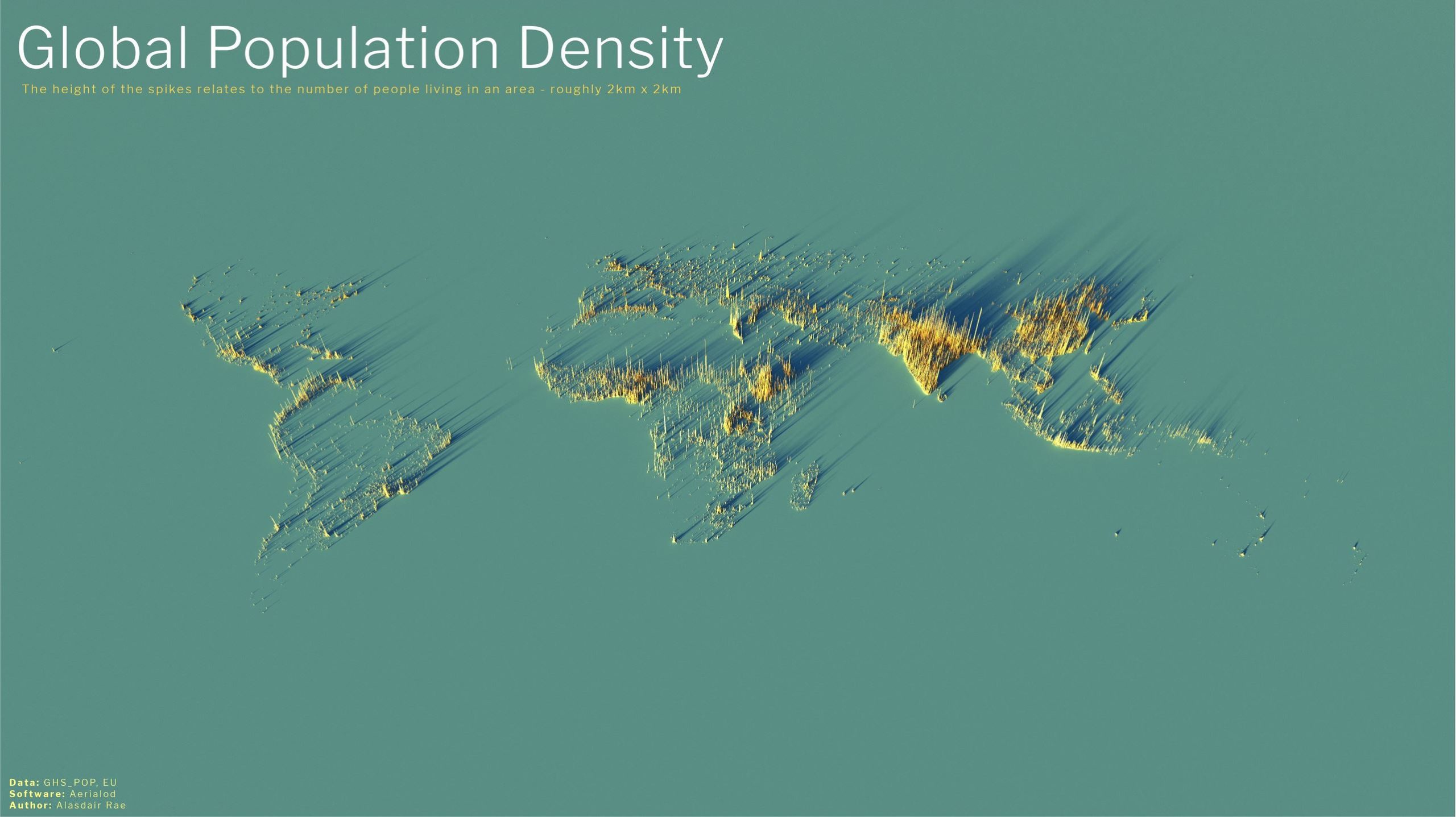
Alistair Rae, Stats, Maps n Pix Click to enlarge | CC 2.0
This is the global distribution of 8 billion people. The abundance of South East Asia is undeniable, as is the emptiness of the Sahara and the vacancy of Siberia. Antarctica is an invisible continent.
Australia and New Zealand are barely there. We can see how isolated Perth Australia is (where I live).
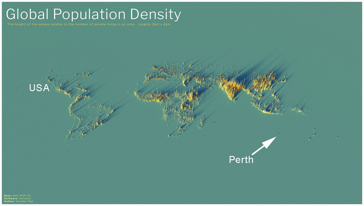
Annotated by Jo to show friends in the USA where Perth is.
Hawaii and Auckland likewise, stand apart.
Most maps originally came from Alastair Rae on Twitter in 2020 and later from the Visual Capitalist team which explains:
The height of each bar represents the number of people living in that specific square, with the global map displaying 2km x 2km squares and subsequent maps displaying 1km x 1km squares.
The USA
Fifty million people live in the zone that stretches from Washington to Boston.
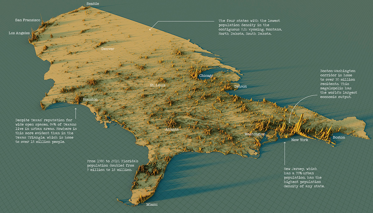
USA Map – Click to enlarge. | Visual Capitalist
China
60 million people live in the conglomerate spikes of Ghangzhou, Shenzhen and Hong Kong.
Otherwise most people in China live in the river basins of the Yellow river and the Yangzte, and the central Sichuan basin.
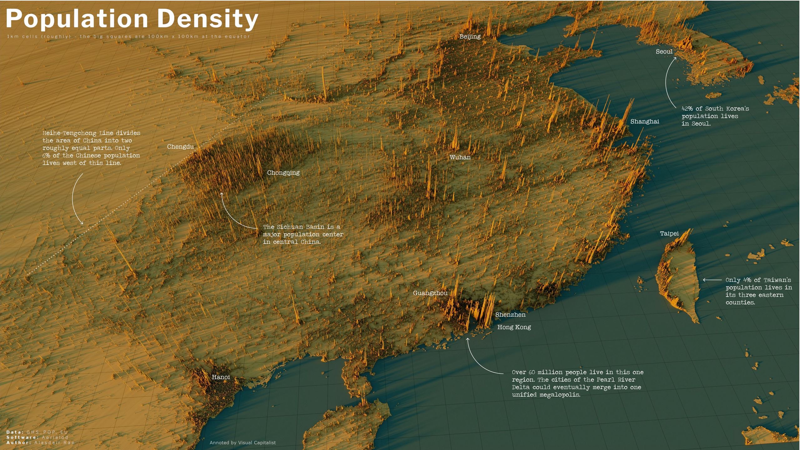
China — Click to enlarge |Annotated by the Visual Capitalist
India
The incredible Indo-Gangetic Plain is in the foothills of the Himalayas, where the Indus and Ganges flow. So much of human life is determined by the geography of nutrients and water flow. In the foreground is Bangladesh on the Ganges river delta and in the background is the population of Pakistan nearly entirely clustered on the Indus River.
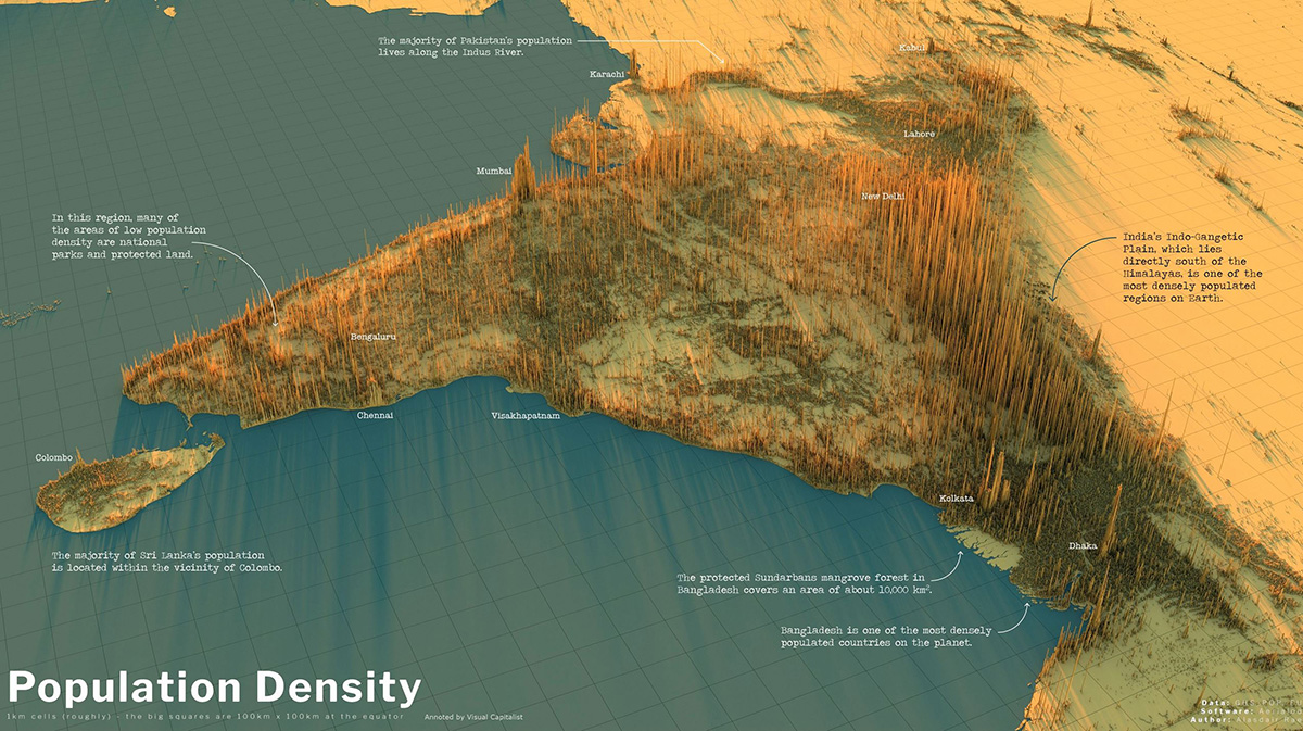
India — Click to enlarge | Annotated by the Visual Capitalist
Recent guesstimates suggest India may now have the largest population in the world, but no one really knows.
The people of the United Kingdom
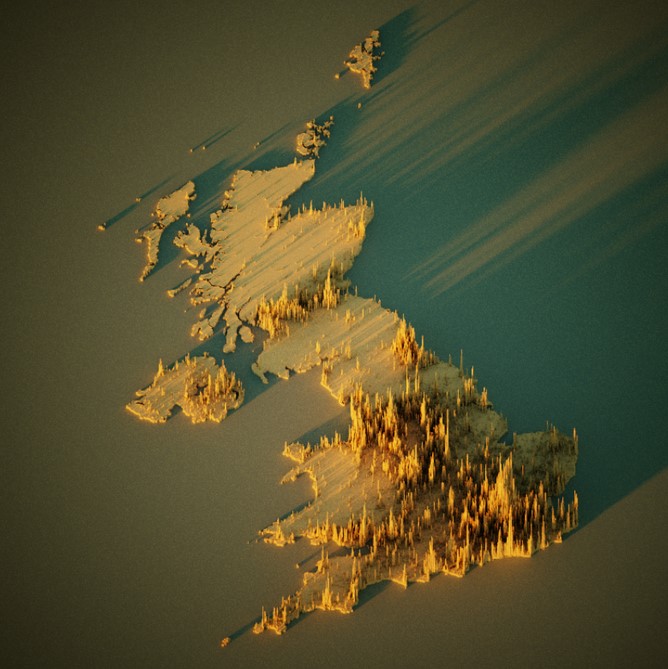
Click to enlarge. | CC 2.0
Under no circumstances should anyone assume humans in the UK want more warmth and sunlight.
I mean, look at where they live, right?
The people of Europe
From some angles the population appears more evenly spread — perhaps due to the age of the civilization.
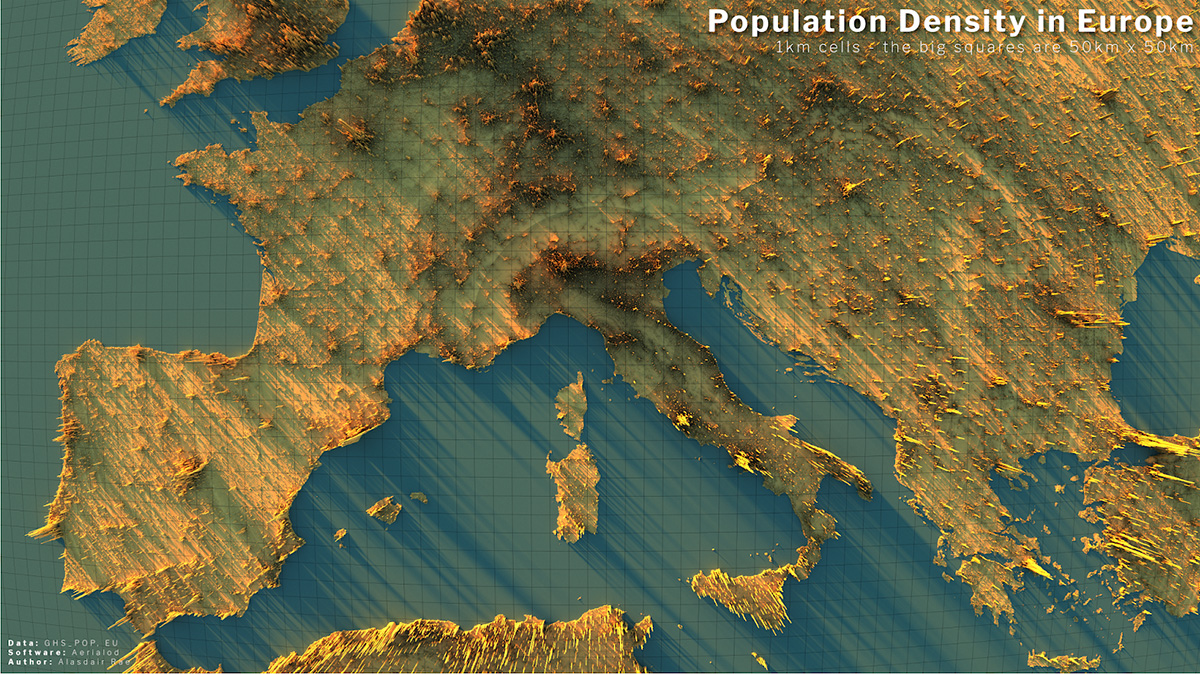
Alistair Rae, Stats, Maps n Pix Click to enlarge | CC 2.0
Though from other angles, there is a remarkable spike at Paris, and a concentration on the rivers flowing from the Alps to the ocean — particularly the Po river of Northern Italy and the Rhine river.
In a sense the map of human population is an anti-map of mountains. We live where the rivers flow.
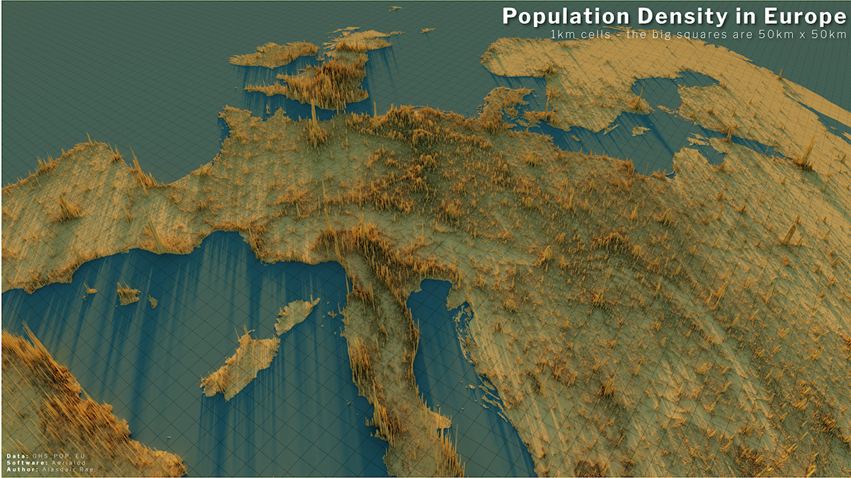
Alistair Rae, Stats, Maps n Pix Click to enlarge | CC 2.0
The incredible population divide of South East Asia and Oceania
Unlike previous maps the land areas below are shown under the spikes. Respectively, Australia, New Zealand and Indonesia have 26 million, 5 million and 280 million people. The Philippines has 109 million. Japan, 126 million. And China looms in the top left with possibly 1,400 million.
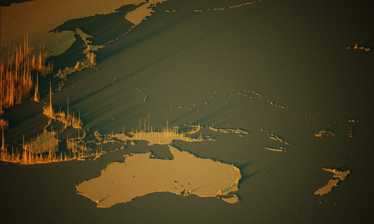
Alistair Rae, Stats Maps and Pix. Click to enlarge | CC 2.0
There are messages in this data, and we hope people are paying attention.