Across the continent downunder, “the new pause” in temperatures is now 9.6 years long as measured by the most reliable system there is — UAH satellites.
If and when we hit the Ten Year Pause, the National Climate Alarm Centres will all issue press releases, just like the other headline events, right? Just like the “Worst bleaching since last year”, “Hottest day since records began” in 1993. Six hot days in a row in one city of Australia.
Which model predicted that temperatures in Australia would do “net nothing” for a decade?
Thanks to Charles for the graph! (His explanation of calculating the “zero slope” is at #14.2.1)
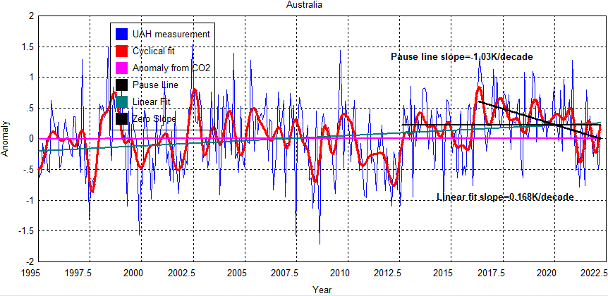
The length of the zero slope pause line is now 9.6 years.
Technically, temperatures have been falling according to the UAH Satellites since May 2016.
Satellites are obviously better for global and continental temperature trends
Assuming we care about trends that is, and not just one-second records. The UAH satellites circle continuously, and cover the entire continent. They don’t just measure 100 small points with thermometers, next to airports and incinerators, but 7 million square kilometers of area.
Some smarty pants will say UAH is bad, because it doesn’t match the land thermometers like RSS does. But that IS the point, RSS was adjusted to match the hyper-adjusted junk on land, and now they’re all terrible.
I explained before why UAH really is so much better:
Five reasons UAH is different (better) to the RSS global temperature estimates
-
-
- UAH agrees with millions of calibrated weather balloons released around the world. RSS now agrees more with surface data from equipment placed near airports, concrete, air-conditioners and which is itself wildly adjusted.
- In the latest adjustments UAH uses empirical comparisons from satellites that aren’t affected by diurnal drift to estimate the errors of those that are. RSS starts with model estimates instead.
- Two particular satellites disagree with each other (NOAA-14 and 15). The UAH team remove the one they think is incorrect. RSS keeps both inconsistent measurements.
- Diurnal drift probably created artificial warming in the RSS set prior to 2002, but created artificial cooling after that. The new version of RSS keeps the warming error before 2002, but fixes the error after then. The upshot is a warmer overall trend.
- UAH uses a more advanced method with three channels. RSS is still using the original method Roy Spencer and John Christy developed with only one channel (which is viewed from three angles).
-
…