By Jo Nova
Everything is a PsyOp now: even the weather maps are on fire
Australia has had a mild summer, a mild year, but that’s a reason for another meaningless “hottest” headline. “Millions across NSW suffering through hottest day over two summers“. So outback New South Wales finally gets an average warm summer day and the climate map makes it look like a nuclear meltdown. Since when was 35 degrees C a shade of heat so hot it was black? (That’s 95F).
To put this in perspective, the town of Cobar near the centre of the map made it to 37C today (98.6F). But a few years ago the average temperature for the whole month of February was 37C. Any Cobar resident who feels like 37C is unusually warm, moved there this morning.
If newspapers were not paid agents or religious acolytes for the cult of climate change the headlines would have said “finally a last blast of summer warmth after two cold years”. But that doesn’t sell solar panels.
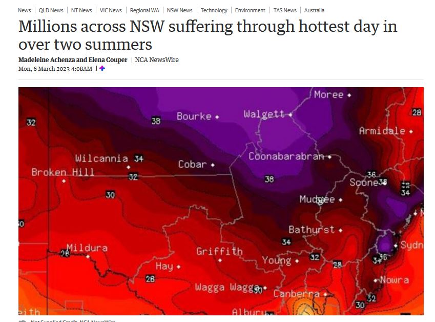
Just another warm summer day made to look like hell on Earth
No heat? No problem…
Call it color inflation. The value of any color is shrinking. Satellites show Australia hasn’t warmed at all in the last ten years, but the headlines and artwork still look the same. Back then, it was a different kind of PsyOp. In 2013, the BOM announced climate change had made Australia so hot they needed to change the color scale of their maps so they could add “purple heat” for a prediction of over 50 degrees C (a temperature that didn’t even happen). Now, 40C is the new 50C and what was an average day in 2020 in January for Bourke is now a purple holocaust. (40C is 104F and 50C is 122F).
To be fair the BOM has the same color chart it had then, and the new radioactive maps are made by some other agency, NCA NewsWire or Stormcast, whoever they are. But the BOM says nothing about this, and the media are happy to play deceptive color tricks on their hapless audience.
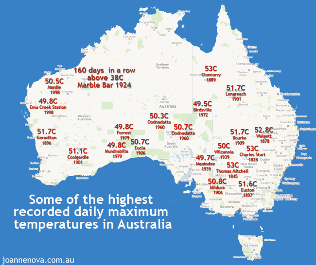
I pointed out ten years ago that if Australian towns hit 50C it wasn’t a record but just a return to a temperature measured all over Australia in the 1800’s.
Real Australians aren’t afraid of 35 degrees C, but sleepy distracted Australians might be fooled out of some taxes by a hellfire map.