Give this man a medal. Prof Norman Fenton explains this so well. If this technique is widely used, then it is a scandal. It is so utterly dishonest, so obviously wrong. If groups really are using this to report “efficacy” where were all the Professors and medical agencies we pay to protect us? Perhaps there were other efficacy studies which didn’t do this? Shouldn’t our universities, the FDA, the CDC, the TGA, and the Chief Medical Officers be the ones to point out this problem, and in real time, not 18 months later…
As a piece of science communication this short video is excellent. The only thing lacking is the list of where exactly this technique is used.
In the first two weeks after vaccination researchers call people “unvaccinated” which leaves room for all kinds of naughty statistical games. By switching infected people from the vaccinated group to the unvaccinated group, or reclassifying them, they introduce a selective bias which will “show” that the vaccinated are less likely to catch Covid, even if they are exactly as likely to catch it.
UPDATE: How many studies misclassify the vaccinated in the first two weeks? On his site Fenton explains that “In assessing the efficacy of Covid vaccines in observational studies (such as in the large Israel study which claimed 95% efficacy of the Pfizer vaccine) it is now standard to assume that the vaccine takes 14 days to ‘work’ and hence to classify a person as ‘unvaccinated’ within 14 days of vaccination.“
Yossi Shaul replied: this is exactly what happened in Israel. And that’s also why whenever we requested “raw data” without any classification, we were turned down.
Hiding raw data is never a good sign.
This is the same Prof Norman Fenton who wrote the paper about mis-categorisation of vaccinated people. That paper is still the most scientifically robust example of excess deaths rising in the weeks after vaccination programs were carried out in each age group in the UK.
I’ll just keep repeating this graph from December last year — the one with the spooky quantum entanglement effect where more unvaccinated people die in the weeks after other people in their age cohort get vaccinated.
Ponder how many people we have vaccinated since this damning study was published?
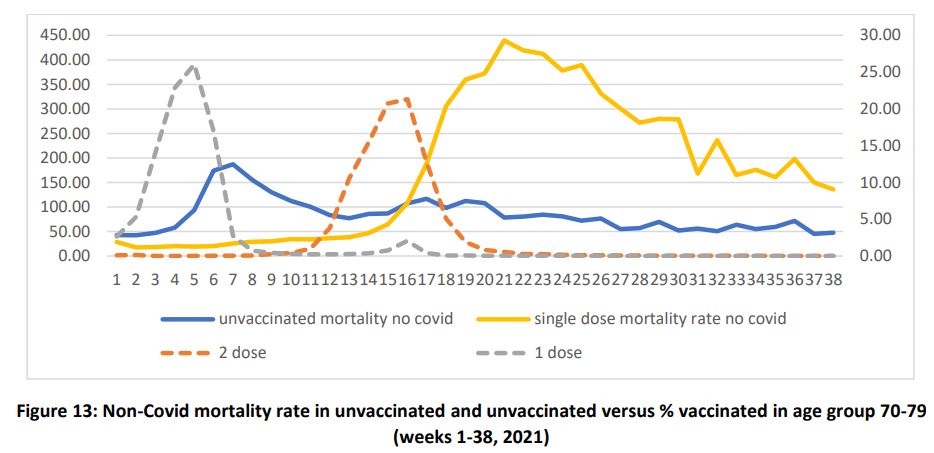
Strangely, the unvaccinated are more likely to die in the week after the first dose peaks in their age group.
A year ago a large Swedish study of efficacy showed how the vaccines held up well from 2 weeks to 4 months, but declined to zero protection by nine months. The graphs don’t include any data from the first two weeks which is a shame. It would have been better to see it, whatever it was, just to know that those who were vaccinated (but didn’t yet have a mature antibody response) were kept in the same data set.
*Edited after a few hours to reflect that we are not certain which studies this applies too.
UPDATED to a corrected video.
REFERENCE
Neil, and Fenton et al (2021) Latest statistics on England mortality data suggest systematic mis-categorisation of vaccine status and uncertain effectiveness of Covid-19 vaccination