“The IPCC remains addicted to hockeysticks”
In the 6th dimension of Intergovernmental Climate Propaganda, which arrived last week, the long discredited Hockeystick is not just a sidenote, it’s the very first graph the IPCC uses in their Summary for Powerful people (the ones who make policy).
As per usual, hundreds of years of warmth has been retro-extinguished. Thousands of proxies around the world all deviated from the real temperature and non-randomly in the same direction. It’s a conspiracy I tell you! Luckily the IPCC has found scientists who can correct these simultaneous errors of proxiness which mostly they do by just tossing out the results they don’t like. They ignore whole series they don’t like, delete the years that don’t work for them, and flip that data upside down if they need to. And if that’s not enough they use trees that grow larger rings when CO2 is higher.
And when they are not deleteing data, they’re using the wrong trees. No one is even pretending anymore. They’ve done it all before and no one went to jail or even lost a job.
As Steve MacIntyre tells it the PAGES2017 data set winnowed down the thousands of proxies to their 692 favorite ones. In PAGES2019, instead of getting more data, they got less, and now there are only 257 proxies.
You might think they were the 257 longest or best proxies, but about 25% of the ones that made it through are short coral studies which often have steep rises in the last 50 years, but no information at all for the two thousand years before that, that mattered.
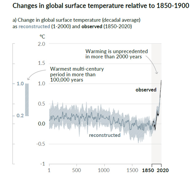
Figure 1, IPCC 6AR. page 8 PDF
Steve McIntyre slices and dices the Zombie Hockeystick.
The IPCC AR6 Hockeystick
Although climate scientists keep telling that defects in their “hockey stick” proxy reconstructions don’t matter – that it doesn’t matter whether they use data upside down, that it doesn’t matter if they cherry pick individual series depending on whether they go up in the 20th century, that it doesn’t matter if they discard series that don’t go the “right” way (“hide the decline”), that it doesn’t matter if they used contaminated data or stripbark bristlecones, that such errors don’t matter because the hockey stick itself doesn’t matter – the IPCC remains addicted to hockey sticks: lo and behold, Figure 1a of its newly minted Summary for Policy-makers contains what else – a hockey stick diagram. If you thought Michael Mann’s hockey stick was bad, imagine a woke hockey stick by woke climate scientists. As the climate scientists say, it’s even worse that we thought.
To give the average punter an idea of just how industrial-grade the cherry picking is, McIntyre picks a random assortment of proxy histories the IPCC filtered out in order to discover the modern Hockeystick marked in Red.
The Black graphs disappeared, the blue graphs lived on, and the red line is the politically correct history of the temperature on Earth.
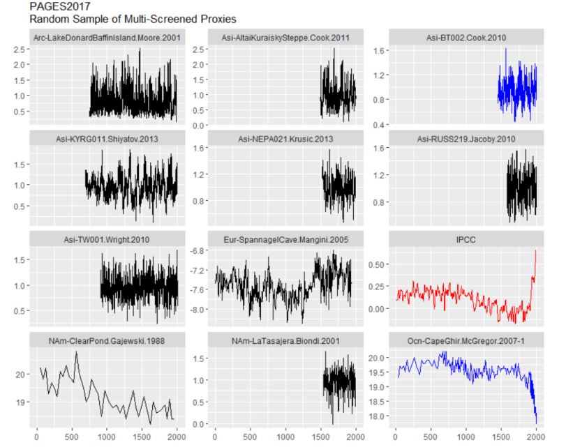
Random selection of proxies that didn’t show unprecedented global warming in PAGES 2017. The IPPC interpretation in Red.
Curiously, Cape Ghir (bottom right) off Morocco actually has a hockeystick, but its one of unprecedented cooling. It’s an alkenone proxy, which McIntyre describes as being good for estimating ocean temperatures, and used so often they have boilerplate formulas to convert the values into temperatures. However this is clearly wrong, the IPCC heroes know the temperatures were rising (how could it be any other way?) so they flip the graph to “discover” the warming. Up is down, black is white, you know the drill, Winston. They’ve done it before.
And a quarter of the cherries that were picked were the brief coral studies which tell us nothing about the Medieval Warm Period:
Coral Temperature Proxies
Hiding the decline
Since about 1960 tree rings and other proxies “diverge” from thermometers probably because tree rings are often not good thermometers, and sometimes thermometers are not good thermometers either — especially when they are put near exhaust vents from air conditioning units.
MacIntrye:
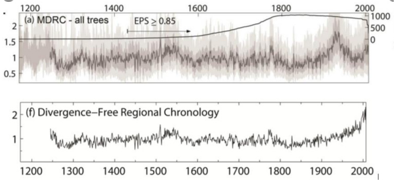
They took “hide the decline” to extremes that had never been contemplated by prior practitioners of this dark art. Rather than hiding the decline in the final product, they did so for individual trees: as explained in the underlying article, they excluded the “divergent portions” of individual trees that had temerity to have decreasing growth in recent years. Even Briffa would never have contemplated such woke radical measures.
Say hello to Divergence-free regional chronology?
“…rather than excluding divergent series altogether,
we exclude only the divergent portions of these series.“
If you don’t like your data, you can delete your data.
See the bump around World War II in the top graph? It’s gone…
…
The warming around WWII was “divergent” from climate models and government grants. It was deleted.
The 2021 Zombie Hockeystick also includes that famous tree that responds to increasing CO2 levels by growing larger rings.
Five different PAGES2019 series use stripbark bristlecones…
By confusing cause with effect the stripbark pines are the ultimate tool to find warming at exactly the same time as CO2 rises.
Read it all: https://climateaudit.org/2021/08/11/the-ipcc-ar6-hockeystick/
REFERENCE/ PROPAGANDA
IPCC Summary for Policy Makers round 6. Page 7 , Figure SPM-1