
There were not many long term sites (in black dots) in the centre of Australia in 1930.
This summer the Bureau of Meteorology (BOM) invented a whole new metric to measure average national heat, which might be all very well except no-one (other than the BOM) seems to know what it is.
On January 7th the BOM claimed Australia set a new “average maximum daily temperature record”. Now the headlines are about the “hottest” Australian summer.
With both records, no one outside the BOM team has access to the methods or data. This post is about the new “daily” temperature of Australia used to declare Jan 7th was a record, but the same point applies to the “hottest summer” records, even though they may be a different data set. Where is the data? Where are the methods?
Is the BOM a science agency or a PR bureau?
The January 7th heatwave supposedly broke all previous “daily” records in this category — a dubious honor since no-one can remember any records like it.
It’s a bit like winning the Side-Jump. It’s not an event anyone knew was on until the medal ceremony. Worse, no one knows how the event was measured, even after the Gold Medal was given away, because the rules are kept secret.
Where are the methods?
It is good marketing. It isn’t science.
Chris Gillham and others asked the BOM and apparently a whole new historic analysis of daily temperatures (based on the AWAP station network) will be released soon. Hopefully it’ll be a fully digitised dataset back to 1911 that researchers can look forward to, but, once again, the bureau is scoring newspaper headlines with black-box procedures that are not complete enough yet to publish.
Is it so urgent that the public had to hear about “record” heat now, rather than after the calculations had been published and reviewed? It’s rather like the “compelling psychology research” (showing we’re all nutters) that still isn’t published six months after the headlines. No one can replicate it, check it, or point out the flaws. It is good marketing. It isn’t science.
The new “area daily average” comes from 700-800 records which sounds impressive. But as far as the independent audit team can tell, more than half of these have been operating for only 30 to 50 years. Our last major heatwave was 1939, not 1972, so many of those thermometers weren’t even recording temperatures the last time Australia got seriously hot.
How many thermometers have 100 year records? Just 16.
The brutally simple average of all the temperatures recorded at 721 weather stations on Jan 7th was 35.1C, not 40.3C. The extra 5 degrees is produced by a form of area weighting to average the thermometers over the entire nation. Most thermometers are located on the cool outside edge of Australia, not the hot middle of the country where hardly anyone lives. So there are not many thermometers with long records to average across the center.
The BOM team, quite realistically, needs to make up for the non-random way those thermometers are placed. But there are many ways to “average” the numbers and different datasets to use (like HQ, ACORN, AWAP). No-one suggests that the BOM ignored the 382 cooler stations within the 721 known to the audit team, but the average of the hottest 339 stations is 40.3C. Curious.
For most Australians on Jan 7th the heatwave averaged somewhere around 35C, not 40.3C.
To have any legitimacy with a new record, the BOM needs to publish its methods that explain how temperatures can be calculated every day over a hundred years from weather stations that in many cases didn’t exist. How else would we know it was a reasonable effort? We all know that tweaked black-box statistics could be used to achieve meaningless records that drive news headlines. Of course, the BOM wouldn’t stoop that low, would they?
Thanks to the independent team who’ve worked very hard to get as far through this as they did. – Jo
——————————————————————–
A GUEST POST by The Team
(Special thanks to Chris Gillham for collating thoughts, see below for the names of the independent non-aligned members who contributed).
What’s hot and what’s not: how did the BoM create its temperature record?
The Bureau of Meteorology claims that Monday, 7 January 2013, was the hottest day ever in Australia, based on an area-averaged calibration that took climate researchers by surprise.
As stated in the BoM’s Special Climate Statement on the extreme January heat: “Australia set a new record for the highest national area-average temperature, recording 40.33C and surpassing the previous record set on 21 December 1972 (40.17C)”.
Or as the BoM put it in its media release for public consumption: “On Monday the average maximum daily temperature record for Australia was broken at 40.33C. The previous record, 40.17C on 21 December 1972, was held for 40 years”.
From that it seems reasonable to assume that the national average maximum daily temperature was 40.33C on 7 January. Media reports quote the BoM as saying the temperature was estimated from the maxima of between 700 and 800 Australian weather stations. In its Special Climate Statement 43, the bureau corrects the national average maximum to 40.30C.
The actual maximum average
The independent research team (instigated through Jo Nova’s blog) thought they’d look at the average maximum at 721 of these stations where temperatures are publicly available.
Excluded were stations with missing 7 January temperatures in the BoM web database as well as those in locations such as Antarctica. Their results are contained in this Excel spreadsheet.
It turns out the average maximum of the 721 stations was 35.1C on 7 January 2013.
The BoM’s Special Climate Statement includes a breakdown of each state’s heatwave including 7 January, and the BoM’s area-averaged estimate can be compared with the actual average maximum of all stations:
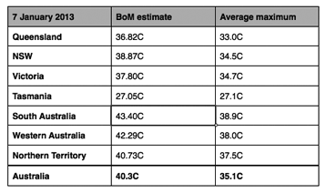
There’s about a 5C difference, the same as the BoM’s estimate of how much the January 2013 heatwave pushed national temperatures above average.
To achieve the BoM’s national and state averages based purely on all station maxima, it’s interesting looking at how many of the highest maxima stations would be needed out of the total in each jurisdiction:
Australia 339 out of 721
NSW 91 out of 172
Northern Territory 27 out of 54
Queensland 54 out of 125
South Australia 45 out of 80
Tasmania 57 out of 57
Victoria 68 out of 94
Western Australia 60 out of 139
In other words, if you chose the hottest 339 weather stations in Australia on 7 January 2013 and ignored the other 382, you’d find an average maximum of 40.3C.
It’s noteworthy that the BoM’s state area-averaged maxima can be multiplied by its area fraction of the Australian landmass, and then summed to obtain the national area average of 40.3C on 7 January:
Qld – 36.8 * 0.224829 = 8.27
NSW – 39.9 * 0.104656 = 4.18
Vic – 37.8 * 0.0296265 = 1.12
Tas – 27.1 * 0.0088255 = 0.24
SA – 43.4 * 0.128087 = 5.56
WA – 42.4 * 0.328743 = 13.94
NT – 40.1 * 0.175234 = 7.03
AUS = sum of the states = 40.3C
A different measure
So does this mean the BoM’s estimate of Australia’s hottest day on 7 January is wrong?
Maybe. Maybe not. The BoM has explained that the estimate of an area average on 7 January 2013 could have been 40.00C or 40.33C, dependent upon which measuring stick is used.
The BoM uses various measuring sticks and it seems the much vaunted ACORN network of grid area weighted temperatures at 112 weather stations had an anomaly on 7 January that was 5.36C above the 1961-90 climatological average of 34.64C.
That adds up to 40.00C. The BoM decided instead to add the ACORN anomaly that day to its Australian Water Availability Project (AWAP) network of stations to achieve an Australian area average of 40.30C on 7 January 2013.
The BoM believes that to gauge the extent of heat across Australia, the most appropriate dataset to use is AWAP which uses daily gridded data from all available and unhomogenised temperature measurements at around 700 stations daily.
The grid file for the BoM’s archived daily maximum RMSE Australian temperature map on 7 January 2013 suggests 718 weather stations were monitored, almost the same as the 721 stations within this analysis.
The AWAP network commenced in 1911 and its real-time daily gridded data monitoring system for daily maximum and minimum temperatures is generated at 1pm EST (2pm EDST) each day for the previous day. The BoM had previously calculated AWAP measures from 1996 but the methodology was not extensively published in peer-reviewed literature until 2009.
The BoM has explained that the AWAP network is not fixed in time due to network changes and basic quality control but sensitivity analyses show stability in the calculations since 1950.
Different datasets
For many years the BoM developed what it calls the High Quality network of weather stations around Australia that meet strict criteria to ensure accurate temperature comparisons back to 1910, with an anomaly baseline from 1961-90.
In early 2012, the HQ network was superseded by the Australian Climate Observations Reference Network (ACORN) comprising 112 stations around the country with an anomaly baseline from 1981-2010 and a slightly warmer trend than HQ according to the CSIRO and the National Climate Centre.
The accuracy of HQ and ACORN datasets can be questioned but they are accepted as the official yardsticks and ACORN feeds global temperature indices. ACORN’s 112 stations are located strategically around Australia to represent an accurate spatial average of Australia’s national temperature, accounting for numerous factors such as historic location shifts, equipment changes, urban heat island (UHI), etc.
The BoM cites 21 December 1972 as the previous hottest Australian day at 40.17C.
Climate researcher Ken Stewart looked closer and found the averaged mean ACORN maximum on 21 December 1972 was 35.91C, somewhat warmer than the raw average max of 35.1C at 721 stations on 7 January 2013 but nevertheless a lot cooler than the 40.17C estimated by the BoM’s AWAP national daily procedure.
Age of weather stations
There have been confusing responses from the BoM to written questions about the AWAP network, with one estimating that around 11 million records are used over 103 years of data and another estimating that around 13 million records are used over 102 years of data.
The research team analysed all 1,886 BoM weather stations (from BOM Product IDCJMC0015) to identify mainland locations that remain open with more than 30 years of temperature data, and that have now been introduced to the BoM’s derivation of daily maxima. They found there were 269 excluding the 112 ACORN stations (download Excel spreadsheet).
The ACORN stations have a mean age of 86.5 years whereas the new ones they introduced have operated for an average of only 46 years. That is, since 1966.
Who knows what extreme events might have been recorded at those stations prior to 1966? For example, these records generally do not include the 1939 heatwave.

…
What’s going on?
The oddity you may have noticed above is that Tasmania was the only place where the estimated and actual maxima agree, and all available stations in that state contributed to the average.
This is a hint at the procedure used by the BoM to declare Australia’s hottest ever day.
The BoM’s estimate is area-averaged, whereby the entire Australian continent is divided into grid cells of latitude and longitude, and the weighted average of these cells is calculated. The BoM has used cell sizes as small as .25x.25 degrees in their evaluation of ACORN data.
All methods achieve average temperatures based on complicated variants such as land area proportions, meridional convergence and a distance weighted interpolation over multiple cells.
Valid extrapolation of temperatures can only be over limited distances but Australia historically had many areas with no temperature estimates at all. It is these unknown elements that can produce different results and demand the application of an accepted and consistent methodology.
But the BoM has introduced a new, unpublished procedure that apparently calculates area weighted means within states, then an area weighted mean across states based on their relative land areas.
Few inland thermometers
It sounds complicated because it is. The adjustments are needed partly because most weather stations in the 1800s and early 1900s were established in populated areas but there was a dearth of isolated inland thermometers and temperatures to build a true national average or historic comparison.
In March 2012, the BoM stated there were 761 weather stations in Australia, 16 with 100 years or more of data, 184 with 50 or more years, 506 with 30 or more, and 29 with less than five years of data.
The maps below show how many more weather stations are feeding Australia’s temperature record from 1930 to 2010, with scant recording possible of the interior where most of the January 2013 heatwave occurred.

…
How is it possible?
It is difficult to imagine how an area-averaged, day-by-day comparison of station recordings as early as 1910 or 1911 is possible, regardless of cell grid weighting, when in many vast areas there were no stations to weight.
A similar problem persists today and to compensate for the sparsity of weather stations in many inland regions, often with totally empty grid cells between them, the ACORN database applies a weighted average which proportionally multiplies their occurrence, at the same time dividing the occurrence of temperatures among more densely located stations in populated regions mostly on the coastal fringe.
As an example, to achieve 40.3C you would have to add another 494 stations which all had Leonora’s maximum of 47.8C (the hottest station in Australia on 7 January) to the other 721. Then you’d have 1,215 stations which altogether averaged 40.3C if the estimate was based simply on unadjusted maxima.
Australia’s “area averaged” record hot temperature on 7 January was (probably) based on an algorithmic compensation for hot outback areas with few thermometers, and an estimation of how this procedure would apply to every day of temperature readings at each of the 700 to 800 weather stations over the past 100 years.
It sounds tricky because many of the stations have shifted, usually to airports, or simply didn’t exist back then. It would be interesting to know what are the error bands in the BoM’s unknown all-station procedure and whether those errors have any consistency back to the early 20th century.
A confusing heatwave
Confusion about the BoM’s representation of the January 2013 heatwave is also caused by its explanation of what’s causing Australia’s heatwave in which a map shows over 70% of the continent recording temperatures in excess of 42C during the first two weeks of January 2013. The bureau then states that “it’s not like these sorts of days occur that often. The records set last week sit between two and three standard deviations above the long-term January mean of 35C”.
The bureau seems to be confusing the daily maximums with the highest temperatures over 14 days. The mean and standard deviation would be the daily mean and standard deviation, whereas the actual figure needed to calculate is the mean and standard deviation for the maximum temperatures over a 14 day period, which would be much higher than the daily figure (read more).
Further, in claiming the records are two to three standard deviations above the 35C mean for January, it should be pointed out that January 2013 was far from over when the statement was made so a valid comparison was not possible.
The January mean from 1961-90 is 34.64C with a standard deviation of 0.91. Temperatures cherry-picked from a short time period are going to deviate from the mean value over a longer period.
There is no doubt the January 2013 heatwave was hot over an extended area of inland Australia. However, such misrepresentations of available data suggest an exaggeration of its intensity in an historical context.
New BoM daily dataset
In its answers to questions about the procedure used to estimate a record hot day on 7 January 2013, the BoM revealed that a more detailed analysis of the January heat event, including changes in daily average temperatures, is likely to be peer-review published within months.
The BoM has advised that upon publication of the research paper, the historical analysis of daily AWAP temperatures will be made publicly available.
This will hopefully provide a new, publicly accessible database of estimated historic daily temperatures since 1911 at more than 700 Australian weather stations.
With a far broader range of stations than the 112 in the ACORN dataset, the new AWAP gauge will arguably contain even more debatable estimates of anomalies at any given location on any given day since 1911.
Dubious
The assurances of the BoM suggest its measuring stick might be accurate for Australian daily temperature estimates starting in the 1950s.
Significant questions still surround the validity of the HQ and ACORN anomaly adjustments or lack of adjustments for historic and recent temperature readings.
The ACORN estimated average anomaly at 112 weather stations is added to Australia’s average maximum in 1961-90 and applied to a different dataset of more than 700 stations over 100 years, with identical mathematics producing “typically small” differences in the latter half.
Anomaly inconsistencies remain between AWAP, the ACORN absolute maximum of 35.9C on 21 December 1972 and the absolute maximum of 35.1C at 721 stations on 7 January 2013.
The claim of a 40.3C record hot day on 7 January 2013 is dubious, particularly when compared before the 1950s.
The independent research team includes Chris Gillham, Ian Hill, Ed Thurstan, David Stockwell, Ken Stewart, Geoff Sherrington, Warwick Hughes and Anthony Cox
A similar analysis with a bit more detail can be viewed here.