Kudos to John O’Sullivan for finding this story; see the note at the end about the extraordinary response his post on this received.
———————————-
Who are the world’s worst “polluters”? According to a new high-spectral-resolution Japanese satellite — it’s developing countries.
Who knew detailed spectroscopic data on Earth’s atmosphere was available to figure out where the CO2 and other greenhouse gases are being produced and absorbed?
In January 2009, a Japanese group launched a satellite “IBUKI” to monitor CO2 and methane spectral bands around the world to establish exactly where the world’s biggest sources and sinks of greenhouse gases were. With climate change being the perilous threat to millions, this data would seem so essential you might wonder why didn’t someone do it before. As it happens, NASA tried — it launched the Orbiting Carbon Observatory in Feb 2009, which was designed to do exactly the same thing, but it crashed on launch. Oddly, NASA don’t seem to be prioritizing the deadly climate threat, as it will take NASA four years to figure out why the Taurus XL rocket failed and relaunch it.
The results from from Japan’s Aerospace Exploration Agency (JAXA) show that Industrialized nations appear to be absorbing the carbon dioxide emissions from the Third World. (Can we get carbon credits for that?) The satellite shows that levels of CO2 are typically lower in developed countries than in air over developing countries.
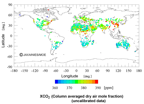
CO2 sources and sinks, recorded by satellite. (Red dots indicate higher levels of CO2, Blue dots mean CO2 levels are lower than average). Official figure caption: Carbon dioxide column averaged dry air mole fractions (XCO2) for clear-sky scenes analyzed using observations at shortwave infrared bands (radiance spectrum uncalibrated data) from the IBUKI greenhouse gas observation sensor (TANSO-FTS). Clear-sky scenes at individual TANSO-FTS observation points are determined using measurements from the cloud/aerosol sensor (TANSO-CAI). Data are excluded where the associated radiance spectra are saturated, and where noise is relatively large due to weak ground surface reflection.
If the evil modern polluters were producing more CO2 (and it mattered to the global flux), then we’d see higher levels of CO2 (more red dots) over the first world. Right? But CO2 levels are lower than average (see the blue dots). The highest emissions, at least on this graph are predominantly in China, and central Africa.)
Australia, New Zealand, South Africa and the US midwest earn Gold Star environment awards for their low carbon dioxide levels.
Likewise, the methane picture is remarkably similar. (NB: This is just April 20 – 28. Different times of year will vary!)

Figure: Methane (column averaged dry air mole fraction) initial analysis (April 20-28 observation data). Methane column averaged dry air mole fraction (XCH4) for clear-sky scenes analyzed under the same processing conditions as the top graph above.
Cheifio sums up the Japanese results: “For now, I think it’s pretty clear that the “CO2 From the Evil Western Polluters” meme has a serious hole in it… “
Chiefio (E.M Smith) goes on to say:
This isn’t that much of a surprise to me. I’d figured out some time ago that trees and bamboo could consume far more CO2 than I “produce” via burning oil and gas. I’ve also pointed out that The West is largely letting trees grow, while mowing our lawns and having the clippings “sequestered” in land fills (along with an untold tonnage of phone books and junk mail…) while the 3rd world is busy burning and cutting down their forests. The simple fact is that “jungle rot” will beat out my “gallon a day” of Diesel any time. Basically, we in the west grow far more wheat, corn, soybeans, wood, lawns, shrubs, etc. than we burn oil. In the 3rd world, they burn their sequestering plants. (And it takes one heck of a lot more wood to cook a meal than it does coal via a highly efficient furnace / electric generator / microwave oven.) But it’s nice to see it documented in aggregate in the “facts in the air”.
You can see in the graph on the right (click if you want to look up close) that the Japanese satellites have got a seriously high quality spectroscope to figure out the levels of greenhouse gases.

These are the kind of results they are getting, the spectral bands over the south pacific in March 2009. Click to enlarge. Gawk at the detail. They are serious graphs. Source http://www.eorc.jaxa.jp/en/imgdata/topics/2009/tp090319.html
Chiefio has also posted a truly beautiful animated graphic. Watch as those Siberian forests, suck up CO2 in summer as they grow, thus reducing the levels to 360 ppm in August 2009 (but curiously not as much in August 2010). You really need to see the graph to appreciate just how dynamic the flux is.
Man-made emissions are only 4% of the total
Since 96% of all CO2 emissions are natural, those sinks and sources will make or break any theory based on whether man-made emissions are problematic.
This topic fits in with Murry Salby’s work — could it be that changes in the natural sources of CO2 drive the global level, rather than our emissions?
—————————————————–
John O’Sullivan Censored?
John O’Sullivan wrote this story up a few days ago (link defunct). After two years of writing for “Suite 101”, he has just been suddenly shut down without warning or explanation. He believes it is in retaliation. What did they think it would achieve? All the thousands of links to his archive of stories now point to defunct pages.
See John O’Sullivan’s page now.
—————————————————-
UPDATE: NOAA has a Carbon Tracker Program with similarish results
The NOAA program captures sample of air at 81 locations and records CO2 levels. Then they presumably do a bit of interpretation and smoothing and modeling to estimate the graphs below. The results agree broadly with what the JAXA satellite recorded.
We can bet that if those red dots had have been located over industrial countries the images would have appeared not just in media stories, but in school halls and posters on bus stations. (Presumably NASA and the OSO team know about the NOAA program and we all know how anxious they are to get that satellite working again…)
[Source: These are global graphs averaged from 2001 -2009]
One-degree fluxes (Left). The pattern of net ecosystem exchange (NEE) of CO2 of the land biosphere averaged over the time period indicated, as estimated by CarbonTracker. This NEE represents land-to-atmosphere carbon exchange from photosynthesis and respiration in terrestrial ecosystems, and a contribution from fires. It does not include fossil fuel emissions. Negative fluxes (blue colors) represent CO2 uptake by the land biosphere, whereas positive fluxes (red colors) indicate regions in which the land biosphere is a net source of CO2 to the atmosphere. Units are gC m-2 yr-1.
Possibly just as interesting is the uncertainty chart (below). Across Siberia and Europe there is a 200 ppm flux uncertainty. I imagine these are the sites with the largest yearly range. Presumably the white over the Sahara means there is not much uncertainty? (But then maybe they have no data – Antarctica is white too.)
(See graph above)
“CarbonTracker surface flux estimates are optimally consistent with measurements of ~31,500 flask samples of air from 81 sites across the world, ~27,800 four-hourly averages of continuously measured CO2 at 13 sites (10 in North America, plus observatories at Mauna Loa, Hawaii; Barrow, Alaska, South Pole; and American Samoa), and ~23,800 four-hourly averages from towers at 13 locations within the continent (see Figure 3). Eight of these towers sample air from heights more than 100m above ground level.”