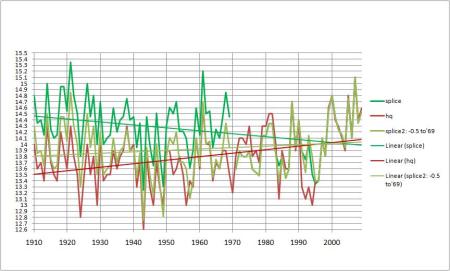
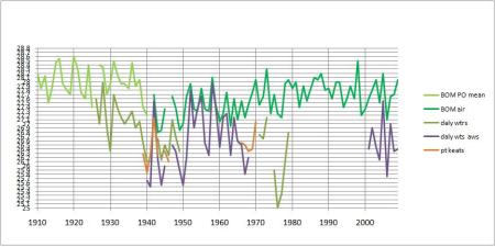
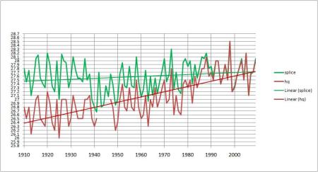
Ken Stewart has been hard at work again, this time analyzing the Australian urban records. While he expected that the cities and towns would show a larger rise than records in the country due to the Urban Heat Island Effect, what he found was that the raw records showed only a 0.4 degree rise, less than the rural records which went from a raw 0.6 to an adjusted 0.85 (a rise of 40%). What shocked him about the urban records were the adjustments… making the trend a full 70% warmer.
The largest adjustments to the raw records are cooling ones in the middle of last century. So 50 years after the measurements were recorded, officials realized they were artificially too high? Hopefully someone who knows can explain why so many thermometers were overestimating temperatures in the first half of the 1900’s.
50 years later?

The raw Australian urban temperature records are in blue. The adjusted records in red. Note that temperatures in the middle of last century appear to be adjusted downwards. These are the annual average recordings for all 34 sites.
Remember Dr David Jones, Head of Climate Monitoring and Prediction, National Climate Centre, Bureau of Meteorology said:
“On the issue of adjustments you find that these have a near zero impact on the all Australian temperature because these tend to be equally positive and negative across the network (as would be expected given they are adjustments for random station changes).”
Yet it’s obvious that there are far more warming adjustments than cooling ones, and remember, many (almost all?) of these urban sites will be markedly different places than what they were in say 1920. The encroachment of concrete, cars and exhaust vents can surely only go in one direction, though I guess, it’s possible all these sites have new sources of shade (why aren’t the themometers moved, if that’s the case?) Like the rural records, the temperatures overall are roughly a quarter of a degree higher after the “corrections”.

Ken explains:
The raw trend is about 0.4C (actually slightly less than 0.4C)- that’s a full 0.2C less than the non-urban raw trend using the same comparison; the adjusted trend is about 0.78C: and that’s a warming bias of 95%. (The 70% figure is based on averaging all the changes in trends- from the table of 34 towns. 95% is from plotting the average temperature for all sites each year, then calculating the trend from this average. It’s artificial as BOM say they don’t do it but it’s a way of comparing at the large scale. It removes much of the error.)
So much for “these tend to be equally positive and negative across the network”.
Of course, BOM says that this data is not used in their climate analyses, so my trend lines shown above are for illustration and comparison purposes only. However, they illustrate the problem quite well: there is a warming bias apparent in the High Quality data.
As well, the “quality” of the High Quality stations leaves much to be desired. Many of the sites have large slabs of data missing, with the HQ record showing “estimates” to fill in the missing years. Some sites should not be used at all: Moree, Grafton, Warnambool, Orange, Bowral, and Bairnsdale.
8 of the 34 are Reference Climate Stations (RCS) and were used by BOM and CSIRO in their State of the Climate Report released in March 2010.
What does it mean for our weather records?
These sites and trends are not used for analyzing Australia’s climate, but none the less, in some cities new records will be set that don’t really reflect what the raw data says, and while plenty of scientists don’t want to be seen talking about a single hot season (it’s weather, remember, not climate), there are plenty of other groups who issue press releases conflating a single season “heat wave” with carbon dioxide.
Ken sums up the problems
- The raw data and the adjusted data both show much less warming than the non-urban sites.
- Many of the sites show distinct cooling, especially in south east Australia.
- The data has been subjectively and manually adjusted.
- The methodology used is not uniformly followed, or else is not as described.
- Sites with poor comparative data have been included.
- Large quantities of data are not available, and have been filled in with estimates.
- The adjustments are not equally positive and negative, and have produced a major impact on the temperature record of many of the sites.
- The adjustments produce a trend in mean temperatures that is between roughly 0.3 degree Celsius and 0.38 degree Celsius per 100 years greater than the raw data does.
- The warming bias in the temperature trend is from 60% to 95% depending on the comparison method.
Some of the sites:
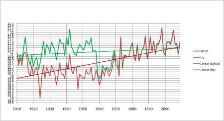
Kent Town (Adelaide): Note Adelaide West Terrace s long record:
Splice made from Adelaide West -0.28, Kent Town, and Northfield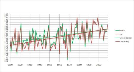
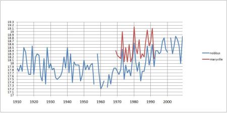
Maryborough (Queensland), and nearby long record stations, Sandy Cape and Gympie, correspond well:
 So much data is telling us the trend is minor.
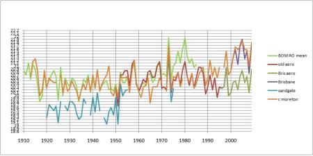
Brisbane Aero– a major city showing cooling!
Splice made from regional office + 0.07 to 1949, then the Old Aerodrome and New Aerodrome data: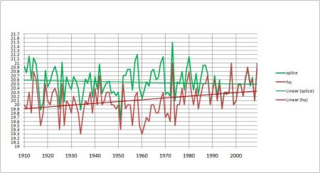
Newcastle– also cooled:
Adjusted:
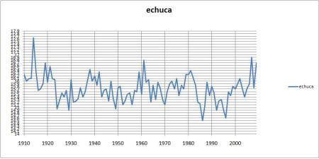
Echuca has a long record with no gaps:
But this becomes
..
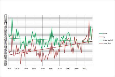
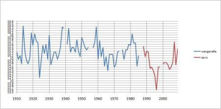
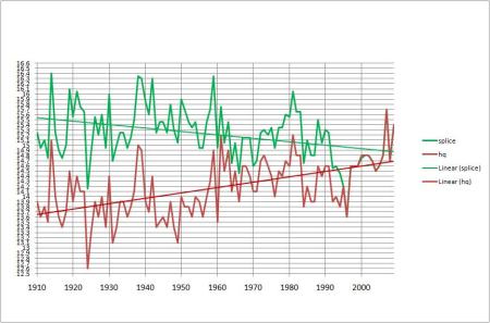
Worst of all is Wangaratta:
Sydney and Melbourne with their massive urban growth have both been adjusted downwards as we would expect (but are the adjustments enough?)
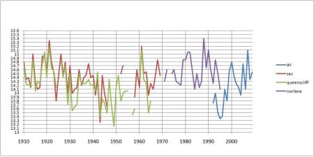
Geelong-a patchy record
Norlane and Queenscliff are used to fill gaps. Ken made 2 splices and went with the more conservative second one:
Darwin still remains one of the most remarkable transformations after adjustment:
Adjusted: This has been discussed several times before on Kens site e.g. Part 2: Northern Territory.
The full record and graphs of all the sites are at KensKingdom, so you can check your town or city there. (Why not drop in on him and say thanks to Ken and Lance for their work…)
Last December I looked at towns across Northern Australia but searching across thousands of kilometers, I couldn’t find any warming trend to match Darwins adjustmented up trend or the IPCC record.

