UPDATE: The newer edition has been released here.
Here’s a Spectacular Poster of ClimateGate Covering 3 Decades
You have to see this to believe it. Look up close and admire the detail while you despair at how long science has been going off the rails. To better appreciate the past and what was exposed by the CRU emails, the Timeline chart consolidates and chronologically organizes the information uncovered and published about the CRU emails by many researchers along with some related contextual events. That the chart exists at all is yet another example of how skilled experts are flocking in to the skeptics’ position and dedicating hours of time pro bono because they are passionately motivated to fight against those who try to deceive us.

Click on the image to see it enlarged, but download the full PDF to see the detail.
Download The PDF (788k)
Mohib Ebrahim has created this amazing document. I’ve produced a permanent Home page for this beautiful poster that will host the latest updates as a PDF. There are also printable versions in A4, A3, A2, US Letter and US Tabloid for those of you (like me) who need printed versions on which scribble, and scrawl exclamation marks.
Thanks also to Curt, an editor who has been dedicated behind the scenes with some of my recent posts, and also with the introduction and lists here. But, if you see an editorial error, blame me 🙂
Here are a few select screen shots so you have some idea of what this document shows. Click on the images just to pop-up readable close-ups.
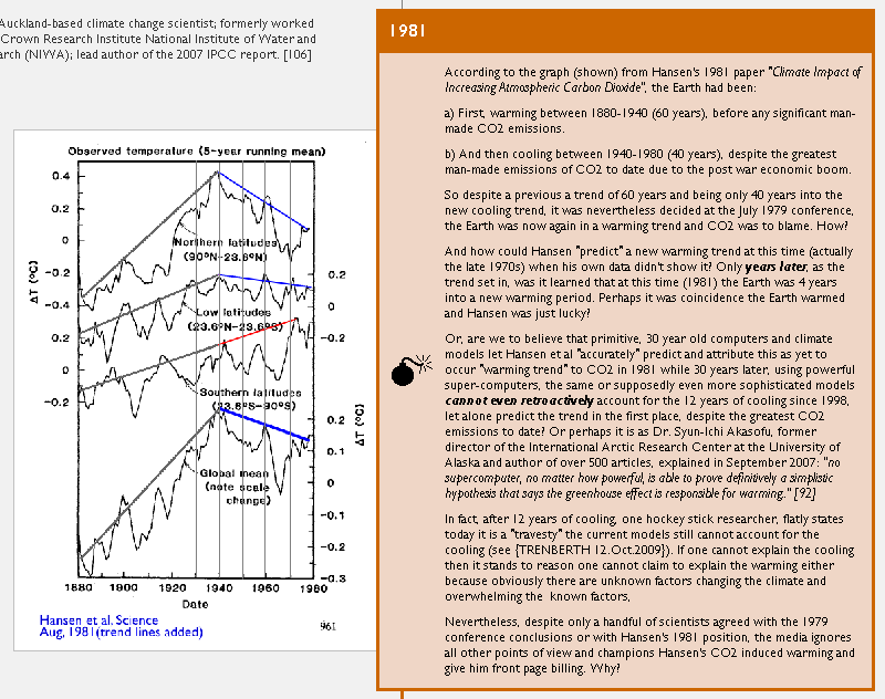
Climatologists had no idea what the temperature would be in the year 2000
…
Looking back in 1981, the world had just barely started warming, despite years of rising CO2 levels.
…
Three decades later they still admit privately that they don’t understand the climate
…
It’s hard to do the full Timeline justice on a small screen. One day, in historical exhibitions, I hope this chart will be exhibited to help people dissect just how the global warming scam grew, and to help teach children what to look for, to minimize the damage from the next exaggerated claim of catastrophe before it grows so large.