The mystery: We know when we drive through a city that temperatures warm from the fringe to the middle. We know UHI is real, but how much does it affect the official records? Is a 2010 city 0.3 K hotter than a 1960 city? How would we know?

Frank Lansner has come up with a way that might approximate the UHI effect — very roughly. It’s well known that UHI gets bigger as cities grow, but the devil is in the detail. Frank argues that it’s not just the size of the city that matters, but it’s growth rate.
The USA is full of large cities, but there is not much difference between the trend in satellites and ground stations there. Frank’s approach could explain this — most of the growth in human population has come in regions like Africa, not the USA.
He figured that if we compare satellite records to ground stations and see if there is a divergence, we might be able to see an indicator of UHI. The info coming out of satellites ought not be affected as populations expand, but the ground stations are often near population centres and they gradually get surrounded with more square-kilometers of concrete and a bigger buffer of UHI. Hence Frank sectioned up the world, and looked at the trends from both sets of measurements.
None of this is simple as Frank points out. Populations don’t just grow evenly across regions, nor does each 10% increase in population translate into the same increase in industrial output (and presumably heat). Indeed Frank finds the trend changes in different regions of the world. What ever the reason, then the significant result of Frank’s analysis is that the ground based temperature stations contain, on average, nearly half a full degree (0.46 K) of extra heat trend 1979-2010 when compared to the satellite based data, and it occurs in exactly in the areas of the world with highest population growth rates: The developing countries.
A 0.46K difference (for Africa, Latin America, and Asia minus Russia) is pretty darn significant especially as it’s only over 30 years. Is that UHI?
Why do ground based temperatures rise so much faster than satellite data in areas of the largest population growth? UHI? Coincidence? Or some natural effect? (And why isn’t a PhD student, or paid researcher doing these analyses?)
——————————————————————————————————
Given the vociferous nature of the comments thread on Franks site (where he previously discussed UHI). I’m offering it up to the skeptic world as a work in progress. Frank is looking for informed feedback.
————————————————————————————————————
UHI, Temperatures and population growth rate
Guest Posted by Frank Lansner
Also posted at his site Hide the decline
Can UHI be described as a function of population growth rate?
In short: Ground based temperature data are often measured from cities and airports Growth in populated areas might lead to faster warming trend in ground based temperatures – hence the UHI (Urban Heat Island) warming error in global temperature data. The problem is not significant when the temperature data is measured from satellites, and therefore:
If UHI has a measurable size, we should be able to see this by comparing ground based temperatures to UAH satellite temperatures, assuming we use a number of samples large enough.
In fact, if there is no sign of UHI in a comparison between ground based and satellite based temperatures, it would be hard to argue that UHI leads to an important warming error in global temperatures.
“UHI – Indicator”
Does this “UHI-Indicator” (the difference between ground based temperature data and UAH TLT data) then reflect UHI at all?

Population growth is slower in countries marked in green, blue or brown.
As argued in a previous article: we would expect to find more UHI error warming in areas with the largest population growth rate, not in areas with a constant population.
If the “UHI-indicator” does reflect some UHI-related warming error in temperature data, then we’d expect to see the effects all over the world: More population growth should lead to more UHI error.

Fig 1. Years 1979-2010.
I then examined the difference in GISS 1200km ground based land data vs UAH TLT land for 74 areas of the world, and this difference – “the UHI indicator” – I show on the Y-axis as a function of the population growth rate of each of the 74 areas in question.
Temperature data is accessible mostly grid for grid on the globe whole population data is mostly nationally accessible, and often also accessible on regional basis or countries. It is not possible then to make a perfect match between grid areas and national/regional areas, but all 74 areas are chosen by fitting best possible to a country or a row of countries and regions. The scarcely populated near-Arctic areas is not fit to study UHI generally and mostly left out. In addition I have mostly focused on continental areas:

Some countries like Russia, Canada and more have the problem that population is in one smaller area of the country and thus population data will basically reflect tendencies in those smaller areas. Therefore I have used regional population data for those countries. But even on regional basis the population is still often only appearing in one corner of the area, and thus some areas are not useful for a population trend comparison.

Fig 3.
Same data, now we see that not surprisingly areas of higher population growth are, for example, Africa and Latin America. There are not many data areas for single continents, and thus a trend-study of these is rough In any case, here’s how same data appears also showing trends from single continents/part of the world:

Fig4. The individual trends for the shown regions are however based on few data points, and the large “noise” in data does make the slope for the individual regions rather random. Removal of single data points of regions can change trends significantly, even to negative.(I have then made some experiments using GISS 250 km radius in stead of GISS 1200 km radius, wih rather mixed results for regions that need some further analysis.)
Many readers may now be thinking (like me): On the above figures we see, that the difference in ground based land temperature data vs. UAH TLT land data do occur most where population grows the fastest. But what if there is some completely different explanation? This could well be. For example, both the population growth and “UHI indication” occurs mostly in warmer countries, southern countries etc? So what if the temperature divergence in data for some perhaps even unknown reason just happened to take place in those southern areas? And had nothing to do with UHI?
To evaluate this idea, I have made illustrations below where I present ONLY data from a certain latitude bonds:

So, now all areas compared are equally south or north on the globe. Results:

Fig 6
And

Fig 7
This comparison still suggests: More population growth => more UHI warming error in temperature data. In addition, one could focus on only areas of same type, for example the deserts. Here data is collected from Mexico, Australia(WA,SA,NA), Sahara, Saudi Arabia and Southern Africa:

Fig 8.
Is there also a trend in the countries with deserts that population growth is accompanied by divergence in temperature data possibly indicating UHI?

Fig 9.
It appears that trends for deserts do not disprove much either.
So for now, conclusions in the article http://wattsupwiththat.com/2010/12/16/uah-and-uhi/ are not proven, but are perhaps supported to some degree.
Some thoughts on: Urbanization – a cold error?
I also want to address not only the size of a population in a region, but also the distribution which is changed by urbanization. Urbanization => cooling in ground based temperature data compared to satellite? In a situation where all cities in an area are growing, then we talk about the well known UHI warming error in the respective temperature stations.

Fig 10. A) Growing cities heats up thermometers, B) Urbanization might cool the rural thermometers on the ground?
As people shift from rural to city-life an increasing population might lead to cooling. If most of the cities have a falling number of citizens, then even though one larger city grows, then many temperature stations may be affected by a little less heat than normal. That is, if the UHI–trend error in temperatures is dependent on population growth, not population size.
In example B) if ten cities of 100,000 inhabitant’s loose 10% population while just one city of 1,000,000 inhabitants gains 10% inhabitants, then the net result might be cooling of average temperature stations. So area-wise, urbanization might lower warming trend line – and thus we have a warming UHI-effect fighting against a cooling urbanization effect, here shown or Australia:

Fig 11
However, a cooling urbanization effect would only exist if the population growth in the smaller cities is negative even though the total population grows.
If we then recall fig 4, then we see the trend lines for USA, Canada and Australia appears below the global average trend line. For now I can’t quantize the urbanization in a graph, but still I will show that urbanization have recently been significant in these areas:

A cooling effect of urbanization is obviously not directly comparable to the warming effect of UHI. When people move out of small towns the concrete and buildings are still there, the lower population number then only have an effect on the “warn activity” like showers and car driving etc.
But all in all, the possibility that some regions in addition to UHI experiences an “urbanization-cooling” helps explain why some regions on fig 3-4 have colder values than the average.
*************************
Conclusion:
Is it a coincidence that temperature divergence between ground based vs satellite based thermometers happens to occur mostly where population growth rate is largest and risk for heat-polluting thermometers is largest? That’s the question, and I am interested to see if other explanations than UHI will show up in the comments or later.
Just for the record: A difference in ground based temperatures vs UAH TLT is likely to not only be UHI, but also be adjustment problems and siting problems and more.
As long as we cannot rule out that there may be some other explanations for the connection “UHI-indicator” vs population growth rate, then we should take care not to conclude too much for now. But it is not getting easier to claim that UHI does not play a role in measuring the global temperature.
I have talked a lot about how different datasets are too scarce to conclude too much on. However, data in this writing does also show significant trends not easily ignored.
As mentioned to begin with, this little analysis deals with data already adjusted in several ways. That is, perhaps im searching for a UHI signal in data already adjusted for UHI. Here a reminder of how data has been homogenized to counter UHI effects:
http://climateaudit.org/2008/03/01/positive-and-negative-urban-adjustments/
In addition, we are dealing with GISS data using 1200 km smoothing radius. So, in some regions where we have rural and urban areas not too far from each other, things should be blurred out to some degree.
But, UHI adjustments and 250 or 1200 km smoothing generally only has regional effects perhaps hiding a UHI signal. But the above illustrations has been made to show different regions in comparison, and this approach is likely to omit most local UHI adjustments and smoothing effects. And when we do comparison across regions we see the industrialized areas (with lower population growth rate) separating strongly from the developing countries (with higher population growth rate):

—> The clear result of this writing is, that developing regions with high population growth rate in average has around 0,46 K more warming trend in GISS 1200 km ground temperatures than UAH TLT from 1979 to 2010.
No such trend difference occurs over industrialized regions with lower population rates 1979-2010 (and widespread loss of rural population)..
************
At least, we are missing an explanation to the obvious:
WHY does ground based land temperatures show much more heat trend than UAH TLT in regions with high population rate compared to regions with low population rate?
So far, I have not managed to answer this without pointing to the obvious: UHI.
** Post Scriptum A **
UHI is often described as a logarithmic function of population, so perhaps its in place to show that the log(Pop2010/pop1979) used i stead of annual growth rate of population is basically giving the same results:

** Post Scriptum B **
It can seem rather odd, that areas where hardly anyone lives, or where people perhaps lives in “caves” still should be able to represent a significant amount of urban heat in data.
However, due to GISS 1200 km radius (2400 km diameter) smoothing, an area can be totally without inhabitants and still represent UHI in GISS data,
Example, the Brazilian jungle:

Manaus in the middle of the “Brazilian jungle” has grown fast to a population like Hamburg of Germany, and Cuiabá to a size like Bremen. On the illustration the 1200 km radius from just these two series are shown. This way a huge area of “monkey jungle land” can be represented by urban GISS data – which should differ from trend measured from UAH TLT. And it does.
Also posted at his site Hide the decline where Frank has other posts like this one, as well as the lead-up UHI work to this. The discussions in comments are active, to say the least.
Other articles by Frank Lansner:
For personal dialog on population data etc. use [email protected] .
Temperature data, KNMI:
http://climexp.knmi.nl/selectfield_obs.cgi?someone@somewhere
Urbanization graphics;
http://www.statcan.gc.ca/pub/91-214-x/2007000/m002_en.gif
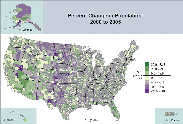
http://www.virginiaplaces.org/population/graphics/popgrowth2000-2005rate.gif
http://www.vision6.com.au/download/files/09640/790794/Australian%20Map%20orig%203004.gif